- Published on
6 Easy Ways To Make A Pop Up Form With Tailwind CSS
- What is Tailwind CSS?
- The description of Pop up Form ui component
- Why use Tailwind CSS to create a Pop up Form ui component?
- The preview of Pop up Form ui component
- The source code of Pop up Form ui component
- How to create a Pop up Form with Tailwind CSS?
- Conclusion
As a FrontEnd technology blogger, you must have heard of Tailwind CSS, a utility-first CSS framework that helps you quickly build custom designs. In this article, we will explore how to use Tailwind CSS to create a Pop up Form ui component.
What is Tailwind CSS?
Tailwind CSS is a utility-first CSS framework that provides low-level utility classes to create custom designs. It allows you to quickly build complex designs without writing custom CSS. With Tailwind CSS, you can easily create responsive designs, apply hover and focus states, and more.
The description of Pop up Form ui component
A Pop up Form ui component is a user interface element that appears on top of the content and requires user interaction to dismiss it. Pop up forms are commonly used for sign-ups, logins, and other forms that require user input.
Why use Tailwind CSS to create a Pop up Form ui component?
Tailwind CSS provides a set of utility classes that make it easy to create custom designs. With Tailwind CSS, you can quickly create a Pop up Form ui component without writing custom CSS. Tailwind CSS also provides responsive classes that allow you to create designs that work on different screen sizes.
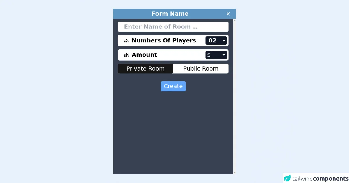
The preview of Pop up Form ui component
To create a Pop up Form ui component with Tailwind CSS, we will use the following classes:
fixed: This class positions the Pop up Form ui component relative to the viewport.inset-0: This class sets the top, right, bottom, and left properties to 0, which makes the Pop up Form ui component cover the entire viewport.bg-gray-900: This class sets the background color of the Pop up Form ui component to gray.opacity-50: This class sets the opacity of the Pop up Form ui component to 50%.z-50: This class sets the z-index of the Pop up Form ui component to 50, which ensures that it appears on top of other elements.
Free download of the Pop up Form's source code
The source code of Pop up Form ui component
To create a Pop up Form ui component with Tailwind CSS, you can use the following HTML and CSS:
<div class="fixed inset-0 bg-gray-900 opacity-50 z-50"></div>

<div class="fixed inset-0 z-50 flex items-center justify-center">
  <div class="bg-white p-6 rounded-lg">
    <h2 class="text-lg font-medium mb-4">Sign up for our newsletter</h2>
    <form>
      <div class="mb-4">
        <label class="block text-gray-700 font-medium mb-2" for="email">
          Email
        </label>
        <input
          class="border border-gray-400 p-2 w-full rounded-lg"
          id="email"
          name="email"
          type="email"
          required
        />
      </div>
      <div class="mb-4">
        <label class="block text-gray-700 font-medium mb-2" for="password">
          Password
        </label>
        <input
          class="border border-gray-400 p-2 w-full rounded-lg"
          id="password"
          name="password"
          type="password"
          required
        />
      </div>
      <button
        class="bg-blue-500 text-white py-2 px-4 rounded-lg hover:bg-blue-600"
        type="submit"
      >
        Sign up
      </button>
    </form>
  </div>
</div>
/* No custom CSS required */
<style>

/* To remove Spin button on Number fields */
input[type=number]::-webkit-outer-spin-button,
input[type=number]::-webkit-inner-spin-button {
    -webkit-appearance: none;
    margin: 0;
}

.radio-uc input[type=radio]:checked~label {
    background-color: #171717;
    color: white;
}
</style>

<div class="h-screen w-full flex flex-wrap justify-center items-center">
  <div class="w-full md:w-1/2">
    <div class="bg-white">
      <div
        class="flex bg-theme-blue-400 text-white px-4"
        style="background-color: rgb(93, 150, 195);"
      >
        <div class="w-full py-2 text-xl md:text-3xl font-bold text-center">
          Form Name
        </div>
        <button class="p-2 inline-block">
          <svg
            xmlns="http://www.w3.org/2000/svg"
            viewBox="0 0 24 24"
            fill="currentColor"
            class="w-8 h-8 self-center"
          >
            <path d="M0 0h24v24H0V0z" fill="none"></path>
            <path
              d="M19 6.41L17.59 5 12 10.59 6.41 5 5 6.41 10.59 12 5 17.59 6.41 19 12 13.41 17.59 19 19 17.59 13.41 12 19 6.41z"
            ></path>
          </svg>
        </button>
      </div>
      <div
        class="py-4 px-2 overflow-y-scroll bg-gray-700 text-white"
        style="height: 85vh;"
      >
        <div class="flex justify-center">
          <form id="createRoomForm" class="md:px-4 w-full">
            <div class="flex flex-wrap mb-4">
              <input
                type="text"
                placeholder="Enter Name of Room .."
                class="
              w-full
              rounded-md
              text-gray-500 text-base
              md:text-3xl
              px-8
              py-2
              font-bold
              outline-none
              focus:outline-none
            "
              />
            </div>

            <div class="flex mb-4 w-full bg-white rounded-lg p-2">
              <label
                for="users_number"
                class="w-full flex pl-6 self-center text-black font-semibold"
              >
                <svg
                  xmlns="http://www.w3.org/2000/svg"
                  viewBox="0 0 20 20"
                  fill="currentColor"
                  class="w-6 h-6 self-center"
                >
                  <path
                    d="M13 6a3 3 0 11-6 0 3 3 0 016 0zM18 8a2 2 0 11-4 0 2 2 0 014 0zM14 15a4 4 0 00-8 0v3h8v-3zM6 8a2 2 0 11-4 0 2 2 0 014 0zM16 18v-3a5.972 5.972 0 00-.75-2.906A3.005 3.005 0 0119 15v3h-3zM4.75 12.094A5.973 5.973 0 004 15v3H1v-3a3 3 0 013.75-2.906z"
                  ></path>
                </svg>
                <span class="pl-4 self-center text-base md:text-3xl">
                  Numbers Of Players
                </span>
              </label>
              <div class="inline-block relative">
                <select
                  id=""
                  class="
                inline-block
                w-20
                md:w-28
                bg-gray-900
                text-white text-base
                md:text-3xl
                font-bold
                h-full
                appearance-none
                px-4
                py-1
                pr-8
                rounded-lg
                shadow
                leading-tight
                outline-none
                focus:outline-none
                focus:shadow-outline
              "
                >
                  <option class="bg-gray-900 text-white" value="2">
                    02
                  </option>
                  <option class="bg-gray-900 text-white" value="3">
                    03
                  </option>
                  <option class="bg-gray-900 text-white" value="4">
                    04
                  </option>
                  <option class="bg-gray-900 text-white" value="5">
                    05
                  </option>
                </select>
                <div
                  class="
                pointer-events-none
                absolute
                inset-y-0
                right-0
                flex
                items-center
                px-2
                text-white
              "
                >
                  <svg
                    xmlns="http://www.w3.org/2000/svg"
                    fill="currentColor"
                    stroke="none"
                    viewBox="0 0 24 24"
                    class="w-4 h-4 fill-current"
                  >
                    <path
                      d="M11.178,19.569C11.364,19.839,11.672,20,12,20s0.636-0.161,0.822-0.431l9-13c0.212-0.306,0.236-0.704,0.063-1.033 C21.713,5.207,21.372,5,21,5H3C2.628,5,2.287,5.207,2.114,5.536C1.941,5.865,1.966,6.263,2.178,6.569L11.178,19.569z"
                    ></path>
                  </svg>
                </div>
              </div>
            </div>
            <div class="flex mb-4 w-full bg-white rounded-lg p-2">
              <label
                for="amount"
                class="w-full flex pl-6 self-center text-black font-semibold"
              >
                <svg
                  xmlns="http://www.w3.org/2000/svg"
                  viewBox="0 0 20 20"
                  fill="currentColor"
                  class="w-6 h-6 self-center"
                >
                  <path
                    d="M13 6a3 3 0 11-6 0 3 3 0 016 0zM18 8a2 2 0 11-4 0 2 2 0 014 0zM14 15a4 4 0 00-8 0v3h8v-3zM6 8a2 2 0 11-4 0 2 2 0 014 0zM16 18v-3a5.972 5.972 0 00-.75-2.906A3.005 3.005 0 0119 15v3h-3zM4.75 12.094A5.973 5.973 0 004 15v3H1v-3a3 3 0 013.75-2.906z"
                  ></path>
                </svg>
                <span class="pl-4 self-center text-base md:text-3xl">
                  Amount
                </span>
              </label>
              <div class="inline-block relative">
                <span
                  class="
                pointer-events-none
                absolute
                inset-y-0
                left-0
                flex
                text-base
                md:text-3xl
                items-center
                px-2
                text-white
              "
                >
                  $
                </span>
                <input
                  type="number"
                  class="
                inline-block
                bg-gray-900
                text-white text-base
                md:text-3xl
                font-bold
                w-20
                md:w-28
                h-full
                appearance-none
                pl-5
                md:pl-7
                py-1
                pr-8
                rounded-lg
                shadow
                leading-tight
                outline-none
                focus:outline-none
                focus:shadow-outline
              "
                />
                <div
                  class="
                pointer-events-none
                absolute
                inset-y-0
                right-0
                flex
                items-center
                px-2
                text-white
              "
                >
                  <svg
                    xmlns="http://www.w3.org/2000/svg"
                    fill="currentColor"
                    stroke="none"
                    viewBox="0 0 24 24"
                    class="w-4 h-4 fill-current"
                  >
                    <path
                      d="M11.178,19.569C11.364,19.839,11.672,20,12,20s0.636-0.161,0.822-0.431l9-13c0.212-0.306,0.236-0.704,0.063-1.033 C21.713,5.207,21.372,5,21,5H3C2.628,5,2.287,5.207,2.114,5.536C1.941,5.865,1.966,6.263,2.178,6.569L11.178,19.569z"
                    ></path>
                  </svg>
                </div>
              </div>
            </div>
            <div class="w-full flex mb-2 bg-white rounded-lg">
              <div class="w-1/2 radio-uc inline-flex rounded-lg">
                <input
                  type="radio"
                  value="private"
                  id="roomPrivate"
                  name="room_type"
                  checked="checked"
                  hidden="hidden"
                />
                <label
                  for="roomPrivate"
                  class="
                w-full
                text-center
                self-center
                text-black
                text-xl
                md:text-3xl
                py-2
                px-4
                rounded-lg
                cursor-pointer
                hover:opacity-75
              "
                >
                  Private Room
                </label>
              </div>
              <div class="w-1/2 radio-uc inline-flex rounded-lg">
                <input
                  type="radio"
                  value="public"
                  name="room_type"
                  id="roomPublic"
                  hidden="hidden"
                />
                <label
                  for="roomPublic"
                  class="
                radio-uc
                text-black
                w-full
                text-center
                self-center
                text-xl
                md:text-3xl
                py-2
                px-4
                rounded-lg
                cursor-pointer
                hover:opacity-75
              "
                >
                  Public Room
                </label>
              </div>
            </div>
            <div class="text-center pt-8">
              <button
                type="submit"
                class="px-4 py-2 text-xl md:text-3xl rounded-lg bg-blue-400 text-white "
              >
                Create
              </button>
            </div>
          </form>
        </div>
      </div>
    </div>
  </div>
</div>
How to create a Pop up Form with Tailwind CSS?
To create a Pop up Form ui component with Tailwind CSS, follow these steps:
- Create a
divelement with thefixed,inset-0,bg-gray-900,opacity-50, andz-50classes. This element will be the background of the Pop up Form ui component. - Create another
divelement with thefixed,inset-0, andz-50classes. This element will be the container for the Pop up Form ui component. - Add the
flex,items-center, andjustify-centerclasses to the containerdivelement to center the Pop up Form ui component vertically and horizontally. - Create a
divelement inside the containerdivelement with thebg-white,p-6, androunded-lgclasses. This element will be the Pop up Form ui component. - Add the content you want to display in the Pop up Form ui component, such as a form or a message.
- Style the content using Tailwind CSS utility classes.
Conclusion
In this article, we have explored how to use Tailwind CSS to create a Pop up Form ui component. Tailwind CSS provides a set of utility classes that make it easy to create custom designs. With Tailwind CSS, you can quickly create a Pop up Form ui component without writing custom CSS. We hope this article has been helpful in showing you how to create a Pop up Form ui component with Tailwind CSS.