- Published on
Advanced Guide: Make A Dashboard Point Of Sale System With Tailwind CSS
- What Is Tailwind CSS?
- The Description Of Dashboard Point Of Sale System UI Component
- Why Use Tailwind CSS To Create A Dashboard Point Of Sale System UI Component?
- The Preview Of Dashboard Point Of Sale System UI Component
- The Source Code Of Dashboard Point Of Sale System UI Component
- How To Create A Dashboard Point Of Sale System With Tailwind CSS?
- Step 1: Set Up Your Environment
- Step 2: Create Your HTML Markup
- Step 3: Style Your HTML Elements With Tailwind CSS
- Step 4: Add Interactivity With JavaScript
- Conclusion
If you are looking to create a dashboard point of sale system, then you have come to the right place. In this article, we will be discussing how to create a dashboard point of sale system using Tailwind CSS. We will cover everything from what Tailwind CSS is to how to create a dashboard point of sale system using it. So, let's get started.
What Is Tailwind CSS?
Tailwind CSS is a utility-first CSS framework that makes it easy to create custom designs without writing any CSS. It provides a set of pre-defined classes that can be used to style HTML elements. This makes it easy to create responsive designs that work on all devices.
The Description Of Dashboard Point Of Sale System UI Component
A dashboard point of sale system is a user interface component that is used to manage sales and inventory. It provides a visual representation of sales data and inventory levels, making it easy for users to make informed decisions.
Why Use Tailwind CSS To Create A Dashboard Point Of Sale System UI Component?
Tailwind CSS is a great choice for creating a dashboard point of sale system UI component because it provides a set of pre-defined classes that can be used to style HTML elements. This makes it easy to create a custom design that is responsive and works on all devices. Additionally, Tailwind CSS is easy to use and requires no knowledge of CSS.
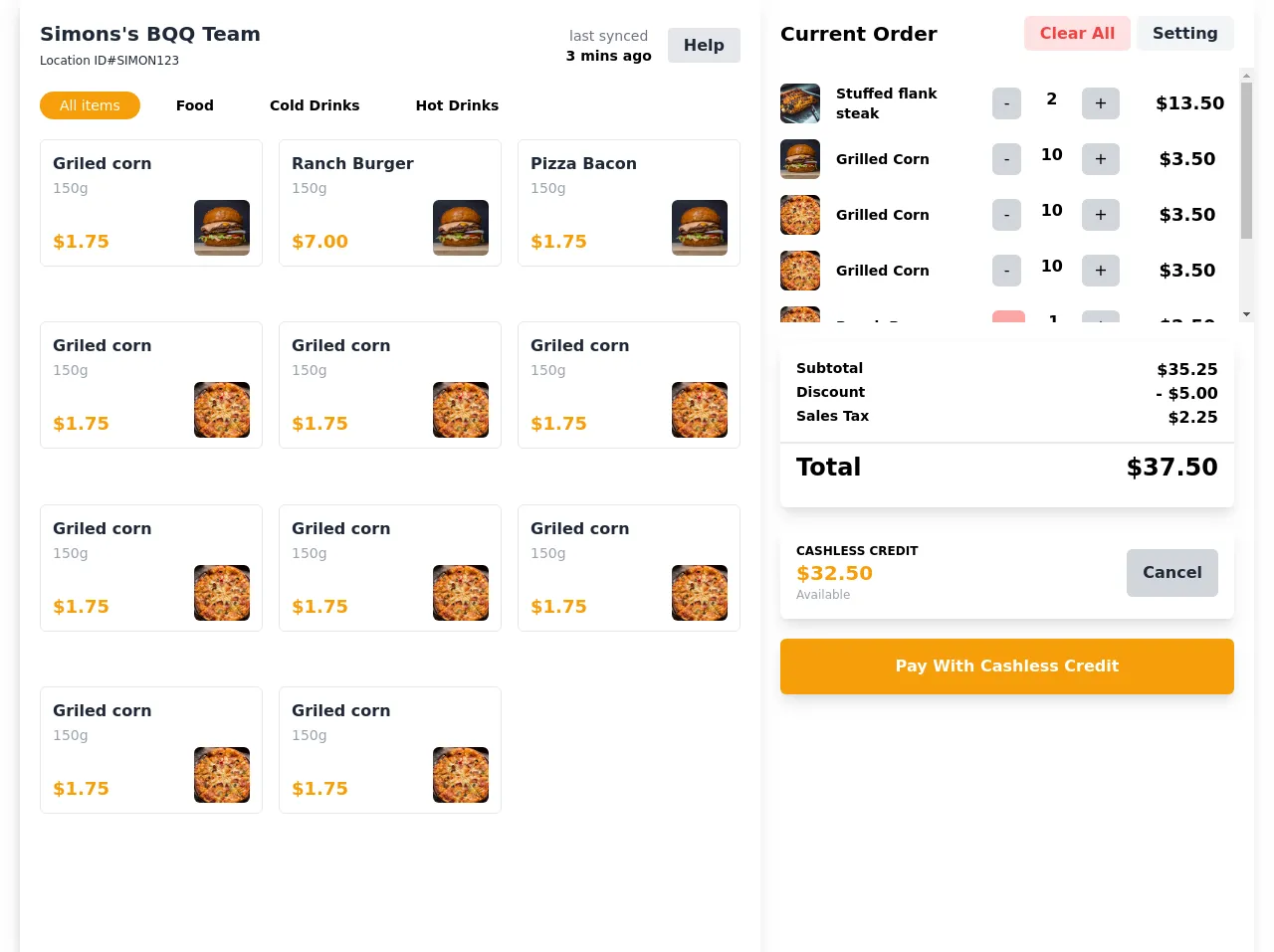
The Preview Of Dashboard Point Of Sale System UI Component
Free download of the Dashboard Point of sale system's source code
The Source Code Of Dashboard Point Of Sale System UI Component
<div class="container mx-auto px-5 bg-white">
      <div class="flex lg:flex-row flex-col-reverse shadow-lg">
        <!-- left section -->
        <div class="w-full lg:w-3/5 min-h-screen shadow-lg">
          <!-- header -->
          <div class="flex flex-row justify-between items-center px-5 mt-5">
            <div class="text-gray-800">
              <div class="font-bold text-xl">Simons's BQQ Team</div>
              <span class="text-xs">Location ID#SIMON123</span>
            </div>
            <div class="flex items-center">
              <div class="text-sm text-center mr-4">
                <div class="font-light text-gray-500">last synced</div>
                <span class="font-semibold">3 mins ago</span>
              </div>
              <div>
                  <span
                  class="px-4 py-2 bg-gray-200 text-gray-800 font-semibold rounded"
                  >
                  Help
                </div>
              </span>
            </div>
          </div>
          <!-- end header -->
          <!-- categories -->
          <div class="mt-5 flex flex-row px-5">
            <span
              class="px-5 py-1 bg-yellow-500 rounded-2xl text-white text-sm mr-4"
            >
              All items
            </span>
            <span class="px-5 py-1 rounded-2xl text-sm font-semibold mr-4">
              Food
            </span>
            <span class="px-5 py-1 rounded-2xl text-sm font-semibold mr-4">
              Cold Drinks
            </span>
            <span class="px-5 py-1 rounded-2xl text-sm font-semibold mr-4">
              Hot Drinks
            </span>
          </div>
          <!-- end categories -->
          <!-- products -->
          <div class="grid grid-cols-3 gap-4 px-5 mt-5 overflow-y-auto h-3/4">
            <div class="px-3 py-3 flex flex-col border border-gray-200 rounded-md h-32 justify-between">
              <div>
                <div class="font-bold text-gray-800">Griled corn</div>
                <span class="font-light text-sm text-gray-400">150g</span>
              </div>
              <div class="flex flex-row justify-between items-center">
                <span class="self-end font-bold text-lg text-yellow-500">$1.75</span>
                <img src="https://source.unsplash.com/sc5sTPMrVfk/600x600" class=" h-14 w-14 object-cover rounded-md" alt="">
              </div>
            </div>
            <div class="px-3 py-3 flex flex-col border border-gray-200 rounded-md h-32 justify-between">
              <div>
                <div class="font-bold text-gray-800">Ranch Burger</div>
                <span class="font-light text-sm text-gray-400">150g</span>
              </div>
              <div class="flex flex-row justify-between items-center">
                <span class="self-end font-bold text-lg text-yellow-500">$7.00</span>
                <img src="https://source.unsplash.com/sc5sTPMrVfk/600x500" class=" h-14 w-14 object-cover rounded-md" alt="">
              </div>
            </div>
            <div class="px-3 py-3 flex flex-col border border-gray-200 rounded-md h-32 justify-between">
              <div>
                <div class="font-bold text-gray-800">Pizza Bacon</div>
                <span class="font-light text-sm text-gray-400">150g</span>
              </div>
              <div class="flex flex-row justify-between items-center">
                <span class="self-end font-bold text-lg text-yellow-500">$1.75</span>
                <img src="https://source.unsplash.com/sc5sTPMrVfk/500x500" class=" h-14 w-14 object-cover rounded-md" alt="">
              </div>
            </div>
            <div class="px-3 py-3 flex flex-col border border-gray-200 rounded-md h-32 justify-between">
              <div>
                <div class="font-bold text-gray-800">Griled corn</div>
                <span class="font-light text-sm text-gray-400">150g</span>
              </div>
              <div class="flex flex-row justify-between items-center">
                <span class="self-end font-bold text-lg text-yellow-500">$1.75</span>
                <img src="https://source.unsplash.com/MNtag_eXMKw/600x600" class=" h-14 w-14 object-cover rounded-md" alt="">
              </div>
            </div>
          </div>
          <!-- end products -->
        </div>
        <!-- end left section -->
        <!-- right section -->
        <div class="w-full lg:w-2/5">
          <!-- header -->
          <div class="flex flex-row items-center justify-between px-5 mt-5">
            <div class="font-bold text-xl">Current Order</div>
            <div class="font-semibold">
              <span class="px-4 py-2 rounded-md bg-red-100 text-red-500">Clear All</span>
              <span class="px-4 py-2 rounded-md bg-gray-100 text-gray-800">Setting</span>
            </div>
          </div>
          <!-- end header -->
          <!-- order list -->
          <div class="px-5 py-4 mt-5 overflow-y-auto h-64">
              <div class="flex flex-row justify-between items-center mb-4">
                <div class="flex flex-row items-center w-2/5">
                  <img src="https://source.unsplash.com/4u_nRgiLW3M/600x600" class="w-10 h-10 object-cover rounded-md" alt="">
                  <span class="ml-4 font-semibold text-sm">Stuffed flank steak</span>
                </div>
                <div class="w-32 flex justify-between">
                  <span class="px-3 py-1 rounded-md bg-gray-300 ">-</span>
                  <span class="font-semibold mx-4">2</span>
                  <span class="px-3 py-1 rounded-md bg-gray-300 ">+</span>
                </div>
                <div class="font-semibold text-lg w-16 text-center">
                  $13.50
                </div>
              </div>
              <div class="flex flex-row justify-between items-center mb-4">
                <div class="flex flex-row items-center w-2/5">
                  <img src="https://source.unsplash.com/sc5sTPMrVfk/600x600" class="w-10 h-10 object-cover rounded-md" alt="">
                  <span class="ml-4 font-semibold text-sm">Grilled Corn</span>
                </div>
                <div class="w-32 flex justify-between">
                  <span class="px-3 py-1 rounded-md bg-gray-300 ">-</span>
                  <span class="font-semibold mx-4">10</span>
                  <span class="px-3 py-1 rounded-md bg-gray-300 ">+</span>
                </div>
                <div class="font-semibold text-lg w-16 text-center">
                  $3.50
                </div>
              </div>
              <div class="flex flex-row justify-between items-center mb-4">
                <div class="flex flex-row items-center w-2/5">
                  <img src="https://source.unsplash.com/MNtag_eXMKw/600x600" class="w-10 h-10 object-cover rounded-md" alt="">
                  <span class="ml-4 font-semibold text-sm">Ranch Burger</span>
                </div>
                <div class="w-32 flex justify-between">
                  <span class="px-3 py-1 rounded-md bg-red-300 text-white">x</span>
                  <span class="font-semibold mx-4">1</span>
                  <span class="px-3 py-1 rounded-md bg-gray-300 ">+</span>
                </div>
                <div class="font-semibold text-lg w-16 text-center">
                  $2.50
                </div>
              </div>
              <div class="flex flex-row justify-between items-center mb-4">
                <div class="flex flex-row items-center w-2/5">
                  <img src="https://source.unsplash.com/4u_nRgiLW3M/600x600" class="w-10 h-10 object-cover rounded-md" alt="">
                  <span class="ml-4 font-semibold text-sm">Ranch Burger</span>
                </div>
                <div class="w-32 flex justify-between">
                  <span class="px-3 py-1 rounded-md bg-red-300 text-white">x</span>
                  <span class="font-semibold mx-4">1</span>
                  <span class="px-3 py-1 rounded-md bg-gray-300 ">+</span>
                </div>
                <div class="font-semibold text-lg w-16 text-center">
                  $2.50
                </div>
              </div>
          </div>
          <!-- end order list -->
          <!-- totalItems -->
          <div class="px-5 mt-5">
            <div class="py-4 rounded-md shadow-lg">
              <div class=" px-4 flex justify-between ">
                <span class="font-semibold text-sm">Subtotal</span>
                <span class="font-bold">$35.25</span>
              </div>
              <div class=" px-4 flex justify-between ">
                <span class="font-semibold text-sm">Discount</span>
                <span class="font-bold">- $5.00</span>
              </div>
              <div class=" px-4 flex justify-between ">
                <span class="font-semibold text-sm">Sales Tax</span>
                <span class="font-bold">$2.25</span>
              </div>
              <div class="border-t-2 mt-3 py-2 px-4 flex items-center justify-between">
                <span class="font-semibold text-2xl">Total</span>
                <span class="font-bold text-2xl">$37.50</span>
              </div>
            </div>
          </div>
          <!-- end total -->
          <!-- cash -->
          <div class="px-5 mt-5">
            <div class="rounded-md shadow-lg px-4 py-4">
              <div class="flex flex-row justify-between items-center">
                <div class="flex flex-col">
                  <span class="uppercase text-xs font-semibold">cashless credit</span>
                  <span class="text-xl font-bold text-yellow-500">$32.50</span>
                  <span class=" text-xs text-gray-400 ">Available</span>
                </div>
                <div class="px-4 py-3 bg-gray-300 text-gray-800 rounded-md font-bold"> Cancel</div>
              </div>
            </div>
          </div>
          <!-- end cash -->
          <!-- button pay-->
          <div class="px-5 mt-5">
            <div class="px-4 py-4 rounded-md shadow-lg text-center bg-yellow-500 text-white font-semibold">
              Pay With Cashless Credit
            </div>
          </div>
          <!-- end button pay -->
        </div>
        <!-- end right section -->
      </div>
    </div>
How To Create A Dashboard Point Of Sale System With Tailwind CSS?
Now that we have covered the basics of Tailwind CSS and the dashboard point of sale system UI component, let's dive into how to create a dashboard point of sale system with Tailwind CSS.
Step 1: Set Up Your Environment
The first step is to set up your environment. You will need to install Node.js and npm. Once you have installed Node.js and npm, you can install Tailwind CSS using npm.
Step 2: Create Your HTML Markup
The next step is to create your HTML markup. You will need to create a container element that will hold your dashboard point of sale system UI component. Inside the container element, you will need to create the various elements that make up the dashboard point of sale system UI component.
Step 3: Style Your HTML Elements With Tailwind CSS
The next step is to style your HTML elements with Tailwind CSS. You can use the pre-defined classes provided by Tailwind CSS to style your HTML elements. For example, you can use the bg-gray-100 class to set the background color of an element to gray.
Step 4: Add Interactivity With JavaScript
The final step is to add interactivity with JavaScript. You can use JavaScript to add functionality to your dashboard point of sale system UI component. For example, you can use JavaScript to update the sales data when a sale is made.
Conclusion
In this article, we have discussed how to create a dashboard point of sale system using Tailwind CSS. We have covered everything from what Tailwind CSS is to how to create a dashboard point of sale system using it. By following the steps outlined in this article, you can create a custom dashboard point of sale system that is responsive and works on all devices.