- Published on
The Ninja Guide To How To Make A Play Vocal Component With Tailwind CSS Better
- What is Tailwind CSS?
- The description of Play vocal component UI component
- Why use Tailwind CSS to create a Play vocal component UI component?
- The preview of Play vocal component UI component
- The source code of Play vocal component UI component
- How to create a Play vocal component with Tailwind CSS?
- Conclusion
What is Tailwind CSS?
Tailwind CSS is a utility-first CSS framework that allows developers to quickly create custom designs without writing any CSS. It provides a set of pre-defined classes that can be used to style HTML elements. With Tailwind CSS, developers can create responsive designs, customize colors, fonts, and spacing, and more.
The description of Play vocal component UI component
The Play vocal component is a UI component that allows users to play audio files. It typically includes a play button, a pause button, and a progress bar. This component is commonly used in music and podcast applications.
Why use Tailwind CSS to create a Play vocal component UI component?
Tailwind CSS is a great choice for creating the Play vocal component UI component for several reasons:
- Tailwind CSS provides a set of pre-defined classes that can be used to style the Play vocal component quickly and easily.
- Tailwind CSS is responsive, which means that the Play vocal component will look great on any device.
- Tailwind CSS is customizable, which means that developers can easily change the colors, fonts, and spacing of the Play vocal component to match the design of their application.
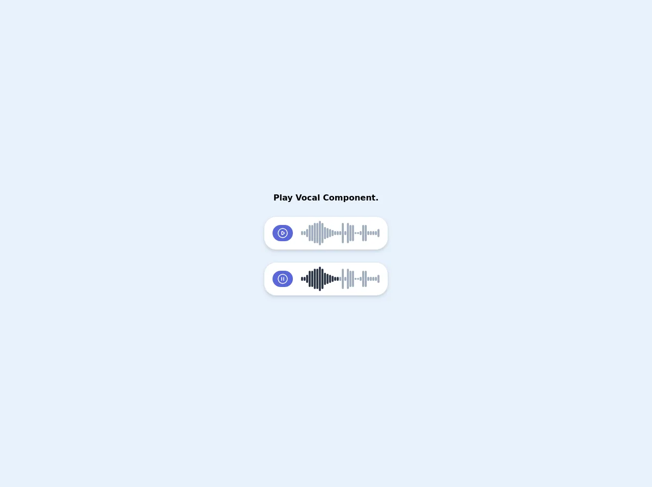
The preview of Play vocal component UI component
The Play vocal component UI component is a simple and intuitive component that allows users to play audio files. It typically includes a play button, a pause button, and a progress bar.
Free download of the Play vocal component's source code
The source code of Play vocal component UI component
The source code for the Play vocal component UI component is relatively simple. It typically includes HTML and CSS code that defines the structure and style of the component.
<div class="flex flex-col items-center justify-center min-h-screen px-4">
  <div class="flex flex-col space-y-6">
    <div class="text-center font-bold">Play Vocal Component.</div>
    <div class="flex flex-row items-center bg-white border px-4 py-2 rounded-3xl shadow-md">
      <button class="flex items-center justify-center bg-indigo-600 hover:bg-indigo-800 rounded-full h-8 w-10">
        <svg class="w-6 h-6 text-white" fill="none" stroke="currentColor" viewBox="0 0 24 24" xmlns="http://www.w3.org/2000/svg">
          <path stroke-linecap="round" stroke-linejoin="round" stroke-width="1.5" d="M14.752 11.168l-3.197-2.132A1 1 0 0010 9.87v4.263a1 1 0 001.555.832l3.197-2.132a1 1 0 000-1.664z"></path>
          <path stroke-linecap="round" stroke-linejoin="round" stroke-width="1.5" d="M21 12a9 9 0 11-18 0 9 9 0 0118 0z"></path>
        </svg>
      </button>
      <div class="flex flex-row items-center space-x-px ml-4">
        <div class="h-2 w-1 bg-gray-500 rounded-lg"></div>
        <div class="h-2 w-1 bg-gray-500 rounded-lg"></div>
        <div class="h-4 w-1 bg-gray-500 rounded-lg"></div>
        <div class="h-8 w-1 bg-gray-500 rounded-lg"></div>
        <div class="h-8 w-1 bg-gray-500 rounded-lg"></div>
        <div class="h-10 w-1 bg-gray-500 rounded-lg"></div>
        <div class="h-10 w-1 bg-gray-500 rounded-lg"></div>
        <div class="h-12 w-1 bg-gray-500 rounded-lg"></div>
        <div class="h-10 w-1 bg-gray-500 rounded-lg"></div>
        <div class="h-6 w-1 bg-gray-500 rounded-lg"></div>
        <div class="h-5 w-1 bg-gray-500 rounded-lg"></div>
        <div class="h-4 w-1 bg-gray-500 rounded-lg"></div>
        <div class="h-3 w-1 bg-gray-500 rounded-lg"></div>
        <div class="h-2 w-1 bg-gray-500 rounded-lg"></div>
        <div class="h-2 w-1 bg-gray-500 rounded-lg"></div>
        <div class="h-2 w-1 bg-gray-500 rounded-lg"></div>
        <div class="h-10 w-1 bg-gray-500 rounded-lg"></div>
        <div class="h-2 w-1 bg-gray-500 rounded-lg"></div>
        <div class="h-10 w-1 bg-gray-500 rounded-lg"></div>
        <div class="h-8 w-1 bg-gray-500 rounded-lg"></div>
        <div class="h-8 w-1 bg-gray-500 rounded-lg"></div>
        <div class="h-1 w-1 bg-gray-500 rounded-lg"></div>
        <div class="h-1 w-1 bg-gray-500 rounded-lg"></div>
        <div class="h-2 w-1 bg-gray-500 rounded-lg"></div>
        <div class="h-8 w-1 bg-gray-500 rounded-lg"></div>
        <div class="h-8 w-1 bg-gray-500 rounded-lg"></div>
        <div class="h-2 w-1 bg-gray-500 rounded-lg"></div>
        <div class="h-2 w-1 bg-gray-500 rounded-lg"></div>
        <div class="h-2 w-1 bg-gray-500 rounded-lg"></div>
        <div class="h-2 w-1 bg-gray-500 rounded-lg"></div>
        <div class="h-4 w-1 bg-gray-500 rounded-lg"></div>
      </div>
    </div>
    <div class="flex flex-row items-center bg-white border px-4 py-2 rounded-3xl shadow-md">
      <button class="flex items-center justify-center bg-indigo-600 hover:bg-indigo-800 rounded-full h-8 w-10">
        <svg class="w-6 h-6 text-white" fill="none" stroke="currentColor" viewBox="0 0 24 24" xmlns="http://www.w3.org/2000/svg">
          <path stroke-linecap="round" stroke-linejoin="round" stroke-width="1.5" d="M10 9v6m4-6v6m7-3a9 9 0 11-18 0 9 9 0 0118 0z"></path>
        </svg>
      </button>
      <div class="flex flex-row items-center space-x-px ml-4">
        <div class="h-2 w-1 bg-gray-800 rounded-lg"></div>
        <div class="h-2 w-1 bg-gray-800 rounded-lg"></div>
        <div class="h-4 w-1 bg-gray-800 rounded-lg"></div>
        <div class="h-8 w-1 bg-gray-800 rounded-lg"></div>
        <div class="h-8 w-1 bg-gray-800 rounded-lg"></div>
        <div class="h-10 w-1 bg-gray-800 rounded-lg"></div>
        <div class="h-10 w-1 bg-gray-800 rounded-lg"></div>
        <div class="h-12 w-1 bg-gray-800 rounded-lg"></div>
        <div class="h-10 w-1 bg-gray-800 rounded-lg"></div>
        <div class="h-6 w-1 bg-gray-800 rounded-lg"></div>
        <div class="h-5 w-1 bg-gray-800 rounded-lg"></div>
        <div class="h-4 w-1 bg-gray-800 rounded-lg"></div>
        <div class="h-3 w-1 bg-gray-800 rounded-lg"></div>
        <div class="h-2 w-1 bg-gray-800 rounded-lg"></div>
        <div class="h-2 w-1 bg-gray-800 rounded-lg"></div>
        <div class="h-2 w-1 bg-gray-500 rounded-lg"></div>
        <div class="h-10 w-1 bg-gray-500 rounded-lg"></div>
        <div class="h-2 w-1 bg-gray-500 rounded-lg"></div>
        <div class="h-10 w-1 bg-gray-500 rounded-lg"></div>
        <div class="h-8 w-1 bg-gray-500 rounded-lg"></div>
        <div class="h-8 w-1 bg-gray-500 rounded-lg"></div>
        <div class="h-1 w-1 bg-gray-500 rounded-lg"></div>
        <div class="h-1 w-1 bg-gray-500 rounded-lg"></div>
        <div class="h-2 w-1 bg-gray-500 rounded-lg"></div>
        <div class="h-8 w-1 bg-gray-500 rounded-lg"></div>
        <div class="h-8 w-1 bg-gray-500 rounded-lg"></div>
        <div class="h-2 w-1 bg-gray-500 rounded-lg"></div>
        <div class="h-2 w-1 bg-gray-500 rounded-lg"></div>
        <div class="h-2 w-1 bg-gray-500 rounded-lg"></div>
        <div class="h-2 w-1 bg-gray-500 rounded-lg"></div>
        <div class="h-4 w-1 bg-gray-500 rounded-lg"></div>
      </div>
    </div>
  </div>
</div>
How to create a Play vocal component with Tailwind CSS?
Creating a Play vocal component with Tailwind CSS is relatively simple. Here are the steps:
- Start by creating a new HTML file and adding the necessary HTML elements for the Play vocal component, such as the play button, pause button, and progress bar.
- Add the necessary Tailwind CSS classes to the HTML elements to style the Play vocal component. For example, you can use the "bg-gray-200" class to set the background color of the progress bar to gray.
- Customize the Play vocal component by changing the colors, fonts, and spacing to match the design of your application. For example, you can use the "text-red-500" class to set the color of the play button to red.
- Test the Play vocal component on different devices to ensure that it is responsive and looks great on all screen sizes.
Conclusion
In conclusion, Tailwind CSS is a great choice for creating the Play vocal component UI component. It provides a set of pre-defined classes that can be used to style the component quickly and easily. Additionally, Tailwind CSS is responsive and customizable, which means that developers can easily create a Play vocal component that matches the design of their application. By following the steps outlined in this article, developers can create a Play vocal component with Tailwind CSS that looks great and functions perfectly.