- Published on
Most Effective Ways To Create A Pagination Buttons With Tailwind CSS
- What is Tailwind CSS?
- The description of Pagination buttons ui component
- Why use Tailwind CSS to create a Pagination buttons ui component?
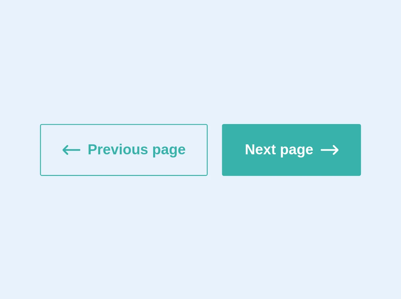
- The preview of Pagination buttons ui component.
- The source code of Pagination buttons ui component.
- How to create a Pagination buttons with Tailwind CSS?
- Conclusion
What is Tailwind CSS?
Tailwind CSS is a utility-first CSS framework that allows you to create custom designs without writing any CSS. It is a highly customizable framework that provides a set of pre-defined classes that you can use to style your HTML elements.
The description of Pagination buttons ui component
Pagination buttons are a common UI component used in web applications to allow users to navigate through a large set of data. Pagination buttons are typically used in conjunction with a table or list of data to allow users to move between pages of data.
Why use Tailwind CSS to create a Pagination buttons ui component?
Tailwind CSS provides a set of pre-defined classes that make it easy to create a pagination button UI component. Using Tailwind CSS, you can create a pagination button UI component that is responsive, customizable, and easy to maintain.
The preview of Pagination buttons ui component.
To create a pagination button UI component with Tailwind CSS, you can use the following classes:
<button class="bg-white hover:bg-gray-100 text-gray-800 font-semibold py-2 px-4 border border-gray-400 rounded shadow">
  1
</button>
Free download of the Pagination buttons's source code
The source code of Pagination buttons ui component.
To create a pagination button UI component with Tailwind CSS, you can use the following HTML and CSS code:
<div class="flex justify-center">
  <button class="bg-white hover:bg-gray-100 text-gray-800 font-semibold py-2 px-4 border border-gray-400 rounded-l shadow">
    Previous
  </button>
  <button class="bg-white hover:bg-gray-100 text-gray-800 font-semibold py-2 px-4 border border-gray-400 shadow">
    1
  </button>
  <button class="bg-white hover:bg-gray-100 text-gray-800 font-semibold py-2 px-4 border border-gray-400 shadow">
    2
  </button>
  <button class="bg-white hover:bg-gray-100 text-gray-800 font-semibold py-2 px-4 border border-gray-400 shadow">
    3
  </button>
  <button class="bg-white hover:bg-gray-100 text-gray-800 font-semibold py-2 px-4 border border-gray-400 rounded-r shadow">
    Next
  </button>
</div>
<div class="flex">
    <button class="border border-teal-500 text-teal-500 block rounded-sm font-bold py-4 px-6 mr-2 flex items-center hover:bg-teal-500 hover:text-white">
        <svg class="h-5 w-5 mr-2 fill-current" version="1.1" id="Layer_1" xmlns="http://www.w3.org/2000/svg" xmlns:xlink="http://www.w3.org/1999/xlink" x="0px" y="0px" viewBox="-49 141 512 512" style="enable-background:new -49 141 512 512;" xml:space="preserve">
            <path id="XMLID_10_" d="M438,372H36.355l72.822-72.822c9.763-9.763,9.763-25.592,0-35.355c-9.763-9.764-25.593-9.762-35.355,0 l-115.5,115.5C-46.366,384.01-49,390.369-49,397s2.634,12.989,7.322,17.678l115.5,115.5c9.763,9.762,25.593,9.763,35.355,0 c9.763-9.763,9.763-25.592,0-35.355L36.355,422H438c13.808,0,25-11.193,25-25S451.808,372,438,372z"></path>
        </svg>
        Previous page
    </button>
    <button class="border border-teal-500 bg-teal-500 text-white block rounded-sm font-bold py-4 px-6 ml-2 flex items-center">
        Next page
        <svg class="h-5 w-5 ml-2 fill-current" clasversion="1.1" id="Layer_1" xmlns="http://www.w3.org/2000/svg" xmlns:xlink="http://www.w3.org/1999/xlink" x="0px" y="0px"
             viewBox="-49 141 512 512" style="enable-background:new -49 141 512 512;" xml:space="preserve">
        <path id="XMLID_11_" d="M-24,422h401.645l-72.822,72.822c-9.763,9.763-9.763,25.592,0,35.355c9.763,9.764,25.593,9.762,35.355,0
            l115.5-115.5C460.366,409.989,463,403.63,463,397s-2.634-12.989-7.322-17.678l-115.5-115.5c-9.763-9.762-25.593-9.763-35.355,0
            c-9.763,9.763-9.763,25.592,0,35.355l72.822,72.822H-24c-13.808,0-25,11.193-25,25S-37.808,422-24,422z"/>
        </svg>
    </button>
</div>
How to create a Pagination buttons with Tailwind CSS?
To create a pagination button UI component with Tailwind CSS, follow these steps:
- Create a
divelement with theflexandjustify-centerclasses to center the pagination buttons horizontally.
<div class="flex justify-center">
  <!-- Pagination buttons will go here -->
</div>
- Create a
buttonelement for each page of data, with thebg-white,text-gray-800,font-semibold,py-2,px-4,border, andshadowclasses.
<button class="bg-white hover:bg-gray-100 text-gray-800 font-semibold py-2 px-4 border border-gray-400 shadow">
  1
</button>
- Add the
rounded-lclass to the first button to round the left edge, and add therounded-rclass to the last button to round the right edge.
<button class="bg-white hover:bg-gray-100 text-gray-800 font-semibold py-2 px-4 border border-gray-400 rounded-l shadow">
  Previous
</button>
<button class="bg-white hover:bg-gray-100 text-gray-800 font-semibold py-2 px-4 border border-gray-400 rounded-r shadow">
  Next
</button>
- Add the
hover:bg-gray-100class to change the background color of the button on hover.
<button class="bg-white hover:bg-gray-100 text-gray-800 font-semibold py-2 px-4 border border-gray-400 rounded shadow">
  1
</button>
- Add the
text-blue-500class to change the text color of the active button.
<button class="bg-white hover:bg-gray-100 text-blue-500 font-semibold py-2 px-4 border border-gray-400 rounded shadow">
  1
</button>
- Add the
bg-blue-500class to change the background color of the active button.
<button class="bg-blue-500 hover:bg-blue-700 text-white font-semibold py-2 px-4 border border-gray-400 rounded shadow">
  1
</button>
Conclusion
Creating a pagination button UI component with Tailwind CSS is a simple and effective way to provide users with a way to navigate through a large set of data. With Tailwind CSS, you can create a responsive, customizable, and easy-to-maintain pagination button UI component in just a few steps.