- Published on
Surprisingly Effective Ways To Create A Pagination With Tailwind CSS
- What is Tailwind CSS?
- The description of Pagination UI component
- Why use Tailwind CSS to create a Pagination UI component?
- The preview of Pagination UI component
- The source code of Pagination UI component
- How to create a Pagination with Tailwind CSS?
- Conclusion
As a FrontEnd technology blogger, it is important to stay up-to-date with the latest tools and techniques. One tool that has gained popularity in recent years is Tailwind CSS. Tailwind CSS is a utility-first CSS framework that allows developers to quickly and easily create custom UI components. In this article, we will explore how to create a Pagination UI component with Tailwind CSS.
What is Tailwind CSS?
Tailwind CSS is a utility-first CSS framework that provides pre-defined CSS classes that can be used to style HTML elements. It allows developers to create custom UI components quickly and easily by using pre-defined classes instead of writing custom CSS code. Tailwind CSS is highly customizable and can be configured to match the design requirements of any project.
The description of Pagination UI component
Pagination is a UI component that is commonly used in web applications to display a large number of items that are divided into multiple pages. Pagination allows users to navigate through the pages and view the items on each page. Pagination typically includes a set of buttons that represent each page, as well as buttons for navigating to the previous and next pages.
Why use Tailwind CSS to create a Pagination UI component?
Tailwind CSS provides a set of pre-defined classes that can be used to create a Pagination UI component quickly and easily. These classes can be customized to match the design requirements of any project. Using Tailwind CSS to create a Pagination UI component can save developers time and effort, as they do not need to write custom CSS code.
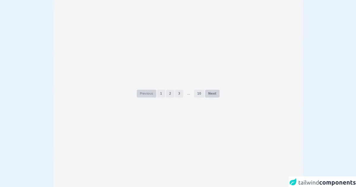
The preview of Pagination UI component
To create a Pagination UI component with Tailwind CSS, we can use a combination of pre-defined classes to style the HTML elements. The result is a clean and modern-looking Pagination UI component that is easy to use and navigate.
Free download of the Pagination's source code
The source code of Pagination UI component
To create a Pagination UI component with Tailwind CSS, we can use a combination of HTML and Tailwind CSS classes. The HTML structure consists of a container element that holds the pagination buttons. Each pagination button is an anchor element that links to the corresponding page. The Tailwind CSS classes are used to style the HTML elements.
<!-- This is an example component -->
<div class='flex items-center justify-center min-h-screen bg-gray-100'>
    <div class="flex flex-col items-center mb-8 px-4 mx-auto mt-8">
        <div class="font-sans flex justify-end space-x-1 select-none">
            <a href="#" class="flex items-center px-4 py-2 text-gray-500 bg-gray-300 rounded-md">
                Previous
            </a>
            <a href="#" class="px-4 py-2 text-gray-700 bg-gray-200 rounded-md hover:bg-teal-400 hover:text-white" style="transition: all 0.2s ease;">
                1
            </a>
            <a href="#" class="px-4 py-2 text-gray-700 bg-gray-200 rounded-md hover:bg-teal-400 hover:text-white" style="transition: all 0.2s ease;">
                2
            </a>
            <a href="#" class="px-4 py-2 text-gray-700 bg-gray-200 rounded-md hover:bg-teal-400 hover:text-white" style="transition: all 0.2s ease;">
                3
            </a>
            <span class="px-4 py-2 text-gray-700  rounded-md" >
                ...
            </span>
            <a href="#" class="px-4 py-2 text-gray-700 bg-gray-200 rounded-md hover:bg-teal-400 hover:text-white" style="transition: all 0.2s ease;">
                10
            </a>
            <a href="#" class="px-4 py-2 font-bold text-gray-500 bg-gray-300 rounded-md hover:bg-teal-400 hover:text-white" style="transition: all 0.2s ease;">
                Next
            </a>
        </div>
    </div>
</div>
How to create a Pagination with Tailwind CSS?
To create a Pagination UI component with Tailwind CSS, follow these steps:
- Create a container element to hold the pagination buttons. Set the display property to flex to align the buttons horizontally.
<div class="flex">
  <!-- Pagination buttons go here -->
</div>
- Create a set of anchor elements to represent each page. Set the Tailwind CSS classes to style the anchor elements.
<a href="#" class="bg-gray-200 hover:bg-gray-300 px-3 py-2 rounded-lg mx-1">1</a>
<a href="#" class="bg-gray-200 hover:bg-gray-300 px-3 py-2 rounded-lg mx-1">2</a>
<a href="#" class="bg-gray-200 hover:bg-gray-300 px-3 py-2 rounded-lg mx-1">3</a>
<a href="#" class="bg-gray-200 hover:bg-gray-300 px-3 py-2 rounded-lg mx-1">4</a>
<a href="#" class="bg-gray-200 hover:bg-gray-300 px-3 py-2 rounded-lg mx-1">5</a>
- Add buttons for navigating to the previous and next pages. Set the Tailwind CSS classes to style the buttons.
<a href="#" class="bg-gray-200 hover:bg-gray-300 px-3 py-2 rounded-lg mx-1">«</a>
<a href="#" class="bg-gray-200 hover:bg-gray-300 px-3 py-2 rounded-lg mx-1">»</a>
- Customize the Tailwind CSS classes to match the design requirements of your project.
Conclusion
In conclusion, Tailwind CSS is a powerful tool that can be used to create custom UI components quickly and easily. Using Tailwind CSS to create a Pagination UI component can save developers time and effort, as they do not need to write custom CSS code. By following the steps outlined in this article, you can create a clean and modern-looking Pagination UI component that is easy to use and navigate.