- Published on
The Ultimate Guide To Help You Build A Page Layout Responsive With Tailwind CSS
- What is Tailwind CSS?
- The description of Page Layout Responsive UI component
- Why use Tailwind CSS to create a Page Layout Responsive UI component?
- The preview of Page Layout Responsive UI component
- The source code of Page Layout Responsive UI component
- How to create a Page Layout Responsive with Tailwind CSS?
- Step 1: Set up your HTML structure
- Step 2: Style your header
- Step 3: Style your main content area
- Step 4: Style your footer
- Conclusion
In today's digital age, responsive web design is no longer an option but a necessity. With the increasing number of devices and screen sizes, it is essential to create a page layout that is responsive and adaptable to different screen sizes. This is where Tailwind CSS comes in handy. In this article, we will guide you through the process of creating a page layout responsive UI component with Tailwind CSS.
What is Tailwind CSS?
Tailwind CSS is a utility-first CSS framework that allows you to create custom designs quickly. It provides a set of pre-defined CSS classes that you can use to style your HTML elements. With Tailwind CSS, you can create responsive and mobile-first designs without writing any custom CSS.
The description of Page Layout Responsive UI component
A page layout responsive UI component is a design element that adapts to different screen sizes. It allows you to create a consistent user experience across multiple devices. The page layout responsive UI component typically includes a header, footer, and main content area. The header and footer remain fixed, while the main content area adjusts to the screen size.
Why use Tailwind CSS to create a Page Layout Responsive UI component?
Tailwind CSS provides a set of pre-defined CSS classes that you can use to create a responsive page layout quickly. It eliminates the need for writing custom CSS and allows you to focus on the design and functionality of your website. Tailwind CSS is also highly customizable, allowing you to create unique designs that match your brand's identity.
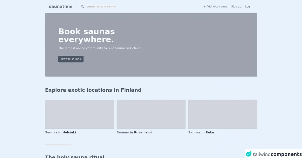
The preview of Page Layout Responsive UI component
To create a page layout responsive UI component with Tailwind CSS, we will use a combination of CSS classes to style our HTML elements. The following is a preview of what our page layout responsive UI component will look like:
Free download of the Page Layout Responsive's source code
The source code of Page Layout Responsive UI component
To create our page layout responsive UI component, we will use a combination of HTML and Tailwind CSS classes. The following is the source code for our page layout responsive UI component:
<!-- Create By Joker Banny -->
<body class="bg-white">
  <header>
    <nav class="p-6">
      <div class="flex justify-between items-center">
        <h1 class="pr-6 border-r-2 text-2xl font-bold text-gray-500">saunatime</h1>
        <div class="flex justify-between flex-grow">
          <div class="flex ml-6 items-center">
            <span>
              <svg xmlns="http://www.w3.org/2000/svg" class="h-5 w-5 mr-4 cursor-pointer text-gray-500" fill="none" viewBox="0 0 24 24" stroke="currentColor">
                <path stroke-linecap="round" stroke-linejoin="round" stroke-width="2" d="M21 21l-6-6m2-5a7 7 0 11-14 0 7 7 0 0114 0z" />
              </svg>
            </span>
            <input class="outline-none text-sm flex-grow bg-gray-100" type="text" placeholder="Search saunas in Finland…" />
          </div>
          <div class="md:flex space-x-6 hidden">
            <span class="text-gray-500 text-md">+ Add your sauna</span>
            <span class="text-gray-500 text-md">Sign up</span>
            <span class="text-gray-500 text-md">Log in</span>
          </div>
        </div>
      </div>
    </nav>
    <!-- Section Hero -->
    <div class="container mx-auto bg-gray-400 h-96 rounded-md flex items-center">
      <div class="sm:ml-20 text-gray-50 text-center sm:text-left">
        <h1 class="text-5xl font-bold mb-4">
          Book saunas <br />
          everywhere.
        </h1>
        <p class="text-lg inline-block sm:block">The largest online community to rent saunas in Finland.</p>
        <button class="mt-8 px-4 py-2 bg-gray-600 rounded">Browse saunas</button>
      </div>
    </div>
  </header>
  <main class="py-16 container mx-auto px-6 md:px-0">
    <section>
      <h1 class="text-3xl font-bold text-gray-600 mb-10">Explore exotic locations in Finland</h1>
      <div class="grid sm:grid-cols-3 gap-4 grid-cols-2">
        <div>
          <div class="bg-gray-300 h-44"></div>
          <h3 class="text-lg font-semibold text-gray-500 mt-2">Saunas in <span class="text-gray-700">Helsinki</span></h3>
        </div>
        <div>
          <div class="bg-gray-300 h-44"></div>
          <h3 class="text-lg font-semibold text-gray-500 mt-2">Saunas in <span class="text-gray-700">Rovaniemi</span></h3>
        </div>
        <div>
          <div class="bg-gray-300 h-44"></div>
          <h3 class="text-lg font-semibold text-gray-500 mt-2">Saunas in <span class="text-gray-700">Ruka</span></h3>
        </div>
      </div>
      <hr class="w-40 my-14 border-4 rounded-md sm:mx-0 mx-auto" />
    </section>
    <section>
      <h1 class="inline-block text-gray-600 font-bold text-3xl">
        The holy sauna ritual <br />
        (or how does Saunatime work).
      </h1>

      <div class="grid grid-cols-3 gap-4 mt-10">
        <div>
          <h3 class="text-lg font-semibold text-gray-500 mt-2">1. Browse and book</h3>
          <p class="text text-gray-400">Start by searching for a location. Once you find a sauna you like, simply check the availability, book it, and make a secure payment right away.</p>
        </div>
        <div>
          <h3 class="text-lg font-semibold text-gray-500 mt-2">2. Have a great bath</h3>
          <p class="text text-gray-400">Meet your host on the date you chose and enjoy the home sauna experience. We'll handle the payment to the host after your experience.</p>
        </div>
        <div>
          <h3 class="text-lg font-semibold text-gray-500 mt-2">3. Review the host</h3>
          <p class="text text-gray-400">If you enjoyed the experience, let others know by giving a review to your sauna host. This way others will know where to go.</p>
        </div>
      </div>
    </section>
    <div class="mt-14">
      <p>Ps. You can also become a Saunatime host in few clicks!</p>
    </div>
  </main>
  <footer class="mb-6 px-6 md:px-0">
    <div class="grid gap-5 grid-cols-5 container mx-auto space-x-6">
      <div>
        <h1 class="text-2xl font-bold text-gray-500">saunatime</h1>
        <p>The largest online community to rent saunas in Finland.</p>
        <spa>© Sharetribe 2017.</spa>
      </div>
      <div class="pt-2">
        <ul>
          <li>Add your sauna</li>
          <li>About us</li>
          <li>F.A.Q</li>
          <li>Help</li>
          <li>Contact</li>
        </ul>
      </div>
      <div class="pt-2">
        <ul>
          <li>Helsinki</li>
          <li>Espoo</li>
          <li>Ruka</li>
          <li>Tampere</li>
          <li>Turku</li>
        </ul>
      </div>
      <div class="pt-2">
        <ul>
          <li>Kuopio</li>
          <li>Mikkeli</li>
          <li>Espoo</li>
          <li>Vantaa</li>
          <li>Ahvenanmaa</li>
        </ul>
      </div>
      <div class="pt-2">
        <div>
          <div class="flex space-x-4 text-gray-500 text-center">
            <span
              ><svg xmlns="http://www.w3.org/2000/svg" class="h-6 w-6" fill="none" viewBox="0 0 24 24" stroke="currentColor">
                <path stroke-linecap="round" stroke-linejoin="round" stroke-width="2" d="M8.228 9c.549-1.165 2.03-2 3.772-2 2.21 0 4 1.343 4 3 0 1.4-1.278 2.575-3.006 2.907-.542.104-.994.54-.994 1.093m0 3h.01M21 12a9 9 0 11-18 0 9 9 0 0118 0z" /></svg
            ></span>
            <span
              ><svg xmlns="http://www.w3.org/2000/svg" class="h-6 w-6" fill="none" viewBox="0 0 24 24" stroke="currentColor">
                <path stroke-linecap="round" stroke-linejoin="round" stroke-width="2" d="M3 8l7.89 5.26a2 2 0 002.22 0L21 8M5 19h14a2 2 0 002-2V7a2 2 0 00-2-2H5a2 2 0 00-2 2v10a2 2 0 002 2z" /></svg
            ></span>
            <span
              ><svg xmlns="http://www.w3.org/2000/svg" class="h-6 w-6" fill="none" viewBox="0 0 24 24" stroke="currentColor">
                <path stroke-linecap="round" stroke-linejoin="round" stroke-width="2" d="M16 8l2-2m0 0l2-2m-2 2l-2-2m2 2l2 2M5 3a2 2 0 00-2 2v1c0 8.284 6.716 15 15 15h1a2 2 0 002-2v-3.28a1 1 0 00-.684-.948l-4.493-1.498a1 1 0 00-1.21.502l-1.13 2.257a11.042 11.042 0 01-5.516-5.517l2.257-1.128a1 1 0 00.502-1.21L9.228 3.683A1 1 0 008.279 3H5z" /></svg
            ></span>
          </div>
          <div class="flex mt-12">
            <p>Privacy & Cookies</p>
            <p>Terms of use</p>
          </div>
        </div>
      </div>
    </div>
  </footer>
</body>
How to create a Page Layout Responsive with Tailwind CSS?
To create a page layout responsive UI component with Tailwind CSS, follow these steps:
Step 1: Set up your HTML structure
The first step is to set up your HTML structure. Your page layout responsive UI component should include a header, footer, and main content area. Here is an example of what your HTML structure should look like:
<header class="bg-gray-800 text-white">
  <!-- header content goes here -->
</header>

<main class="container mx-auto px-4">
  <!-- main content goes here -->
</main>

<footer class="bg-gray-800 text-white">
  <!-- footer content goes here -->
</footer>
Step 2: Style your header
The next step is to style your header. You can use Tailwind CSS classes to set the background color, text color, and font size of your header. Here is an example of how to style your header:
<header class="bg-gray-800 text-white">
  <div class="container mx-auto px-4 py-6 flex justify-between items-center">
    <h1 class="text-lg font-bold">Logo</h1>
    <nav>
      <ul class="flex">
        <li class="mx-4"><a href="#">Home</a></li>
        <li class="mx-4"><a href="#">About</a></li>
        <li class="mx-4"><a href="#">Contact</a></li>
      </ul>
    </nav>
  </div>
</header>
Step 3: Style your main content area
The main content area is where you will display your website's content. You can use Tailwind CSS classes to set the width, margin, and padding of your main content area. Here is an example of how to style your main content area:
<main class="container mx-auto px-4">
  <div class="grid grid-cols-1 sm:grid-cols-2 md:grid-cols-3 lg:grid-cols-4 gap-4">
    <!-- your content goes here -->
  </div>
</main>
Step 4: Style your footer
The last step is to style your footer. You can use Tailwind CSS classes to set the background color, text color, and font size of your footer. Here is an example of how to style your footer:
<footer class="bg-gray-800 text-white">
<div class="container mx-auto px-4 py-6 flex justify-center">
<p>© 2021 Your Company. All rights reserved.</p>
</div>
</footer>
Conclusion
Creating a page layout responsive UI component with Tailwind CSS is a straightforward process. By using a combination of pre-defined CSS classes, you can create a responsive and mobile-first design without writing any custom CSS. We hope this guide has helped you create a page layout responsive UI component for your website.