- Published on
A Complete Guide To Build A Overlapping Product Card With Tailwind CSS
- What is Tailwind CSS?
- The description of Overlapping Product Card UI component
- Why use Tailwind CSS to create an Overlapping Product Card UI component?
- The preview of Overlapping Product Card UI component
- The source code of Overlapping Product Card UI component
- How to create an Overlapping Product Card with Tailwind CSS?
- Conclusion
In the world of front-end development, CSS frameworks have become an essential tool for developers to create beautiful and responsive user interfaces. Tailwind CSS is one of the most popular CSS frameworks that has gained a lot of popularity in recent years. In this article, we will discuss how to create an Overlapping Product Card UI component using Tailwind CSS.
What is Tailwind CSS?
Tailwind CSS is a utility-first CSS framework that provides a set of pre-defined CSS classes that can be used to style HTML elements. It allows developers to quickly build custom user interfaces without writing any CSS from scratch. Tailwind CSS is highly customizable and can be configured to generate any style of CSS that you need.
The description of Overlapping Product Card UI component
An Overlapping Product Card is a UI component that is commonly used in e-commerce websites to display product information. It consists of an image of the product, a title, a description, and a price. The image of the product overlaps the other elements of the card, giving it a unique and modern look.
Why use Tailwind CSS to create an Overlapping Product Card UI component?
Tailwind CSS provides a set of pre-defined CSS classes that can be used to create an Overlapping Product Card UI component quickly. It also allows developers to customize the styles of the component easily. Using Tailwind CSS can save a lot of time and effort in creating a custom UI component from scratch.
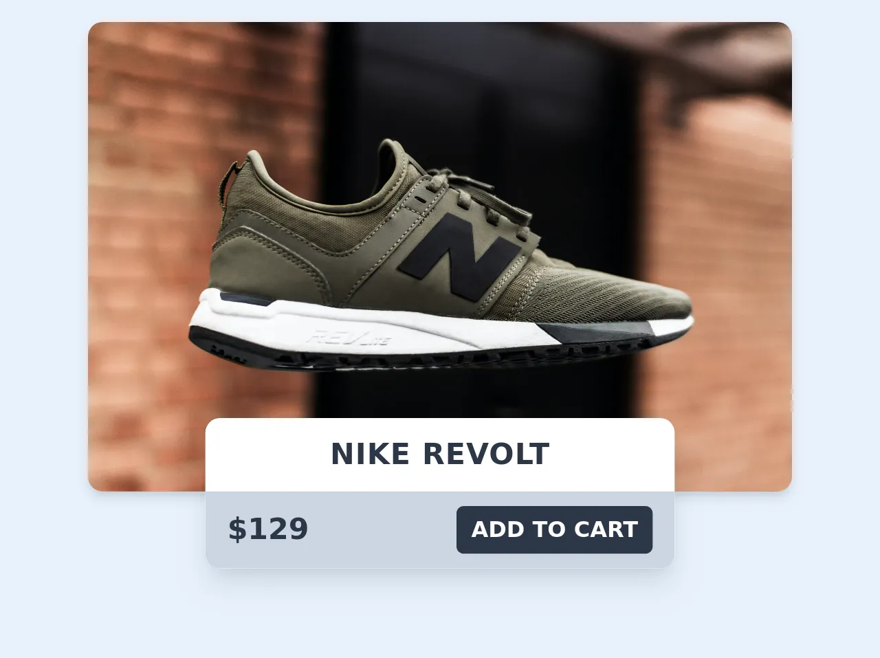
The preview of Overlapping Product Card UI component
To create an Overlapping Product Card UI component using Tailwind CSS, we will use a combination of CSS classes to position the elements of the card. The final result will look like this:
Free download of the Overlapping Product Card's source code
The source code of Overlapping Product Card UI component
To create an Overlapping Product Card UI component using Tailwind CSS, we will use the following HTML and CSS code:
<div class="flex flex-col justify-center items-center max-w-sm mx-auto my-8">
  <div style="background-image: url(https://images.unsplash.com/photo-1539185441755-769473a23570?ixlib=rb-1.2.1&ixid=eyJhcHBfaWQiOjEyMDd9&auto=format&fit=crop&w=1951&q=80"
       class="bg-gray-300 h-64 w-full rounded-lg shadow-md bg-cover bg-center"></div>
  <div class="w-56 md:w-64 bg-white -mt-10 shadow-lg rounded-lg overflow-hidden">
    <div class="py-2 text-center font-bold uppercase tracking-wide text-gray-800">Nike Revolt</div>
    <div class="flex items-center justify-between py-2 px-3 bg-gray-400">
      <h1 class="text-gray-800 font-bold ">$129</h1>
      <button class=" bg-gray-800 text-xs text-white px-2 py-1 font-semibold rounded uppercase hover:bg-gray-700">Add to cart</button>
    </div>
  </div>
</div>
How to create an Overlapping Product Card with Tailwind CSS?
To create an Overlapping Product Card UI component using Tailwind CSS, follow these steps:
- Create a new HTML file and add the following code:
<div class="max-w-sm mx-auto bg-white rounded-xl shadow-md overflow-hidden">
  <div class="md:flex">
    <div class="md:flex-shrink-0">
      <img class="h-48 w-full object-cover md:w-48" src="product-image.jpg" alt="Product image">
    </div>
    <div class="p-8">
      <div class="uppercase tracking-wide text-sm text-indigo-500 font-semibold">Product name</div>
      <a href="#" class="block mt-1 text-lg leading-tight font-medium text-black hover:underline">Product description</a>
      <p class="mt-2 text-gray-500">Lorem ipsum dolor sit amet, consectetur adipiscing elit. Phasellus nec iaculis mauris.</p>
      <div class="mt-4">
        <span class="text-gray-500 text-sm">Price:</span>
        <span class="font-medium text-lg text-gray-900">$10</span>
      </div>
    </div>
  </div>
</div>
- Add the necessary Tailwind CSS classes to the HTML code. The classes used in this example are:
max-w-sm: sets the maximum width of the card to small.mx-auto: centers the card horizontally.bg-white: sets the background color of the card to white.rounded-xl: sets the border radius of the card to extra large.shadow-md: adds a shadow effect to the card.md:flex: sets the display property of the card to flex on medium screens and above.md:flex-shrink-0: prevents the image from shrinking on medium screens and above.h-48: sets the height of the image to 48 pixels.w-full: sets the width of the image to full.object-cover: scales the image to cover the entire container.md:w-48: sets the width of the image to 48 pixels on medium screens and above.p-8: adds padding to the content of the card.uppercase: sets the text to uppercase.tracking-wide: adds letter spacing to the text.text-sm: sets the font size of the text to small.text-indigo-500: sets the color of the text to indigo.font-semibold: sets the font weight of the text to semi-bold.block: sets the display property of the link to block.mt-1: adds margin to the top of the link.text-lg: sets the font size of the link to large.leading-tight: sets the line height of the link to tight.font-medium: sets the font weight of the link to medium.text-black: sets the color of the link to black.hover:underline: adds an underline effect to the link on hover.mt-2: adds margin to the top of the paragraph.text-gray-500: sets the color of the paragraph to gray.mt-4: adds margin to the top of the price.text-gray-500: sets the color of the price to gray.text-sm: sets the font size of the price to small.font-medium: sets the font weight of the price to medium.text-lg: sets the font size of the price to large.text-gray-900: sets the color of the price to dark gray.
- Save the HTML file and open it in a web browser to see the Overlapping Product Card UI component.
Conclusion
In this article, we have discussed how to create an Overlapping Product Card UI component using Tailwind CSS. We have seen how using Tailwind CSS can save a lot of time and effort in creating a custom UI component from scratch. By following the steps outlined in this article, you can create a beautiful and modern UI component for your web projects.