- Published on
Learn How To Create A Outlined Input With Tailwind CSS from the Pros
- What is Tailwind CSS?
- The description of Outlined Input ui component
- Why use Tailwind CSS to create a Outlined Input ui component?
- The preview of Outlined Input ui component
- The source code of Outlined Input ui component
- How to create a Outlined Input with Tailwind CSS?
- Step 1: Create the HTML markup
- Step 2: Add Tailwind CSS classes
- Step 3: Style the input field
- Step 4: Customize the component
- Conclusion
As a FrontEnd developer, you are always looking for ways to enhance your UI design skills. One way to achieve this is by using Tailwind CSS, a utility-first CSS framework that makes it easy to create custom UI components. In this article, we will guide you through the process of creating an Outlined Input UI component using Tailwind CSS.
What is Tailwind CSS?
Tailwind CSS is a utility-first CSS framework that provides a set of pre-defined CSS classes that can be used to style HTML elements. It is designed to speed up the development process by reducing the need to write custom CSS code. Tailwind CSS provides a wide range of CSS classes that can be used to create custom UI components.
The description of Outlined Input ui component
The Outlined Input UI component is a form input field that has an outline around it. This component is commonly used in web forms to indicate that the input field is editable. The outline around the input field also helps to distinguish it from other elements on the page.
Why use Tailwind CSS to create a Outlined Input ui component?
Tailwind CSS provides a set of pre-defined CSS classes that can be used to create custom UI components. This makes it easy to create complex UI components without having to write custom CSS code. Using Tailwind CSS also ensures that your UI components are consistent across your website or application.
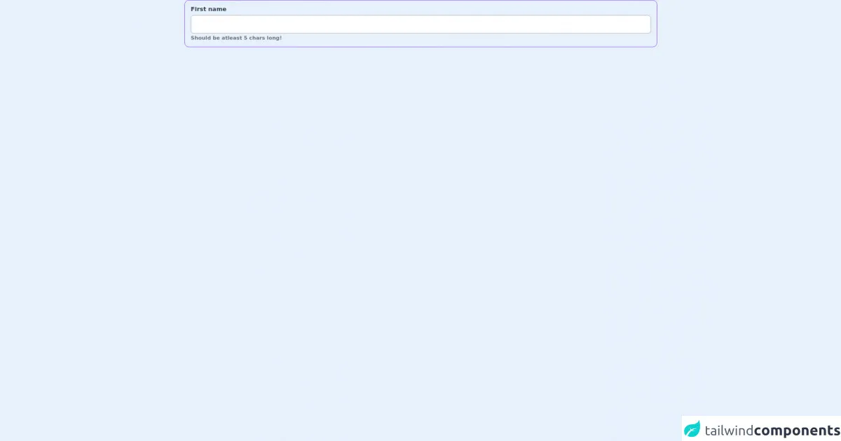
The preview of Outlined Input ui component
To create an Outlined Input UI component, we will use Tailwind CSS classes to style a standard HTML input field. The resulting component will have an outline around it, indicating that it is editable.
Free download of the Outlined Input's source code
The source code of Outlined Input ui component
To create an Outlined Input UI component, we will use the following HTML and CSS code.
<div class="container">
    <label for="other" class="block w-full space-y-1 text-gray-700 text-md font-semibold px-4 py-3 rounded-xl border border-purple-600 transition hover:bg-gray-50 hover:bg-opacity-50 hover:border-purple-800">
        <span>First name</span>
        <input type="text" id="name" value="" class="w-full p-3 font-thin transition duration-200 focus:shadow-md focus:outline-none ring-offset-2 border border-gray-400 rounded-lg focus:ring-2 focus:ring-purple-300">
        <label class="text-sm font-semibold text-gray-500">Should be atleast 5 chars long!</label>
    </label>
</div>
How to create a Outlined Input with Tailwind CSS?
To create an Outlined Input UI component with Tailwind CSS, follow these steps:
Step 1: Create the HTML markup
Create a standard HTML input field with a label. The label is used to describe the input field.
<div class="mb-4">
  <label class="block text-gray-700 text-sm font-bold mb-2" for="username">
    Username
  </label>
  <input
    class="appearance-none border rounded w-full py-2 px-3 text-gray-700 leading-tight focus:outline-none focus:shadow-outline"
    id="username"
    type="text"
    placeholder="Username"
  />
</div>
Step 2: Add Tailwind CSS classes
Add the following Tailwind CSS classes to the input field to create the outline:
<input
  class="appearance-none border rounded w-full py-2 px-3 text-gray-700 leading-tight focus:outline-none focus:shadow-outline"
  id="username"
  type="text"
  placeholder="Username"
/>
The border class adds a border around the input field. The rounded class rounds the corners of the input field. The focus:outline-none class removes the outline when the input field is in focus. The focus:shadow-outline class adds a shadow around the input field when it is in focus.
Step 3: Style the input field
To style the input field, add the following Tailwind CSS classes:
<input
  class="appearance-none border rounded w-full py-2 px-3 text-gray-700 leading-tight focus:outline-none focus:shadow-outline"
  id="username"
  type="text"
  placeholder="Username"
/>
The appearance-none class removes the default styling of the input field. The text-gray-700 class sets the text color to gray. The leading-tight class sets the line height of the input field to be tight.
Step 4: Customize the component
You can customize the Outlined Input UI component by adding or removing Tailwind CSS classes. For example, you can change the border color by adding the border-gray-400 class:
<input
  class="appearance-none border border-gray-400 rounded w-full py-2 px-3 text-gray-700 leading-tight focus:outline-none focus:shadow-outline"
  id="username"
  type="text"
  placeholder="Username"
/>
You can also change the border thickness by adding the border-2 class:
<input
  class="appearance-none border-2 border-gray-400 rounded w-full py-2 px-3 text-gray-700 leading-tight focus:outline-none focus:shadow-outline"
  id="username"
  type="text"
  placeholder="Username"
/>
Conclusion
Creating an Outlined Input UI component with Tailwind CSS is easy and straightforward. By using Tailwind CSS, you can create custom UI components quickly and easily, without having to write custom CSS code. With a little bit of customization, you can create a unique and consistent UI design for your website or application.