- Published on
6 Ideas To Help You Build A Outlined Buttons With Tailwind CSS Like A Pro
- What is Tailwind CSS?
- The description of Outlined buttons ui component
- Why use Tailwind CSS to create a Outlined buttons ui component?
- The preview of Outlined buttons ui component.
- The source code of Outlined buttons ui component.
- How to create a Outlined buttons with Tailwind CSS?
- 1. Use the border utility class
- 2. Use the bg-transparent utility class
- 3. Use the text-* utility class to change the text color
- 4. Use the font-bold utility class to make the text bold
- 5. Use the py-* and px-* utility classes to adjust the padding
- 6. Use the rounded utility class to round the corners
- Conclusion
What is Tailwind CSS?
Tailwind CSS is a utility-first CSS framework that allows you to build custom designs quickly. It provides a set of pre-defined classes that you can use to style your HTML elements. With Tailwind CSS, you can create complex layouts and designs without writing any custom CSS code.
The description of Outlined buttons ui component
Outlined buttons are a popular UI component that is used to highlight an action or call-to-action on a webpage. They are similar to regular buttons, but with a transparent background and a border that outlines the button. Outlined buttons are often used as a secondary action or to provide a visual hierarchy on a page.
Why use Tailwind CSS to create a Outlined buttons ui component?
Tailwind CSS provides a set of pre-defined classes that you can use to create Outlined buttons quickly and easily. With Tailwind CSS, you don't need to write any custom CSS code to create Outlined buttons. This saves you time and effort and allows you to focus on building your application.
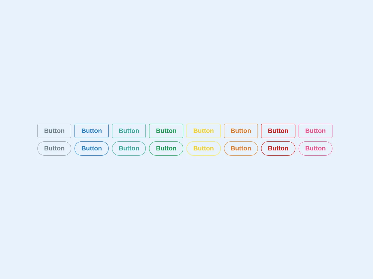
The preview of Outlined buttons ui component.
Outlined buttons are a simple yet effective way to add visual interest to your webpage. They can be used to highlight a call-to-action or to provide a secondary action. Here is a preview of what an Outlined button looks like:
<button class="bg-transparent border border-blue-500 text-blue-500 font-bold py-2 px-4 rounded">
  Outlined Button
</button>
Free download of the Outlined buttons's source code
The source code of Outlined buttons ui component.
Creating an Outlined button with Tailwind CSS is easy. You can use the border utility class to add a border to the button and the bg-transparent utility class to make the background transparent. Here is the source code for an Outlined button:
<button class="bg-transparent border border-blue-500 text-blue-500 font-bold py-2 px-4 rounded">
  Outlined Button
</button>
<div class="flex flex-wrap flex-col">
	<div class="flex flex-wrap">
		<button class="bg-transparent hover:bg-grey text-grey-dark font-semibold hover:text-white py-2 px-4 border border-grey hover:border-transparent rounded mr-2">
		  Button
		</button>
		<button class="bg-transparent hover:bg-blue text-blue-dark font-semibold hover:text-white py-2 px-4 border border-blue hover:border-transparent rounded mr-2">
		  Button
		</button>
		<button class="bg-transparent hover:bg-teal text-teal-dark font-semibold hover:text-white py-2 px-4 border border-teal hover:border-transparent rounded mr-2">
		  Button
		</button>
		<button class="bg-transparent hover:bg-green text-green-dark font-semibold hover:text-white py-2 px-4 border border-green hover:border-transparent rounded mr-2">
		  Button
		</button>
		<button class="bg-transparent hover:bg-yellow text-yellow-dark font-semibold hover:text-white py-2 px-4 border border-yellow hover:border-transparent rounded mr-2">
		  Button
		</button>
		<button class="bg-transparent hover:bg-orange text-orange-dark font-semibold hover:text-white py-2 px-4 border border-orange hover:border-transparent rounded mr-2">
		  Button
		</button>
		<button class="bg-transparent hover:bg-red text-red-dark font-semibold hover:text-white py-2 px-4 border border-red hover:border-transparent rounded mr-2">
		  Button
		</button>
		<button class="bg-transparent hover:bg-pink text-pink-dark font-semibold hover:text-white py-2 px-4 border border-pink hover:border-transparent rounded mr-2">
		  Button
		</button>
	</div>
	<div class="flex flex-wrap mt-2">
		<button class="bg-transparent hover:bg-grey text-grey-dark font-semibold hover:text-white py-2 px-4 border border-grey hover:border-transparent rounded-full mr-2">
		  Button
		</button>
		<button class="bg-transparent hover:bg-blue text-blue-dark font-semibold hover:text-white py-2 px-4 border border-blue hover:border-transparent rounded-full mr-2">
		  Button
		</button>
		<button class="bg-transparent hover:bg-teal text-teal-dark font-semibold hover:text-white py-2 px-4 border border-teal hover:border-transparent rounded-full mr-2">
		  Button
		</button>
		<button class="bg-transparent hover:bg-green text-green-dark font-semibold hover:text-white py-2 px-4 border border-green hover:border-transparent rounded-full mr-2">
		  Button
		</button>
		<button class="bg-transparent hover:bg-yellow text-yellow-dark font-semibold hover:text-white py-2 px-4 border border-yellow hover:border-transparent rounded-full mr-2">
		  Button
		</button>
		<button class="bg-transparent hover:bg-orange text-orange-dark font-semibold hover:text-white py-2 px-4 border border-orange hover:border-transparent rounded-full mr-2">
		  Button
		</button>
		<button class="bg-transparent hover:bg-red text-red-dark font-semibold hover:text-white py-2 px-4 border border-red hover:border-transparent rounded-full mr-2">
		  Button
		</button>
		<button class="bg-transparent hover:bg-pink text-pink-dark font-semibold hover:text-white py-2 px-4 border border-pink hover:border-transparent rounded-full mr-2">
		  Button
		</button>
	</div>
</div>
How to create a Outlined buttons with Tailwind CSS?
Creating an Outlined button with Tailwind CSS is easy. Here are six ideas to help you build an Outlined button with Tailwind CSS like a pro:
1. Use the border utility class
To create an Outlined button, you need to add a border to the button. You can use the border utility class to add a border to the button. Here's an example:
<button class="border border-blue-500">Outlined Button</button>
This will create a button with a blue border.
2. Use the bg-transparent utility class
To make the background of the button transparent, you can use the bg-transparent utility class. Here's an example:
<button class="border border-blue-500 bg-transparent">Outlined Button</button>
This will create a button with a blue border and a transparent background.
3. Use the text-* utility class to change the text color
You can use the text-* utility class to change the color of the text in the button. Here's an example:
<button class="border border-blue-500 bg-transparent text-blue-500">Outlined Button</button>
This will create a button with a blue border, a transparent background, and blue text.
4. Use the font-bold utility class to make the text bold
You can use the font-bold utility class to make the text in the button bold. Here's an example:
<button class="border border-blue-500 bg-transparent text-blue-500 font-bold">Outlined Button</button>
This will create a button with a blue border, a transparent background, blue text, and bold text.
5. Use the py-* and px-* utility classes to adjust the padding
You can use the py-* and px-* utility classes to adjust the padding of the button. Here's an example:
<button class="border border-blue-500 bg-transparent text-blue-500 font-bold py-2 px-4">Outlined Button</button>
This will create a button with a blue border, a transparent background, blue text, bold text, and padding of 2 units on the y-axis and 4 units on the x-axis.
6. Use the rounded utility class to round the corners
You can use the rounded utility class to round the corners of the button. Here's an example:
<button class="border border-blue-500 bg-transparent text-blue-500 font-bold py-2 px-4 rounded">Outlined Button</button>
This will create a button with a blue border, a transparent background, blue text, bold text, padding of 2 units on the y-axis and 4 units on the x-axis, and rounded corners.
Conclusion
Outlined buttons are a simple yet effective way to add visual interest to your webpage. With Tailwind CSS, you can create Outlined buttons quickly and easily using pre-defined utility classes. By following the six ideas outlined in this article, you can build Outlined buttons with Tailwind CSS like a pro.