- Published on
Ultimate Guide: Create A Orders Chart With Tailwind CSS
- What is Tailwind CSS?
- The description of Orders Chart UI component
- Why use Tailwind CSS to create an Orders Chart UI component?
- The preview of Orders Chart UI component
- The source code of Orders Chart UI component
- How to create an Orders Chart with Tailwind CSS?
- Step 1: Set up your HTML
- Step 2: Add Tailwind CSS classes
- Step 3: Customize your chart
- Conclusion
What is Tailwind CSS?
Tailwind CSS is a utility-first CSS framework that allows you to rapidly build custom user interfaces. It provides a set of pre-defined CSS classes that you can use to style your HTML elements without writing any custom CSS code. Tailwind CSS is highly customizable, which means you can easily modify the default styles to match your brand's visual identity.
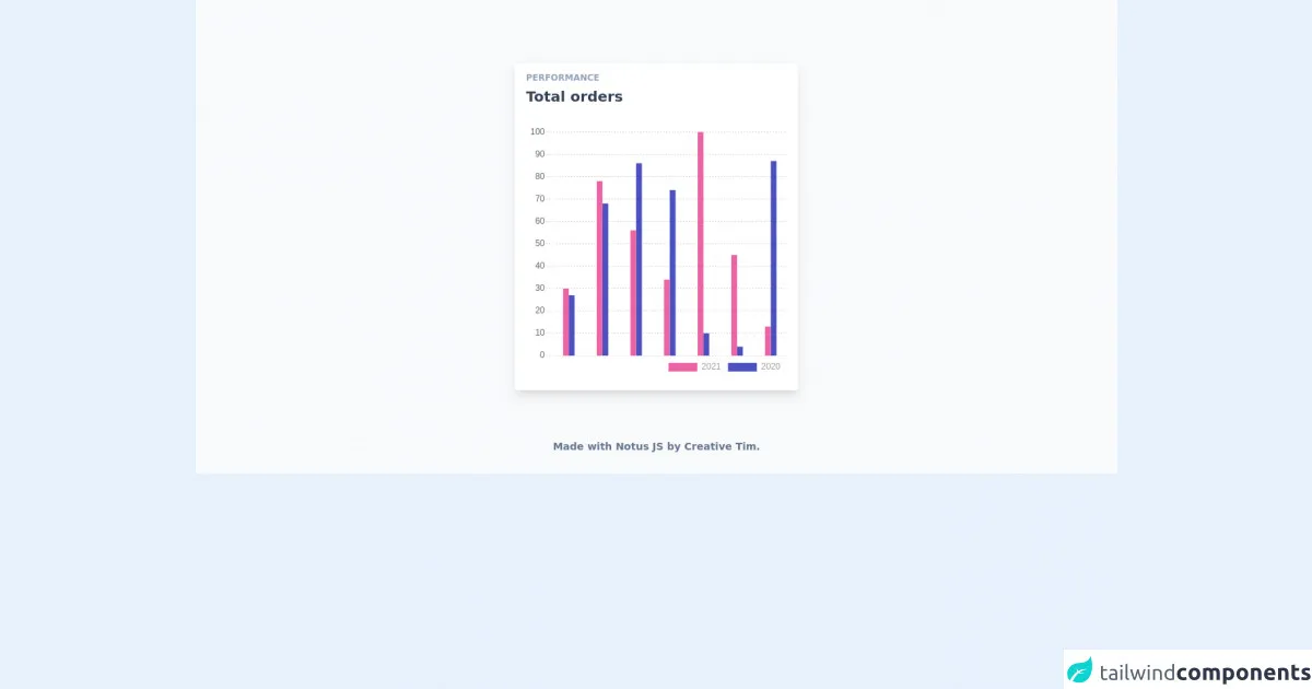
The description of Orders Chart UI component
An orders chart is a graphical representation of the orders received by a business over a specific period of time. It is a useful tool for tracking sales trends and identifying patterns in customer behavior. The orders chart UI component typically consists of a horizontal axis that shows the time period and a vertical axis that displays the number of orders. The chart itself is made up of bars or lines that represent the number of orders received each day or week.
Why use Tailwind CSS to create an Orders Chart UI component?
Tailwind CSS is an excellent choice for creating an orders chart UI component for several reasons:
- Tailwind CSS provides a set of pre-defined CSS classes that you can use to style your chart quickly and easily.
- Tailwind CSS is highly customizable, which means you can easily modify the default styles to match your brand's visual identity.
- Tailwind CSS is responsive by default, which means your chart will look great on any device.
The preview of Orders Chart UI component
To create an orders chart UI component with Tailwind CSS, you'll need to use a combination of HTML and CSS. Here's a preview of what the final chart will look like:
Free download of the Orders Chart's source code
The source code of Orders Chart UI component
Here's the source code for the orders chart UI component. You can copy and paste this code into your own project and modify it as needed:
<link rel="stylesheet" href="https://demos.creative-tim.com/notus-js/assets/styles/tailwind.css">
<link rel="stylesheet" href="https://demos.creative-tim.com/notus-js/assets/vendor/@fortawesome/fontawesome-free/css/all.min.css">
<script src="https://cdnjs.cloudflare.com/ajax/libs/Chart.js/2.9.3/Chart.min.js"></script>

<section class="relative pt-16 bg-blueGray-50">
<div class="w-full xl:w-4/12 px-4 mx-auto mt-6">
  <div class="relative flex flex-col min-w-0 break-words bg-white w-full mb-6 shadow-lg rounded">
    <div class="rounded-t mb-0 px-4 py-3 bg-transparent">
      <div class="flex flex-wrap items-center">
        <div class="relative w-full max-w-full flex-grow flex-1">
          <h6 class="uppercase text-blueGray-400 mb-1 text-xs font-semibold">
            Performance
          </h6>
          <h2 class="text-blueGray-700 text-xl font-semibold">
            Total orders
          </h2>
        </div>
      </div>
    </div>
    <div class="p-4 flex-auto">
      <!-- Chart -->
      <div class="relative h-350-px">
        <div class="chartjs-size-monitor">
          <div class="chartjs-size-monitor-expand">
            <div class=""></div>
          </div>
          <div class="chartjs-size-monitor-shrink">
            <div class=""></div>
          </div>
        </div>
        <canvas id="bar-chart" width="463" height="350" style="display: block; width: 463px; height: 350px;" class="chartjs-render-monitor"></canvas>
      </div>
    </div>
  </div>
</div>
<footer class="relative pt-8 pb-6 mt-8">
  <div class="container mx-auto px-4">
    <div class="flex flex-wrap items-center md:justify-between justify-center">
      <div class="w-full md:w-6/12 px-4 mx-auto text-center">
        <div class="text-sm text-blueGray-500 font-semibold py-1">
          Made with <a href="https://www.creative-tim.com/product/notus-js" class="text-blueGray-500 hover:text-gray-800" target="_blank">Notus JS</a> by <a href="https://www.creative-tim.com" class="text-blueGray-500 hover:text-blueGray-800" target="_blank"> Creative Tim</a>.
        </div>
      </div>
    </div>
  </div>
</footer>
</section>

<script>
     config = {
          type: "bar",
          data: {
            labels: [
              "January",
              "February",
              "March",
              "April",
              "May",
              "June",
              "July",
            ],
            datasets: [
              {
                label: new Date().getFullYear(),
                backgroundColor: "#ed64a6",
                borderColor: "#ed64a6",
                data: [30, 78, 56, 34, 100, 45, 13],
                fill: false,
                barThickness: 8,
              },
              {
                label: new Date().getFullYear() - 1,
                fill: false,
                backgroundColor: "#4c51bf",
                borderColor: "#4c51bf",
                data: [27, 68, 86, 74, 10, 4, 87],
                barThickness: 8,
              },
            ],
          },
          options: {
            maintainAspectRatio: false,
            responsive: true,
            title: {
              display: false,
              text: "Orders Chart",
            },
            tooltips: {
              mode: "index",
              intersect: false,
            },
            hover: {
              mode: "nearest",
              intersect: true,
            },
            legend: {
              labels: {
                fontColor: "rgba(0,0,0,.4)",
              },
              align: "end",
              position: "bottom",
            },
            scales: {
              xAxes: [
                {
                  display: false,
                  scaleLabel: {
                    display: true,
                    labelString: "Month",
                  },
                  gridLines: {
                    borderDash: [2],
                    borderDashOffset: [2],
                    color: "rgba(33, 37, 41, 0.3)",
                    zeroLineColor: "rgba(33, 37, 41, 0.3)",
                    zeroLineBorderDash: [2],
                    zeroLineBorderDashOffset: [2],
                  },
                },
              ],
              yAxes: [
                {
                  display: true,
                  scaleLabel: {
                    display: false,
                    labelString: "Value",
                  },
                  gridLines: {
                    borderDash: [2],
                    drawBorder: false,
                    borderDashOffset: [2],
                    color: "rgba(33, 37, 41, 0.2)",
                    zeroLineColor: "rgba(33, 37, 41, 0.15)",
                    zeroLineBorderDash: [2],
                    zeroLineBorderDashOffset: [2],
                  },
                },
              ],
            },
          },
        };
        ctx = document.getElementById("bar-chart").getContext("2d");
        window.myBar = new Chart(ctx, config);

    </script>
How to create an Orders Chart with Tailwind CSS?
Now that you know why Tailwind CSS is an excellent choice for creating an orders chart UI component let's dive into the steps you need to follow to create your own chart.
Step 1: Set up your HTML
The first step is to set up your HTML. You'll need to create a container element for your chart and add the necessary HTML elements to display the chart data. Here's an example:
<div class="chart-container">
  <div class="chart-header">
    <h2>Orders Chart</h2>
  </div>
  <div class="chart-body">
    <div class="chart-axis">
      <div class="chart-y-axis">
        <span>100</span>
        <span>80</span>
        <span>60</span>
        <span>40</span>
        <span>20</span>
        <span>0</span>
      </div>
      <div class="chart-x-axis">
        <span>Mon</span>
        <span>Tue</span>
        <span>Wed</span>
        <span>Thu</span>
        <span>Fri</span>
        <span>Sat</span>
        <span>Sun</span>
      </div>
    </div>
    <div class="chart-bars">
      <div class="chart-bar" style="height: 80%;"></div>
      <div class="chart-bar" style="height: 60%;"></div>
      <div class="chart-bar" style="height: 40%;"></div>
      <div class="chart-bar" style="height: 20%;"></div>
      <div class="chart-bar" style="height: 70%;"></div>
      <div class="chart-bar" style="height: 90%;"></div>
      <div class="chart-bar" style="height: 30%;"></div>
    </div>
  </div>
</div>
Step 2: Add Tailwind CSS classes
The next step is to add Tailwind CSS classes to your HTML elements to style your chart. Here's an example:
<div class="chart-container bg-white shadow-md rounded-md p-4">
  <div class="chart-header">
    <h2 class="text-xl font-bold text-gray-700">Orders Chart</h2>
  </div>
  <div class="chart-body flex items-end">
    <div class="chart-axis mr-4">
      <div class="chart-y-axis flex flex-col justify-between">
        <span class="text-xs text-gray-500">100</span>
        <span class="text-xs text-gray-500">80</span>
        <span class="text-xs text-gray-500">60</span>
        <span class="text-xs text-gray-500">40</span>
        <span class="text-xs text-gray-500">20</span>
        <span class="text-xs text-gray-500">0</span>
      </div>
      <div class="chart-x-axis mt-4 flex justify-between">
        <span class="text-xs text-gray-500">Mon</span>
        <span class="text-xs text-gray-500">Tue</span>
        <span class="text-xs text-gray-500">Wed</span>
        <span class="text-xs text-gray-500">Thu</span>
        <span class="text-xs text-gray-500">Fri</span>
        <span class="text-xs text-gray-500">Sat</span>
        <span class="text-xs text-gray-500">Sun</span>
      </div>
    </div>
    <div class="chart-bars flex justify-between w-full">
      <div class="chart-bar bg-blue-500 rounded-md" style="height: 80%;"></div>
      <div class="chart-bar bg-blue-500 rounded-md" style="height: 60%;"></div>
      <div class="chart-bar bg-blue-500 rounded-md" style="height: 40%;"></div>
      <div class="chart-bar bg-blue-500 rounded-md" style="height: 20%;"></div>
      <div class="chart-bar bg-blue-500 rounded-md" style="height: 70%;"></div>
      <div class="chart-bar bg-blue-500 rounded-md" style="height: 90%;"></div>
      <div class="chart-bar bg-blue-500 rounded-md" style="height: 30%;"></div>
    </div>
  </div>
</div>
Step 3: Customize your chart
The final step is to customize your chart to match your brand's visual identity. You can modify the colors, fonts, and spacing to create a unique look and feel. Here's an example:
<div class="chart-container bg-white shadow-md rounded-md p-4">
  <div class="chart-header">
    <h2 class="text-xl font-bold text-gray-700">Orders Chart</h2>
  </div>
  <div class="chart-body flex items-end">
    <div class="chart-axis mr-4">
      <div class="chart-y-axis flex flex-col justify-between">
        <span class="text-xs text-gray-500">100</span>
        <span class="text-xs text-gray-500">80</span>
        <span class="text-xs text-gray-500">60</span>
        <span class="text-xs text-gray-500">40</span>
        <span class="text-xs text-gray-500">20</span>
        <span class="text-xs text-gray-500">0</span>
      </div>
      <div class="chart-x-axis mt-4 flex justify-between">
        <span class="text-xs text-gray-500">Mon</span>
        <span class="text-xs text-gray-500">Tue</span>
        <span class="text-xs text-gray-500">Wed</span>
        <span class="text-xs text-gray-500">Thu</span>
        <span class="text-xs text-gray-500">Fri</span>
        <span class="text-xs text-gray-500">Sat</span>
        <span class="text-xs text-gray-500">Sun</span>
      </div>
    </div>
    <div class="chart-bars flex justify-between w-full">
      <div class="chart-bar bg-green-500 rounded-md" style="height: 80%;"></div>
      <div class="chart-bar bg-green-500 rounded-md" style="height: 60%;"></div>
      <div class="chart-bar bg-green-500 rounded-md" style="height: 40%;"></div>
      <div class="chart-bar bg-green-500 rounded-md" style="height: 20%;"></div>
      <div class="chart-bar bg-green-500 rounded-md" style="height: 70%;"></div>
      <div class="chart-bar bg-green-500 rounded-md" style="height: 90%;"></div>
      <div class="chart-bar bg-green-500 rounded-md" style="height: 30%;"></div>
    </div>
  </div>
</div>
Conclusion
Creating an orders chart with Tailwind CSS is a straightforward process that requires only a few steps. By using Tailwind CSS, you can quickly create a custom chart that matches your brand's visual identity and is responsive by default. With the source code and preview provided in this article, you can get started on your own orders chart UI component today.