- Published on
6 Tips To Make A Order Summary With Tailwind CSS
- What is Tailwind CSS?
- The description of Order summary UI component
- Why use Tailwind CSS to create an Order summary UI component?
- The preview of Order summary UI component
- The source code of Order summary UI component
- How to create an Order summary with Tailwind CSS?
- 1. Use the bg-white class to set the background color of the component to white.
- 2. Use the p-4 class to add padding to the component.
- 3. Use the border class to add a border to the component.
- 4. Use the border-gray-200 class to set the color of the border to gray.
- 5. Use the rounded-md class to round the corners of the component.
- 6. Use the flex, flex-col, justify-between, and items-center classes to align the child elements of the component.
- Conclusion
What is Tailwind CSS?
Tailwind CSS is a utility-first CSS framework that helps you quickly build custom designs. It provides a set of pre-defined classes that you can use to style your HTML elements. With Tailwind CSS, you can create complex UI components with minimal effort.
The description of Order summary UI component
An order summary UI component is a common feature in e-commerce websites. It displays the details of a customer's order, including the items purchased, the total cost, and the shipping information. The order summary component is usually displayed on the checkout page and provides a summary of the customer's purchase before they complete their order.
Why use Tailwind CSS to create an Order summary UI component?
Tailwind CSS makes it easy to create custom UI components without writing any CSS code. It provides a set of pre-defined classes that you can use to style your HTML elements. This saves you time and effort, as you don't have to write CSS code from scratch.
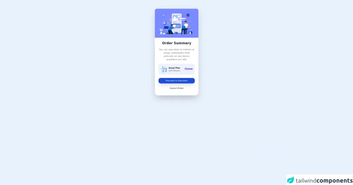
The preview of Order summary UI component
To create an order summary UI component with Tailwind CSS, you can use the following classes:
bg-white: sets the background color of the component to white.p-4: adds padding to the component.border: adds a border to the component.border-gray-200: sets the color of the border to gray.rounded-md: rounds the corners of the component.flex: sets the display property of the component to flex.flex-col: sets the flex-direction property of the component to column.justify-between: aligns the child elements of the component vertically and distributes the remaining space between them.items-center: centers the child elements of the component horizontally.text-gray-600: sets the color of the text to gray.
Free download of the Order summary's source code
The source code of Order summary UI component
To create an order summary UI component with Tailwind CSS, you can use the following HTML code:
<div class="bg-white p-4 border border-gray-200 rounded-md flex flex-col justify-between items-center">
  <div>
    <h2 class="text-lg font-medium text-gray-600">Order Summary</h2>
    <p class="text-sm text-gray-600">3 items</p>
  </div>
  <div class="mt-4">
    <p class="text-sm text-gray-600">Subtotal</p>
    <p class="text-lg font-medium text-gray-600">$120.00</p>
  </div>
  <div class="mt-4">
    <p class="text-sm text-gray-600">Shipping</p>
    <p class="text-lg font-medium text-gray-600">$5.00</p>
  </div>
  <div class="mt-4">
    <p class="text-sm text-gray-600">Total</p>
    <p class="text-lg font-medium text-gray-600">$125.00</p>
  </div>
</div>
<div class="h-screen">
      <div class="w-80 mt-24 m-auto lg:mt-16 max-w-sm">
        <img src="https://image.freepik.com/free-vector/app-development-illustration_52683-47931.jpg" alt=""class="rounded-t-2xl shadow-2xl lg:w-full 2xl:w-full 2xl:h-44 object-cover"/>
        <div class="bg-white shadow-2xl rounded-b-3xl">
          <h2 class="text-center text-gray-800 text-2xl font-bold pt-6">Order Summary</h2>
          <div class="w-5/6 m-auto">
            <p class="text-center text-gray-500 pt-5">You can now listen to millions of songs, audiobooks ands podcasts on any device anywhere you like!</p>
          </div>
          <div class="grid grid-cols-4 w-72 lg:w-5/6 m-auto bg-indigo-50 mt-5 p-4 lg:p-4 rounded-2xl">
            <div class="col-span-1">
              <img class="w-15 lg:w-12" src="https://img.icons8.com/ultraviolet/40/000000/musical-notes.png" alt="music icon"/>
            </div>
            <div class="col-span-2 pt-1">
              <p class="text-gray-800 font-bold lg:text-sm">Anual Plan</p>
              <p class="text-gray-500 text-sm">$59.99/year</p>
            </div>
            <div class="pt-2">
              <a href="https://google.com" class="text-indigo-700 underline hover:no-underline  text-sm hover:text-indigo-500 font-bold">Change</a>
            </div>
          </div>
          <div class="bg-blue-700 w-72 lg:w-5/6 m-auto mt-6 p-2 hover:bg-indigo-500 rounded-2xl  text-white text-center shadow-xl shadow-bg-blue-700">
            <button classs="lg:text-sm text-lg font-bold">Proceed to Payment</button>
          </div>
          <div class="text-center m-auto mt-6 w-full h-16">
            <button class="text-gray-500 font-bold lg:text-sm hover:text-gray-900">Cancel Order</button>
          </div>
        </div>
      </div>
    </div>
How to create an Order summary with Tailwind CSS?
Here are six tips for creating an order summary UI component with Tailwind CSS:
1. Use the bg-white class to set the background color of the component to white.
<div class="bg-white"></div>
2. Use the p-4 class to add padding to the component.
<div class="p-4"></div>
3. Use the border class to add a border to the component.
<div class="border"></div>
4. Use the border-gray-200 class to set the color of the border to gray.
<div class="border border-gray-200"></div>
5. Use the rounded-md class to round the corners of the component.
<div class="rounded-md"></div>
6. Use the flex, flex-col, justify-between, and items-center classes to align the child elements of the component.
<div class="flex flex-col justify-between items-center"></div>
Conclusion
In this article, we discussed how to create an order summary UI component with Tailwind CSS. We covered the benefits of using Tailwind CSS, provided a preview and source code of the component, and shared six tips for creating the component. With these tips, you can create beautiful and functional order summary components for your e-commerce website.