- Published on
3 Things You Must Know To Make A Notifications Popup With Tailwind CSS
- What is Tailwind CSS?
- The description of Notifications popup UI component
- Why use Tailwind CSS to create a Notifications popup UI component?
- The preview of Notifications popup UI component
- The source code of Notifications popup UI component
- How to create a Notifications popup with Tailwind CSS?
- Step 1: Create the HTML structure
- Step 2: Style the notifications popup with CSS
- Conclusion
Tailwind CSS is a utility-first CSS framework that helps developers to build responsive and modern web applications quickly. It provides a set of pre-defined CSS classes that can be used to style HTML elements. In this article, we will discuss how to create a notifications popup UI component with Tailwind CSS.
What is Tailwind CSS?
Tailwind CSS is a CSS framework that provides a set of pre-defined CSS classes that can be used to style HTML elements. It is a utility-first CSS framework, which means that it focuses on providing low-level utility classes that can be combined to create complex styles. Tailwind CSS is designed to be highly customizable, and it provides a configuration file that can be used to customize the framework's default styles.
The description of Notifications popup UI component
A notifications popup UI component is a UI element that displays notifications to users. It is typically used in web applications to notify users of new messages, updates, or events. The notifications popup UI component is usually displayed in the top-right corner of the screen and can be closed by clicking on a close button.
Why use Tailwind CSS to create a Notifications popup UI component?
Tailwind CSS provides a set of pre-defined CSS classes that can be used to create the notifications popup UI component quickly. It also provides a responsive design system that makes it easy to create a notifications popup that works well on different screen sizes. Additionally, Tailwind CSS is highly customizable, which means that developers can easily customize the notifications popup UI component to match their application's design.
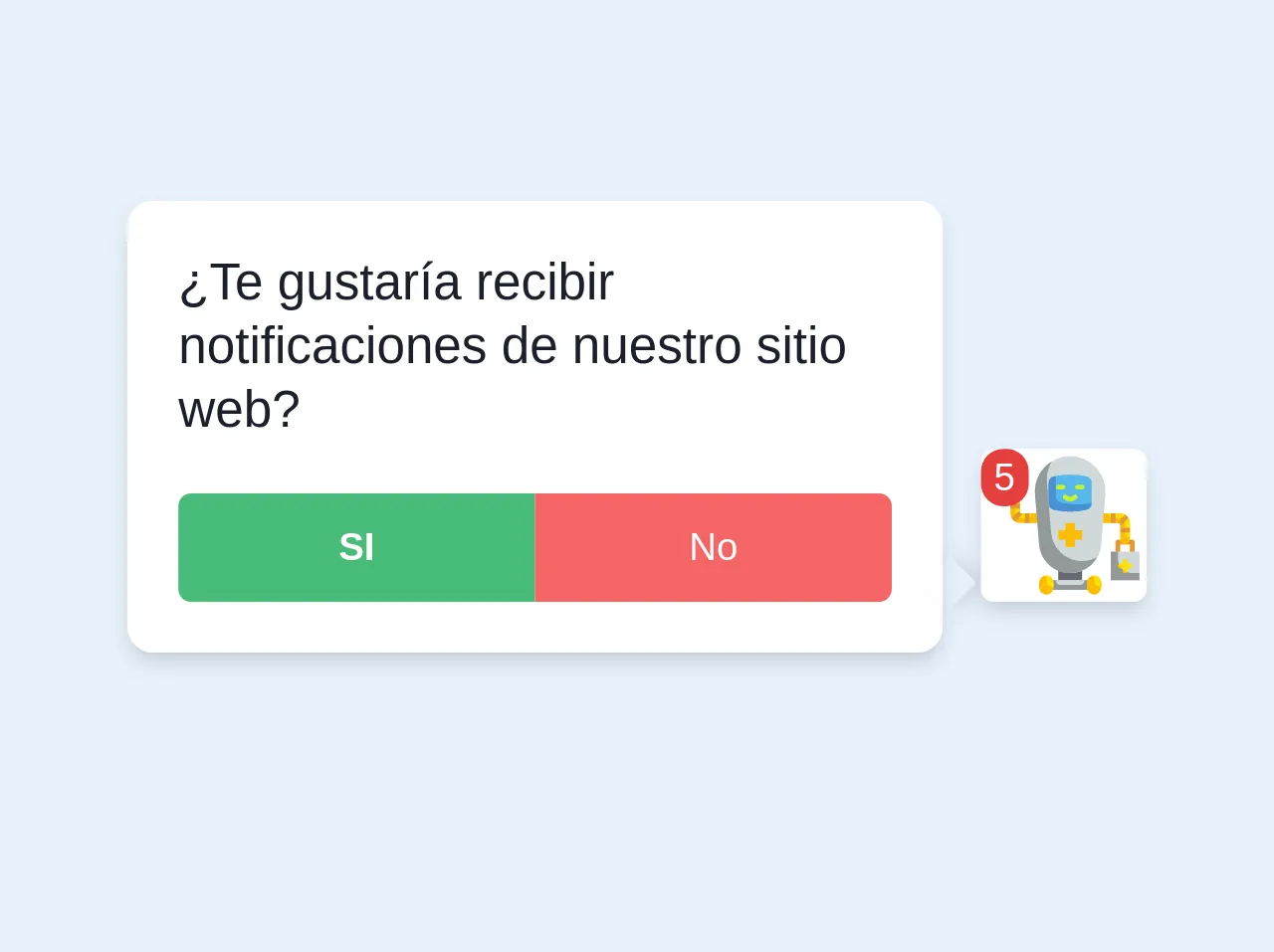
The preview of Notifications popup UI component
To create a notifications popup UI component with Tailwind CSS, we will use a combination of HTML and CSS. The HTML code will define the structure of the notifications popup, while the CSS code will define its style. Here's a preview of what the notifications popup UI component will look like:
Free download of the Notifications popup's source code
The source code of Notifications popup UI component
To create the notifications popup UI component, we will use a combination of HTML and CSS. The HTML code will define the structure of the notifications popup, while the CSS code will define its style. Here's the source code of the notifications popup UI component:
<div>
<div class="pr-16 relative">
<div class="bg-white rounded-lg shadow-md p-4 border-1 border-gray-400 w-64 mb-8">
<div class="relative">
<span class="block absolute bottom-0 shadow-md w-3 h-3 right-0" style="right:-30px;background-color: inherit; transform: translateX(-6px) rotate(45deg); pointer-events: none; box-shadow: 2px -2px 5px 0 rgba(0,0,0,.1);"> </span>
<p class="block mb-1 text-gray-900 leading-tight mb-4">
¿Te gustaría recibir notificaciones de nuestro sitio web?
</p>
<div class="block flex flex-wrap w-full">
<button class="rounded-l justify-center p-2 text-xs font-bold bg-green-500 text-white flex w-1/2">SI</button>
<button class="rounded-r justify-center p-2 text-xs bg-red-500 text-white flex w-1/2">No</button>
</div>
</div>
</div>
<div class="absolute bottom-0 shadow-md right-0 mr-0 mb-4 bg-white rounded">
<p class="absolute bg-red-600 justify-center rounded-full px-1 mr-4 text-white text-xs">5</p>
<svg class="w-12 ml-1" viewBox="0 0 64 64" xmlns="http://www.w3.org/2000/svg"><path d="m9 8a1 1 0 0 0 1-1v-3a1 1 0 0 0 -2 0v3a1 1 0 0 0 1 1z" fill="#7ab92d"/><path d="m7 17.82h4a.82.82 0 0 0 0-1.64h-1.18v-2.18a.82.82 0 0 0 -1.64 0v2.18h-1.18a.82.82 0 0 0 0 1.64z" fill="#7ab92d"/><path d="m58 38h-6a1 1 0 0 0 -1 1v4a1 1 0 0 0 2 0v-3h4v3a1 1 0 0 0 2 0v-4a1 1 0 0 0 -1-1z" fill="#e59730"/><path d="m27 49h10v6h-10z" fill="#656b76"/><path d="m19 31v-4h-8v-6.89a2.07 2.07 0 0 0 -1.66-2.11 2 2 0 0 0 -2.34 2v7a4 4 0 0 0 4 4z" fill="#fcbc04"/><path d="m45 27v4h8v6.89a2.07 2.07 0 0 0 1.66 2.11 2 2 0 0 0 2.34-2v-7a4 4 0 0 0 -4-4z" fill="#fcbc04"/><path d="m32 52a13 13 0 0 1 -13-12l-1.7-21a14.75 14.75 0 0 1 14.7-16 14.75 14.75 0 0 1 14.7 16l-1.7 21a13 13 0 0 1 -13 12z" fill="#d0d8da"/><path d="m38.65 25.52a30.45 30.45 0 0 1 -13.3 0 3 3 0 0 1 -2.35-2.93v-8.18a3 3 0 0 1 2.35-2.93 30.45 30.45 0 0 1 13.3 0 3 3 0 0 1 2.35 2.93v8.18a3 3 0 0 1 -2.35 2.93z" fill="#57b7eb"/><path d="m28.35 22.52a3 3 0 0 1 -2.35-2.93v-8.24l-.65.13a3 3 0 0 0 -2.35 2.93v8.18a3 3 0 0 0 2.35 2.93 30.45 30.45 0 0 0 13.3 0 3 3 0 0 0 2.35-2.87 30.64 30.64 0 0 1 -12.65-.13z" fill="#4891d3"/><path d="m37 47a13 13 0 0 1 -13-12l-1.7-21a14.74 14.74 0 0 1 2.06-8.81 14.75 14.75 0 0 0 -7.06 13.81l1.7 21a13 13 0 0 0 24.33 5.29 12.9 12.9 0 0 1 -6.33 1.71z" fill="#93999a"/><path d="m53 27h-5a2 2 0 0 0 2 2h3a2 2 0 0 1 2 2v4a2 2 0 0 0 2 2v-6a4 4 0 0 0 -4-4z" fill="#f9e109"/><path d="m11 27v-7a2 2 0 0 0 -2 2v5a2 2 0 0 0 2 2h3a2 2 0 0 0 2-2z" fill="#f9e109"/><path d="m49 43h12v12h-12z" fill="#d0d8da"/><path d="m7 10h4v4h-4z" fill="#93999a"/><path d="m7 6h4v4h-4z" fill="#a1d51c"/><path d="m37 34h-3v-3h-4v3h-3v4h3v3h4v-3h3z" fill="#fcbc04"/><path d="m24 55h16v4h-16z" fill="#93999a"/><rect fill="#fcbc04" height="8" rx="3" width="6" x="19" y="53"/><rect fill="#fcbc04" height="8" rx="3" width="6" x="39" y="53"/><path d="m26 55h12a0 0 0 0 1 0 0 2 2 0 0 1 -2 2h-8a2 2 0 0 1 -2-2 0 0 0 0 1 0 0z" fill="#d0d8da"/><path d="m52 46v-3h-3v12h12v-3h-3a6 6 0 0 1 -6-6z" fill="#93999a"/><path d="m9 6h2v4h-2z" fill="#c4f236"/><path d="m9 10h2a0 0 0 0 1 0 0v2a0 0 0 0 1 0 0 2 2 0 0 1 -2-2 0 0 0 0 1 0 0z" fill="#d0d8da"/><path d="m42 53a3 3 0 0 1 3 3v2a0 0 0 0 1 0 0 3 3 0 0 1 -3-3v-2a0 0 0 0 1 0 0z" fill="#f9e109"/><path d="m22 53a3 3 0 0 1 3 3v2a0 0 0 0 1 0 0 3 3 0 0 1 -3-3v-2a0 0 0 0 1 0 0z" fill="#f9e109"/><path d="m37 15h-2a1 1 0 0 0 0 2h2a1 1 0 0 0 0-2z" fill="#c4f236"/><path d="m30 16a1 1 0 0 0 -1-1h-2a1 1 0 0 0 0 2h2a1 1 0 0 0 1-1z" fill="#c4f236"/><path d="m33.41 19.41a2 2 0 0 1 -2.82 0 1 1 0 0 0 -1.42 1.42 4 4 0 0 0 5.66 0 1 1 0 1 0 -1.42-1.42z" fill="#c4f236"/><path d="m57 48h-1v-1a1 1 0 0 0 -2 0v1h-1a1 1 0 0 0 0 2h1v1a1 1 0 0 0 2 0v-1h1a1 1 0 0 0 0-2z" fill="#f9e109"/><g fill="#e59730"><path d="m49 27h2v4h-2z"/><path d="m53 33h4v2h-4z"/><path d="m13 27h2v4h-2z"/><path d="m7 23h4v2h-4z"/></g><path d="m53 50h.54a6.06 6.06 0 0 1 -1.12-1.8 1 1 0 0 0 .58 1.8z" fill="#fcbc04"/><path d="m55 52a1 1 0 0 0 .8-.42 6.06 6.06 0 0 1 -1.8-1.12v.54a1 1 0 0 0 1 1z" fill="#fcbc04"/><path d="m11 26a1 1 0 0 0 -.71.29l-2.72 2.71a3.89 3.89 0 0 0 1.43 1.43l2.73-2.72a1 1 0 0 0 .27-.71h-1z" fill="#e59730"/><path d="m53 32a1 1 0 0 0 .71-.29l2.72-2.71a3.89 3.89 0 0 0 -1.43-1.43l-2.73 2.72a1 1 0 0 0 -.27.71h1z" fill="#e59730"/><path d="m9 3a1 1 0 0 1 1 1v2a0 0 0 0 1 0 0h-1a0 0 0 0 1 0 0v-3a0 0 0 0 1 0 0z" fill="#a1d51c"/></svg>
</div>
</div>
</div>
How to create a Notifications popup with Tailwind CSS?
To create a notifications popup with Tailwind CSS, follow these steps:
Step 1: Create the HTML structure
The first step is to create the HTML structure of the notifications popup. Here's an example of what the HTML code might look like:
<div class="fixed top-0 right-0 m-4">
  <div class="bg-white rounded-lg shadow-lg p-4">
    <div class="font-bold text-lg mb-2">Notifications</div>
    <ul>
      <li class="text-gray-700">New message from John</li>
      <li class="text-gray-700">New comment on your post</li>
      <li class="text-gray-700">New follower</li>
    </ul>
    <button class="mt-4 bg-blue-500 hover:bg-blue-700 text-white font-bold py-2 px-4 rounded">
      View all notifications
    </button>
    <button class="absolute top-0 right-0 mr-2 mt-2">
      <svg class="fill-current text-gray-600 hover:text-gray-800" xmlns="http://www.w3.org/2000/svg" width="18" height="18" viewBox="0 0 18 18">
        <path d="M1.5 1.5l15 15M16.5 1.5l-15 15"></path>
      </svg>
    </button>
  </div>
</div>
In this code, we have created a div element with the fixed, top-0, and right-0 classes to position the notifications popup in the top-right corner of the screen. Inside this div, we have created another div element with the bg-white, rounded-lg, shadow-lg, and p-4 classes to create a white background with rounded corners and a shadow effect. Inside this div, we have added a div element with the font-bold and text-lg classes to display the title of the notifications popup. Below the title, we have added an unordered list (ul) with three list items (li) to display the notifications. Finally, we have added two buttons: one to view all notifications and another to close the notifications popup.
Step 2: Style the notifications popup with CSS
The next step is to style the notifications popup with CSS. Here's an example of what the CSS code might look like:
/* Set the width of the notifications popup */
.fixed {
  width: 320px;
}

/* Style the title of the notifications popup */
.font-bold {
  color: #374151;
}

/* Style the list items */
li {
  padding: 0.5rem 0;
  border-bottom: 1px solid #E5E7EB;
}

/* Style the buttons */
button {
  border: none;
  outline: none;
  cursor: pointer;
}

/* Style the "View all notifications" button */
.bg-blue-500 {
  background-color: #3B82F6;
}

.bg-blue-500:hover {
  background-color: #2563EB;
}

/* Style the close button */
svg {
  width: 18px;
  height: 18px;
}
In this code, we have set the width of the notifications popup to 320px. We have also styled the title of the notifications popup with the color property. We have added some padding and a border to the list items to make them more readable. We have removed the border and outline from the buttons and added a cursor property to make them look clickable. We have also styled the "View all notifications" button with a blue background color and a hover effect. Finally, we have set the width and height of the close button icon.
Conclusion
In this article, we have discussed how to create a notifications popup UI component with Tailwind CSS. We have seen how Tailwind CSS can help developers to create responsive and modern web applications quickly. We have also provided a preview and source code of the notifications popup UI component and explained how to create it step-by-step. With these tips, you can create your own notifications popup UI component with Tailwind CSS.