- Published on
Surprisingly Effective Ways To Make A Notifications Dropdown With Tailwind CSS
- What is Tailwind CSS?
- The description of Notifications dropdown UI component
- Why use Tailwind CSS to create a Notifications dropdown UI component?
- The preview of Notifications dropdown UI component
- The source code of Notifications dropdown UI component
- How to create a Notifications dropdown with Tailwind CSS?
- Step 1: Create the HTML structure
- Step 2: Style the HTML with Tailwind CSS
- Step 3: Add JavaScript to toggle the notifications dropdown
- Conclusion
As a FrontEnd technology blogger, I'm always looking for ways to make my UI components more efficient and visually appealing. In this article, I'll show you how to create a notifications dropdown UI component using Tailwind CSS. We'll cover what Tailwind CSS is, why it's a great choice for creating UI components, and how to create a notifications dropdown using Tailwind CSS.
What is Tailwind CSS?
Tailwind CSS is a utility-first CSS framework that allows you to quickly build custom user interfaces. Instead of writing custom CSS for each element of your UI, Tailwind CSS provides a set of pre-defined utility classes that you can use to style your HTML elements. This approach makes it easier to create consistent UI components and speeds up the development process.
The description of Notifications dropdown UI component
A notifications dropdown UI component is a common feature in web applications that allows users to see their notifications in a dropdown menu. When a user clicks on the notifications icon, a dropdown menu appears with a list of their notifications. The notifications dropdown UI component is a great way to keep users informed about updates and changes to their account.
Why use Tailwind CSS to create a Notifications dropdown UI component?
Tailwind CSS is an excellent choice for creating a notifications dropdown UI component for several reasons. First, Tailwind CSS provides a set of pre-defined utility classes that make it easy to style your UI components. Second, Tailwind CSS is highly customizable, so you can easily modify the default styles to match your application's branding. Finally, Tailwind CSS is lightweight and fast, which means your UI components will load quickly and provide a better user experience.
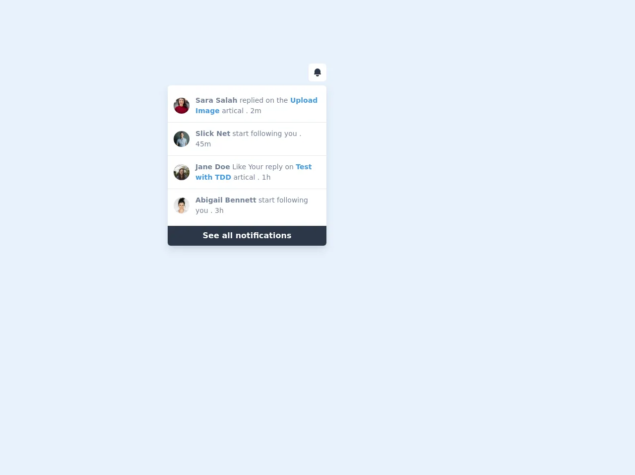
The preview of Notifications dropdown UI component
To create a notifications dropdown UI component with Tailwind CSS, we'll use HTML and CSS. Here's a preview of what the completed notifications dropdown will look like:
Free download of the Notifications dropdown's source code
The source code of Notifications dropdown UI component
Here's the source code for the notifications dropdown UI component:
<script src="https://cdn.jsdelivr.net/gh/alpinejs/[email protected]/dist/alpine.min.js" defer></script>


<div class="flex justify-center h-screen">
    <div x-data="{ dropdownOpen: true }" class="relative my-32">
        <button @click="dropdownOpen = !dropdownOpen" class="relative z-10 block rounded-md bg-white p-2 focus:outline-none">
            <svg class="h-5 w-5 text-gray-800" xmlns="http://www.w3.org/2000/svg" viewBox="0 0 20 20" fill="currentColor">
                <path d="M10 2a6 6 0 00-6 6v3.586l-.707.707A1 1 0 004 14h12a1 1 0 00.707-1.707L16 11.586V8a6 6 0 00-6-6zM10 18a3 3 0 01-3-3h6a3 3 0 01-3 3z" />
            </svg>
        </button>

        <div x-show="dropdownOpen" @click="dropdownOpen = false" class="fixed inset-0 h-full w-full z-10"></div>

        <div x-show="dropdownOpen" class="absolute right-0 mt-2 bg-white rounded-md shadow-lg overflow-hidden z-20" style="width:20rem;">
            <div class="py-2">
                <a href="#" class="flex items-center px-4 py-3 border-b hover:bg-gray-100 -mx-2">
                    <img class="h-8 w-8 rounded-full object-cover mx-1" src="https://images.unsplash.com/photo-1494790108377-be9c29b29330?ixlib=rb-1.2.1&ixid=eyJhcHBfaWQiOjEyMDd9&auto=format&fit=crop&w=334&q=80" alt="avatar">
                    <p class="text-gray-600 text-sm mx-2">
                        <span class="font-bold" href="#">Sara Salah</span> replied on the <span class="font-bold text-blue-500" href="#">Upload Image</span> artical . 2m
                    </p>
                </a>
                <a href="#" class="flex items-center px-4 py-3 border-b hover:bg-gray-100 -mx-2">
                    <img class="h-8 w-8 rounded-full object-cover mx-1" src="https://images.unsplash.com/photo-1531427186611-ecfd6d936c79?ixlib=rb-1.2.1&ixid=eyJhcHBfaWQiOjEyMDd9&auto=format&fit=crop&w=634&q=80" alt="avatar">
                    <p class="text-gray-600 text-sm mx-2">
                        <span class="font-bold" href="#">Slick Net</span> start following you . 45m
                    </p>
                </a>
                <a href="#" class="flex items-center px-4 py-3 border-b hover:bg-gray-100 -mx-2">
                    <img class="h-8 w-8 rounded-full object-cover mx-1" src="https://images.unsplash.com/photo-1450297350677-623de575f31c?ixlib=rb-1.2.1&ixid=eyJhcHBfaWQiOjEyMDd9&auto=format&fit=crop&w=334&q=80" alt="avatar">
                    <p class="text-gray-600 text-sm mx-2">
                        <span class="font-bold" href="#">Jane Doe</span> Like Your reply on <span class="font-bold text-blue-500" href="#">Test with TDD</span> artical . 1h
                    </p>
                </a>
                <a href="#" class="flex items-center px-4 py-3 hover:bg-gray-100 -mx-2">
                    <img class="h-8 w-8 rounded-full object-cover mx-1" src="https://images.unsplash.com/photo-1580489944761-15a19d654956?ixlib=rb-1.2.1&ixid=eyJhcHBfaWQiOjEyMDd9&auto=format&fit=crop&w=398&q=80" alt="avatar">
                    <p class="text-gray-600 text-sm mx-2">
                        <span class="font-bold" href="#">Abigail Bennett</span> start following you . 3h
                    </p>
                </a>
            </div>
            <a href="#" class="block bg-gray-800 text-white text-center font-bold py-2">See all notifications</a>
        </div>
    </div>
</div>
How to create a Notifications dropdown with Tailwind CSS?
To create a notifications dropdown with Tailwind CSS, follow these steps:
Step 1: Create the HTML structure
The first step is to create the HTML structure for the notifications dropdown. Here's an example:
<div class="relative">
  <button class="bg-gray-300 text-gray-700 font-bold py-2 px-4 rounded inline-flex items-center">
    <span>Notifications</span>
    <span class="ml-1">
      <svg xmlns="http://www.w3.org/2000/svg" viewBox="0 0 20 20" fill="currentColor" class="w-4 h-4">
        <path fill-rule="evenodd" d="M10 18a2 2 0 002-2H8a2 2 0 002 2zm5-6V9a5 5 0 00-4-4.9V3a1 1 0 00-2 0v1.1A5 5 0 005 9v3l-2 2v1h14v-1l-2-2z" clip-rule="evenodd" />
      </svg>
    </span>
  </button>
  <div class="absolute right-0 mt-2 w-48 bg-white rounded-lg shadow-lg z-10">
    <div class="py-2">
      <a href="#" class="block px-4 py-2 text-gray-800 hover:bg-gray-100">Notification 1</a>
      <a href="#" class="block px-4 py-2 text-gray-800 hover:bg-gray-100">Notification 2</a>
      <a href="#" class="block px-4 py-2 text-gray-800 hover:bg-gray-100">Notification 3</a>
    </div>
  </div>
</div>
In this example, we've created a button that will display the notifications dropdown when clicked. We've also added an absolute positioned div that will contain the notifications.
Step 2: Style the HTML with Tailwind CSS
Next, we'll use Tailwind CSS to style the HTML elements. Here's an example:
<div class="relative">
  <button class="bg-gray-300 text-gray-700 font-bold py-2 px-4 rounded inline-flex items-center">
    <span>Notifications</span>
    <span class="ml-1">
      <svg xmlns="http://www.w3.org/2000/svg" viewBox="0 0 20 20" fill="currentColor" class="w-4 h-4">
        <path fill-rule="evenodd" d="M10 18a2 2 0 002-2H8a2 2 0 002 2zm5-6V9a5 5 0 00-4-4.9V3a1 1 0 00-2 0v1.1A5 5 0 005 9v3l-2 2v1h14v-1l-2-2z" clip-rule="evenodd" />
      </svg>
    </span>
  </button>
  <div class="absolute right-0 mt-2 w-48 bg-white rounded-lg shadow-lg z-10">
    <div class="py-2">
      <a href="#" class="block px-4 py-2 text-gray-800 hover:bg-gray-100">Notification 1</a>
      <a href="#" class="block px-4 py-2 text-gray-800 hover:bg-gray-100">Notification 2</a>
      <a href="#" class="block px-4 py-2 text-gray-800 hover:bg-gray-100">Notification 3</a>
    </div>
  </div>
</div>
In this example, we've used Tailwind CSS classes to style the button and the notifications dropdown. We've also added some hover effects to make the UI component more interactive.
Step 3: Add JavaScript to toggle the notifications dropdown
Finally, we'll add some JavaScript to toggle the notifications dropdown when the button is clicked. Here's an example:
<div class="relative">
  <button class="bg-gray-300 text-gray-700 font-bold py-2 px-4 rounded inline-flex items-center" id="notificationsButton">
    <span>Notifications</span>
    <span class="ml-1">
      <svg xmlns="http://www.w3.org/2000/svg" viewBox="0 0 20 20" fill="currentColor" class="w-4 h-4">
        <path fill-rule="evenodd" d="M10 18a2 2 0 002-2H8a2 2 0 002 2zm5-6V9a5 5 0 00-4-4.9V3a1 1 0 00-2 0v1.1A5 5 0 005 9v3l-2 2v1h14v-1l-2-2z" clip-rule="evenodd" />
      </svg>
    </span>
  </button>
  <div class="absolute right-0 mt-2 w-48 bg-white rounded-lg shadow-lg z-10 hidden" id="notificationsDropdown">
    <div class="py-2">
      <a href="#" class="block px-4 py-2 text-gray-800 hover:bg-gray-100">Notification 1</a>
      <a href="#" class="block px-4 py-2 text-gray-800 hover:bg-gray-100">Notification 2</a>
      <a href="#" class="block px-4 py-2 text-gray-800 hover:bg-gray-100">Notification 3</a>
    </div>
  </div>
</div>

<script>
  const notificationsButton = document.getElementById('notificationsButton');
  const notificationsDropdown = document.getElementById('notificationsDropdown');

  notificationsButton.addEventListener('click', () => {
    notificationsDropdown.classList.toggle('hidden');
  });
</script>
In this example, we've added an ID to the button and the notifications dropdown. We've also added some JavaScript to toggle the hidden class when the button is clicked.
Conclusion
In this article, we've covered how to create a notifications dropdown UI component using Tailwind CSS. We've discussed what Tailwind CSS is, why it's a great choice for creating UI components, and how to create a notifications dropdown using Tailwind CSS. By following these steps, you can create a visually appealing and efficient notifications dropdown for your web application.