- Published on
The Ninja Guide To How To Build A Notifications With Tailwind CSS Better
- What is Tailwind CSS?
- The description of Notifications UI component
- Why use Tailwind CSS to create a Notifications UI component?
- The preview of Notifications UI component
- The source code of Notifications UI component
- How to create a Notifications with Tailwind CSS?
- Step 1: Create the HTML structure
- Step 2: Style the notification using Tailwind CSS classes
- Step 3: Add JavaScript functionality to the notification
- Conclusion
Notifications are an essential part of any web application that keeps the user informed about the latest updates and events. Creating a notification UI component can be a challenging task, especially if you want to make it look beautiful and responsive across all devices. In this article, we will explore how to build a notification UI component using Tailwind CSS and make it look better.
What is Tailwind CSS?
Tailwind CSS is a utility-first CSS framework that provides a set of pre-defined classes to style HTML elements. It enables developers to create responsive and customizable UI components with minimal effort. Tailwind CSS has gained popularity among developers due to its flexibility and ease of use.
The description of Notifications UI component
Notifications are a common UI component that displays messages to the user. They can be used to inform the user about new updates, errors, or important events. Notifications can be displayed in various ways, such as pop-ups, banners, or alerts.
Why use Tailwind CSS to create a Notifications UI component?
Tailwind CSS provides a set of pre-defined classes that can be used to create a responsive and customizable notification UI component. It eliminates the need for writing custom CSS code, which can save a lot of time and effort. Additionally, Tailwind CSS provides a consistent design system that can be used across all UI components.
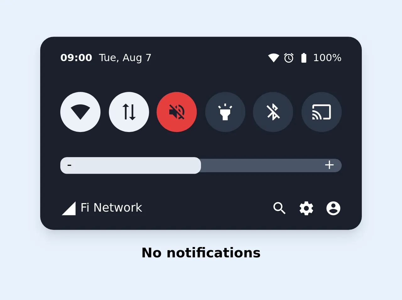
The preview of Notifications UI component
Notifications UI component can be displayed in various ways, such as pop-ups, banners, or alerts. Here is a preview of how the notification UI component can look like:
Free download of the Notifications's source code
The source code of Notifications UI component
To create a notification UI component, we need to write HTML and CSS code. Here is the source code of the notification UI component:
<link href="https://fonts.googleapis.com/icon?family=Material+Icons"
      rel="stylesheet">

<style>
body {
  background-image: linear-gradient( 109.6deg,  rgba(223,234,247,1) 11.2%, rgba(244,248,252,1) 61.1% );
  min-width: 100vw;
  min-height: 100vh;
  display: flex;
  flex-direction: column;
  justify-content: center;
  align-items: center;
}


.rounded-xl{
  border-radius: 1rem;
}

.data-connection-icon{transform: rotate(270deg); width: 24px;}

.slider-wrapper{
  height: 1rem;
  position: relative;
  z-index: 1;
}
.slider-wrapper::before, .slider-wrapper::after{
  position: absolute;
  top: 45%;
  transform:  translateY(-50%);
  z-index: 2;
}

.slider-wrapper::before{color: #000; left: 8px; content: "-";}

.slider-wrapper::after{color: #fff; right: 8px; content: "+";}

.slider-pointer{
  height: 1.2rem;
  position: relative;
  z-index: 1;
}

.material-icons.md-14 { font-size: 14px; }
.material-icons.md-20 { font-size: 20px; }
.material-icons.md-24 { font-size: 24px; }
</style>


<div class="max-w-sm rounded-xl mb-4 overflow-hidden shadow-lg bg-gray-900 text-white">
  <div class="px-6 py-4 flex items-center justify-between">
    <div class="flex items-center">
      <b class="text-xs mr-2">09:00</b>
      <small class="text-xs">Tue, Aug 7</small>
    </div>
    <div class="flex items-center">
      <span class="material-icons md-14 mr-1">
        signal_wifi_4_bar
      </span>
      <span class="material-icons md-14 mr-1">
        alarm
      </span>
      <span class="material-icons md-14 mr-1">
        battery_full
      </span>
      <span class="text-xs">100%</span>
    </div>
  </div>
  <div class="px-6 py-4 flex items-center justify-between">
    <div class="flex items-center justify-center rounded-full h-12 w-12 bg-gray-200 mr-2">
      <span class="material-icons text-gray-900">
        signal_wifi_4_bar
      </span>
    </div>
    <div class="flex items-center justify-center rounded-full h-12 w-12 bg-gray-200 mr-2">
      <span class="material-icons md-24 text-gray-900 data-connection-icon">
        sync_alt
      </span>
    </div>
    <div class="flex items-center justify-center rounded-full h-12 w-12 bg-red-600 mr-2">
      <span class="material-icons text-gray-900">
        volume_off
      </span>
    </div>
    <div class="flex items-center justify-center rounded-full h-12 w-12 bg-gray-800 mr-2">
      <span class="material-icons">
        highlight
      </span>
    </div>
    <div class="flex items-center justify-center rounded-full h-12 w-12 bg-gray-800 mr-2">
      <span class="material-icons">
        bluetooth_disabled
      </span>
    </div>
    <div class="flex items-center justify-center rounded-full h-12 w-12 bg-gray-800">
      <span class="material-icons">
        cast
      </span>
    </div>
  </div>
  <div class="px-6 py-4 flex items-center justify-between">
    <div class="bg-gray-700 w-screen rounded-lg flex items-center slider-wrapper" style="">
     <div class="bg-gray-300 w-1/2 rounded-lg flex slider-pointer" style="">
      </div>
    </div>
  </div>
  <div class="px-6 py-4 flex items-center justify-between">
    <div class="flex items-center ">
      <span class="material-icons md-20 mr-1">
        signal_cellular_4_bar
      </span>
      <span class="text-sm">Fi Network</span>

    </div>
    <div class="flex items-center ">
      <span class="material-icons md-20 mr-3">
        search
      </span>
      <span class="material-icons md-20 mr-3">
        settings
      </span>
      <span class="material-icons md-20">
        account_circle
      </span>
    </div>
  </div>
</div>
<span class="font-bold">No notifications</span>
How to create a Notifications with Tailwind CSS?
To create a notification UI component with Tailwind CSS, we need to follow these steps:
Step 1: Create the HTML structure
We start by creating the HTML structure for the notification UI component. We can use the div element to create a container for the notification. Inside the container, we can add elements such as the notification title, message, and close button.
<div class="bg-white border border-gray-300 p-4 rounded-lg shadow-lg">
  <div class="flex items-center justify-between mb-2">
    <h3 class="text-lg font-medium">Notification Title</h3>
    <button class="text-gray-500 hover:text-gray-600">
      <svg class="h-4 w-4 fill-current" viewBox="0 0 20 20">
        <path
          d="M14.348 5.652a.999.999 0 1 0-1.414 1.414L8.414 10l-4.348 4.348a.999.999 0 1 0 1.414 1.414L10 11.414l4.348 4.348a.999.999 0 1 0 1.414-1.414L11.414 10l4.348-4.348z"
        />
      </svg>
    </button>
  </div>
  <p class="text-gray-600">Notification message goes here.</p>
</div>
Step 2: Style the notification using Tailwind CSS classes
Next, we can use Tailwind CSS classes to style the notification UI component. We can use classes such as bg-white, border, p-4, rounded-lg, and shadow-lg to style the container. We can also use classes such as text-lg, font-medium, and text-gray-600 to style the notification title and message.
<div class="bg-white border border-gray-300 p-4 rounded-lg shadow-lg">
  <div class="flex items-center justify-between mb-2">
    <h3 class="text-lg font-medium">Notification Title</h3>
    <button class="text-gray-500 hover:text-gray-600">
      <svg class="h-4 w-4 fill-current" viewBox="0 0 20 20">
        <path
          d="M14.348 5.652a.999.999 0 1 0-1.414 1.414L8.414 10l-4.348 4.348a.999.999 0 1 0 1.414 1.414L10 11.414l4.348 4.348a.999.999 0 1 0 1.414-1.414L11.414 10l4.348-4.348z"
        />
      </svg>
    </button>
  </div>
  <p class="text-gray-600">Notification message goes here.</p>
</div>
Step 3: Add JavaScript functionality to the notification
Finally, we can add JavaScript functionality to the notification UI component. We can use JavaScript to show and hide the notification, and to handle user interactions such as clicking the close button.
const notification = document.querySelector('.notification');
const closeBtn = notification.querySelector('.close-btn');

closeBtn.addEventListener('click', () => {
  notification.classList.add('hidden');
});
Conclusion
In this article, we have explored how to build a notification UI component using Tailwind CSS. We have seen how Tailwind CSS can simplify the process of creating a responsive and customizable notification UI component. By following the steps outlined in this article, you can create beautiful and functional notifications for your web application.