- Published on
A Complete Guide To Make A Notification Toast With Tailwind CSS
- What is Tailwind CSS?
- The Description of Notification Toast UI Component
- Why Use Tailwind CSS to Create a Notification Toast UI Component?
- The Preview of Notification Toast UI Component
- The Source Code of Notification Toast UI Component
- How to Create a Notification Toast with Tailwind CSS?
- Conclusion
What is Tailwind CSS?
Tailwind CSS is a utility-first CSS framework that allows developers to quickly and easily create custom designs without having to write any CSS. It provides a set of pre-defined classes that can be used to style HTML elements. Tailwind CSS is different from other CSS frameworks because it doesn't have any pre-built components. Instead, it provides a set of low-level utility classes that can be combined to create custom designs.
The Description of Notification Toast UI Component
A notification toast is a small message that appears on the screen to notify the user of an event or action. It is an essential UI component that is used in almost every web application. Notification toasts can be used to inform users of new messages, updates, errors, or any other important information.
Why Use Tailwind CSS to Create a Notification Toast UI Component?
Tailwind CSS is an excellent choice for creating a notification toast UI component because it provides a wide range of utility classes that can be used to style the toast. With Tailwind CSS, you can easily customize the toast's background color, text color, font size, padding, and much more. Also, Tailwind CSS is easy to use and requires minimal setup, making it an ideal choice for developers who want to create UI components quickly.
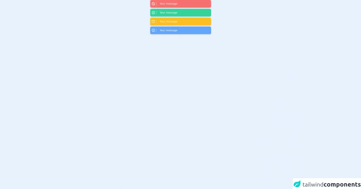
The Preview of Notification Toast UI Component
To create a notification toast with Tailwind CSS, we will use a combination of utility classes to style the toast. The final result will look something like this:
Free download of the Notification toast's source code
The Source Code of Notification Toast UI Component
To create the notification toast, we will use HTML and CSS. The HTML code will define the structure of the toast, and the CSS code will style it using Tailwind CSS utility classes. Here is the source code for the notification toast:
<div class="grid grid-cols-1 gap-2 justify-center items-center">
	<!-- Danger -->
	<div class='flex items-center text-white max-w-sm w-full bg-red-400 shadow-md rounded-lg overflow-hidden mx-auto'>
		<div class='w-10 border-r px-2'>
			<svg class="w-6 h-6" fill="none" stroke="currentColor" viewBox="0 0 24 24"
				xmlns="http://www.w3.org/2000/svg">
				<path stroke-linecap="round" stroke-linejoin="round" stroke-width="2"
					d="M18.364 18.364A9 9 0 005.636 5.636m12.728 12.728A9 9 0 015.636 5.636m12.728 12.728L5.636 5.636">
				</path>
			</svg>
		</div>

		<div class='flex items-center px-2 py-3'>


			<div class='mx-3'>
				<p>Your message</p>
			</div>
		</div>
	</div>

	<!-- succes -->
	<div class='flex items-center text-white max-w-sm w-full bg-green-400 shadow-md rounded-lg overflow-hidden mx-auto'>
		<div class='w-10 border-r px-2'>
			<svg class="w-6 h-6" fill="none" stroke="currentColor" viewBox="0 0 24 24"
				xmlns="http://www.w3.org/2000/svg">
				<path stroke-linecap="round" stroke-linejoin="round" stroke-width="2"
					d="M9 12l2 2 4-4M7.835 4.697a3.42 3.42 0 001.946-.806 3.42 3.42 0 014.438 0 3.42 3.42 0 001.946.806 3.42 3.42 0 013.138 3.138 3.42 3.42 0 00.806 1.946 3.42 3.42 0 010 4.438 3.42 3.42 0 00-.806 1.946 3.42 3.42 0 01-3.138 3.138 3.42 3.42 0 00-1.946.806 3.42 3.42 0 01-4.438 0 3.42 3.42 0 00-1.946-.806 3.42 3.42 0 01-3.138-3.138 3.42 3.42 0 00-.806-1.946 3.42 3.42 0 010-4.438 3.42 3.42 0 00.806-1.946 3.42 3.42 0 013.138-3.138z">
				</path>
			</svg>
		</div>

		<div class='flex items-center px-2 py-3'>


			<div class='mx-3'>
				<p>Your message</p>
			</div>
		</div>
	</div>

	<!-- warning -->
	<div
		class='flex items-center text-white max-w-sm w-full bg-yellow-400 shadow-md rounded-lg overflow-hidden mx-auto'>
		<div class='w-10 border-r px-2'>
			<svg class="w-6 h-6" fill="none" stroke="currentColor" viewBox="0 0 24 24"
				xmlns="http://www.w3.org/2000/svg">
				<path stroke-linecap="round" stroke-linejoin="round" stroke-width="2"
					d="M20.618 5.984A11.955 11.955 0 0112 2.944a11.955 11.955 0 01-8.618 3.04A12.02 12.02 0 003 9c0 5.591 3.824 10.29 9 11.622 5.176-1.332 9-6.03 9-11.622 0-1.042-.133-2.052-.382-3.016zM12 9v2m0 4h.01">
				</path>
			</svg>
		</div>

		<div class='flex items-center px-2 py-3'>


			<div class='mx-3'>
				<p>Your message</p>
			</div>
		</div>
	</div>
	<!-- info -->
	<div class='flex items-center text-white max-w-sm w-full bg-blue-400 shadow-md rounded-lg overflow-hidden mx-auto'>
		<div class='w-10 border-r px-2'>
			<svg class="w-6 h-6" fill="none" stroke="currentColor" viewBox="0 0 24 24"
				xmlns="http://www.w3.org/2000/svg">
				<path stroke-linecap="round" stroke-linejoin="round" stroke-width="2"
					d="M13 16h-1v-4h-1m1-4h.01M21 12a9 9 0 11-18 0 9 9 0 0118 0z"></path>
			</svg>
		</div>

		<div class='flex items-center px-2 py-3'>


			<div class='mx-3'>
				<p>Your message</p>
			</div>
		</div>
	</div>

</div>
How to Create a Notification Toast with Tailwind CSS?
To create a notification toast with Tailwind CSS, follow these steps:
- Create a new HTML file and add the following code:
<div class="bg-green-500 text-white font-bold rounded-lg border shadow-lg px-4 py-2">
  Success! Your message has been sent.
</div>
- In the code above, we have used the following Tailwind CSS classes:
bg-green-500: sets the background color of the toast to green.text-white: sets the text color of the toast to white.font-bold: sets the font weight of the text to bold.rounded-lg: rounds the corners of the toast.border: adds a border to the toast.shadow-lg: adds a shadow to the toast.px-4: adds horizontal padding to the toast.py-2: adds vertical padding to the toast.
Save the HTML file and open it in a web browser. You should see the notification toast displayed on the screen.
To customize the toast, you can modify the utility classes used in the HTML code. For example, you can change the background color to red by using the
bg-red-500class instead ofbg-green-500.
Conclusion
In this article, we have learned how to create a notification toast with Tailwind CSS. We have seen how Tailwind CSS provides a wide range of utility classes that can be used to style UI components quickly and easily. With Tailwind CSS, you can create custom designs without having to write any CSS. We hope this tutorial has been helpful in getting you started with Tailwind CSS and creating UI components.