- Published on
Build A Nonsense Card With Tailwind CSS Like A Pro With The Help Of These 6 Tips
- What is Tailwind CSS?
- The description of Nonsense card UI component
- Why use Tailwind CSS to create a Nonsense card UI component?
- The preview of Nonsense card UI component
- The source code of Nonsense card UI component
- How to create a Nonsense card with Tailwind CSS?
- Step 1: Set up a new HTML file
- Step 2: Add the Nonsense card container
- Step 3: Add the image
- Step 4: Add the text
- Step 5: Add some styles
- Step 6: Tweak the styles
- Conclusion
As a FrontEnd technology blogger, it's essential to stay up-to-date with the latest tools and trends. One such tool that has gained immense popularity among developers is Tailwind CSS. It's a utility-first CSS framework that allows you to build beautiful and responsive user interfaces quickly. In this article, we'll explore how to create a Nonsense card UI component with Tailwind CSS and some tips to make it look like a pro.
What is Tailwind CSS?
Tailwind CSS is a highly customizable CSS framework that provides a set of utility classes to style your HTML elements. It allows you to create complex layouts and responsive designs without writing any custom CSS. You can use it with any JavaScript framework or even with plain HTML.
The description of Nonsense card UI component
A Nonsense card is a UI component that displays a random image and some text. It's commonly used as a placeholder or filler content in web design. It's called Nonsense because the content is usually meaningless or irrelevant.
Why use Tailwind CSS to create a Nonsense card UI component?
Tailwind CSS provides a set of utility classes that make it easy to create complex layouts and styles. It's also highly customizable, so you can easily tweak the styles to match your design requirements. Moreover, Tailwind CSS has excellent documentation and an active community that makes it easy to learn and use.
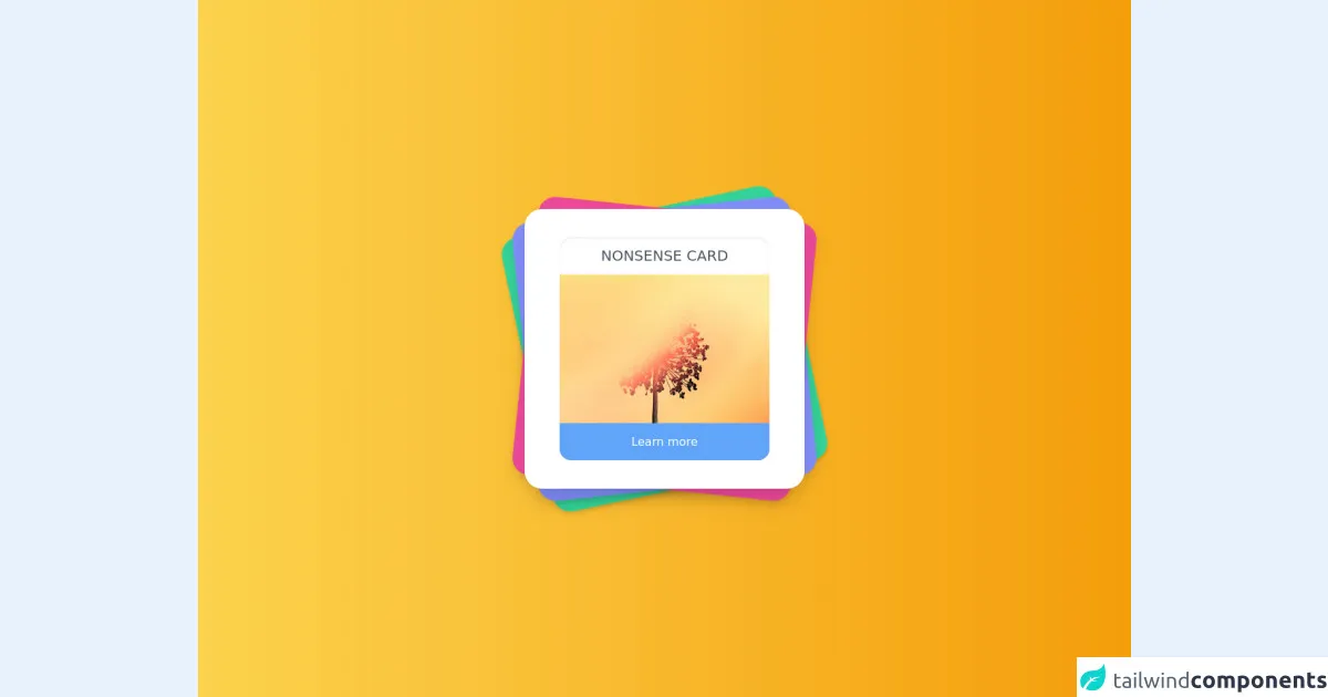
The preview of Nonsense card UI component
To create a Nonsense card UI component with Tailwind CSS, we'll use a combination of utility classes to style the card's image and text. Here's a preview of what the final Nonsense card will look like:
Free download of the Nonsense card's source code
The source code of Nonsense card UI component
To create a Nonsense card UI component, we'll use HTML and Tailwind CSS classes. Here's the source code for the Nonsense card:
<main class="grid h-screen place-items-center relative bg-gradient-to-r from-yellow-300 to-yellow-500">
  </div>
  <div class="relative h-96 w-96">
    <div class="card bg-green-400 shadow-md inline-block w-96 h-96 rounded-3xl absolute bottom-0 transform -rotate-12"></div>
    <div class="card bg-indigo-400 shadow-lg inline-block w-96 h-96 rounded-3xl absolute bottom-0 transform -rotate-6"></div>
    <div class="card bg-pink-500 shadow-lg inline-block w-96 h-96 rounded-3xl absolute bottom-0 transform rotate-6"></div>
    <div class="card bg-white transition shadow-xl w-96 h-96 rounded-3xl absolute bottom-0 z-10 grid place-items-center">
      <div class="card bg-white shadow-inner h-4/5 w-3/4 rounded-2xl overflow-hidden relative">
        <h1 class="shadow-md text-xl font-thin text-center text-gray-600 uppercase p-3">Nonsense card</h1>
        <img src="https://images.unsplash.com/photo-1611500730105-02d129cd71f0?crop=entropy&cs=tinysrgb&fit=crop&fm=jpg&h=500&ixid=MXwxfDB8MXxyYW5kb218fHx8fHx8fA&ixlib=rb-1.2.1&q=80&utm_campaign=api-credit&utm_medium=referral&utm_source=unsplash_source&w=500" alt="" />
        <button class="card bg-blue-400 hover:bg-blue-500 focus:outline-none transition text-white w-full h-1/6 absolute bottom-0 ">Learn more</button>
      </div>
    </div>
  </div>
</main>
How to create a Nonsense card with Tailwind CSS?
Now that we have an understanding of what Tailwind CSS is and why we should use it let's dive into the steps to create a Nonsense card UI component.
Step 1: Set up a new HTML file
Create a new HTML file and add the following code:
<!DOCTYPE html>
<html lang="en">
  <head>
    <meta charset="UTF-8" />
    <meta name="viewport" content="width=device-width, initial-scale=1.0" />
    <meta http-equiv="X-UA-Compatible" content="ie=edge" />
    <title>Nonsense Card with Tailwind CSS</title>
    <link rel="stylesheet" href="https://cdn.jsdelivr.net/npm/[email protected]/dist/tailwind.min.css" />
  </head>
  <body>
    <div class="container mx-auto">
      <div class="max-w-sm rounded overflow-hidden shadow-lg">
        <img class="w-full" src="https://source.unsplash.com/random/800x600" alt="Random Image" />
        <div class="px-6 py-4">
          <div class="font-bold text-xl mb-2">Lorem Ipsum</div>
          <p class="text-gray-700 text-base">
            Lorem ipsum dolor sit amet, consectetur adipiscing elit. Sed do eiusmod tempor incididunt ut labore et dolore magna aliqua. Ut enim ad minim veniam, quis nostrud exercitation ullamco laboris nisi ut aliquip ex ea commodo consequat.
          </p>
        </div>
      </div>
    </div>
  </body>
</html>
In this code, we've added the necessary HTML tags and included the Tailwind CSS stylesheet.
Step 2: Add the Nonsense card container
We'll use the max-w-sm class to set the maximum width of the card container to 640px. We'll also add the rounded class to give the container a rounded border and the overflow-hidden class to hide any content that overflows the container.
<div class="max-w-sm rounded overflow-hidden shadow-lg">
Step 3: Add the image
We'll use the w-full class to make the image take up the full width of the container. We'll also use the src attribute to set the image's source to a random image from the Unsplash API.
<img class="w-full" src="https://source.unsplash.com/random/800x600" alt="Random Image" />
Step 4: Add the text
We'll use the px-6 and py-4 classes to add padding to the text container. We'll also use the font-bold and text-xl classes to make the title bold and large. Finally, we'll use the text-gray-700 and text-base classes to set the text color to gray and the font size to the base size.
<div class="px-6 py-4">
  <div class="font-bold text-xl mb-2">Lorem Ipsum</div>
  <p class="text-gray-700 text-base">
    Lorem ipsum dolor sit amet, consectetur adipiscing elit. Sed do eiusmod tempor incididunt ut labore et dolore magna aliqua. Ut enim ad minim veniam, quis nostrud exercitation ullamco laboris nisi ut aliquip ex ea commodo consequat.
  </p>
</div>
Step 5: Add some styles
We'll use the shadow-lg class to add a shadow to the card container and make it look like it's floating above the page. We'll also use the container and mx-auto classes to center the card on the page.
<div class="container mx-auto">
Step 6: Tweak the styles
Now that we have the basic structure of the Nonsense card, we can tweak the styles to match our design requirements. For example, we can change the background color of the card, the font family, and the font sizes.
Conclusion
In this article, we've explored how to create a Nonsense card UI component with Tailwind CSS. We've also discussed why Tailwind CSS is an excellent choice for building responsive and customizable user interfaces. By following the steps outlined in this article and using the tips provided, you can create beautiful and professional-looking UI components with ease.