- Published on
3 Things You Must Know To Build A Newsletter With Tailwind CSS
- What is Tailwind CSS?
- The description of Newsletter ui component
- Why use Tailwind CSS to create a Newsletter ui component?
- The preview of Newsletter ui component
- The source code of Newsletter ui component
- How to create a Newsletter with Tailwind CSS?
- Conclusion
What is Tailwind CSS?
Tailwind CSS is a utility-first CSS framework that provides a set of pre-defined classes to help you quickly build custom user interfaces. It allows you to create complex layouts and designs without having to write custom CSS from scratch. Tailwind CSS is highly customizable, which means you can easily change the look and feel of your website or application by modifying the pre-defined classes.
The description of Newsletter ui component
A newsletter is a great way to keep your audience informed about your latest news, products, and services. A well-designed newsletter can help you build trust with your subscribers and increase engagement. The newsletter UI component is a pre-designed user interface element that you can use to create a newsletter quickly and easily.
Why use Tailwind CSS to create a Newsletter ui component?
Tailwind CSS is an excellent choice for creating a newsletter UI component for several reasons:
- Rapid development: Tailwind CSS provides a set of pre-defined classes that you can use to create a newsletter UI component quickly and easily.
- Highly customizable: Tailwind CSS is highly customizable, which means you can easily modify the pre-defined classes to match your brand's look and feel.
- Responsive design: Tailwind CSS provides responsive design classes that allow you to create a newsletter UI component that looks great on all devices.
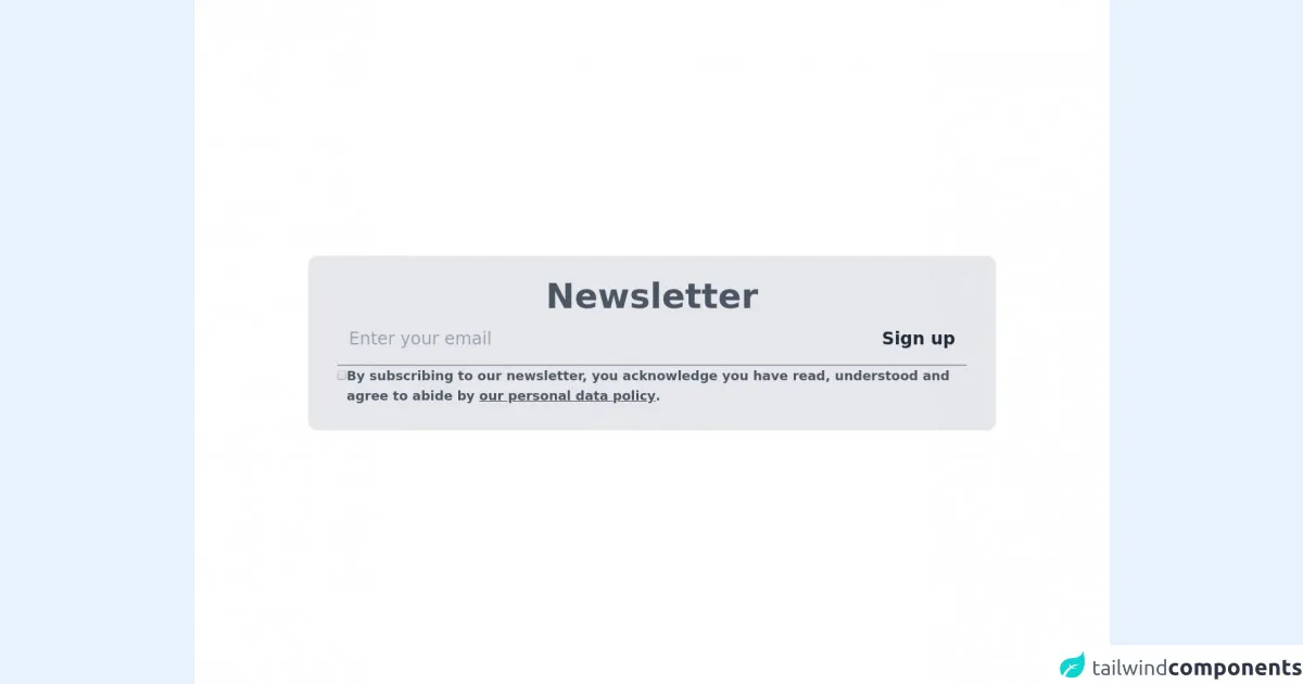
The preview of Newsletter ui component
To create a newsletter UI component with Tailwind CSS, you can use the following classes:
bg-white: Sets the background color of the newsletter to white.p-6: Adds padding to the newsletter.border: Adds a border to the newsletter.rounded-lg: Rounds the corners of the newsletter.shadow-md: Adds a shadow effect to the newsletter.
Free download of the Newsletter's source code
The source code of Newsletter ui component
To create a newsletter UI component with Tailwind CSS, you can use the following HTML code:
<div class="bg-white p-6 border rounded-lg shadow-md">
  <h2 class="text-lg font-bold mb-4">Newsletter Title</h2>
  <p class="text-gray-700 mb-4">Lorem ipsum dolor sit amet, consectetur adipiscing elit. Sed ac orci quis tortor bibendum consequat. Donec fringilla, lacus eget ullamcorper ultrices, eros eros commodo tellus, eu fringilla felis lorem in nulla. </p>
  <form>
    <div class="mb-4">
      <label class="block text-gray-700 font-bold mb-2" for="email">
        Email Address
      </label>
      <input class="shadow appearance-none border rounded w-full py-2 px-3 text-gray-700 leading-tight focus:outline-none focus:shadow-outline" id="email" type="email" placeholder="Enter your email address">
    </div>
    <div class="flex items-center justify-between">
      <button class="bg-blue-500 hover:bg-blue-700 text-white font-bold py-2 px-4 rounded focus:outline-none focus:shadow-outline" type="button">
        Subscribe
      </button>
    </div>
  </form>
</div>
<main class="divide-y-4 bg-white w-full flex flex-col">
  <section class="text-gray-600 relative grid place-content-center place-items-center h-screen">
    <section class="flex flex-col gap-12 w-3/4 px-10 py-8 rounded-xl shadow bg-gray-200">
      <h2 class="text-5xl text-center font-semibold">Newsletter</h2>
      <form name="newsletter" class="flex flex-wrap gap-6">
        <div class="w-full py-2 border-b-2 border-gray-400 flex justify-between gap-3">
          <input type="email" class="outline-none text-2xl flex-1 px-4 py-3 bg-transparent" placeholder="Enter your email" />
          <button type="button" class="text-2xl font-semibold text-gray-800 px-4 py-2 rounded-lg hover:bg-gray-300 transition flex items-center justify-center">Sign up</button>
        </div>
        <label class="w-full flex items-baseline gap-3 font-semibold text-lg">
          <input type="checkbox" value="policy-read" />
          <span>By subscribing to our newsletter, you acknowledge you have read, understood and agree to abide by <a href="#" class="underline">our personal data policy</a>.</span>
        </label>
      </form>
    </section>
  </section>
</main>
How to create a Newsletter with Tailwind CSS?
To create a newsletter with Tailwind CSS, follow these steps:
- Create a new HTML file and add the above HTML code to it.
- Link the Tailwind CSS stylesheet to your HTML file by adding the following line to the head section of your HTML file:
<link href="https://cdn.jsdelivr.net/npm/tailwindcss@latest/dist/tailwind.min.css" rel="stylesheet">
- Customize the newsletter UI component by modifying the pre-defined classes to match your brand's look and feel.
- Publish your newsletter and start engaging with your subscribers.
Conclusion
In this article, we've discussed why Tailwind CSS is an excellent choice for creating a newsletter UI component. We've also provided a preview and source code for a newsletter UI component that you can use as a starting point for your own newsletter. With Tailwind CSS, you can create beautiful and responsive newsletters quickly and easily.