- Published on
The 5 Really Obvious Ways To Create A Neumorphism Sidebar With Tailwind CSS Better That You Ever Did
- What is Tailwind CSS?
- The description of Neumorphism sidebar ui component
- Why use Tailwind CSS to create a Neumorphism sidebar ui component?
- The preview of Neumorphism sidebar ui component
- The source code of Neumorphism sidebar ui component
- How to create a Neumorphism sidebar with Tailwind CSS?
- 1. Define the sidebar container
- 2. Add the Neumorphism effect
- 3. Add rounded corners
- 4. Add padding and margin
- 5. Customize the design
- Conclusion
Are you looking for a way to create a Neumorphism sidebar with Tailwind CSS? Look no further! In this article, we will explore the five really obvious ways to create a Neumorphism sidebar with Tailwind CSS that will take your design to the next level.
What is Tailwind CSS?
Tailwind CSS is a utility-first CSS framework that allows you to quickly create custom designs without writing any CSS. It provides a set of pre-defined classes that you can use to style your HTML elements.
The description of Neumorphism sidebar ui component
Neumorphism is a design trend that combines skeuomorphism and flat design. It uses soft shadows and gradients to create a 3D effect, making the design look like it's popping out of the screen. A Neumorphism sidebar is a UI component that follows this design trend and is commonly used in web applications.
Why use Tailwind CSS to create a Neumorphism sidebar ui component?
Tailwind CSS provides a set of pre-defined classes that make it easy to create a Neumorphism sidebar without writing any CSS. It also allows you to customize the design by adding your own classes or modifying the existing ones.
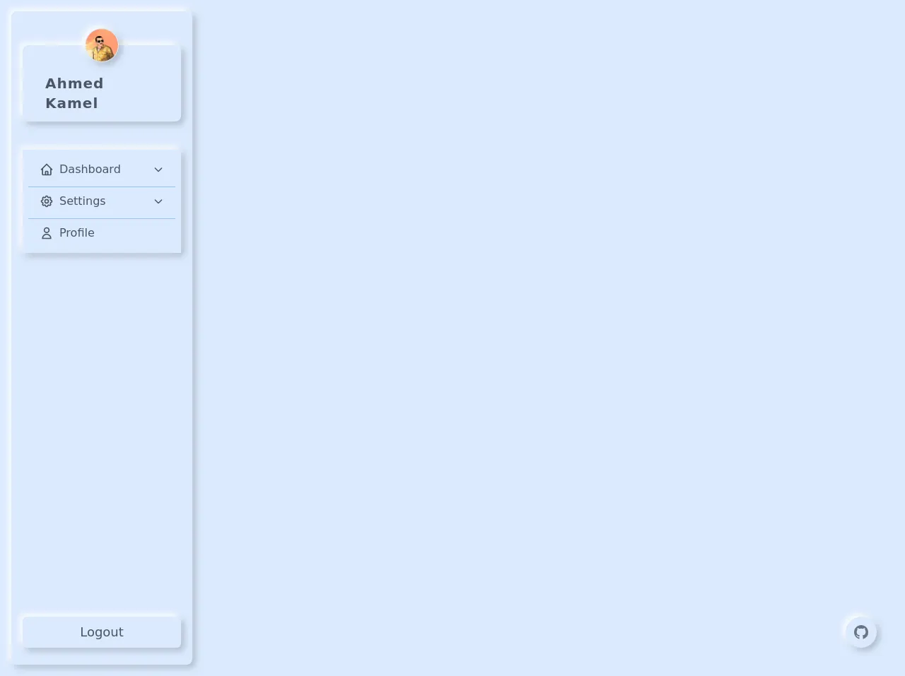
The preview of Neumorphism sidebar ui component
To create a Neumorphism sidebar with Tailwind CSS, we will use a combination of soft shadows, gradients, and rounded corners. The result will be a sidebar that looks like it's popping out of the screen.
Free download of the Neumorphism sidebar's source code
The source code of Neumorphism sidebar ui component
To create a Neumorphism sidebar with Tailwind CSS, we will use the following HTML and CSS code:
<style>
      /* Add this shadow in tailwind.config.js */
      .neumorphism-shadow {
        box-shadow: -4px -4px 10px rgb(255, 255, 255), 4px 4px 10px rgba(0, 0, 0, 0.219);
      }
      /* Rotate chevron in collapsing */
      [data-bs-toggle='collapse'][aria-expanded='true'] span:nth-child(3) svg {
        transform: rotate(-90deg);
      }

      /* For bootstrap collapse plugin */
      .fade {
        transition: opacity 0.15s linear;
      }
      .fade:not(.show) {
        opacity: 0;
      }
      .collapse:not(.show) {
        display: none;
      }
      .collapsing {
        height: 0;
        overflow: hidden;
        transition: height 0.35s ease;
      }
      @media (prefers-reduced-motion: reduce) {
        .collapsing {
          transition: none;
        }
        .fade {
          transition: none;
        }
      }
      /* fixed github link. this stuff also should be applied throw config file  */
      .github-link:hover {
        box-shadow: inset -4px -4px 10px rgb(255, 255, 255), inset 4px 4px 10px rgba(0, 0, 0, 0.219);
      }
      .github-link:hover > svg,
      .github-link:focus > svg {
        transform: scale(.95)
      }

/* TODO: CHANGE SCROLLBAR STYLE */
    </style>
<div class="flex h-screen bg-blue-100 antialiased text-gray-900">
      <aside class="flex-shrink-0 p-4 w-72 h-full">
        <div class="flex flex-col h-full pt-12 pb-4 rounded-lg neumorphism-shadow">
          <!-- Sidebar header -->
          <div
            class="flex flex-col items-center justify-center flex-shrink-0 px-4 py-2 mx-4 rounded-lg neumorphism-shadow"
          >
            <img
              class="w-12 h-12 p-px -mt-8 rounded-full neumorphism-shadow"
              src="https://avatars0.githubusercontent.com/u/57622665?s=460&u=8f581f4c4acd4c18c33a87b3e6476112325e8b38&v=4"
              alt="Ahmed Kamel"
              srcset=""
            />
            <a href="https://github.com/Kamona-WD" target="_blank" class="mt-3 px-4 py-1 rounded-md text-xl font-semibold tracking-wider text-gray-600 hover:underline focus:ring focus:outline-none">Ahmed Kamel</a>
          </div>
          <!-- Sidebar links -->
          <nav class="flex-1 max-h-full p-4 mt-6 overflow-y-hidden">
            <ul class="max-h-full p-2 space-y-1 overflow-y-auto divide-y divide-blue-300 neumorphism-shadow">
              <!-- Dashboard link -->
              <li>
                <button
                  class="flex items-center w-full px-4 py-2 text-gray-600 transition-transform transform rounded-md hover:translate-x-1 focus:outline-none focus:ring"
                  data-bs-target="#dashboardCollapse"
                  data-bs-toggle="collapse"
                  aria-expanded="false"
                  aria-controls="dashboardCollapse"
                >
                  <span>
                    <svg
                      class="w-5 h-5"
                      xmlns="http://www.w3.org/2000/svg"
                      fill="none"
                      viewBox="0 0 24 24"
                      stroke="currentColor"
                    >
                      <path
                        stroke-linecap="round"
                        stroke-linejoin="round"
                        stroke-width="2"
                        d="M3 12l2-2m0 0l7-7 7 7M5 10v10a1 1 0 001 1h3m10-11l2 2m-2-2v10a1 1 0 01-1 1h-3m-6 0a1 1 0 001-1v-4a1 1 0 011-1h2a1 1 0 011 1v4a1 1 0 001 1m-6 0h6"
                      />
                    </svg>
                  </span>
                  <span class="ml-2 font-medium">Dashboard</span>
                  <span class="ml-auto">
                    <svg
                      class="w-4 h-4 transition-transform"
                      xmlns="http://www.w3.org/2000/svg"
                      fill="none"
                      viewBox="0 0 24 24"
                      stroke="currentColor"
                    >
                      <path stroke-linecap="round" stroke-linejoin="round" stroke-width="2" d="M19 9l-7 7-7-7" />
                    </svg>
                  </span>
                </button>
                <ul class="collapse" id="dashboardCollapse">
                  <li>
                    <a
                      href="#"
                      class="flex px-6 py-2 font-medium text-gray-600 transition-transform transform hover:translate-x-1"
                      >Link one</a
                    >
                  </li>
                  <li>
                    <a
                      href="#"
                      class="flex px-6 py-2 font-medium text-gray-600 transition-transform transform hover:translate-x-1"
                      >Link two</a
                    >
                  </li>
                  <li>
                    <a
                      href="#"
                      class="flex px-6 py-2 font-medium text-gray-600 transition-transform transform hover:translate-x-1"
                      >Link three</a
                    >
                  </li>
                </ul>
              </li>
              <!-- Settings link -->
              <li>
                <button
                  class="flex items-center w-full px-4 py-2 text-gray-600 transition-transform transform rounded-md hover:translate-x-1 focus:outline-none focus:ring"
                  data-bs-target="#settingsCollapse"
                  data-bs-toggle="collapse"
                  aria-expanded="false"
                  aria-controls="settingsCollapse"
                >
                  <span>
                    <svg
                      class="w-5 h-5"
                      xmlns="http://www.w3.org/2000/svg"
                      fill="none"
                      viewBox="0 0 24 24"
                      stroke="currentColor"
                    >
                      <path
                        stroke-linecap="round"
                        stroke-linejoin="round"
                        stroke-width="2"
                        d="M10.325 4.317c.426-1.756 2.924-1.756 3.35 0a1.724 1.724 0 002.573 1.066c1.543-.94 3.31.826 2.37 2.37a1.724 1.724 0 001.065 2.572c1.756.426 1.756 2.924 0 3.35a1.724 1.724 0 00-1.066 2.573c.94 1.543-.826 3.31-2.37 2.37a1.724 1.724 0 00-2.572 1.065c-.426 1.756-2.924 1.756-3.35 0a1.724 1.724 0 00-2.573-1.066c-1.543.94-3.31-.826-2.37-2.37a1.724 1.724 0 00-1.065-2.572c-1.756-.426-1.756-2.924 0-3.35a1.724 1.724 0 001.066-2.573c-.94-1.543.826-3.31 2.37-2.37.996.608 2.296.07 2.572-1.065z"
                      />
                      <path
                        stroke-linecap="round"
                        stroke-linejoin="round"
                        stroke-width="2"
                        d="M15 12a3 3 0 11-6 0 3 3 0 016 0z"
                      />
                    </svg>
                  </span>
                  <span class="ml-2 font-medium">Settings</span>
                  <span class="ml-auto">
                    <svg
                      class="w-4 h-4 transition-transform"
                      xmlns="http://www.w3.org/2000/svg"
                      fill="none"
                      viewBox="0 0 24 24"
                      stroke="currentColor"
                    >
                      <path stroke-linecap="round" stroke-linejoin="round" stroke-width="2" d="M19 9l-7 7-7-7" />
                    </svg>
                  </span>
                </button>
                <ul class="collapse" id="settingsCollapse">
                  <li>
                    <a
                      href="#"
                      class="flex px-6 py-2 font-medium text-gray-600 transition-transform transform hover:translate-x-1"
                      >Link one</a
                    >
                  </li>
                  <li>
                    <a
                      href="#"
                      class="flex px-6 py-2 font-medium text-gray-600 transition-transform transform hover:translate-x-1"
                      >Link two</a
                    >
                  </li>
                  <li>
                    <a
                      href="#"
                      class="flex px-6 py-2 font-medium text-gray-600 transition-transform transform hover:translate-x-1"
                      >Link three</a
                    >
                  </li>
                  <li>
                    <a
                      href="#"
                      class="flex px-6 py-2 font-medium text-gray-600 transition-transform transform hover:translate-x-1"
                      >Link four</a
                    >
                  </li>
                </ul>
              </li>
              <!-- Profile link -->
              <li>
                <a
                  href="#"
                  class="flex items-center px-4 py-2 text-gray-600 transition-transform transform rounded-md hover:translate-x-1 focus:ring focus:outline-none"
                >
                  <span>
                    <svg
                      class="w-5 h-5"
                      xmlns="http://www.w3.org/2000/svg"
                      fill="none"
                      viewBox="0 0 24 24"
                      stroke="currentColor"
                    >
                      <path
                        stroke-linecap="round"
                        stroke-linejoin="round"
                        stroke-width="2"
                        d="M16 7a4 4 0 11-8 0 4 4 0 018 0zM12 14a7 7 0 00-7 7h14a7 7 0 00-7-7z"
                      />
                    </svg>
                  </span>
                  <span class="ml-2 font-medium">Profile</span>
                </a>
              </li>
            </ul>
          </nav>
          <div class="flex-shrink-0 px-4 py-2">
            <button
              class="w-full px-4 py-2 text-lg font-medium text-center text-gray-600 transition-transform transform rounded-md hover:scale-105 neumorphism-shadow focus:outline-none focus:ring"
            >
              Logout
            </button>
          </div>
        </div>
      </aside>
      <div class="flex-1">
        <main>
          <a href="https://github.com/Kamona-WD" target="_blank" class="p-3 neumorphism-shadow rounded-full fixed bottom-10 right-10 github-link focus:outline-none focus:ring">
            <svg class="w-5 h-5 text-gray-500" viewBox="0 0 16 16" fill="currentColor" aria-hidden="true">
                  <path
                    fill-rule="evenodd"
                    d="M8 0C3.58 0 0 3.58 0 8c0 3.54 2.29 6.53 5.47 7.59.4.07.55-.17.55-.38 0-.19-.01-.82-.01-1.49-2.01.37-2.53-.49-2.69-.94-.09-.23-.48-.94-.82-1.13-.28-.15-.68-.52-.01-.53.63-.01 1.08.58 1.23.82.72 1.21 1.87.87 2.33.66.07-.52.28-.87.51-1.07-1.78-.2-3.64-.89-3.64-3.95 0-.87.31-1.59.82-2.15-.08-.2-.36-1.02.08-2.12 0 0 .67-.21 2.2.82.64-.18 1.32-.27 2-.27.68 0 1.36.09 2 .27 1.53-1.04 2.2-.82 2.2-.82.44 1.1.16 1.92.08 2.12.51.56.82 1.27.82 2.15 0 3.07-1.87 3.75-3.65 3.95.29.25.54.73.54 1.48 0 1.07-.01 1.93-.01 2.2 0 .21.15.46.55.38A8.013 8.013 0 0016 8c0-4.42-3.58-8-8-8z"
                  ></path>
                </svg>
          </a>
        </main>
      </div>
    </div>
    <!-- Using bootstrap.js for its collapse plugin -->
    <script
      src="https://cdn.jsdelivr.net/npm/[email protected]/dist/js/bootstrap.bundle.min.js"
      integrity="sha384-ygbV9kiqUc6oa4msXn9868pTtWMgiQaeYH7/t7LECLbyPA2x65Kgf80OJFdroafW"
      crossorigin="anonymous"
    ></script>
How to create a Neumorphism sidebar with Tailwind CSS?
Now that we have a preview and source code of a Neumorphism sidebar, let's dive into the five really obvious ways to create it with Tailwind CSS.
1. Define the sidebar container
The first step is to define the container for the sidebar. We will use the bg-gray-100 class to set the background color and the w-64 class to set the width of the sidebar.
<div class="bg-gray-100 w-64">
  <!-- Sidebar content -->
</div>
2. Add the Neumorphism effect
To create the Neumorphism effect, we will use a combination of soft shadows and gradients. We will use the shadow-lg class to add a soft shadow to the sidebar and the bg-gradient-to-b class to add a gradient that goes from top to bottom.
<div class="bg-gray-100 w-64 shadow-lg bg-gradient-to-b from-gray-200 to-gray-100">
  <!-- Sidebar content -->
</div>
3. Add rounded corners
To make the sidebar look more like it's popping out of the screen, we will add rounded corners to the top-left and bottom-left corners. We will use the rounded-tl-lg and rounded-bl-lg classes to add the rounded corners.
<div class="bg-gray-100 w-64 shadow-lg bg-gradient-to-b from-gray-200 to-gray-100 rounded-tl-lg rounded-bl-lg">
  <!-- Sidebar content -->
</div>
4. Add padding and margin
To make the sidebar content look more centered and spaced out, we will add some padding and margin to the container. We will use the p-4 class to add padding and the mt-8 class to add margin to the top of the container.
<div class="bg-gray-100 w-64 shadow-lg bg-gradient-to-b from-gray-200 to-gray-100 rounded-tl-lg rounded-bl-lg p-4 mt-8">
  <!-- Sidebar content -->
</div>
5. Customize the design
Finally, you can customize the design by adding your own classes or modifying the existing ones. For example, you can change the background color by using a different color class or add more rounded corners by using the rounded-tr-lg and rounded-br-lg classes.
<div class="bg-blue-100 w-64 shadow-lg bg-gradient-to-b from-blue-200 to-blue-100 rounded-tl-lg rounded-tr-lg rounded-bl-lg rounded-br-lg p-4 mt-8">
  <!-- Sidebar content -->
</div>
Conclusion
In this article, we explored the five really obvious ways to create a Neumorphism sidebar with Tailwind CSS. We learned how to use soft shadows, gradients, and rounded corners to create a sidebar that looks like it's popping out of the screen. With Tailwind CSS, you can easily customize the design and create a unique Neumorphism sidebar for your web application.