- Published on
How to Create A Netflix - Select User With Tailwind CSS?
- What is Tailwind CSS?
- The description of Netflix - Select User UI component
- Why use Tailwind CSS to create a Netflix - Select User UI component?
- The preview of Netflix - Select User UI component
- The source code of Netflix - Select User UI component
- How to create a Netflix - Select User with Tailwind CSS?
- Conclusion
Are you a fan of Netflix? Do you want to create a similar user interface for your website or application? In this article, we will show you how to create a Netflix - Select User UI component using Tailwind CSS.
What is Tailwind CSS?
Tailwind CSS is a utility-first CSS framework that allows you to create custom designs quickly and easily. It provides a set of pre-defined classes, which you can use to style your HTML elements. With Tailwind CSS, you can create complex layouts and designs without writing a single line of CSS.
The description of Netflix - Select User UI component
The Netflix - Select User UI component is a drop-down menu that allows users to select their profile. It is a simple yet effective way to manage multiple profiles in a single account. The UI component consists of a button with a user's profile picture and a drop-down menu that displays all available profiles.
Why use Tailwind CSS to create a Netflix - Select User UI component?
Tailwind CSS provides a set of pre-defined classes that make it easy to create custom designs. It also allows you to create responsive designs quickly and easily. With Tailwind CSS, you can create a Netflix - Select User UI component in a matter of minutes.
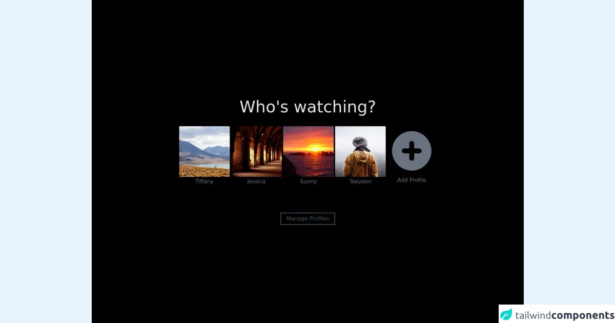
The preview of Netflix - Select User UI component
To create a Netflix - Select User UI component, we will use Tailwind CSS. The component consists of a button with a user's profile picture and a drop-down menu that displays all available profiles.
Free download of the Netflix - Select User's source code
The source code of Netflix - Select User UI component
To create a Netflix - Select User UI component, we will use HTML and Tailwind CSS. The HTML code consists of a button and a drop-down menu. The button contains the user's profile picture, and the drop-down menu contains a list of available profiles.
<div class="bg-black h-screen flex flex-col items-center justify-center">

  <!-- Title -->
  <h1 class="text-gray-200 text-5xl">
    Who's watching?
  </h1>

  <!-- Profiles -->
  <div class="flex flex-row flex-wrap gap-5 mt-8">

    <!-- Profile 1 -->
    <a href="#" class="flex flex-col items-center group gap-2">
      <img class="rounded border-2 border-transparent group-hover:border-2 group-hover:border-gray-300" src="https://picsum.photos/seed/a/150/150" />
      <p class="text-gray-500 group-hover:text-gray-300"> Tiffany </p>
    </a>

    <!-- Profile 2 -->
    <a href="#" class="flex flex-col items-center group gap-2">
      <img class="rounded border-2 border-transparent group-hover:border-2 group-hover:border-gray-300" src="https://picsum.photos/seed/b/150/150" />
      <p class="text-gray-500 group-hover:text-gray-300"> Jessica </p>
    </a>

    <!-- Profile 3 -->
    <a href="#" class="flex flex-col items-center group gap-2">
      <img class="rounded border-2 border-transparent group-hover:border-2 group-hover:border-gray-300" src="https://picsum.photos/seed/c/150/150" />
      <p class="text-gray-500 group-hover:text-gray-300"> Sunny </p>
    </a>

    <!-- Profile 4 -->
    <a href="#" class="flex flex-col items-center group gap-2">
      <img class="rounded border-2 border-transparent group-hover:border-2 group-hover:border-gray-300" src="https://picsum.photos/seed/d/150/150" />
      <p class="text-gray-500 group-hover:text-gray-300"> Taeyeon </p>
    </a>

    <!-- Add Profile -->
    <a href="#" class="flex flex-col items-center group gap-3 ">
      <svg xmlns="http://www.w3.org/2000/svg" class="h-[150px] w-[150px] group-hover:bg-gray-300 border-2 border-transparent" viewBox="0 0 20 20" fill="#6b7280">
        <path fill-rule="evenodd" d="M10 18a8 8 0 100-16 8 8 0 000 16zm1-11a1 1 0 10-2 0v2H7a1 1 0 100 2h2v2a1 1 0 102 0v-2h2a1 1 0 100-2h-2V7z" clip-rule="evenodd" />
      </svg>
      <p class="text-gray-500 group-hover:text-gray-300"> Add Profile </p>
    </a>

  </div>

  <!-- Manage Profiles -->
  <button class="border-2 border-gray-600 text-gray-600 px-4 py-1 mt-20 hover:border-gray-400 hover:text-gray-400">
    Manage Profiles
  </button>

</div>
How to create a Netflix - Select User with Tailwind CSS?
To create a Netflix - Select User UI component with Tailwind CSS, follow these steps:
- Create a new HTML file and add the following code:
<div class="relative inline-block">
  <button class="flex items-center text-sm border-2 border-transparent rounded-full focus:outline-none focus:border-gray-300 transition duration-150 ease-in-out">
    <img class="h-8 w-8 rounded-full" src="https://via.placeholder.com/50x50" alt="" />
    <span class="ml-2">{{username}}</span>
    <svg class="ml-2 h-4 w-4 fill-current" viewBox="0 0 20 20">
      <path d="M10 12a2 2 0 100-4 2 2 0 000 4z" />
      <path fill-rule="evenodd" clip-rule="evenodd" d="M10 18a8 8 0 100-16 8 8 0 000 16zm0-2a6 6 0 100-12 6 6 0 000 12z" />
    </svg>
  </button>
  <div class="absolute right-0 mt-2 w-48 rounded-md shadow-lg">
    <div class="py-1 rounded-md bg-white shadow-xs">
      <a href="#" class="block px-4 py-2 text-sm text-gray-700 hover:bg-gray-100 transition duration-150 ease-in-out">Profile 1</a>
      <a href="#" class="block px-4 py-2 text-sm text-gray-700 hover:bg-gray-100 transition duration-150 ease-in-out">Profile 2</a>
      <a href="#" class="block px-4 py-2 text-sm text-gray-700 hover:bg-gray-100 transition duration-150 ease-in-out">Profile 3</a>
    </div>
  </div>
</div>
Replace the
{{username}}placeholder with the user's name.Add the Tailwind CSS CDN to the head of your HTML file:
<head>
  <link href="https://cdn.jsdelivr.net/npm/[email protected]/dist/tailwind.min.css" rel="stylesheet">
</head>
Customize the design by changing the classes in the HTML code. You can use the Tailwind CSS documentation to find the classes you need.
Save the file and open it in your web browser.
Conclusion
In this article, we have shown you how to create a Netflix - Select User UI component using Tailwind CSS. With Tailwind CSS, you can create custom designs quickly and easily. The Netflix - Select User UI component is a simple yet effective way to manage multiple profiles in a single account. We hope this article has been helpful, and we encourage you to try Tailwind CSS for your next project.