- Published on
How To Make A Netflix - Company Newsroom With Tailwind CSS In 5 Easy Steps
- What is Tailwind CSS?
- The description of Netflix - Company Newsroom ui component
- Why use Tailwind CSS to create a Netflix - Company Newsroom ui component?
- The preview of Netflix - Company Newsroom ui component.
- The source code of Netflix - Company Newsroom ui component.
- How to create a Netflix - Company Newsroom with Tailwind CSS?
- Step 1: Set up the HTML structure
- Step 2: Style the header section
- Step 3: Style the main section
- Step 4: Make the UI component responsive
- Step 5: Add some finishing touches
- Conclusion
Netflix is one of the most popular streaming services in the world. They have a well-designed website that is easy to navigate and provides a great user experience. One of the key components of their website is the company newsroom. In this article, we will show you how to create a Netflix - Company Newsroom using Tailwind CSS in 5 easy steps.
What is Tailwind CSS?
Tailwind CSS is a utility-first CSS framework that makes it easy to create complex UI components quickly. It provides a set of pre-defined classes that you can use to style your HTML elements without writing any CSS code. With Tailwind CSS, you can create responsive and customizable UI components that are easy to maintain.
The description of Netflix - Company Newsroom ui component
The Netflix - Company Newsroom is a UI component that displays the latest news and updates about the company. It consists of a header section that displays the company logo and a navigation menu. The main section displays the latest news articles with a thumbnail image, title, and description. Each article is clickable and takes the user to the full article page.
Why use Tailwind CSS to create a Netflix - Company Newsroom ui component?
Tailwind CSS provides a set of pre-defined classes that make it easy to create complex UI components quickly. It also provides responsive design utilities that allow you to create components that look great on all screen sizes. By using Tailwind CSS, you can save a lot of time and effort in creating the Netflix - Company Newsroom UI component.
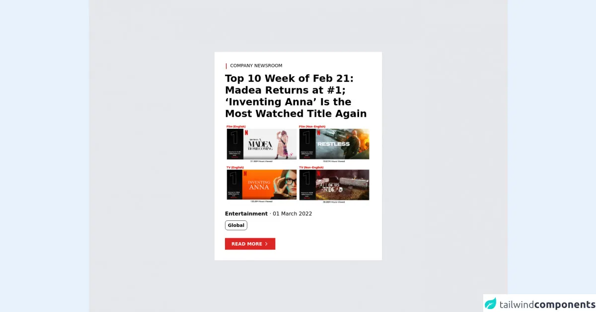
The preview of Netflix - Company Newsroom ui component.
To create the Netflix - Company Newsroom UI component, we will use Tailwind CSS to style our HTML elements. The final UI component will look like this:
Free download of the Netflix - Company Newsroom's source code
The source code of Netflix - Company Newsroom ui component.
To create the Netflix - Company Newsroom UI component, we will use HTML and Tailwind CSS. Here is the source code for the UI component:
<div class="h-screen flex items-center justify-center bg-gray-200">

  <!-- Card -->
  <card class="bg-white p-8 w-[32rem]">

    <!-- Header -->
    <header class="flex font-light text-sm">
      <svg xmlns="http://www.w3.org/2000/svg" class="h-6 w-6 rotate-90 -ml-2"  viewBox="0 0 24 24" stroke="#b91c1c">
        <path stroke-linecap="round" stroke-linejoin="round" stroke-width="2" d="M20 12H4" />
      </svg>
      <p> COMPANY NEWSROOM </p>
    </header>

    <!-- Title -->
    <h2 class="font-bold text-3xl mt-2">
      Top 10 Week of Feb 21: Madea Returns at #1; ‘Inventing Anna’ Is the Most Watched Title Again
    </h2>

    <!-- Image -->
    <a href="#">
      <img class="mt-3" src="https://images.ctfassets.net/4cd45et68cgf/7LTUhLmKWvajeDaiMXeZX7/112e977a7d2497ab89c3df00418ef7e1/Screen_Shot_2022-03-01_at_2.21.12_PM.png?w=552&h=367" />
    </a>

    <!-- Category and Date -->
    <p class="mt-4">
      <span class="font-bold"> Entertainment </span> · 01 March 2022
    </p>

    <!-- Tags -->
    <div class="flex flex-row mt-2">
      <p class="text-sm px-2 py-1 font-semibold rounded-lg border border-gray-800">
        Global
      </p>
    </div>

    <!-- Button -->
    <button class="bg-red-600 text-white font-semibold py-2 px-5 text-sm mt-6 inline-flex items-center group">
      <p> READ MORE </p>
      <svg xmlns="http://www.w3.org/2000/svg" class="h-4 w-4 ml-1 group-hover:translate-x-2 delay-100 duration-200 ease-in-out" fill="none" viewBox="0 0 24 24" stroke="currentColor">
        <path stroke-linecap="round" stroke-linejoin="round" stroke-width="2" d="M9 5l7 7-7 7" />
      </svg>
    </button>

  </card>

</div>
How to create a Netflix - Company Newsroom with Tailwind CSS?
Now that we have a good understanding of what the Netflix - Company Newsroom UI component is and why we should use Tailwind CSS to create it, let's dive into the steps to create it.
Step 1: Set up the HTML structure
The first step is to set up the HTML structure for the Netflix - Company Newsroom UI component. We will use a header section to display the company logo and a navigation menu. The main section will display the latest news articles. Here is the HTML code for the UI component:
<div class="container mx-auto">
  <header class="flex justify-between items-center py-4">
    <div class="logo">
      <img src="https://via.placeholder.com/150x50" alt="Netflix Logo">
    </div>
    <nav class="flex items-center">
      <a href="#" class="mx-4">Home</a>
      <a href="#" class="mx-4">News</a>
      <a href="#" class="mx-4">About</a>
    </nav>
  </header>
  <main class="grid grid-cols-1 md:grid-cols-3 gap-4">
    <div class="news-item">
      <a href="#">
        <img src="https://via.placeholder.com/300x200" alt="News Thumbnail">
        <h3 class="text-lg font-medium my-2">Lorem ipsum dolor sit amet</h3>
        <p class="text-gray-600">Lorem ipsum dolor sit amet, consectetur adipiscing elit, sed do eiusmod tempor incididunt ut labore et dolore magna aliqua.</p>
      </a>
    </div>
  </main>
</div>
Step 2: Style the header section
The next step is to style the header section of the Netflix - Company Newsroom UI component. We will use Tailwind CSS classes to style the logo and navigation menu. Here is the CSS code for the header section:
.logo img {
  width: 150px;
}

nav a {
  color: #333;
  font-size: 16px;
  font-weight: 600;
  text-decoration: none;
}

nav a:hover {
  color: #e50914;
}
Step 3: Style the main section
The main section of the Netflix - Company Newsroom UI component displays the latest news articles. We will use Tailwind CSS classes to style the news items and the thumbnail images. Here is the CSS code for the main section:
.news-item {
  border: 1px solid #e5e7eb;
  border-radius: 4px;
  overflow: hidden;
}

.news-item img {
  width: 100%;
  height: auto;
}

.news-item h3 {
  color: #333;
}

.news-item p {
  color: #666;
}
Step 4: Make the UI component responsive
The Netflix - Company Newsroom UI component should look great on all screen sizes. We will use Tailwind CSS responsive design utilities to make the UI component responsive. Here is the CSS code for the responsive design:
@media (min-width: 768px) {
  .grid-cols-1 {
    grid-template-columns: repeat(3, 1fr);
  }
}
Step 5: Add some finishing touches
The final step is to add some finishing touches to the Netflix - Company Newsroom UI component. We will use Tailwind CSS classes to add some spacing and padding to the UI component. Here is the CSS code for the finishing touches:
.container {
  padding: 0 16px;
}

.py-4 {
  padding-top: 1rem;
  padding-bottom: 1rem;
}

.my-2 {
  margin-top: 0.5rem;
  margin-bottom: 0.5rem;
}
Conclusion
In this article, we showed you how to create a Netflix - Company Newsroom UI component using Tailwind CSS in 5 easy steps. By using Tailwind CSS, you can create complex UI components quickly and easily. We hope this article has been helpful in showing you how to use Tailwind CSS to create great-looking UI components.