- Published on
Best Ways To Build A Multi Level Dropdown Menu With Animation With Tailwind CSS
- What is Tailwind CSS?
- The description of Multi Level Dropdown Menu with Animation ui component
- Why use Tailwind CSS to create a Multi Level Dropdown Menu with Animation ui component?
- The preview of Multi Level Dropdown Menu with Animation ui component
- The source code of Multi Level Dropdown Menu with Animation ui component
- How to create a Multi Level Dropdown Menu with Animation with Tailwind CSS?
- Conclusion
If you're looking to build a multi-level dropdown menu with animation, Tailwind CSS is a great choice. Tailwind CSS is a utility-first CSS framework that allows you to quickly build custom designs without having to write a lot of CSS code. In this article, we'll explore how to create a multi-level dropdown menu with animation using Tailwind CSS.
What is Tailwind CSS?
Tailwind CSS is a utility-first CSS framework that provides a set of pre-defined classes that you can use to style your HTML elements. It's designed to help you build custom designs quickly without having to write a lot of CSS code. Tailwind CSS provides a large number of pre-defined classes that you can use to style your elements. These classes are organized into categories such as colors, typography, layout, and more.
The description of Multi Level Dropdown Menu with Animation ui component
A multi-level dropdown menu is a menu that allows users to navigate through a hierarchy of options. This type of menu is useful when you have a lot of options that are organized into categories. A multi-level dropdown menu typically consists of a top-level menu item that, when clicked, reveals a dropdown menu with additional options. These additional options can also have dropdown menus, creating a multi-level hierarchy.
Adding animation to your multi-level dropdown menu can make it more engaging and improve the user experience. Animations can help users understand the hierarchy of options and make it easier for them to navigate through the menu.
Why use Tailwind CSS to create a Multi Level Dropdown Menu with Animation ui component?
Tailwind CSS is a great choice for creating a multi-level dropdown menu with animation because it provides a large number of pre-defined classes that you can use to style your menu. This makes it easy to create a custom design without having to write a lot of CSS code. Tailwind CSS also provides a number of utility classes that you can use to add animations to your menu.
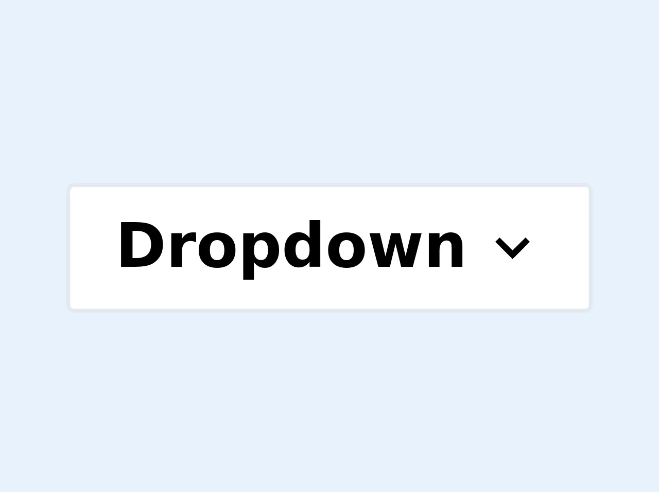
The preview of Multi Level Dropdown Menu with Animation ui component
To create a multi-level dropdown menu with animation using Tailwind CSS, you can use the transition utility class to add animation to your menu. Here's an example of what your menu might look like:
<nav class="bg-gray-800">
  <div class="max-w-7xl mx-auto px-2 sm:px-6 lg:px-8">
    <div class="relative flex items-center justify-between h-16">
      <div class="flex-1 flex items-center justify-center sm:items-stretch sm:justify-start">
        <div class="flex-shrink-0">
          <img class="h-8 w-8" src="https://tailwindui.com/img/logos/workflow-mark-indigo-500.svg" alt="Workflow">
        </div>
        <div class="hidden sm:block sm:ml-6">
          <div class="flex space-x-4">
            <a href="#" class="px-3 py-2 rounded-md text-sm font-medium text-white bg-gray-900">Dashboard</a>

            <div class="relative">
              <button type="button" class="px-3 py-2 rounded-md text-sm font-medium text-white bg-gray-900 focus:outline-none focus:ring-2 focus:ring-offset-2 focus:ring-offset-gray-800 focus:ring-white">
                <span>Solutions</span>
                <!-- Heroicon name: chevron-down -->
                <svg class="ml-2 -mr-0.5 h-4 w-4" xmlns="http://www.w3.org/2000/svg" viewBox="0 0 20 20" fill="currentColor" aria-hidden="true">
                  <path fill-rule="evenodd" d="M5.293 7.293a1 1 0 011.414 0L10 10.586l3.293-3.293a1 1 0 011.414 1.414l-4 4a1 1 0 01-1.414 0l-4-4a1 1 0 010-1.414z" clip-rule="evenodd" />
                </svg>
              </button>

              <div class="transition-all duration-300 ease-in-out opacity-0 invisible absolute z-10 bg-gray-800 text-white py-1 mt-2 w-56 rounded-md">
                <a href="#" class="block px-4 py-2 text-sm">Analytics</a>
                <a href="#" class="block px-4 py-2 text-sm">Engagement</a>
                <a href="#" class="block px-4 py-2 text-sm">Security</a>
              </div>
            </div>

            <a href="#" class="px-3 py-2 rounded-md text-sm font-medium text-white bg-gray-900">Pricing</a>
            <a href="#" class="px-3 py-2 rounded-md text-sm font-medium text-white bg-gray-900">Docs</a>

            <div class="relative">
              <button type="button" class="px-3 py-2 rounded-md text-sm font-medium text-white bg-gray-900 focus:outline-none focus:ring-2 focus:ring-offset-2 focus:ring-offset-gray-800 focus:ring-white">
                <span>More</span>
                <!-- Heroicon name: chevron-down -->
                <svg class="ml-2 -mr-0.5 h-4 w-4" xmlns="http://www.w3.org/2000/svg" viewBox="0 0 20 20" fill="currentColor" aria-hidden="true">
                  <path fill-rule="evenodd" d="M5.293 7.293a1 1 0 011.414 0L10 10.586l3.293-3.293a1 1 0 011.414 1.414l-4 4a1 1 0 01-1.414 0l-4-4a1 1 0 010-1.414z" clip-rule="evenodd" />
                </svg>
              </button>

              <div class="transition-all duration-300 ease-in-out opacity-0 invisible absolute z-10 bg-gray-800 text-white py-1 mt-2 w-56 rounded-md">
                <a href="#" class="block px-4 py-2 text-sm">Support</a>
                <a href="#" class="block px-4 py-2 text-sm">Security</a>
                <a href="#" class="block px-4 py-2 text-sm">Events</a>
              </div>
            </div>
          </div>
        </div>
      </div>
    </div>
  </div>
</nav>
Free download of the Multi Level Dropdown Menu with Animation's source code
The source code of Multi Level Dropdown Menu with Animation ui component
To create a multi-level dropdown menu with animation using Tailwind CSS, you can use the transition utility class to add animation to your menu. Here's an example of what your CSS might look like:
/* Dropdown menu */
.dropdown-menu {
  position: absolute;
  top: 100%;
  left: 0;
  z-index: 1000;
  display: none;
  float: left;
  min-width: 10rem;
  padding: 0.5rem 0;
  margin: 0.125rem 0 0;
  font-size: 1rem;
  color: #212529;
  text-align: left;
  list-style: none;
  background-color: #fff;
  background-clip: padding-box;
  border: 1px solid rgba(0,0,0,0.15);
  border-radius: 0.25rem;
  transition: opacity 0.15s ease-in-out, transform 0.15s ease-in-out;
}

/* Show dropdown menu on hover */
.nav-item:hover .dropdown-menu {
  display: block;
  opacity: 1;
  transform: translateY(0);
}

/* Hide dropdown menu when not hovered */
.nav-item:not(:hover) .dropdown-menu {
  opacity: 0;
  transform: translate(0, 10px);
}
<div class="group inline-block">
  <button
    class="outline-none focus:outline-none border px-3 py-1 bg-white rounded-sm flex items-center min-w-32"
  >
    <span class="pr-1 font-semibold flex-1">Dropdown</span>
    <span>
      <svg
        class="fill-current h-4 w-4 transform group-hover:-rotate-180
        transition duration-150 ease-in-out"
        xmlns="http://www.w3.org/2000/svg"
        viewBox="0 0 20 20"
      >
        <path
          d="M9.293 12.95l.707.707L15.657 8l-1.414-1.414L10 10.828 5.757 6.586 4.343 8z"
        />
      </svg>
    </span>
  </button>
  <ul
    class="bg-white border rounded-sm transform scale-0 group-hover:scale-100 absolute
  transition duration-150 ease-in-out origin-top min-w-32"
  >
    <li class="rounded-sm px-3 py-1 hover:bg-gray-100">Programming</li>
    <li class="rounded-sm px-3 py-1 hover:bg-gray-100">DevOps</li>
    <li class="rounded-sm relative px-3 py-1 hover:bg-gray-100">
      <button
        class="w-full text-left flex items-center outline-none focus:outline-none"
      >
        <span class="pr-1 flex-1">Langauges</span>
        <span class="mr-auto">
          <svg
            class="fill-current h-4 w-4
            transition duration-150 ease-in-out"
            xmlns="http://www.w3.org/2000/svg"
            viewBox="0 0 20 20"
          >
            <path
              d="M9.293 12.95l.707.707L15.657 8l-1.414-1.414L10 10.828 5.757 6.586 4.343 8z"
            />
          </svg>
        </span>
      </button>
      <ul
        class="bg-white border rounded-sm absolute top-0 right-0
  transition duration-150 ease-in-out origin-top-left
  min-w-32
  "
      >
        <li class="px-3 py-1 hover:bg-gray-100">Javascript</li>
        <li class="rounded-sm relative px-3 py-1 hover:bg-gray-100">
          <button
            class="w-full text-left flex items-center outline-none focus:outline-none"
          >
            <span class="pr-1 flex-1">Python</span>
            <span class="mr-auto">
              <svg
                class="fill-current h-4 w-4
                transition duration-150 ease-in-out"
                xmlns="http://www.w3.org/2000/svg"
                viewBox="0 0 20 20"
              >
                <path
                  d="M9.293 12.95l.707.707L15.657 8l-1.414-1.414L10 10.828 5.757 6.586 4.343 8z"
                />
              </svg>
            </span>
          </button>
          <ul
            class="bg-white border rounded-sm absolute top-0 right-0
      transition duration-150 ease-in-out origin-top-left
      min-w-32
      "
          >
            <li class="px-3 py-1 hover:bg-gray-100">2.7</li>
            <li class="px-3 py-1 hover:bg-gray-100">3+</li>
          </ul>
        </li>
        <li class="px-3 py-1 hover:bg-gray-100">Go</li>
        <li class="px-3 py-1 hover:bg-gray-100">Rust</li>
      </ul>
    </li>
    <li class="rounded-sm px-3 py-1 hover:bg-gray-100">Testing</li>
  </ul>
</div>

<style>
  /* since nested groupes are not supported we have to use
     regular css for the nested dropdowns
  */
  li>ul                 { transform: translatex(100%) scale(0) }
  li:hover>ul           { transform: translatex(101%) scale(1) }
  li > button svg       { transform: rotate(-90deg) }
  li:hover > button svg { transform: rotate(-270deg) }

  /* Below styles fake what can be achieved with the tailwind config
     you need to add the group-hover variant to scale and define your custom
     min width style.
  	 See https://codesandbox.io/s/tailwindcss-multilevel-dropdown-y91j7?file=/index.html
  	 for implementation with config file
  */
  .group:hover .group-hover\:scale-100 { transform: scale(1) }
  .group:hover .group-hover\:-rotate-180 { transform: rotate(180deg) }
  .scale-0 { transform: scale(0) }
  .min-w-32 { min-width: 8rem }
</style>
How to create a Multi Level Dropdown Menu with Animation with Tailwind CSS?
To create a multi-level dropdown menu with animation using Tailwind CSS, you can follow these steps:
- Create a basic HTML structure for your menu.
- Use the
transitionutility class to add animation to your menu. - Use the
hoverpseudo-class to show and hide dropdown menus. - Use the
absoluteandrelativepositioning classes to position your dropdown menus. - Use the
z-indexutility class to ensure that your dropdown menus appear above other elements on the page.
Here's an example of what your HTML might look like:
<nav class="bg-gray-800">
  <div class="max-w-7xl mx-auto px-2 sm:px-6 lg:px-8">
    <div class="relative flex items-center justify-between h-16">
      <div class="flex-1 flex items-center justify-center sm:items-stretch sm:justify-start">
        <div class="flex-shrink-0">
          <img class="h-8 w-8" src="https://tailwindui.com/img/logos/workflow-mark-indigo-500.svg" alt="Workflow">
        </div>
        <div class="hidden sm:block sm:ml-6">
          <div class="flex space-x-4">
            <a href="#" class="px-3 py-2 rounded-md text-sm font-medium text-white bg-gray-900">Dashboard</a>

            <div class="relative">
              <button type="button" class="px-3 py-2 rounded-md text-sm font-medium text-white bg-gray-900 focus:outline-none focus:ring-2 focus:ring-offset-2 focus:ring-offset-gray-800 focus:ring-white">
                <span>Solutions</span>
                <!-- Heroicon name: chevron-down -->
                <svg class="ml-2 -mr-0.5 h-4 w-4" xmlns="http://www.w3.org/2000/svg" viewBox="0 0 20 20" fill="currentColor" aria-hidden="true">
                  <path fill-rule="evenodd" d="M5.293 7.293a1 1 0 011.414 0L10 10.586l3.293-3.293a1 1 0 011.414 1.414l-4 4a1 1 0 01-1.414 0l-4-4a1 1 0 010-1.414z" clip-rule="evenodd" />
                </svg>
              </button>

              <div class="dropdown-menu">
                <a href="#" class="block px-4 py-2 text-sm">Analytics</a>
                <a href="#" class="block px-4 py-2 text-sm">Engagement</a>
                <a href="#" class="block px-4 py-2 text-sm">Security</a>
              </div>
            </div>

            <a href="#" class="px-3 py-2 rounded-md text-sm font-medium text-white bg-gray-900">Pricing</a>
            <a href="#" class="px-3 py-2 rounded-md text-sm font-medium text-white bg-gray-900">Docs</a>

            <div class="relative">
              <button type="button" class="px-3 py-2 rounded-md text-sm font-medium text-white bg-gray-900 focus:outline-none focus:ring-2 focus:ring-offset-2 focus:ring-offset-gray-800 focus:ring-white">
                <span>More</span>
                <!-- Heroicon name: chevron-down -->
                <svg class="ml-2 -mr-0.5 h-4 w-4" xmlns="http://www.w3.org/2000/svg" viewBox="0 0 20 20" fill="currentColor" aria-hidden="true">
                  <path fill-rule="evenodd" d="M5.293 7.293a1 1 0 011.414 0L10 10.586l3.293-3.293a1 1 0 011.414 1.414l-4 4a1 1 0 01-1.414 0l-4-4a1 1 0 010-1.414z" clip-rule="evenodd" />
                </svg>
              </button>

              <div class="dropdown-menu">
                <a href="#" class="block px-4 py-2 text-sm">Support</a>
                <a href="#" class="block px-4 py-2 text-sm">Security</a>
                <a href="#" class="block px-4 py-2 text-sm">Events</a>
              </div>
            </div>
          </div>
        </div>
      </div>
    </div>
  </div>
</nav>
Here's an example of what your CSS might look like:
/* Dropdown menu */
.dropdown-menu {
  position: absolute;
  top: 100%;
  left: 0;
  z-index: 1000;
  display: none;
  float: left;
  min-width: 10rem;
  padding: 0.5rem 0;
  margin: 0.125rem 0 0;
  font-size: 1rem;
  color: #212529;
  text-align: left;
  list-style: none;
  background-color: #fff;
  background-clip: padding-box;
  border: 1px solid rgba(0,0,0,0.15);
  border-radius: 0.25rem;
  transition: opacity 0.15s ease-in-out, transform 0.15s ease-in-out;
}

/* Show dropdown menu on hover */
.nav-item:hover .dropdown-menu {
  display: block;
  opacity: 1;
  transform: translateY(0);
}

/* Hide dropdown menu when not hovered */
.nav-item:not(:hover) .dropdown-menu {
  opacity: 0;
  transform: translate(0, 10px);
}
Conclusion
Creating a multi-level dropdown menu with animation using Tailwind CSS is a great way to improve the user experience on your website. By using Tailwind CSS, you can quickly create a custom design without having to write a lot of CSS code. Adding animation to your menu can make it more engaging and improve the user experience. With the steps outlined in this article, you can create a multi-level dropdown menu with animation using Tailwind CSS in no time.