- Published on
A Complete Guide To Make A Navigation Component With Tailwind CSS
- What is Tailwind CSS?
- The description of Navigation component ui component
- Why use Tailwind CSS to create a Navigation component ui component?
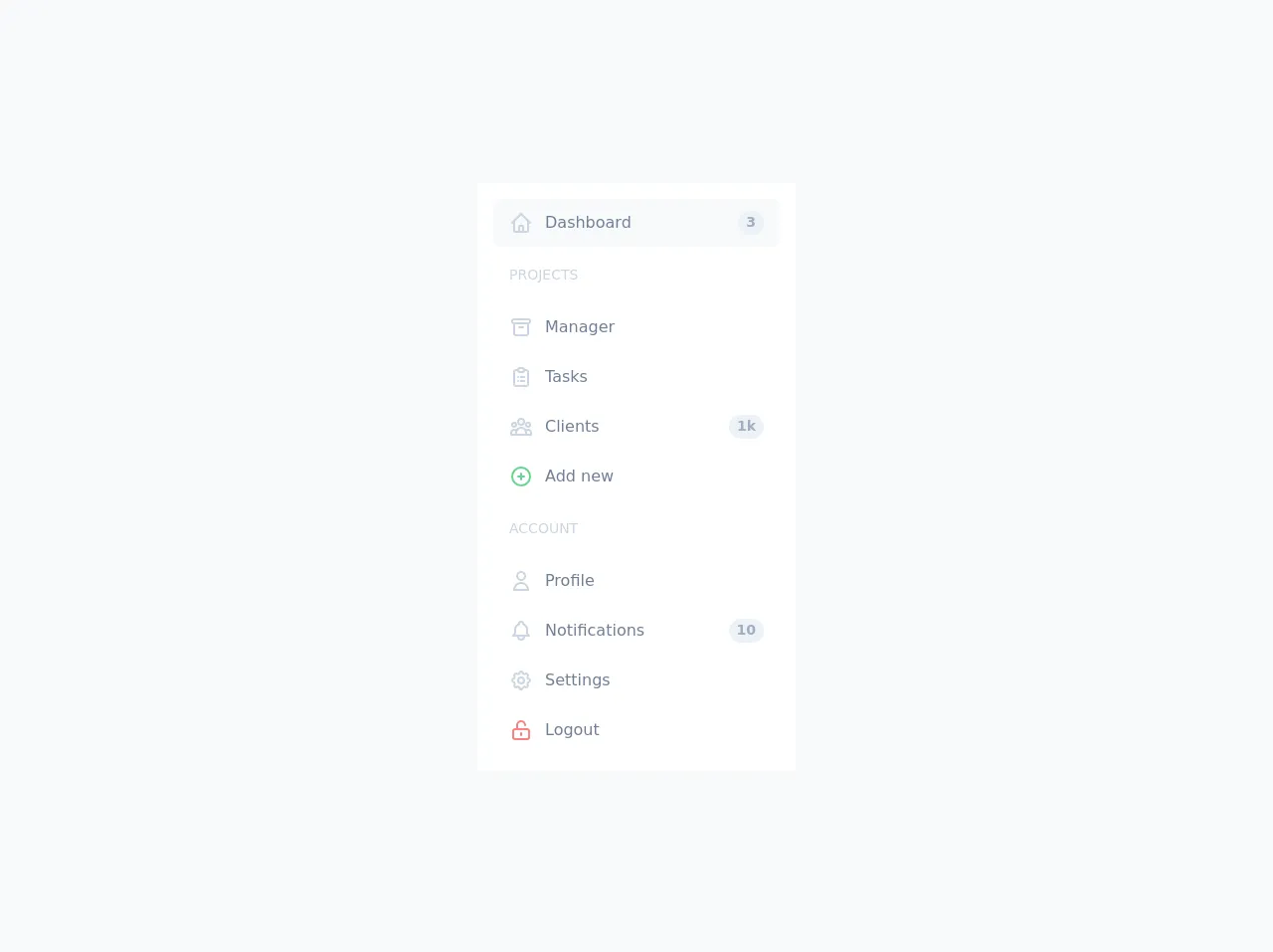
- The preview of Navigation component ui component.
- The source code of Navigation component ui component.
- How to create a Navigation component with Tailwind CSS?
- Step 1: Set up your HTML
- Step 2: Add Tailwind CSS to your project
- Step 3: Add Tailwind CSS classes to your HTML
- Step 4: Customize your Navigation component
- Conclusion
In this article, we will be discussing how to create a Navigation component using Tailwind CSS. We will cover everything from what Tailwind CSS is, to why it's the perfect choice for creating a Navigation component, to the step-by-step process of creating one.
What is Tailwind CSS?
Tailwind CSS is a utility-first CSS framework that allows you to build custom designs quickly and efficiently. It provides a set of pre-defined classes that you can use to style your HTML elements. With Tailwind CSS, you can create complex designs without having to write custom CSS code.
The description of Navigation component ui component
A Navigation component is an essential part of any website or web application. It allows users to navigate through different pages or sections of a website. A Navigation component typically consists of a menu bar that contains links to different pages or sections of a website.
Why use Tailwind CSS to create a Navigation component ui component?
Tailwind CSS is the perfect choice for creating a Navigation component because it provides a set of pre-defined classes that you can use to style your HTML elements. This means that you don't have to write custom CSS code, which saves you time and effort. Additionally, Tailwind CSS is highly customizable, which means that you can easily modify the pre-defined classes to match your design requirements.
The preview of Navigation component ui component.
To create a Navigation component using Tailwind CSS, we will be using the following HTML code:
Free download of the Navigation component's source code
The source code of Navigation component ui component.
To create a Navigation component using Tailwind CSS, we will be using the following CSS code:
<div class="min-h-screen flex items-center justify-center bg-gray-100 py-6">
		<div class="flex w-full max-w-xs p-4 bg-white">
			<ul class="flex flex-col w-full">
				<li class="my-px">
					<a href="#"
					   class="flex flex-row items-center h-12 px-4 rounded-lg text-gray-600 bg-gray-100">
						<span class="flex items-center justify-center text-lg text-gray-400">
							<svg fill="none"
								 stroke-linecap="round"
								 stroke-linejoin="round"
								 stroke-width="2"
								 viewBox="0 0 24 24"
								 stroke="currentColor"
								 class="h-6 w-6">
								<path d="M3 12l2-2m0 0l7-7 7 7M5 10v10a1 1 0 001 1h3m10-11l2 2m-2-2v10a1 1 0 01-1 1h-3m-6 0a1 1 0 001-1v-4a1 1 0 011-1h2a1 1 0 011 1v4a1 1 0 001 1m-6 0h6"></path>
							</svg>
						</span>
						<span class="ml-3">Dashboard</span>
						<span class="flex items-center justify-center text-sm text-gray-500 font-semibold bg-gray-200 h-6 px-2 rounded-full ml-auto">3</span>
					</a>
				</li>
				<li class="my-px">
					<span class="flex font-medium text-sm text-gray-400 px-4 my-4 uppercase">Projects</span>
				</li>
				<li class="my-px">
					<a href="#"
					   class="flex flex-row items-center h-12 px-4 rounded-lg text-gray-600 hover:bg-gray-100">
						<span class="flex items-center justify-center text-lg text-gray-400">
							<svg fill="none"
								 stroke-linecap="round"
								 stroke-linejoin="round"
								 stroke-width="2"
								 viewBox="0 0 24 24"
								 stroke="currentColor"
								 class="h-6 w-6">
								<path d="M5 8h14M5 8a2 2 0 110-4h14a2 2 0 110 4M5 8v10a2 2 0 002 2h10a2 2 0 002-2V8m-9 4h4"></path>
							</svg>
						</span>
						<span class="ml-3">Manager</span>
					</a>
				</li>
				<li class="my-px">
					<a href="#"
					   class="flex flex-row items-center h-12 px-4 rounded-lg text-gray-600 hover:bg-gray-100">
						<span class="flex items-center justify-center text-lg text-gray-400">
							<svg fill="none"
								 stroke-linecap="round"
								 stroke-linejoin="round"
								 stroke-width="2"
								 viewBox="0 0 24 24"
								 stroke="currentColor"
								 class="h-6 w-6">
								<path d="M9 5H7a2 2 0 00-2 2v12a2 2 0 002 2h10a2 2 0 002-2V7a2 2 0 00-2-2h-2M9 5a2 2 0 002 2h2a2 2 0 002-2M9 5a2 2 0 012-2h2a2 2 0 012 2m-3 7h3m-3 4h3m-6-4h.01M9 16h.01"></path>
							</svg>
						</span>
						<span class="ml-3">Tasks</span>
					</a>
				</li>
				<li class="my-px">
					<a href="#"
					   class="flex flex-row items-center h-12 px-4 rounded-lg text-gray-600 hover:bg-gray-100">
						<span class="flex items-center justify-center text-lg text-gray-400">
							<svg fill="none"
								 stroke-linecap="round"
								 stroke-linejoin="round"
								 stroke-width="2"
								 viewBox="0 0 24 24"
								 stroke="currentColor"
								 class="h-6 w-6">
								<path d="M17 20h5v-2a3 3 0 00-5.356-1.857M17 20H7m10 0v-2c0-.656-.126-1.283-.356-1.857M7 20H2v-2a3 3 0 015.356-1.857M7 20v-2c0-.656.126-1.283.356-1.857m0 0a5.002 5.002 0 019.288 0M15 7a3 3 0 11-6 0 3 3 0 016 0zm6 3a2 2 0 11-4 0 2 2 0 014 0zM7 10a2 2 0 11-4 0 2 2 0 014 0z"></path>
							</svg>
						</span>
						<span class="ml-3">Clients</span>
						<span class="flex items-center justify-center text-sm text-gray-500 font-semibold bg-gray-200 h-6 px-2 rounded-full ml-auto">1k</span>
					</a>
				</li>
				<li class="my-px">
					<a href="#"
					   class="flex flex-row items-center h-12 px-4 rounded-lg text-gray-600 hover:bg-gray-100">
						<span class="flex items-center justify-center text-lg text-green-400">
							<svg fill="none"
								 stroke-linecap="round"
								 stroke-linejoin="round"
								 stroke-width="2"
								 viewBox="0 0 24 24"
								 stroke="currentColor"
								 class="h-6 w-6">
								<path d="M12 9v3m0 0v3m0-3h3m-3 0H9m12 0a9 9 0 11-18 0 9 9 0 0118 0z"></path>
							</svg>
						</span>
						<span class="ml-3">Add new</span>
					</a>
				</li>
				<li class="my-px">
					<span class="flex font-medium text-sm text-gray-400 px-4 my-4 uppercase">Account</span>
				</li>
				<li class="my-px">
					<a href="#"
					   class="flex flex-row items-center h-12 px-4 rounded-lg text-gray-600 hover:bg-gray-100">
						<span class="flex items-center justify-center text-lg text-gray-400">
							<svg fill="none"
								 stroke-linecap="round"
								 stroke-linejoin="round"
								 stroke-width="2"
								 viewBox="0 0 24 24"
								 stroke="currentColor"
								 class="h-6 w-6">
								<path d="M16 7a4 4 0 11-8 0 4 4 0 018 0zM12 14a7 7 0 00-7 7h14a7 7 0 00-7-7z"></path>
							</svg>
						</span>
						<span class="ml-3">Profile</span>
					</a>
				</li>
				<li class="my-px">
					<a href="#"
					   class="flex flex-row items-center h-12 px-4 rounded-lg text-gray-600 hover:bg-gray-100">
						<span class="flex items-center justify-center text-lg text-gray-400">
							<svg fill="none"
								 stroke-linecap="round"
								 stroke-linejoin="round"
								 stroke-width="2"
								 viewBox="0 0 24 24"
								 stroke="currentColor"
								 class="h-6 w-6">
								<path d="M15 17h5l-1.405-1.405A2.032 2.032 0 0118 14.158V11a6.002 6.002 0 00-4-5.659V5a2 2 0 10-4 0v.341C7.67 6.165 6 8.388 6 11v3.159c0 .538-.214 1.055-.595 1.436L4 17h5m6 0v1a3 3 0 11-6 0v-1m6 0H9"></path>
							</svg>
						</span>
						<span class="ml-3">Notifications</span>
						<span class="flex items-center justify-center text-sm text-gray-500 font-semibold bg-gray-200 h-6 px-2 rounded-full ml-auto">10</span>
					</a>
				</li>
				<li class="my-px">
					<a href="#"
					   class="flex flex-row items-center h-12 px-4 rounded-lg text-gray-600 hover:bg-gray-100">
						<span class="flex items-center justify-center text-lg text-gray-400">
							<svg fill="none"
								 stroke-linecap="round"
								 stroke-linejoin="round"
								 stroke-width="2"
								 viewBox="0 0 24 24"
								 stroke="currentColor"
								 class="h-6 w-6">
								<path d="M10.325 4.317c.426-1.756 2.924-1.756 3.35 0a1.724 1.724 0 002.573 1.066c1.543-.94 3.31.826 2.37 2.37a1.724 1.724 0 001.065 2.572c1.756.426 1.756 2.924 0 3.35a1.724 1.724 0 00-1.066 2.573c.94 1.543-.826 3.31-2.37 2.37a1.724 1.724 0 00-2.572 1.065c-.426 1.756-2.924 1.756-3.35 0a1.724 1.724 0 00-2.573-1.066c-1.543.94-3.31-.826-2.37-2.37a1.724 1.724 0 00-1.065-2.572c-1.756-.426-1.756-2.924 0-3.35a1.724 1.724 0 001.066-2.573c-.94-1.543.826-3.31 2.37-2.37.996.608 2.296.07 2.572-1.065z"></path>
								<path d="M15 12a3 3 0 11-6 0 3 3 0 016 0z"></path>
							</svg>
						</span>
						<span class="ml-3">Settings</span>
					</a>
				</li>
				<li class="my-px">
					<a href="#"
					   class="flex flex-row items-center h-12 px-4 rounded-lg text-gray-600 hover:bg-gray-100">
						<span class="flex items-center justify-center text-lg text-red-400">
							<svg fill="none"
								 stroke-linecap="round"
								 stroke-linejoin="round"
								 stroke-width="2"
								 viewBox="0 0 24 24"
								 stroke="currentColor"
								 class="h-6 w-6">
								<path d="M8 11V7a4 4 0 118 0m-4 8v2m-6 4h12a2 2 0 002-2v-6a2 2 0 00-2-2H6a2 2 0 00-2 2v6a2 2 0 002 2z"></path>
							</svg>
						</span>
						<span class="ml-3">Logout</span>
					</a>
				</li>
			</ul>
		</div>
	</div>
How to create a Navigation component with Tailwind CSS?
Now that we have covered the basics of Tailwind CSS and why it's the perfect choice for creating a Navigation component, let's dive into the step-by-step process of creating one.
Step 1: Set up your HTML
The first step is to set up your HTML. In this example, we will be using a simple unordered list to create our Navigation component.
<nav class="bg-gray-800">
  <div class="max-w-7xl mx-auto px-2 sm:px-6 lg:px-8">
    <div class="relative flex items-center justify-between h-16">
      <div class="absolute inset-y-0 left-0 flex items-center sm:hidden">
        <!-- Mobile menu button-->
        <button type="button" class="inline-flex items-center justify-center p-2 rounded-md text-gray-400 hover:text-white hover:bg-gray-700 focus:outline-none focus:ring-2 focus:ring-inset focus:ring-white" aria-controls="mobile-menu" aria-expanded="false">
          <span class="sr-only">Open main menu</span>
          <!-- Icon when menu is closed. -->
          <!--
            Heroicon name: menu

            Menu open: "hidden", Menu closed: "block"
          -->
          <svg class="block h-6 w-6" xmlns="http://www.w3.org/2000/svg" fill="none" viewBox="0 0 24 24" stroke="currentColor" aria-hidden="true">
            <path stroke-linecap="round" stroke-linejoin="round" stroke-width="2" d="M4 6h16M4 12h16M4 18h16" />
          </svg>
          <!-- Icon when menu is open. -->
          <!--
            Heroicon name: x

            Menu open: "block", Menu closed: "hidden"
          -->
          <svg class="hidden h-6 w-6" xmlns="http://www.w3.org/2000/svg" fill="none" viewBox="0 0 24 24" stroke="currentColor" aria-hidden="true">
            <path stroke-linecap="round" stroke-linejoin="round" stroke-width="2" d="M6 18L18 6M6 6l12 12" />
          </svg>
        </button>
      </div>
      <div class="flex-1 flex items-center justify-center sm:items-stretch sm:justify-start">
        <div class="flex-shrink-0 flex items-center">
          <img class="block lg:hidden h-8 w-auto" src="https://tailwindui.com/img/logos/workflow-mark-indigo-500.svg" alt="Workflow">
          <img class="hidden lg:block h-8 w-auto" src="https://tailwindui.com/img/logos/workflow-logo-indigo-500-mark-white-text.svg" alt="Workflow">
        </div>
        <div class="hidden sm:block sm:ml-6">
          <div class="flex space-x-4">
            <!-- Current: "bg-gray-900 text-white", Default: "text-gray-300 hover:bg-gray-700 hover:text-white" -->
            <a href="#" class="bg-gray-900 text-white px-3 py-2 rounded-md text-sm font-medium">Dashboard</a>
            <a href="#" class="text-gray-300 hover:bg-gray-700 hover:text-white px-3 py-2 rounded-md text-sm font-medium">Team</a>
            <a href="#" class="text-gray-300 hover:bg-gray-700 hover:text-white px-3 py-2 rounded-md text-sm font-medium">Projects</a>
            <a href="#" class="text-gray-300 hover:bg-gray-700 hover:text-white px-3 py-2 rounded-md text-sm font-medium">Calendar</a>
          </div>
        </div>
      </div>
      <div class="absolute inset-y-0 right-0 flex items-center pr-2 sm:static sm:inset-auto sm:ml-6 sm:pr-0">
        <button class="bg-gray-800 p-1 rounded-full text-gray-400 hover:text-white focus:outline-none focus:ring-2 focus:ring-offset-2 focus:ring-offset-gray-800 focus:ring-white">
          <span class="sr-only">View notifications</span>
          <!-- Heroicon name: bell -->
          <svg class="h-6 w-6" xmlns="http://www.w3.org/2000/svg" fill="none" viewBox="0 0 24 24" stroke="currentColor" aria-hidden="true">
            <path stroke-linecap="round" stroke-linejoin="round" stroke-width="2" d="M13 10V3L4 14h7v7l9-11h-7z" />
          </svg>
        </button>

        <!-- Profile dropdown -->
        <div class="ml-3 relative">
          <div>
            <button type="button" class="bg-gray-800 flex text-sm rounded-full focus:outline-none focus:ring-2 focus:ring-offset-2 focus:ring-offset-gray-800 focus:ring-white" id="user-menu" aria-expanded="false" aria-haspopup="true">
              <span class="sr-only">Open user menu</span>
              <img class="h-8 w-8 rounded-full" src="https://avatars.githubusercontent.com/u/4574820?v=4" alt="">
            </button>
          </div>
          <!--
            Profile dropdown panel, show/hide based on dropdown state.

            Entering: "transition ease-out duration-100"
              From: "transform opacity-0 scale-95"
              To: "transform opacity-100 scale-100"
            Leaving: "transition ease-in duration-75"
              From: "transform opacity-100 scale-100"
              To: "transform opacity-0 scale-95"
          -->
          <div class="hidden origin-top-right absolute right-0 mt-2 w-48 rounded-md shadow-lg py-1 bg-white ring-1 ring-black ring-opacity-5" role="menu" aria-orientation="vertical" aria-labelledby="user-menu">
            <a href="#" class="block px-4 py-2 text-sm text-gray-700 hover:bg-gray-100" role="menuitem">Your Profile</a>
            <a href="#" class="block px-4 py-2 text-sm text-gray-700 hover:bg-gray-100" role="menuitem">Settings</a>
            <a href="#" class="block px-4 py-2 text-sm text-gray-700 hover:bg-gray-100" role="menuitem">Sign out</a>
          </div>
        </div>
      </div>
    </div>
  </div>

  <!-- Mobile menu, show/hide based on menu state. -->
  <div class="sm:hidden" id="mobile-menu">
    <div class="px-2 pt-2 pb-3 space-y-1">
      <!-- Current: "bg-gray-900 text-white", Default: "text-gray-300 hover:bg-gray-700 hover:text-white" -->
      <a href="#" class="bg-gray-900 text-white block px-3 py-2 rounded-md text-base font-medium">Dashboard</a>
      <a href="#" class="text-gray-300 hover:bg-gray-700 hover:text-white block px-3 py-2 rounded-md text-base font-medium">Team</a>
      <a href="#" class="text-gray-300 hover:bg-gray-700 hover:text-white block px-3 py-2 rounded-md text-base font-medium">Projects</a>
      <a href="#" class="text-gray-300 hover:bg-gray-700 hover:text-white block px-3 py-2 rounded-md text-base font-medium">Calendar</a>
    </div>
  </div>
</nav>
Step 2: Add Tailwind CSS to your project
The next step is to add Tailwind CSS to your project. You can either download the CSS file from the official website or use a package manager like npm or yarn to install it.
Step 3: Add Tailwind CSS classes to your HTML
Now that we have set up our HTML and added Tailwind CSS to our project, we can start adding Tailwind CSS classes to our HTML elements. In this example, we will be using the following classes:
bg-gray-800: sets the background color of the Navigation component to gray-800.max-w-7xl: sets the maximum width of the Navigation component to 7xl.mx-auto: centers the Navigation component horizontally.px-2: adds padding to the left and right of the Navigation component.sm:px-6: adds more padding to the left and right of the Navigation component on small screens.lg:px-8: adds even more padding to the left and right of the Navigation component on large screens.relative: sets the position of the Navigation component to relative.flex: sets the display property of the Navigation component to flex.items-center: centers the Navigation component vertically.justify-between: distributes the Navigation component items evenly along the horizontal axis.h-16: sets the height of the Navigation component to 16.absolute: sets the position of the Navigation component to absolute.inset-y-0: positions the Navigation component at the top and bottom of the parent element.left-0: positions the Navigation component at the left of the parent element.hidden: hides the element on small screens.flex-shrink-0: prevents the element from shrinking.sm:hidden: hides the element on small screens.sm:ml-6: adds margin to the left of the element on small screens.sm:block: displays the element on small screens.space-x-4: adds space between the Navigation component items.text-gray-300: sets the text color of the Navigation component items to gray-300.hover:bg-gray-700: sets the background color of the Navigation component items to gray-700 on hover.hover:text-white: sets the text color of the Navigation component items to white on hover.px-3: adds padding to the left and right of the Navigation component items.py-2: adds padding to the top and bottom of the Navigation component items.rounded-md: rounds the corners of the Navigation component items.text-sm: sets the font size of the Navigation component items to sm.font-medium: sets the font weight of the Navigation component items to medium.bg-gray-900: sets the background color of the Navigation component items to gray-900.text-white: sets the text color of the Navigation component items to white.block: sets the display property of the Navigation component items to block.sm:hidden: hides the element on small screens.sm:block: displays the element on small screens.sm:ml-6: adds margin to the left of the element on small screens.sm:static: sets the position of the element to static on small screens.sm:inset-auto: positions the element at the center of the parent element on small screens.sm:pr-0: removes the padding from the right of the element on small screens.bg-gray-800: sets the background color of the element to gray-800.p-1: adds padding to the element.rounded-full: rounds the corners of the element.text-gray-400: sets the text color of the element to gray-400.hover:text-white: sets the text color of the element to white on hover.focus:outline-none: removes the outline from the element on focus.focus:ring-2: adds a ring around the element on focus.focus:ring-offset-2: adds an offset to the ring around the element on focus.focus:ring-offset-gray-800: sets the color of the offset ring to gray-800.focus:ring-white: sets the color of the ring to white.ml-3: adds margin to the left of the element.relative: sets the position of the element to relative.rounded-full: rounds the corners of the element.focus:outline-none: removes the outline from the element on focus.focus:ring-2: adds a ring around the element on focus.focus:ring-offset-2: adds an offset to the ring around the element on focus.focus:ring-offset-gray-800: sets the color of the offset ring to gray-800.focus:ring-white: sets the color of the ring to white.hidden: hides the element.origin-top-right: sets the origin of the element to the top-right corner.absolute: sets the position of the element to absolute.right-0: positions the element at the right of the parent element.mt-2: adds margin to the top of the element.w-48: sets the width of the element to 48.rounded-md: rounds the corners of the element.shadow-lg: adds a shadow to the element.py-1: adds padding to the top and bottom of the element.bg-white: sets the background color of the element to white.ring-1: adds a ring around the element.ring-black: sets the color of the ring to black.ring-opacity-5: sets the opacity of the ring to 5.role="menu": sets the role of the element to menu.aria-orientation="vertical": sets the orientation of the element to vertical.aria-labelledby="user-menu": sets the label of the element to user-menu.block: sets the display property of the element to block.px-4: adds padding to the left and right of the element.py-2: adds padding to the top and bottom of the element.text-sm: sets the font size of the element to sm.text-gray-700: sets the text color of the element to gray-700.hover:bg-gray-100: sets the background color of the element to gray-100 on hover.origin-top-right: sets the origin of the element to the top-right corner.absolute: sets the position of the element to absolute.right-0: positions the element at the right of the parent element.
Step 4: Customize your Navigation component
Tailwind CSS is highly customizable, which means that you can easily modify the pre-defined classes to match your design requirements. For example, you can change the background color of the Navigation component by modifying the bg-gray-800 class.
Conclusion
In this article, we have discussed how to create a Navigation component using Tailwind CSS. We have covered everything from what Tailwind CSS is, to why it's the perfect choice for creating a Navigation component, to the step-by-step process of creating one. With Tailwind CSS, you can create complex designs quickly and efficiently, without having to write custom CSS code.