- Published on
Ultimate Guide: Make A Navigation Blog With Dropdown + Search And Logo With Tailwind CSS
- What is Tailwind CSS?
- The description of Navigation Blog With Dropdown + Search and Logo ui component
- Why use Tailwind CSS to create a Navigation Blog With Dropdown + Search and Logo ui component?
- The preview of Navigation Blog With Dropdown + Search and Logo ui component.
- The source code of Navigation Blog With Dropdown + Search and Logo ui component.
- How to create a Navigation Blog With Dropdown + Search and Logo with Tailwind CSS?
- Step 1: Create the HTML structure
- Step 2: Add Tailwind CSS classes
- Step 3: Customize the design
- Conclusion
In the world of web development, creating a navigation menu with dropdowns, search, and logo can be a daunting task. However, with the help of Tailwind CSS, a utility-first CSS framework, it becomes much easier. In this article, we will guide you through the process of creating a navigation blog with dropdowns, search, and logo using Tailwind CSS.
What is Tailwind CSS?
Tailwind CSS is a utility-first CSS framework that allows you to create custom designs without writing any CSS code. It provides a set of pre-defined CSS classes that can be used to style HTML elements. With Tailwind CSS, you can create complex layouts and designs with ease.
The description of Navigation Blog With Dropdown + Search and Logo ui component
A navigation blog with dropdowns, search, and logo is a common UI component used in many websites. It allows users to navigate through different sections of the website, search for specific content, and return to the homepage by clicking on the logo.
Why use Tailwind CSS to create a Navigation Blog With Dropdown + Search and Logo ui component?
Tailwind CSS provides a set of pre-defined CSS classes that can be used to create a navigation blog with dropdowns, search, and logo. This saves time and effort in writing custom CSS code. Additionally, Tailwind CSS is highly customizable, allowing you to create a unique design for your website.
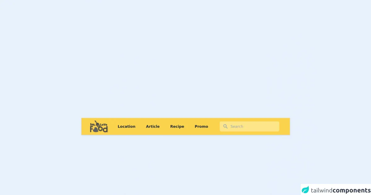
The preview of Navigation Blog With Dropdown + Search and Logo ui component.
To create a navigation blog with dropdowns, search, and logo, we will use Tailwind CSS. Here is a preview of what the final UI component will look like:
Free download of the Navigation Blog With Dropdown + Search and Logo's source code
The source code of Navigation Blog With Dropdown + Search and Logo ui component.
To create a navigation blog with dropdowns, search, and logo, we will use HTML and Tailwind CSS. Here is the source code for the UI component:
<script src="//unpkg.com/alpinejs" defer></script>
<nav
class="z-0 relative"
x-data="{open:false,menu:false, lokasi:false}">
  <div class="relative z-10 bg-yellow-300 shadow">
    <div class="max-w-7xl mx-auto px-2 sm:px-4 lg:px-8">
      <div class="relative flex items-center justify-between h-16">
        <div class="flex items-center px-2 lg:px-0">
          <a class="flex-shrink-0" href="#">
            <img class="block lg:hidden h-12 w-16" src="https://imlovefood.com/wp-content/themes/mypanganthema/img/logo_small.png" alt="Logo">
            <img class="hidden lg:block h-12 w-auto" src="https://imlovefood.com/wp-content/themes/mypanganthema/img/logo_small_gray.png" alt="Logo">
          </a>
          <div class="hidden lg:block lg:ml-2">
            <div class="flex">
              <a href="#" class="ml-4 px-3 py-2 rounded-md text-sm leading-5 font-medium text-gray-800 font-semibold hover:bg-yellow-500 hover:text-white transition duration-150 ease-in-out cursor-pointer focus:outline-none focus:text-white focus:bg-gray-700 "> Location </a>
              <a href="#" class="ml-4 px-3 py-2 rounded-md text-sm leading-5 font-medium text-gray-800 font-semibold hover:bg-yellow-500 hover:text-white transition duration-150 ease-in-out cursor-pointer focus:outline-none focus:text-white focus:bg-gray-700 "> Article </a>
              <a href="#" class="ml-4 px-3 py-2 rounded-md text-sm leading-5 font-medium text-gray-800 font-semibold hover:bg-yellow-500 hover:text-white transition duration-150 ease-in-out cursor-pointer focus:outline-none focus:text-white focus:bg-gray-700 "> Recipe </a>
              <a href="#" class="ml-4 px-3 py-2 rounded-md text-sm leading-5 font-medium text-gray-800 font-semibold hover:bg-yellow-500 hover:text-white transition duration-150 ease-in-out cursor-pointer focus:outline-none focus:text-white focus:bg-gray-700 "> Promo </a>
            </div>
          </div>
        </div>
        <div class="flex-1 flex justify-center px-2 lg:ml-6 lg:justify-end">
          <div class="max-w-lg w-full lg:max-w-xs">
            <label for="search" class="sr-only">Search </label>
            <form methode="get" action="#" class="relative z-50">
              <button type="submit" id="searchsubmit" class="absolute inset-y-0 left-0 pl-3 flex items-center pointer-events-none">
                <svg class="h-5 w-5 text-gray-400" fill="currentColor" viewBox="0 0 20 20">
                  <path fill-rule="evenodd" d="M8 4a4 4 0 100 8 4 4 0 000-8zM2 8a6 6 0 1110.89 3.476l4.817 4.817a1 1 0 01-1.414 1.414l-4.816-4.816A6 6 0 012 8z" clip-rule="evenodd"></path>
                </svg>
              </button>
              <input type="text" name="s" id="s" class="block w-full pl-10 pr-3 py-2 border border-transparent rounded-md leading-5 bg-yellow-200 text-gray-300 placeholder-gray-400 focus:outline-none focus:bg-white focus:text-gray-900 sm:text-sm transition duration-150 ease-in-out" placeholder="Search">
            </form>
          </div>
        </div>
        <div class="flex lg:hidden">
          <button @click="menu=!menu" class="inline-flex items-center justify-center p-2 rounded-md text-gray-400 hover:text-white hover:bg-gray-700 focus:outline-none focus:bg-gray-700 focus:text-white transition duration-150 ease-in-out" aria-label="Main menu" aria-expanded="false">
            <svg class="block h-6 w-6" xmlns="http://www.w3.org/2000/svg" fill="none" viewBox="0 0 24 24" stroke="currentColor">
              <path stroke-linecap="round" stroke-linejoin="round" stroke-width="2" d="M4 6h16M4 12h16M4 18h16"></path>
            </svg>
            <svg class="hidden h-6 w-6" xmlns="http://www.w3.org/2000/svg" fill="none" viewBox="0 0 24 24" stroke="currentColor">
              <path stroke-linecap="round" stroke-linejoin="round" stroke-width="2" d="M6 18L18 6M6 6l12 12"></path>
            </svg>
          </button>
        </div>
      </div>
    </div>
    <div x-show="menu" class="block md:hidden">
      <div class="px-2 pt-2 pb-3">
        <a href="#" class="mt-1 block px-3 py-2 rounded-md text-white font-semibold font-medium hover:bg-yellow-500 focus:outline-none focus:text-white focus:bg-gray-700 transition duration-150 ease-in-out">Location </a>
        <a href="#" class="mt-1 block px-3 py-2 rounded-md text-white font-semibold font-medium hover:bg-yellow-500 focus:outline-none focus:text-white focus:bg-gray-700 transition duration-150 ease-in-out">Article </a>
        <a href="#" class="mt-1 block px-3 py-2 rounded-md text-white font-semibold font-medium hover:bg-yellow-500 focus:outline-none focus:text-white focus:bg-gray-700 transition duration-150 ease-in-out">Recipe </a>
        <a href="#" class="mt-1 block px-3 py-2 rounded-md text-white font-semibold font-medium hover:bg-yellow-500 focus:outline-none focus:text-white focus:bg-gray-700 transition duration-150 ease-in-out">Promo </a>
      </div>
    </div>
  </div>
</nav>
How to create a Navigation Blog With Dropdown + Search and Logo with Tailwind CSS?
Now that we have an idea of what we are going to create, let's dive into the steps to create a navigation blog with dropdowns, search, and logo using Tailwind CSS.
Step 1: Create the HTML structure
The first step is to create the HTML structure for the navigation blog. We will use a nav element to wrap the navigation menu and a ul element to create a list of navigation items. Here is the HTML code:
<nav class="bg-gray-800">
  <div class="max-w-7xl mx-auto px-2 sm:px-6 lg:px-8">
    <div class="relative flex items-center justify-between h-16">
      <div class="flex-1 flex items-center justify-center sm:items-stretch sm:justify-start">
        <div class="flex-shrink-0">
          <a href="#" class="text-white font-bold text-xl">Logo</a>
        </div>
        <div class="hidden sm:block sm:ml-6">
          <ul class="flex space-x-4">
            <li><a href="#" class="text-gray-300 hover:bg-gray-700 hover:text-white px-3 py-2 rounded-md text-sm font-medium">Home</a></li>
            <li>
              <a href="#" class="text-gray-300 hover:bg-gray-700 hover:text-white px-3 py-2 rounded-md text-sm font-medium">Dropdown</a>
              <div class="hidden bg-gray-700 text-white absolute z-50 right-0 mt-2 py-2 w-48 rounded-md shadow-lg">
                <a href="#" class="block px-4 py-2 text-sm text-gray-300 hover:bg-gray-900">Option 1</a>
                <a href="#" class="block px-4 py-2 text-sm text-gray-300 hover:bg-gray-900">Option 2</a>
                <a href="#" class="block px-4 py-2 text-sm text-gray-300 hover:bg-gray-900">Option 3</a>
              </div>
            </li>
            <li><a href="#" class="text-gray-300 hover:bg-gray-700 hover:text-white px-3 py-2 rounded-md text-sm font-medium">Search</a></li>
          </ul>
        </div>
      </div>
    </div>
  </div>
</nav>
In this code, we have created a navigation menu with a logo, home link, dropdown link, and search link. The dropdown link has a dropdown menu that appears when the user hovers over it.
Step 2: Add Tailwind CSS classes
Now that we have created the HTML structure, we can add Tailwind CSS classes to style the navigation blog. Here is the updated HTML code with Tailwind CSS classes:
<nav class="bg-gray-800">
  <div class="max-w-7xl mx-auto px-2 sm:px-6 lg:px-8">
    <div class="relative flex items-center justify-between h-16">
      <div class="flex-1 flex items-center justify-center sm:items-stretch sm:justify-start">
        <div class="flex-shrink-0">
          <a href="#" class="text-white font-bold text-xl">Logo</a>
        </div>
        <div class="hidden sm:block sm:ml-6">
          <ul class="flex space-x-4">
            <li><a href="#" class="text-gray-300 hover:bg-gray-700 hover:text-white px-3 py-2 rounded-md text-sm font-medium">Home</a></li>
            <li class="relative">
              <a href="#" class="text-gray-300 hover:bg-gray-700 hover:text-white px-3 py-2 rounded-md text-sm font-medium">Dropdown</a>
              <div class="hidden bg-gray-700 text-white absolute z-50 right-0 mt-2 py-2 w-48 rounded-md shadow-lg">
                <a href="#" class="block px-4 py-2 text-sm text-gray-300 hover:bg-gray-900">Option 1</a>
                <a href="#" class="block px-4 py-2 text-sm text-gray-300 hover:bg-gray-900">Option 2</a>
                <a href="#" class="block px-4 py-2 text-sm text-gray-300 hover:bg-gray-900">Option 3</a>
              </div>
            </li>
            <li><a href="#" class="text-gray-300 hover:bg-gray-700 hover:text-white px-3 py-2 rounded-md text-sm font-medium">Search</a></li>
          </ul>
        </div>
      </div>
    </div>
  </div>
</nav>
In this code, we have added Tailwind CSS classes to style the navigation blog. We have used classes such as bg-gray-800 to set the background color, text-white to set the text color, rounded-md to set the border radius, and shadow-lg to add a shadow effect.
Step 3: Customize the design
Tailwind CSS provides a wide range of customization options that allow you to create a unique design for your website. You can customize the colors, fonts, spacing, and more. Here is an example of how you can customize the design of the navigation blog:
<nav class="bg-purple-800">
  <div class="max-w-7xl mx-auto px-2 sm:px-6 lg:px-8">
    <div class="relative flex items-center justify-between h-16">
      <div class="flex-1 flex items-center justify-center sm:items-stretch sm:justify-start">
        <div class="flex-shrink-0">
          <a href="#" class="text-white font-bold text-xl">Logo</a>
        </div>
        <div class="hidden sm:block sm:ml-6">
          <ul class="flex space-x-4">
            <li><a href="#" class="text-gray-300 hover:bg-purple-700 hover:text-white px-3 py-2 rounded-md text-sm font-medium">Home</a></li>
            <li class="relative">
              <a href="#" class="text-gray-300 hover:bg-purple-700 hover:text-white px-3 py-2 rounded-md text-sm font-medium">Dropdown</a>
              <div class="hidden bg-purple-700 text-white absolute z-50 right-0 mt-2 py-2 w-48 rounded-md shadow-lg">
                <a href="#" class="block px-4 py-2 text-sm text-gray-300 hover:bg-purple-900">Option 1</a>
                <a href="#" class="block px-4 py-2 text-sm text-gray-300 hover:bg-purple-900">Option 2</a>
                <a href="#" class="block px-4 py-2 text-sm text-gray-300 hover:bg-purple-900">Option 3</a>
              </div>
            </li>
            <li><a href="#" class="text-gray-300 hover:bg-purple-700 hover:text-white px-3 py-2 rounded-md text-sm font-medium">Search</a></li>
          </ul>
        </div>
      </div>
    </div>
  </div>
</nav>
In this code, we have customized the design of the navigation blog by changing the background color to bg-purple-800, the hover color to hover:bg-purple-700, and the font size to text-sm.
Conclusion
In this article, we have shown you how to create a navigation blog with dropdowns, search, and logo using Tailwind CSS. We started by creating the HTML structure and then added Tailwind CSS classes to style the navigation blog. We also showed you how to customize the design to create a unique look for your website. With the help of Tailwind CSS, creating a navigation blog with dropdowns, search, and logo has never been easier.