- Published on
The Ultimate Guide To Help You Create A Navbar With Tagline And Logo With Tailwind CSS
- What is Tailwind CSS?
- The description of Navbar with Tagline and Logo ui component
- Why use Tailwind CSS to create a Navbar with Tagline and Logo ui component?
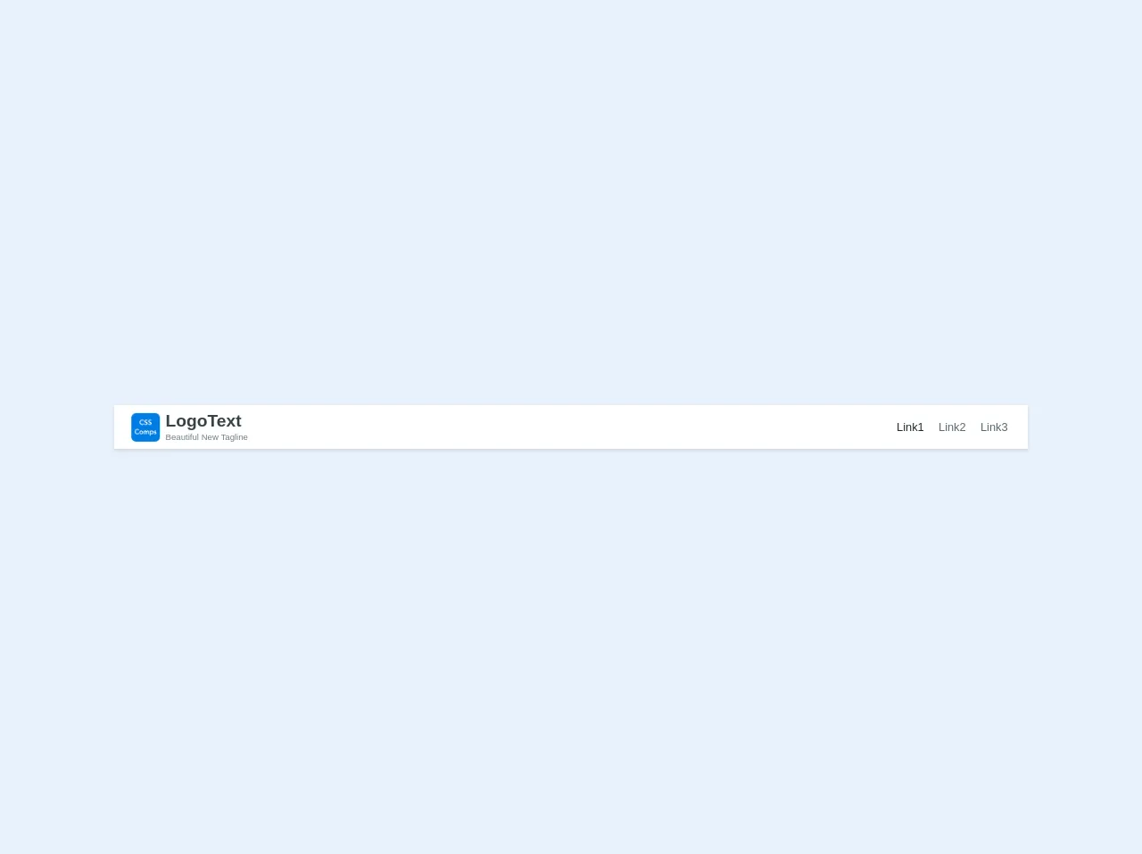
- The preview of Navbar with Tagline and Logo ui component.
- The source code of Navbar with Tagline and Logo ui component.
- How to create a Navbar with Tagline and Logo with Tailwind CSS?
- Conclusion
What is Tailwind CSS?
Tailwind CSS is a utility-first CSS framework that helps you quickly build custom designs without having to write CSS from scratch. It provides a set of pre-defined classes that you can use to style your HTML elements. With Tailwind CSS, you can create responsive and mobile-first designs easily.
The description of Navbar with Tagline and Logo ui component
A Navbar with Tagline and Logo is a user interface component that is commonly used in web applications. It is a navigation bar that contains a logo and a tagline. The logo is usually placed on the left side of the navbar, while the tagline is placed on the right side. The Navbar with Tagline and Logo ui component is a great way to enhance the branding of your website and make it more memorable to your users.
Why use Tailwind CSS to create a Navbar with Tagline and Logo ui component?
Tailwind CSS is a great choice for creating a Navbar with Tagline and Logo ui component because it provides a set of pre-defined classes that you can use to style your HTML elements. With Tailwind CSS, you can easily create a responsive Navbar with Tagline and Logo that looks great on all devices.
The preview of Navbar with Tagline and Logo ui component.
To create a Navbar with Tagline and Logo using Tailwind CSS, you can use the following HTML code:
<nav class="bg-gray-800">
  <div class="max-w-7xl mx-auto px-2 sm:px-6 lg:px-8">
    <div class="flex items-center justify-between h-16">
      <div class="flex-shrink-0">
        <img class="h-8 w-8" src="logo.png" alt="Logo">
      </div>
      <div class="flex-1 flex items-center justify-center sm:items-stretch sm:justify-start">
        <div class="hidden sm:block sm:ml-6">
          <div class="flex space-x-4">
            <a href="#" class="text-gray-300 hover:bg-gray-700 hover:text-white px-3 py-2 rounded-md text-sm font-medium">Home</a>
            <a href="#" class="text-gray-300 hover:bg-gray-700 hover:text-white px-3 py-2 rounded-md text-sm font-medium">About</a>
            <a href="#" class="text-gray-300 hover:bg-gray-700 hover:text-white px-3 py-2 rounded-md text-sm font-medium">Contact</a>
          </div>
        </div>
      </div>
      <div class="flex items-center">
        <div class="ml-4">
          <div class="text-sm font-medium text-gray-300">Your tagline goes here</div>
        </div>
      </div>
    </div>
  </div>
</nav>
Free download of the Navbar with Tagline and Logo's source code
The source code of Navbar with Tagline and Logo ui component.
To create a Navbar with Tagline and Logo using Tailwind CSS, you can use the following HTML code:
<nav class="bg-gray-800">
  <div class="max-w-7xl mx-auto px-2 sm:px-6 lg:px-8">
    <div class="flex items-center justify-between h-16">
      <div class="flex-shrink-0">
        <img class="h-8 w-8" src="logo.png" alt="Logo">
      </div>
      <div class="flex-1 flex items-center justify-center sm:items-stretch sm:justify-start">
        <div class="hidden sm:block sm:ml-6">
          <div class="flex space-x-4">
            <a href="#" class="text-gray-300 hover:bg-gray-700 hover:text-white px-3 py-2 rounded-md text-sm font-medium">Home</a>
            <a href="#" class="text-gray-300 hover:bg-gray-700 hover:text-white px-3 py-2 rounded-md text-sm font-medium">About</a>
            <a href="#" class="text-gray-300 hover:bg-gray-700 hover:text-white px-3 py-2 rounded-md text-sm font-medium">Contact</a>
          </div>
        </div>
      </div>
      <div class="flex items-center">
        <div class="ml-4">
          <div class="text-sm font-medium text-gray-300">Your tagline goes here</div>
        </div>
      </div>
    </div>
  </div>
</nav>
<nav class="font-sans flex flex-col text-center content-center sm:flex-row sm:text-left sm:justify-between py-2 px-6 bg-white shadow sm:items-baseline w-full">

  <div class="mb-2 sm:mb-0 flex flex-row
  ">
    <div class="h-10 w-10 self-center mr-2">
      <img class="h-10 w-10 self-center" src="https://csscomps.com/images/csscomps.png" />
    </div>
    <div>
      <a href="/home" class="text-2xl no-underline text-grey-darkest hover:text-blue-dark font-sans font-bold">LogoText</a><br>
      <span class="text-xs text-grey-dark">Beautiful New Tagline</span>
    </div>
  </div>

  <div class="sm:mb-0 self-center">
    <!-- <div class="h-10" style="display: table-cell, vertical-align: middle;"> -->
    <a href="#" class="text-md no-underline text-black hover:text-blue-dark ml-2 px-1">Link1</a>
    <a href="#" class="text-md no-underline text-grey-darker hover:text-blue-dark ml-2 px-1">Link2</a>
    <!-- <a href="/two" class="text-lg no-underline text-grey-darkest hover:text-blue-dark ml-2">About Us</a> -->
    <a href="#" class="text-md no-underline text-grey-darker hover:text-blue-dark ml-2 px-1">Link3</a>
    <!-- </div> -->

  </div>
</nav>
How to create a Navbar with Tagline and Logo with Tailwind CSS?
To create a Navbar with Tagline and Logo with Tailwind CSS, you can follow these steps:
- Create a new HTML file and add the following code to it:
<nav class="bg-gray-800">
  <div class="max-w-7xl mx-auto px-2 sm:px-6 lg:px-8">
    <div class="flex items-center justify-between h-16">
      <div class="flex-shrink-0">
        <img class="h-8 w-8" src="logo.png" alt="Logo">
      </div>
      <div class="flex-1 flex items-center justify-center sm:items-stretch sm:justify-start">
        <div class="hidden sm:block sm:ml-6">
          <div class="flex space-x-4">
            <a href="#" class="text-gray-300 hover:bg-gray-700 hover:text-white px-3 py-2 rounded-md text-sm font-medium">Home</a>
            <a href="#" class="text-gray-300 hover:bg-gray-700 hover:text-white px-3 py-2 rounded-md text-sm font-medium">About</a>
            <a href="#" class="text-gray-300 hover:bg-gray-700 hover:text-white px-3 py-2 rounded-md text-sm font-medium">Contact</a>
          </div>
        </div>
      </div>
      <div class="flex items-center">
        <div class="ml-4">
          <div class="text-sm font-medium text-gray-300">Your tagline goes here</div>
        </div>
      </div>
    </div>
  </div>
</nav>
Save the file as index.html.
Add the Tailwind CSS stylesheet to your HTML file by adding the following code to the head section of your HTML file:
<link rel="stylesheet" href="https://cdnjs.cloudflare.com/ajax/libs/tailwindcss/2.2.16/tailwind.min.css" integrity="sha512-4K4fLr8VJ+J0lYKt0F4L7gQIhVWj2A9Qv3Eo1r3n0gH8j1sUd7x7L5qXsXzLhI4zvJZ2KfYl7zP3vHsKgF2y3Q==" crossorigin="anonymous" referrerpolicy="no-referrer" />
- Open the index.html file in your web browser and you should see the Navbar with Tagline and Logo.
Conclusion
In this article, we have discussed how to create a Navbar with Tagline and Logo using Tailwind CSS. We have seen that Tailwind CSS is a great choice for creating responsive and mobile-first designs. By following the steps outlined in this article, you can easily create a Navbar with Tagline and Logo for your web application.