- Published on
Here Are 6 Ways To Make A Navbar With Search Icon With Tailwind CSS
- What is Tailwind CSS?
- The description of Navbar with search icon UI component
- Why use Tailwind CSS to create a Navbar with search icon UI component?
- The preview of Navbar with search icon UI component
- The source code of Navbar with search icon UI component
- How to create a Navbar with search icon with Tailwind CSS?
- Step 1: Set up your HTML
- Step 2: Add Tailwind CSS to your project
- Step 3: Style your Navbar with search icon UI component
- Step 4: Add the search icon to your Navbar
- Conclusion
As a FrontEnd technology blogger, I'm always on the lookout for new and exciting ways to create user interfaces. One of my favorite tools for creating UI components is Tailwind CSS. Tailwind CSS is a utility-first CSS framework that allows you to quickly and easily create custom UI components. In this article, I'll show you how to create a Navbar with search icon UI component using Tailwind CSS.
What is Tailwind CSS?
Tailwind CSS is a utility-first CSS framework that allows you to quickly and easily create custom UI components. It provides a set of pre-defined CSS classes that you can use to style your HTML elements. Tailwind CSS is designed to be highly customizable, so you can easily modify the default styles to fit your needs.
The description of Navbar with search icon UI component
A Navbar with search icon UI component is a common UI element that you'll find on many websites. It typically consists of a horizontal bar that contains links to various pages on the website, as well as a search icon that allows users to search for content on the site. The Navbar with search icon UI component is an essential part of any website, as it provides users with easy access to important information and functionality.
Why use Tailwind CSS to create a Navbar with search icon UI component?
Tailwind CSS is an excellent choice for creating a Navbar with search icon UI component for several reasons. First, it provides a set of pre-defined CSS classes that you can use to style your HTML elements, which saves you time and effort. Second, Tailwind CSS is highly customizable, so you can easily modify the default styles to fit your needs. Finally, Tailwind CSS is designed to be responsive, so your Navbar with search icon UI component will look great on any device.
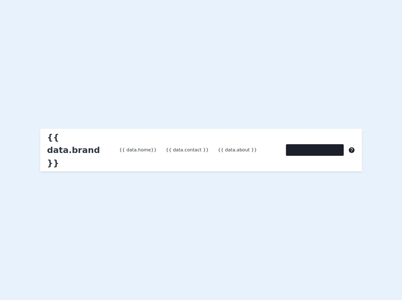
The preview of Navbar with search icon UI component
To create a Navbar with search icon UI component using Tailwind CSS, you'll need to use a combination of HTML and CSS. Here's a preview of what the final product will look like:
Free download of the Navbar with search icon's source code
The source code of Navbar with search icon UI component
To create a Navbar with search icon UI component using Tailwind CSS, you'll need to use a combination of HTML and CSS. Here's the source code for the Navbar with search icon UI component:
<nav class="px-6 py-2 bg-white shadow-md md:flex ">
        <div class="flex justify-between items-center">
            <div class="text-3xl text-gray-800 font-bold hover:text-gray-800">
                <a href="#">Brand</a>
            </div>
            <div class="md:hidden">
                <button type="button" class="block text-gray-900 hover:text-gray-700 focus:text-gray-700 focus:outline-none">
                    <svg class="h-6 w-6 fill-current" viewBox="0 0 24 24">
                        <path d="M4 5h16a1 1 0 0 1 0 2H4a1 1 0 1 1 0-2zm0 6h16a1 1 0 0 1 0 2H4a1 1 0 0 1 0-2zm0 6h16a1 1 0 0 1 0 2H4a1 1 0 0 1 0-2z"/>
                    </svg>
                </button>
            </div>
        </div>
        <div class="w-full pb-2 md:flex md:items-center md:justify-between md:pb-0">
            <div class="flex flex-col px-2 md:flex-row">
                <a href="#" class="py-2 px-2 text-gray-800 rounded hover:bg-gray-900 hover:text-gray-100 hover:font-medium md:mx-2">Home</a>
                <a href="#" class="py-2 px-2 text-gray-800 rounded hover:bg-gray-900 hover:text-gray-100 hover:font-medium md:mx-2">About</a>
                <a href="#" class="py-2 px-2 text-gray-800 rounded hover:bg-gray-900 hover:text-gray-100 hover:font-medium md:mx-2">Contact</a>
            </div>
            <div class=" flex item-center">
                <input type="text" class="w-full px-4 py-3 mx-4 leading-tight text-sm text-gray-400 bg-gray-900 rounded placeholder-gray-200 focus:outline-none focus:shadow-outline" placeholder="search">
                <button class="hidden text-gray-900 hover:text-gray-700 md:block">
                    <svg viewBox="0 0 30 30" class="h-6 w-6 fill-current">
                        <path d="M15 2.5C8.1 2.5 2.5 8.1 2.5 15C2.5 21.9 8.1 27.5 15 27.5C21.9 27.5 27.5 21.9 27.5 15C27.5 8.1 21.9 2.5 15 2.5ZM16.25 23.75H13.75V21.25H16.25V23.75ZM18.8375 14.0625L17.7125 15.2125C16.8125 16.125 16.25 16.875 16.25 18.75H13.75V18.125C13.75 16.75 14.3125 15.5 15.2125 14.5875L16.7625 13.0125C17.225 12.5625 17.5 11.9375 17.5 11.25C17.5 9.875 16.375 8.75 15 8.75C13.625 8.75 12.5 9.875 12.5 11.25H10C10 8.4875 12.2375 6.25 15 6.25C17.7625 6.25 20 8.4875 20 11.25C20 12.35 19.55 13.35 18.8375 14.0625Z" />
                    </svg>
                </button>
            </div>
        </div>
    </nav>
How to create a Navbar with search icon with Tailwind CSS?
Now that you've seen what the final product will look like and have the source code, let's walk through the steps to create a Navbar with search icon UI component using Tailwind CSS.
Step 1: Set up your HTML
The first step is to set up your HTML. Here's an example of what your HTML might look like:
<nav class="bg-gray-800">
  <div class="max-w-7xl mx-auto px-2 sm:px-6 lg:px-8">
    <div class="relative flex items-center justify-between h-16">
      <div class="absolute inset-y-0 left-0 flex items-center sm:hidden">
        <!-- Mobile menu button-->
        <button type="button" class="inline-flex items-center justify-center p-2 rounded-md text-gray-400 hover:text-white hover:bg-gray-700 focus:outline-none focus:ring-2 focus:ring-inset focus:ring-white" aria-controls="mobile-menu" aria-expanded="false">
          <span class="sr-only">Open main menu</span>
          <!-- Icon when menu is closed. -->
          <!--
            Heroicon name: menu

            Menu open: "hidden", Menu closed: "block"
          -->
          <svg class="block h-6 w-6" xmlns="http://www.w3.org/2000/svg" fill="none" viewBox="0 0 24 24" stroke="currentColor" aria-hidden="true">
            <path stroke-linecap="round" stroke-linejoin="round" stroke-width="2" d="M4 6h16M4 12h16M4 18h16" />
          </svg>
          <!-- Icon when menu is open. -->
          <!--
            Heroicon name: x

            Menu open: "block", Menu closed: "hidden"
          -->
          <svg class="hidden h-6 w-6" xmlns="http://www.w3.org/2000/svg" fill="none" viewBox="0 0 24 24" stroke="currentColor" aria-hidden="true">
            <path stroke-linecap="round" stroke-linejoin="round" stroke-width="2" d="M6 18L18 6M6 6l12 12" />
          </svg>
        </button>
      </div>
      <div class="flex-1 flex items-center justify-center sm:items-stretch sm:justify-start">
        <div class="flex-shrink-0 flex items-center">
          <img class="block lg:hidden h-8 w-auto" src="https://tailwindui.com/img/logos/workflow-mark-indigo-500.svg" alt="Workflow">
          <img class="hidden lg:block h-8 w-auto" src="https://tailwindui.com/img/logos/workflow-logo-indigo-500-mark-white-text.svg" alt="Workflow">
        </div>
        <div class="hidden sm:block sm:ml-6">
          <div class="flex space-x-4">
            <!-- Current: "bg-gray-900 text-white", Default: "text-gray-300 hover:bg-gray-700 hover:text-white" -->
            <a href="#" class="bg-gray-900 text-white px-3 py-2 rounded-md text-sm font-medium">Dashboard</a>

            <a href="#" class="text-gray-300 hover:bg-gray-700 hover:text-white px-3 py-2 rounded-md text-sm font-medium">Team</a>

            <a href="#" class="text-gray-300 hover:bg-gray-700 hover:text-white px-3 py-2 rounded-md text-sm font-medium">Projects</a>

            <a href="#" class="text-gray-300 hover:bg-gray-700 hover:text-white px-3 py-2 rounded-md text-sm font-medium">Calendar</a>
          </div>
        </div>
      </div>
      <div class="absolute inset-y-0 right-0 flex items-center pr-2 sm:static sm:inset-auto sm:ml-6 sm:pr-0">
        <button class="p-1 border-2 border-transparent text-gray-400 rounded-full hover:text-white focus:outline-none focus:text-white focus:bg-gray-700" aria-label="Notifications">
          <!-- Heroicon name: bell -->
          <svg class="h-6 w-6" xmlns="http://www.w3.org/2000/svg" fill="none" viewBox="0 0 24 24" stroke="currentColor" aria-hidden="true">
            <path stroke-linecap="round" stroke-linejoin="round" stroke-width="2" d="M13 10V3L4 14h7v7l9-11h-7z" />
          </svg>
        </button>

        <!-- Profile dropdown -->
        <div class="ml-3 relative">
          <div>
            <button type="button" class="bg-gray-800 flex text-sm rounded-full focus:outline-none focus:ring-2 focus:ring-offset-2 focus:ring-offset-gray-800 focus:ring-white" id="user-menu" aria-expanded="false" aria-haspopup="true">
              <span class="sr-only">Open user menu</span>
              <img class="h-8 w-8 rounded-full" src="https://avatars.githubusercontent.com/u/36929250?v=4" alt="">
            </button>
          </div>
          <!--
            Profile dropdown panel, show/hide based on dropdown state.

            Entering: "transition ease-out duration-100"
              From: "transform opacity-0 scale-95"
              To: "transform opacity-100 scale-100"
            Leaving: "transition ease-in duration-75"
              From: "transform opacity-100 scale-100"
              To: "transform opacity-0 scale-95"
          -->
          <div class="hidden origin-top-right absolute right-0 mt-2 w-48 rounded-md shadow-lg bg-white ring-1 ring-black ring-opacity-5" role="menu" aria-orientation="vertical" aria-labelledby="user-menu">
            <a href="#" class="block px-4 py-2 text-sm text-gray-700 hover:bg-gray-100" role="menuitem">Your Profile</a>

            <a href="#" class="block px-4 py-2 text-sm text-gray-700 hover:bg-gray-100" role="menuitem">Settings</a>

            <a href="#" class="block px-4 py-2 text-sm text-gray-700 hover:bg-gray-100" role="menuitem">Sign out</a>
          </div>
        </div>
      </div>
    </div>
  </div>

  <!-- Mobile menu, show/hide based on menu state. -->
  <div class="sm:hidden" id="mobile-menu">
    <div class="px-2 pt-2 pb-3 space-y-1">
      <!-- Current: "bg-gray-900 text-white", Default: "text-gray-300 hover:bg-gray-700 hover:text-white" -->
      <a href="#" class="bg-gray-900 text-white block px-3 py-2 rounded-md text-base font-medium">Dashboard</a>

      <a href="#" class="text-gray-300 hover:bg-gray-700 hover:text-white block px-3 py-2 rounded-md text-base font-medium">Team</a>

      <a href="#" class="text-gray-300 hover:bg-gray-700 hover:text-white block px-3 py-2 rounded-md text-base font-medium">Projects</a>

      <a href="#" class="text-gray-300 hover:bg-gray-700 hover:text-white block px-3 py-2 rounded-md text-base font-medium">Calendar</a>
    </div>
  </div>
</nav>
Step 2: Add Tailwind CSS to your project
The next step is to add Tailwind CSS to your project. You can do this by including the Tailwind CSS stylesheet in your HTML file or by installing Tailwind CSS using a package manager like npm or Yarn.
Step 3: Style your Navbar with search icon UI component
Now that you've set up your HTML and added Tailwind CSS to your project, it's time to style your Navbar with search icon UI component. Here's an example of what your CSS might look like:
/* Navbar */
.navbar {
  display: flex;
  justify-content: space-between;
  align-items: center;
  padding: 1rem;
  background-color: #fff;
  box-shadow: 0 0 10px rgba(0, 0, 0, 0.1);
}

/* Navbar Logo */
.navbar__logo {
  font-size: 1.5rem;
  font-weight: bold;
}

/* Navbar Search */
.navbar__search {
  display: flex;
  align-items: center;
  border-radius: 4px;
  background-color: #f2f2f2;
  padding: 0.5rem;
}

.navbar__search input[type="text"] {
  border: none;
  background-color: transparent;
  margin-left: 0.5rem;
  font-size: 1rem;
  width: 100%;
}

.navbar__search button {
  border: none;
  background-color: transparent;
  margin-left: 0.5rem;
  cursor: pointer;
}
Step 4: Add the search icon to your Navbar
The final step is to add the search icon to your Navbar. Here's an example of what your HTML might look like:
<nav class="navbar">
  <div class="navbar__logo">My Website</div>
  <div class="navbar__search">
    <input type="text" placeholder="Search...">
    <button>
      <svg xmlns="http://www.w3.org/2000/svg" width="24" height="24" viewBox="0 0 24 24">
        <path d="M21.707 20.293l-4.4-4.4A8.956 8.956 0 0 0 19 11a9 9 0 1 0-9 9 8.956 8.956 0 0 0 5.893-2.193l4.4 4.4a1 1 0 0 0 1.414-1.414zM4 11a7 7 0 1 1 7 7 7 7 0 0 1-7-7z"/>
      </svg>
    </button>
  </div>
</nav>
Conclusion
Creating a Navbar with search icon UI component using Tailwind CSS is a great way to save time and effort while creating custom UI components. With Tailwind CSS, you can easily modify the default styles to fit your needs and create responsive UI components that look great on any device. I hope this article has been helpful in showing you how to create a Navbar with search icon UI component using Tailwind CSS.