- Published on
Surprisingly Effective Ways To Make A Navbar Using Css Only With Tailwind CSS
- What is Tailwind CSS?
- The description of Navbar using css only ui component
- Why use Tailwind CSS to create a Navbar using css only ui component?
- The preview of Navbar using css only ui component
- The source code of Navbar using css only ui component
- How to create a Navbar using css only with Tailwind CSS?
- Conclusion
As a FrontEnd technology blogger, you might be familiar with the concept of a Navbar. It is an essential component of any website that helps visitors navigate through the site's different pages. In this article, we will discuss how to create a Navbar using css only with Tailwind CSS.
What is Tailwind CSS?
Tailwind CSS is a utility-first CSS framework that helps developers create responsive and customizable user interfaces. It offers a set of pre-defined CSS classes that can be used to style HTML elements. Tailwind CSS is designed to be highly customizable, and it allows developers to create unique designs without writing custom CSS.
The description of Navbar using css only ui component
A Navbar is a user interface component that contains links to different pages of a website. It is usually placed at the top of the page and is visible on all pages of the site. A Navbar can be created using HTML and CSS, and it is an essential component of any website.
Why use Tailwind CSS to create a Navbar using css only ui component?
Tailwind CSS offers a set of pre-defined CSS classes that can be used to create a Navbar without writing custom CSS. This makes it easy for developers to create a Navbar quickly and efficiently. Tailwind CSS also offers responsive design classes that can be used to create a Navbar that is optimized for different screen sizes.
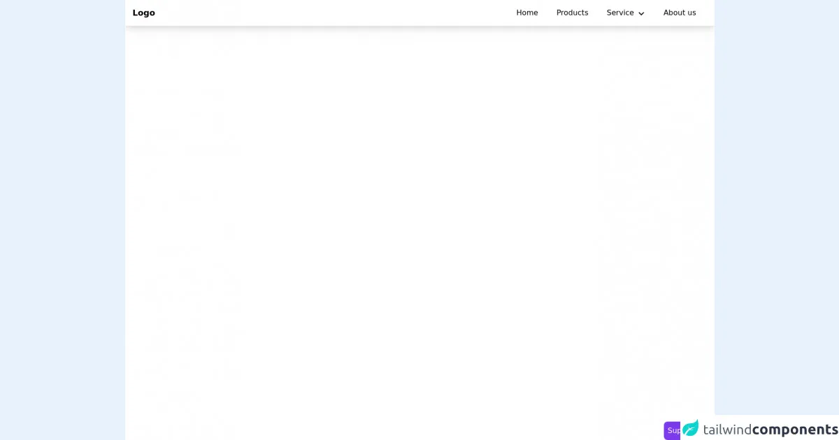
The preview of Navbar using css only ui component
Creating a Navbar using css only with Tailwind CSS is a straightforward process. By using a combination of HTML and Tailwind CSS classes, we can create a Navbar that is both functional and visually appealing.
Free download of the Navbar using css only's source code
The source code of Navbar using css only ui component
To create a Navbar using css only with Tailwind CSS, we need to write HTML code and use Tailwind CSS classes to style the Navbar.
<div class="min-h-screen bg-white">

<style>
    @media only screen and (min-width: 768px){
        .parent:hover .child {
            opacity:1;
            height:auto;
            overflow:none;
            transform: translateY(0);
        }
        .child {
            opacity:0;
            height:0;
            overflow:hidden;
            transform: translateY(-10%);
        }
    }

</style>

    <nav class="flex px-4 border-b md:shadow-lg items-center relative">
        <div class="text-lg font-bold md:py-0 py-4">
            Logo
        </div>
        <ul class="md:px-2 ml-auto md:flex md:space-x-2 absolute md:relative top-full left-0 right-0">
            <li>
                <a href="#" class="flex md:inline-flex p-4 items-center hover:bg-gray-50">
                    <span>Home</span>
                </a>
            </li>
            <li>
                <a href="#" class="flex md:inline-flex p-4 items-center hover:bg-gray-50">
                    <span>Products</span>
                </a>
            </li>
            <li class="relative parent">
                <a href="#" class="flex justify-between md:inline-flex p-4 items-center hover:bg-gray-50 space-x-2">
                    <span>Service</span>
                    <svg xmlns="http://www.w3.org/2000/svg" class="w-4 h-4 fill-current pt-1" viewBox="0 0 24 24"><path d="M0 7.33l2.829-2.83 9.175 9.339 9.167-9.339 2.829 2.83-11.996 12.17z"/></svg>
                </a>
                <ul class="child transition duration-300 md:absolute top-full right-0 md:w-48 bg-white md:shadow-lg md:rounded-b ">
                    <li>
                        <a href="#" class="flex px-4 py-3 hover:bg-gray-50">
                            Web development
                        </a>
                    </li>
                    <li>
                        <a href="#" class="flex px-4 py-3 hover:bg-gray-50">
                            Web Design
                        </a>
                    </li>
                    <li>
                        <a href="#" class="flex px-4 py-3 hover:bg-gray-50">
                            Machine Learning
                        </a>
                    </li>
                </ul>
            </li>
            <li>
                <a href="#" class="flex md:inline-flex p-4 items-center hover:bg-gray-50">
                    <span>About us</span>
                </a>
            </li>
        </ul>
        <div class="ml-auto md:hidden text-gray-500 cursor-pointer">
            <svg xmlns="http://www.w3.org/2000/svg" class="w-5 h-5 fill-current" viewBox="0 0 24 24"><path d="M24 20.188l-8.315-8.209 8.2-8.282-3.697-3.697-8.212 8.318-8.31-8.203-3.666 3.666 8.321 8.24-8.206 8.313 3.666 3.666 8.237-8.318 8.285 8.203z"/></svg>
        </div>
    </nav>
</div>


    <!-- support me by buying a coffee -->
    <a href="https://www.buymeacoffee.com/danimai" target="_blank" class="bg-purple-600 p-2 rounded-lg text-white fixed right-0 bottom-0">
        Support me
    </a>
How to create a Navbar using css only with Tailwind CSS?
To create a Navbar using css only with Tailwind CSS, we need to follow these steps:
- Create an HTML file and add a Navbar container.
<nav class="bg-gray-800">
  <div class="max-w-7xl mx-auto px-2 sm:px-6 lg:px-8">
    <div class="relative flex items-center justify-between h-16">
      <!-- Navbar content goes here -->
    </div>
  </div>
</nav>
- Add a Logo and Navigation Links.
<nav class="bg-gray-800">
  <div class="max-w-7xl mx-auto px-2 sm:px-6 lg:px-8">
    <div class="relative flex items-center justify-between h-16">
      <!-- Logo -->
      <div class="flex-shrink-0 flex items-center">
        <img class="h-8 w-8" src="https://tailwindui.com/img/logos/workflow-mark-indigo-500.svg" alt="Workflow">
        <span class="text-white font-semibold ml-2">Workflow</span>
      </div>
      <!-- Navigation Links -->
      <div class="hidden md:block">
        <div class="ml-10 flex items-baseline space-x-4">
          <a href="#" class="px-3 py-2 rounded-md text-sm font-medium text-white bg-gray-900">Dashboard</a>
          <a href="#" class="px-3 py-2 rounded-md text-sm font-medium text-gray-300 hover:text-white hover:bg-gray-700">Team</a>
          <a href="#" class="px-3 py-2 rounded-md text-sm font-medium text-gray-300 hover:text-white hover:bg-gray-700">Projects</a>
          <a href="#" class="px-3 py-2 rounded-md text-sm font-medium text-gray-300 hover:text-white hover:bg-gray-700">Calendar</a>
        </div>
      </div>
    </div>
  </div>
</nav>
- Add a Responsive Navbar.
<nav class="bg-gray-800">
  <div class="max-w-7xl mx-auto px-2 sm:px-6 lg:px-8">
    <div class="relative flex items-center justify-between h-16">
      <!-- Logo -->
      <div class="flex-shrink-0 flex items-center">
        <img class="h-8 w-8" src="https://tailwindui.com/img/logos/workflow-mark-indigo-500.svg" alt="Workflow">
        <span class="text-white font-semibold ml-2">Workflow</span>
      </div>
      <!-- Navigation Links -->
      <div class="hidden md:block">
        <div class="ml-10 flex items-baseline space-x-4">
          <a href="#" class="px-3 py-2 rounded-md text-sm font-medium text-white bg-gray-900">Dashboard</a>
          <a href="#" class="px-3 py-2 rounded-md text-sm font-medium text-gray-300 hover:text-white hover:bg-gray-700">Team</a>
          <a href="#" class="px-3 py-2 rounded-md text-sm font-medium text-gray-300 hover:text-white hover:bg-gray-700">Projects</a>
          <a href="#" class="px-3 py-2 rounded-md text-sm font-medium text-gray-300 hover:text-white hover:bg-gray-700">Calendar</a>
        </div>
      </div>
      <!-- Mobile Menu -->
      <div class="-mr-2 flex md:hidden">
        <button type="button" class="bg-gray-800 inline-flex items-center justify-center p-2 rounded-md text-gray-400 hover:text-white hover:bg-gray-700 focus:outline-none focus:ring-2 focus:ring-offset-2 focus:ring-offset-gray-800 focus:ring-white" aria-controls="mobile-menu" aria-expanded="false">
          <span class="sr-only">Open main menu</span>
          <!-- Icon when menu is closed. -->
          <!--
            Heroicon name: menu

            Menu open: "hidden", Menu closed: "block"
          -->
          <svg class="block h-6 w-6" xmlns="http://www.w3.org/2000/svg" fill="none" viewBox="0 0 24 24" stroke="currentColor" aria-hidden="true">
            <path stroke-linecap="round" stroke-linejoin="round" stroke-width="2" d="M4 6h16M4 12h16M4 18h16" />
          </svg>
          <!-- Icon when menu is open. -->
          <!--
            Heroicon name: x

            Menu open: "block", Menu closed: "hidden"
          -->
          <svg class="hidden h-6 w-6" xmlns="http://www.w3.org/2000/svg" fill="none" viewBox="0 0 24 24" stroke="currentColor" aria-hidden="true">
            <path stroke-linecap="round" stroke-linejoin="round" stroke-width="2" d="M6 18L18 6M6 6l12 12" />
          </svg>
        </button>
      </div>
    </div>
    <!-- Mobile Menu Content -->
    <div class="md:hidden" id="mobile-menu">
      <div class="px-2 pt-2 pb-3 space-y-1 sm:px-3">
        <a href="#" class="block px-3 py-2 rounded-md text-base font-medium text-white bg-gray-900">Dashboard</a>
        <a href="#" class="block px-3 py-2 rounded-md text-base font-medium text-gray-300 hover:text-white hover:bg-gray-700">Team</a>
        <a href="#" class="block px-3 py-2 rounded-md text-base font-medium text-gray-300 hover:text-white hover:bg-gray-700">Projects</a>
        <a href="#" class="block px-3 py-2 rounded-md text-base font-medium text-gray-300 hover:text-white hover:bg-gray-700">Calendar</a>
      </div>
    </div>
  </div>
</nav>
Conclusion
In conclusion, creating a Navbar using css only with Tailwind CSS is a straightforward process. By using a combination of HTML and Tailwind CSS classes, we can create a Navbar that is both functional and visually appealing. Tailwind CSS offers a set of pre-defined CSS classes that can be used to create a Navbar without writing custom CSS. This makes it easy for developers to create a Navbar quickly and efficiently.