- Published on
6 Steps To Build A Navbar Section Hero And Menu With Tailwind CSS Like A Pro In Under An Hour
- What is Tailwind CSS?
- The description of Navbar Section Hero and Menu ui component
- Why use Tailwind CSS to create a Navbar Section Hero and Menu ui component?
- The preview of Navbar Section Hero and Menu ui component.
- The source code of Navbar Section Hero and Menu ui component.
- How to create a Navbar Section Hero and Menu with Tailwind CSS?
- Step 1: Set up your HTML
- Step 2: Create the Navbar Section
- Step 3: Create the Hero Section
- Step 4: Create the Menu Section
- Step 5: Add the Tailwind CSS classes
- Step 6: Style the Navbar Section Hero and Menu
- Conclusion
As a FrontEnd technology blogger, I am always on the lookout for new and exciting ways to create beautiful and functional user interfaces. Recently, I came across Tailwind CSS, a utility-first CSS framework that has been gaining popularity among developers for its ease of use and flexibility. In this article, I will show you how to create a Navbar Section Hero and Menu with Tailwind CSS in just six easy steps.
What is Tailwind CSS?
Tailwind CSS is a utility-first CSS framework that provides a set of pre-defined classes that you can use to style your HTML elements. Unlike other CSS frameworks, Tailwind CSS does not come with pre-designed components, but rather focuses on providing you with the building blocks to create your own custom components.
The description of Navbar Section Hero and Menu ui component
A Navbar Section Hero and Menu is a popular UI component that is commonly used on websites to provide users with easy access to different sections of the website. It typically consists of a navigation bar at the top of the page, a hero section that showcases the website's main message or product, and a menu that allows users to navigate to different sections of the website.
Why use Tailwind CSS to create a Navbar Section Hero and Menu ui component?
Tailwind CSS provides a set of pre-defined classes that you can use to style your HTML elements, making it easy to create custom UI components like a Navbar Section Hero and Menu. Additionally, Tailwind CSS is highly customizable, allowing you to easily tweak the styles to match your website's branding.
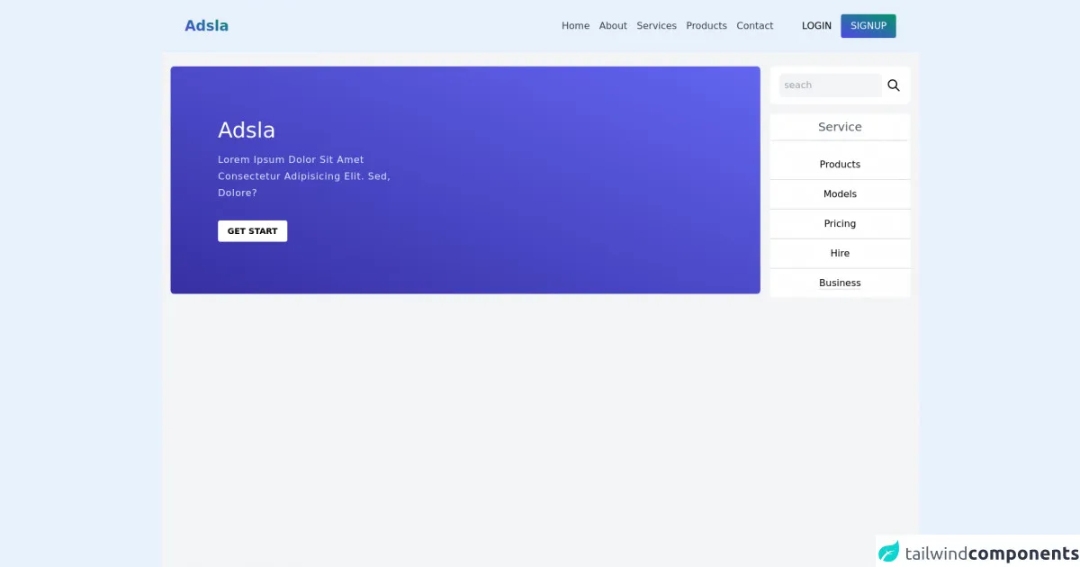
The preview of Navbar Section Hero and Menu ui component.
To give you an idea of what the final product will look like, here is a preview of the Navbar Section Hero and Menu UI component we will be creating:
Free download of the Navbar Section Hero and Menu's source code
The source code of Navbar Section Hero and Menu ui component.
Here is the source code for the Navbar Section Hero and Menu UI component:
<!-- Header -->
<header>
  <!-- navbar and menu -->
  <nav class="shadow">

  <div class="flex justify-between items-center py-6 px-10 container mx-auto">

    <div>
      <h1 class="text-2xl font-bold bg-gradient-to-tr from-indigo-600 to-green-600 bg-clip-text text-transparent hover:cursor-pointer">Adsla</h1>
    </div>

    <div>

      <div class="hover:cursor-pointer sm:hidden">
        <spnan class="h-1 rounded-full block w-8 mb-1 bg-gradient-to-tr from-indigo-600 to-green-600"></spnan>
        <spnan class="h-1 rounded-full block w-8 mb-1 bg-gradient-to-tr from-indigo-600 to-green-600"></spnan>
        <spnan class="h-1 rounded-full block w-8 mb-1 bg-gradient-to-tr from-indigo-600 to-green-600"></spnan>
      </div>
      <div class="flex items-center">

        <ul class="sm:flex space-x-4 hidden items-center">
          <li><a href="#" class="text-gray-700 hover:text-indigo-600 text-md ">Home</a></li>
          <li><a href="#" class="text-gray-700 hover:text-indigo-600 text-md ">About</a></li>
          <li><a href="#" class="text-gray-700 hover:text-indigo-600 text-md ">Services</a></li>
          <li><a href="#" class="text-gray-700 hover:text-indigo-600 text-md ">Products</a></li>
          <li><a href="#" class="text-gray-700 hover:text-indigo-600 text-md ">Contact</a></li>
        </ul>

        <div class="md:flex items-center hidden space-x-4 ml-8 lg:ml-12">
          <h1 class="text-text-gray-600  py-2 hover:cursor-pointer hover:text-indigo-600">LOGIN</h1>
          <h1 class="text-text-gray-600  py-2 hover:cursor-pointer px-4 rounded text-white bg-gradient-to-tr from-indigo-600 to-green-600 hover:shadow-lg">SIGNUP</h1>
        </div>
      </div>
    </div>
  </div>
  </nav>
</header>
<main>
  <!-- section hero -->
  <section>
    <div class="bg-gray-100 sm:grid grid-cols-5 grid-rows-2 px-4 py-6 min-h-full lg:min-h-screen space-y-6 sm:space-y-0 sm:gap-4">

    <div class="h-96 col-span-4 bg-gradient-to-tr from-indigo-800 to-indigo-500 rounded-md flex items-center">
      <div class="ml-20 w-80">
      <h2 class="text-white text-4xl">Adsla</h2>
      <p class="text-indigo-100 mt-4 capitalize font-thin tracking-wider leading-7">Lorem ipsum dolor sit amet consectetur adipisicing elit. Sed, dolore?</p>

      <a href="#" class="uppercase inline-block mt-8 text-sm bg-white py-2 px-4 rounded font-semibold hover:bg-indigo-100">get start</a>
      </div>

    </div>
    <div class="h-96 col-span-1 ">
      <div class="bg-white py-3 px-4 rounded-lg flex justify-around items-center ">
   <input type="text" placeholder="seach" class=" bg-gray-100 rounded-md  outline-none pl-2 ring-indigo-700 w-full mr-2 p-2">
  <span><svg xmlns="http://www.w3.org/2000/svg" class="h-6 w-6" fill="none" viewBox="0 0 24 24" stroke="currentColor ">
  <path stroke-linecap="round" stroke-linejoin="round" stroke-width="2" d="M21 21l-6-6m2-5a7 7 0 11-14 0 7 7 0 0114 0z" />
</svg></span>
      </div>
      <div class="bg-white  rounded-md">

      <h1 class="text-center text-xl my-4  bg-white py-2 rounded-md border-b-2 cursor-pointer  text-gray-600">Service</h1>
      <div class="bg-white rounded-md list-none  text-center ">
        <li class="py-3 border-b-2"><a href="#" class="list-none  hover:text-indigo-600">Products</a></li>
        <li class="py-3 border-b-2"><a href="#" class="list-none  hover:text-indigo-600">Models</a></li>
        <li class="py-3 border-b-2"><a href="#" class="list-none  hover:text-indigo-600">Pricing</a></li>
        <li class="py-3 border-b-2"><a href="#" class="list-none  hover:text-indigo-600">Hire</a></li>
        <li class="py-3 "><a href="#" class="list-none border-b-2 hover:text-indigo-600">Business</a></li>
      </div>
      </div>
    </div>
    </div>

  </section>

</main>
How to create a Navbar Section Hero and Menu with Tailwind CSS?
Now that we have an idea of what we will be creating, let's dive into the six steps to create a Navbar Section Hero and Menu with Tailwind CSS:
Step 1: Set up your HTML
The first step is to set up your HTML structure. In this example, we will create a basic HTML structure with a header, main, and footer section. The header section will contain our Navbar Section Hero and Menu component.
<!DOCTYPE html>
<html>
  <head>
    <title>Navbar Section Hero and Menu with Tailwind CSS</title>
    <link rel="stylesheet" href="https://cdn.jsdelivr.net/npm/[email protected]/dist/tailwind.min.css">
  </head>
  <body>
    <header class="bg-gray-800">
      <!-- Navbar Section Hero and Menu goes here -->
    </header>
    <main>
      <!-- Main content goes here -->
    </main>
    <footer>
      <!-- Footer content goes here -->
    </footer>
  </body>
</html>
Step 2: Create the Navbar Section
The next step is to create the Navbar Section. We will use the flex and justify-between classes to create a horizontal layout with our logo on the left and our navigation links on the right.
<header class="bg-gray-800">
  <div class="container mx-auto flex justify-between p-5">
    <div class="text-white font-bold text-xl">
      My Website
    </div>
    <div class="flex">
      <a href="#" class="text-gray-300 hover:text-white px-3 py-2 rounded-md text-sm font-medium">Home</a>
      <a href="#" class="text-gray-300 hover:text-white px-3 py-2 rounded-md text-sm font-medium">About</a>
      <a href="#" class="text-gray-300 hover:text-white px-3 py-2 rounded-md text-sm font-medium">Contact</a>
    </div>
  </div>
</header>
Step 3: Create the Hero Section
The Hero Section is a large banner that showcases the website's main message or product. We will use the bg-gray-100 class to set the background color and the py-20 class to add some padding to the top and bottom of the section.
<section class="bg-gray-100 py-20">
  <div class="container mx-auto">
    <h1 class="text-5xl font-bold text-gray-800">Welcome to My Website</h1>
    <p class="mt-5 text-xl text-gray-600">Lorem ipsum dolor sit amet, consectetur adipiscing elit. Sed euismod enim eu ante tristique, eget consequat velit ullamcorper. Donec vel nibh non sapien bibendum malesuada. </p>
    <button class="mt-10 bg-blue-500 hover:bg-blue-700 text-white font-bold py-2 px-4 rounded">
      Get Started
    </button>
  </div>
</section>
Step 4: Create the Menu Section
The Menu Section is a list of links that allow users to navigate to different sections of the website. We will use the flex and justify-center classes to center the links horizontally and the py-5 class to add some padding to the top and bottom of the section.
<section class="bg-gray-200 py-5">
  <div class="container mx-auto flex justify-center">
    <a href="#" class="text-gray-600 hover:text-gray-800 px-3 py-2 rounded-md text-sm font-medium">Home</a>
    <a href="#" class="text-gray-600 hover:text-gray-800 px-3 py-2 rounded-md text-sm font-medium">About</a>
    <a href="#" class="text-gray-600 hover:text-gray-800 px-3 py-2 rounded-md text-sm font-medium">Services</a>
    <a href="#" class="text-gray-600 hover:text-gray-800 px-3 py-2 rounded-md text-sm font-medium">Contact</a>
  </div>
</section>
Step 5: Add the Tailwind CSS classes
Now that we have created the basic structure of our Navbar Section Hero and Menu, we can start adding the Tailwind CSS classes to style our components. We will use classes like bg-gray-800 to set the background color, text-white to set the text color, and rounded-md to add rounded corners to our buttons.
Step 6: Style the Navbar Section Hero and Menu
Finally, we can style the Navbar Section Hero and Menu to match our website's branding. We can use the bg-gray-800 class to set the background color of the Navbar, the text-white class to set the text color, and the font-bold class to make the text bold.
Conclusion
In this article, we have learned how to create a Navbar Section Hero and Menu with Tailwind CSS in just six easy steps. Tailwind CSS provides a set of pre-defined classes that make it easy to create custom UI components like a Navbar Section Hero and Menu. By following the steps outlined in this article, you can create a beautiful and functional Navbar Section Hero and Menu for your website in under an hour.