- Published on
6 Incredibly Easy Ways To Make A Navbar Menu With Tailwind CSS Better While Spending Less
- What is Tailwind CSS?
- The description of Navbar Menu ui component
- Why use Tailwind CSS to create a Navbar Menu ui component?
- The preview of Navbar Menu ui component
- The source code of Navbar Menu ui component
- How to create a Navbar Menu with Tailwind CSS?
- Step 1: Set up your HTML
- Step 2: Add Tailwind CSS
- Step 3: Style your Navbar Menu
- Step 4: Add JavaScript for Mobile Navbar Menu
- Conclusion
What is Tailwind CSS?
Tailwind CSS is a utility-first CSS framework that allows you to create custom designs quickly and easily. It provides a set of pre-defined classes that you can use to style your HTML elements without having to write any CSS code.
The description of Navbar Menu ui component
A Navbar Menu is a user interface component that is commonly used in web applications to provide easy navigation for users. It typically consists of a horizontal bar that contains links to different pages or sections of the application.
Why use Tailwind CSS to create a Navbar Menu ui component?
Tailwind CSS makes it incredibly easy to create a Navbar Menu with just a few lines of code. It provides a set of pre-defined classes that you can use to style your Navbar Menu without having to write any custom CSS code. This saves you time and effort, and allows you to focus on creating a great user experience.
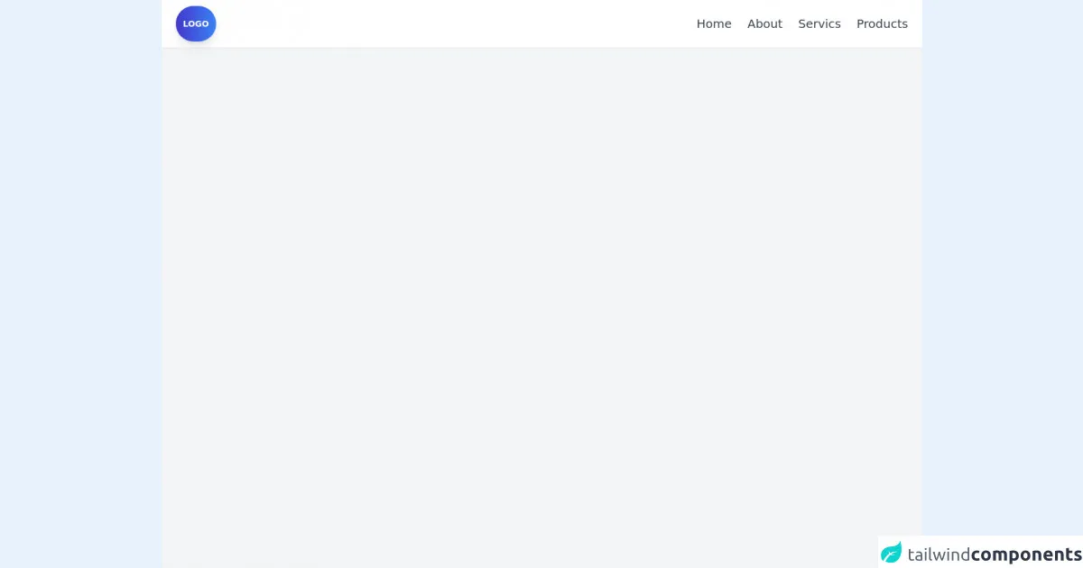
The preview of Navbar Menu ui component
In the following section, we will take a look at a preview of what our Navbar Menu will look like.
Free download of the Navbar Menu's source code
The source code of Navbar Menu ui component
Here is the source code for our Navbar Menu.
<!-- Create Navbar Menu -->
<header class="min-h-screen bg-gray-100">
  <nav class="flex items-center justify-between p-6 h-20 bg-white shadow-sm">
    <div class="py-5 px-3 rounded-full bg-gradient-to-r from-indigo-700 to-blue-500 text-sm text-white font-semibold shadow-lg hover:cursor-pointer hover:shadow-lg">LOGO</div>
    <ul>
      <li class="space-x-5 text-xl">
        <a href="#" class="hidden sm:inline-block text-gray-700 hover:text-indigo-700">Home</a>
        <a href="#" class="hidden sm:inline-block text-gray-700 hover:text-indigo-700">About</a>
        <a href="#" class="hidden sm:inline-block text-gray-700 hover:text-indigo-700">Servics</a>
        <a href="#" class="hidden sm:inline-block text-gray-700 hover:text-indigo-700">Products</a>
      </li>
      <div class="sm:hidden space-y-1 hover:cursor-pointer">
        <span class="w-10 h-1 bg-gray-600 rounded-full block"></span>
        <span class="w-10 h-1 bg-gray-600 rounded-full block"></span>
        <span class="w-10 h-1 bg-gray-600 rounded-full block"></span>
      </div>
    </ul>
  </nav>
</header>
How to create a Navbar Menu with Tailwind CSS?
Now that we have a better understanding of what Tailwind CSS is and why it is a great choice for creating a Navbar Menu, let's take a look at how we can create one.
Step 1: Set up your HTML
The first step is to set up your HTML. In this example, we will create a simple Navbar Menu with three links.
<nav class="bg-gray-800">
  <div class="max-w-7xl mx-auto px-2 sm:px-6 lg:px-8">
    <div class="relative flex items-center justify-between h-16">
      <div class="flex-1 flex items-center justify-center sm:items-stretch sm:justify-start">
        <div class="flex-shrink-0">
          <img class="h-8 w-8" src="https://tailwindui.com/img/logos/workflow-mark-indigo-500.svg" alt="Workflow">
        </div>
        <div class="hidden sm:block sm:ml-6">
          <div class="flex space-x-4">
            <a href="#" class="bg-gray-900 text-white px-3 py-2 rounded-md text-sm font-medium">Dashboard</a>
            <a href="#" class="text-gray-300 hover:bg-gray-700 hover:text-white px-3 py-2 rounded-md text-sm font-medium">Team</a>
            <a href="#" class="text-gray-300 hover:bg-gray-700 hover:text-white px-3 py-2 rounded-md text-sm font-medium">Projects</a>
          </div>
        </div>
      </div>
      <div class="-mr-2 flex items-center sm:hidden">
        <!-- Mobile menu button -->
        <button type="button" class="bg-gray-900 inline-flex items-center justify-center p-2 rounded-md text-gray-400 hover:text-white hover:bg-gray-700 focus:outline-none focus:ring-2 focus:ring-offset-2 focus:ring-offset-gray-800 focus:ring-white" aria-controls="mobile-menu" aria-expanded="false">
          <span class="sr-only">Open main menu</span>
          <!-- Icon when menu is closed. -->
          <!--
            Heroicon name: menu

            Menu open: "hidden", Menu closed: "block"
          -->
          <svg class="block h-6 w-6" xmlns="http://www.w3.org/2000/svg" fill="none" viewBox="0 0 24 24" stroke="currentColor" aria-hidden="true">
            <path stroke-linecap="round" stroke-linejoin="round" stroke-width="2" d="M4 6h16M4 12h16M4 18h16"></path>
          </svg>
          <!-- Icon when menu is open. -->
          <!--
            Heroicon name: x

            Menu open: "block", Menu closed: "hidden"
          -->
          <svg class="hidden h-6 w-6" xmlns="http://www.w3.org/2000/svg" fill="none" viewBox="0 0 24 24" stroke="currentColor" aria-hidden="true">
            <path stroke-linecap="round" stroke-linejoin="round" stroke-width="2" d="M6 18L18 6M6 6l12 12"></path>
          </svg>
        </button>
      </div>
    </div>
  </div>

  <!-- Mobile menu, show/hide based on menu state. -->
  <div class="sm:hidden" id="mobile-menu">
    <div class="px-2 pt-2 pb-3 space-y-1">
      <a href="#" class="bg-gray-900 text-white block px-3 py-2 rounded-md text-base font-medium">Dashboard</a>
      <a href="#" class="text-gray-300 hover:bg-gray-700 hover:text-white block px-3 py-2 rounded-md text-base font-medium">Team</a>
      <a href="#" class="text-gray-300 hover:bg-gray-700 hover:text-white block px-3 py-2 rounded-md text-base font-medium">Projects</a>
    </div>
  </div>
</nav>
Step 2: Add Tailwind CSS
Next, we need to add Tailwind CSS to our project. You can either download the CSS file and include it in your HTML, or you can use a CDN to include it.
<link href="https://cdn.jsdelivr.net/npm/tailwindcss@latest/dist/tailwind.min.css" rel="stylesheet">
Step 3: Style your Navbar Menu
Now that we have our HTML set up and Tailwind CSS added, we can start styling our Navbar Menu. In this example, we will use some of the pre-defined classes provided by Tailwind CSS to style our Navbar Menu.
/* Navbar Menu */
.navbar-menu {
  background-color: #1a202c;
}

/* Navbar Logo */
.navbar-logo {
  height: 40px;
  width: 40px;
}

/* Navbar Links */
.navbar-links {
  display: flex;
  justify-content: space-between;
  align-items: center;
}

.navbar-links a {
  color: #fff;
  text-decoration: none;
  margin-right: 20px;
  font-size: 16px;
  font-weight: 600;
}

.navbar-links a:hover {
  color: #cbd5e0;
}

/* Mobile Navbar Menu */
.mobile-navbar-menu {
  display: none;
}

.mobile-navbar-menu.active {
  display: block;
}

.mobile-navbar-menu a {
  display: block;
  padding: 10px 0;
  color: #fff;
  font-size: 16px;
  font-weight: 600;
  border-bottom: 1px solid #cbd5e0;
}

.mobile-navbar-menu a:hover {
  color: #cbd5e0;
}
Step 4: Add JavaScript for Mobile Navbar Menu
Finally, we need to add some JavaScript code to toggle the mobile Navbar Menu when the user clicks on the menu button.
const mobileMenuButton = document.querySelector('.mobile-menu-button');
const mobileNavbarMenu = document.querySelector('.mobile-navbar-menu');

mobileMenuButton.addEventListener('click', () => {
  mobileNavbarMenu.classList.toggle('active');
});
Conclusion
In this article, we have learned how to create a Navbar Menu with Tailwind CSS. We have seen how Tailwind CSS makes it incredibly easy to create custom designs quickly and easily, and how it provides a set of pre-defined classes that you can use to style your HTML elements without having to write any CSS code. By following the steps outlined in this article, you can create a great-looking Navbar Menu for your web application in no time.