- Published on
Beginners Guide: Build A Navbar & Hamburger Menu For Ecommerce With Tailwind CSS
- What is Tailwind CSS?
- The description of Navbar & Hamburger Menu for Ecommerce ui component
- Why use Tailwind CSS to create a Navbar & Hamburger Menu for Ecommerce ui component?
- The preview of Navbar & Hamburger Menu for Ecommerce ui component.
- The source code of Navbar & Hamburger Menu for Ecommerce ui component.
- How to create a Navbar & Hamburger Menu for Ecommerce with Tailwind CSS?
- Step 1: Create a new HTML file and add the necessary HTML elements for the Navbar and Hamburger Menu components.
- Step 2: Add the necessary Tailwind CSS classes to style the HTML elements.
- Step 3: Use JavaScript to add functionality to the Hamburger Menu component.
- Conclusion
As a FrontEnd technology blogger, it's important to stay up-to-date with the latest tools and frameworks. Tailwind CSS is a utility-first CSS framework that has gained popularity in recent years due to its flexibility and ease of use. In this article, we'll explore how to use Tailwind CSS to build a Navbar & Hamburger Menu for Ecommerce.
What is Tailwind CSS?
Tailwind CSS is a utility-first CSS framework that allows you to rapidly build custom user interfaces. It provides a set of pre-defined classes that you can use to style your HTML elements. Tailwind CSS is different from other CSS frameworks because it doesn't come with pre-designed components. Instead, it provides a set of building blocks that you can use to create your own custom components.
The description of Navbar & Hamburger Menu for Ecommerce ui component
A Navbar & Hamburger Menu for Ecommerce is a user interface component that is commonly used in online stores. It provides users with easy access to different sections of the website, such as the shopping cart, product categories, and account information. The Navbar is the top-level navigation bar that contains links to different sections of the website. The Hamburger Menu is a collapsible menu that appears when the user clicks on the hamburger icon. It provides access to additional links and options.
Why use Tailwind CSS to create a Navbar & Hamburger Menu for Ecommerce ui component?
Tailwind CSS provides a set of pre-defined classes that you can use to style your HTML elements. This makes it easy to create custom user interfaces without having to write a lot of CSS code. Tailwind CSS also provides a responsive design system that makes it easy to create user interfaces that look great on different screen sizes. This is important for an Ecommerce website because users will be accessing the site from different devices.
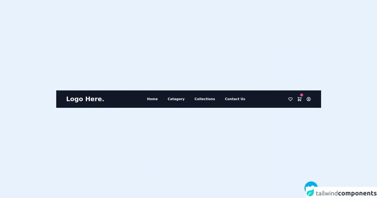
The preview of Navbar & Hamburger Menu for Ecommerce ui component.
To create a Navbar & Hamburger Menu for Ecommerce, we'll use Tailwind CSS to style our HTML elements. The Navbar will contain links to different sections of the website, such as the shopping cart, product categories, and account information. The Hamburger Menu will be a collapsible menu that appears when the user clicks on the hamburger icon. It will provide access to additional links and options.
Free download of the Navbar & Hamburger Menu for Ecommerce's source code
The source code of Navbar & Hamburger Menu for Ecommerce ui component.
To create the Navbar & Hamburger Menu for Ecommerce, we'll use HTML and Tailwind CSS. We'll create a Navbar component that contains links to different sections of the website. We'll also create a Hamburger Menu component that appears when the user clicks on the hamburger icon. The Hamburger Menu will be a collapsible menu that provides access to additional links and options.
<!-- follow me on twitter @asad_codes -->

<div class="flex flex-wrap place-items-center h-screen">
  <section class="relative mx-auto">
      <!-- navbar -->
    <nav class="flex justify-between bg-gray-900 text-white w-screen">
      <div class="px-5 xl:px-12 py-6 flex w-full items-center">
        <a class="text-3xl font-bold font-heading" href="#">
          <!-- <img class="h-9" src="logo.png" alt="logo"> -->
          Logo Here.
        </a>
        <!-- Nav Links -->
        <ul class="hidden md:flex px-4 mx-auto font-semibold font-heading space-x-12">
          <li><a class="hover:text-gray-200" href="#">Home</a></li>
          <li><a class="hover:text-gray-200" href="#">Catagory</a></li>
          <li><a class="hover:text-gray-200" href="#">Collections</a></li>
          <li><a class="hover:text-gray-200" href="#">Contact Us</a></li>
        </ul>
        <!-- Header Icons -->
        <div class="hidden xl:flex items-center space-x-5 items-center">
          <a class="hover:text-gray-200" href="#">
            <svg xmlns="http://www.w3.org/2000/svg" class="h-6 w-6" fill="none" viewBox="0 0 24 24" stroke="currentColor">
              <path stroke-linecap="round" stroke-linejoin="round" stroke-width="2" d="M4.318 6.318a4.5 4.5 0 000 6.364L12 20.364l7.682-7.682a4.5 4.5 0 00-6.364-6.364L12 7.636l-1.318-1.318a4.5 4.5 0 00-6.364 0z" />
            </svg>
          </a>
          <a class="flex items-center hover:text-gray-200" href="#">
              <svg xmlns="http://www.w3.org/2000/svg" class="h-6 w-6" fill="none" viewBox="0 0 24 24" stroke="currentColor">
                  <path stroke-linecap="round" stroke-linejoin="round" stroke-width="2" d="M3 3h2l.4 2M7 13h10l4-8H5.4M7 13L5.4 5M7 13l-2.293 2.293c-.63.63-.184 1.707.707 1.707H17m0 0a2 2 0 100 4 2 2 0 000-4zm-8 2a2 2 0 11-4 0 2 2 0 014 0z" />
              </svg>
            <span class="flex absolute -mt-5 ml-4">
              <span class="animate-ping absolute inline-flex h-3 w-3 rounded-full bg-pink-400 opacity-75"></span>
                <span class="relative inline-flex rounded-full h-3 w-3 bg-pink-500">
                </span>
              </span>
          </a>
          <!-- Sign In / Register      -->
          <a class="flex items-center hover:text-gray-200" href="#">
              <svg xmlns="http://www.w3.org/2000/svg" class="h-6 w-6 hover:text-gray-200" fill="none" viewBox="0 0 24 24" stroke="currentColor">
                <path stroke-linecap="round" stroke-linejoin="round" stroke-width="2" d="M5.121 17.804A13.937 13.937 0 0112 16c2.5 0 4.847.655 6.879 1.804M15 10a3 3 0 11-6 0 3 3 0 016 0zm6 2a9 9 0 11-18 0 9 9 0 0118 0z" />
              </svg>
          </a>

        </div>
      </div>
      <!-- Responsive navbar -->
      <a class="xl:hidden flex mr-6 items-center" href="#">
        <svg xmlns="http://www.w3.org/2000/svg" class="h-6 w-6 hover:text-gray-200" fill="none" viewBox="0 0 24 24" stroke="currentColor">
          <path stroke-linecap="round" stroke-linejoin="round" stroke-width="2" d="M3 3h2l.4 2M7 13h10l4-8H5.4M7 13L5.4 5M7 13l-2.293 2.293c-.63.63-.184 1.707.707 1.707H17m0 0a2 2 0 100 4 2 2 0 000-4zm-8 2a2 2 0 11-4 0 2 2 0 014 0z" />
        </svg>
        <span class="flex absolute -mt-5 ml-4">
          <span class="animate-ping absolute inline-flex h-3 w-3 rounded-full bg-pink-400 opacity-75"></span>
          <span class="relative inline-flex rounded-full h-3 w-3 bg-pink-500">
          </span>
        </span>
      </a>
      <a class="navbar-burger self-center mr-12 xl:hidden" href="#">
          <svg xmlns="http://www.w3.org/2000/svg" class="h-6 w-6 hover:text-gray-200" fill="none" viewBox="0 0 24 24" stroke="currentColor">
              <path stroke-linecap="round" stroke-linejoin="round" stroke-width="2" d="M4 6h16M4 12h16M4 18h16" />
          </svg>
      </a>
    </nav>

  </section>
</div>
<!-- Does this resource worth a follow? -->
<div class="absolute bottom-0 right-0 mb-4 mr-4 z-10">
    <div>
        <a title="Follow me on twitter" href="https://www.twitter.com/asad_codes" target="_blank" class="block w-16 h-16 rounded-full transition-all shadow hover:shadow-lg transform hover:scale-110 hover:rotate-12">
            <img class="object-cover object-center w-full h-full rounded-full" src="https://www.imore.com/sites/imore.com/files/styles/large/public/field/image/2019/12/twitter-logo.jpg"/>
        </a>
    </div>
</div>
How to create a Navbar & Hamburger Menu for Ecommerce with Tailwind CSS?
To create a Navbar & Hamburger Menu for Ecommerce with Tailwind CSS, follow these steps:
- Create a new HTML file and add the necessary HTML elements for the Navbar and Hamburger Menu components.
- Add the necessary Tailwind CSS classes to style the HTML elements.
- Use JavaScript to add functionality to the Hamburger Menu component.
Let's take a closer look at each step.
Step 1: Create a new HTML file and add the necessary HTML elements for the Navbar and Hamburger Menu components.
First, create a new HTML file and add the necessary HTML elements for the Navbar and Hamburger Menu components. Here's an example:
<nav class="bg-gray-800">
  <div class="max-w-7xl mx-auto px-4 sm:px-6 lg:px-8">
    <div class="flex items-center justify-between h-16">
      <div class="flex items-center">
        <a href="#" class="flex-shrink-0">
          <img class="h-8 w-8" src="https://tailwindui.com/img/logos/workflow-mark-indigo-500.svg" alt="Workflow">
        </a>
        <div class="hidden md:block">
          <div class="ml-10 flex items-baseline space-x-4">
            <a href="#" class="px-3 py-2 rounded-md text-sm font-medium text-white bg-gray-900 focus:outline-none focus:text-white focus:bg-gray-700">Dashboard</a>

            <a href="#" class="px-3 py-2 rounded-md text-sm font-medium text-gray-300 hover:text-white hover:bg-gray-700 focus:outline-none focus:text-white focus:bg-gray-700">Team</a>

            <a href="#" class="px-3 py-2 rounded-md text-sm font-medium text-gray-300 hover:text-white hover:bg-gray-700 focus:outline-none focus:text-white focus:bg-gray-700">Projects</a>

            <a href="#" class="px-3 py-2 rounded-md text-sm font-medium text-gray-300 hover:text-white hover:bg-gray-700 focus:outline-none focus:text-white focus:bg-gray-700">Calendar</a>

            <a href="#" class="px-3 py-2 rounded-md text-sm font-medium text-gray-300 hover:text-white hover:bg-gray-700 focus:outline-none focus:text-white focus:bg-gray-700">Reports</a>
          </div>
        </div>
      </div>
      <div class="-mr-2 flex md:hidden">
        <button type="button" class="bg-gray-800 inline-flex items-center justify-center p-2 rounded-md text-gray-400 hover:text-white hover:bg-gray-700 focus:outline-none focus:ring-2 focus:ring-offset-2 focus:ring-offset-gray-800 focus:ring-white" aria-controls="mobile-menu" aria-expanded="false">
          <span class="sr-only">Open main menu</span>
          <!-- Heroicon name: menu -->
          <svg class="block h-6 w-6" xmlns="http://www.w3.org/2000/svg" fill="none" viewBox="0 0 24 24" stroke="currentColor" aria-hidden="true">
            <path stroke-linecap="round" stroke-linejoin="round" stroke-width="2" d="M4 6h16M4 12h16M4 18h16"></path>
          </svg>
          <!-- Heroicon name: x -->
          <svg class="hidden h-6 w-6" xmlns="http://www.w3.org/2000/svg" fill="none" viewBox="0 0 24 24" stroke="currentColor" aria-hidden="true">
            <path stroke-linecap="round" stroke-linejoin="round" stroke-width="2" d="M6 18L18 6M6 6l12 12"></path>
          </svg>
        </button>
      </div>
    </div>
  </div>

  <div class="md:hidden" id="mobile-menu">
    <div class="px-2 pt-2 pb-3 space-y-1 sm:px-3">
      <a href="#" class="block px-3 py-2 rounded-md text-base font-medium text-white bg-gray-900 focus:outline-none focus:text-white focus:bg-gray-700">Dashboard</a>

      <a href="#" class="block px-3 py-2 rounded-md text-base font-medium text-gray-300 hover:text-white hover:bg-gray-700 focus:outline-none focus:text-white focus:bg-gray-700">Team</a>

      <a href="#" class="block px-3 py-2 rounded-md text-base font-medium text-gray-300 hover:text-white hover:bg-gray-700 focus:outline-none focus:text-white focus:bg-gray-700">Projects</a>

      <a href="#" class="block px-3 py-2 rounded-md text-base font-medium text-gray-300 hover:text-white hover:bg-gray-700 focus:outline-none focus:text-white focus:bg-gray-700">Calendar</a>

      <a href="#" class="block px-3 py-2 rounded-md text-base font-medium text-gray-300 hover:text-white hover:bg-gray-700 focus:outline-none focus:text-white focus:bg-gray-700">Reports</a>
    </div>
  </div>
</nav>
Step 2: Add the necessary Tailwind CSS classes to style the HTML elements.
Next, we'll add the necessary Tailwind CSS classes to style the HTML elements. Here's an example:
<nav class="bg-gray-800">
  <div class="max-w-7xl mx-auto px-4 sm:px-6 lg:px-8">
    <div class="flex items-center justify-between h-16">
      <div class="flex items-center">
        <a href="#" class="flex-shrink-0">
          <img class="h-8 w-8" src="https://tailwindui.com/img/logos/workflow-mark-indigo-500.svg" alt="Workflow">
        </a>
        <div class="hidden md:block">
          <div class="ml-10 flex items-baseline space-x-4">
            <a href="#" class="px-3 py-2 rounded-md text-sm font-medium text-white bg-gray-900 focus:outline-none focus:text-white focus:bg-gray-700">Dashboard</a>

            <a href="#" class="px-3 py-2 rounded-md text-sm font-medium text-gray-300 hover:text-white hover:bg-gray-700 focus:outline-none focus:text-white focus:bg-gray-700">Team</a>

            <a href="#" class="px-3 py-2 rounded-md text-sm font-medium text-gray-300 hover:text-white hover:bg-gray-700 focus:outline-none focus:text-white focus:bg-gray-700">Projects</a>

            <a href="#" class="px-3 py-2 rounded-md text-sm font-medium text-gray-300 hover:text-white hover:bg-gray-700 focus:outline-none focus:text-white focus:bg-gray-700">Calendar</a>

            <a href="#" class="px-3 py-2 rounded-md text-sm font-medium text-gray-300 hover:text-white hover:bg-gray-700 focus:outline-none focus:text-white focus:bg-gray-700">Reports</a>
          </div>
        </div>
      </div>
      <div class="-mr-2 flex md:hidden">
        <button type="button" class="bg-gray-800 inline-flex items-center justify-center p-2 rounded-md text-gray-400 hover:text-white hover:bg-gray-700 focus:outline-none focus:ring-2 focus:ring-offset-2 focus:ring-offset-gray-800 focus:ring-white" aria-controls="mobile-menu" aria-expanded="false">
          <span class="sr-only">Open main menu</span>
          <!-- Heroicon name: menu -->
          <svg class="block h-6 w-6" xmlns="http://www.w3.org/2000/svg" fill="none" viewBox="0 0 24 24" stroke="currentColor" aria-hidden="true">
            <path stroke-linecap="round" stroke-linejoin="round" stroke-width="2" d="M4 6h16M4 12h16M4 18h16"></path>
          </svg>
          <!-- Heroicon name: x -->
          <svg class="hidden h-6 w-6" xmlns="http://www.w3.org/2000/svg" fill="none" viewBox="0 0 24 24" stroke="currentColor" aria-hidden="true">
            <path stroke-linecap="round" stroke-linejoin="round" stroke-width="2" d="M6 18L18 6M6 6l12 12"></path>
          </svg>
        </button>
      </div>
    </div>
  </div>

  <div class="md:hidden" id="mobile-menu">
    <div class="px-2 pt-2 pb-3 space-y-1 sm:px-3">
      <a href="#" class="block px-3 py-2 rounded-md text-base font-medium text-white bg-gray-900 focus:outline-none focus:text-white focus:bg-gray-700">Dashboard</a>

      <a href="#" class="block px-3 py-2 rounded-md text-base font-medium text-gray-300 hover:text-white hover:bg-gray-700 focus:outline-none focus:text-white focus:bg-gray-700">Team</a>

      <a href="#" class="block px-3 py-2 rounded-md text-base font-medium text-gray-300 hover:text-white hover:bg-gray-700 focus:outline-none focus:text-white focus:bg-gray-700">Projects</a>

      <a href="#" class="block px-3 py-2 rounded-md text-base font-medium text-gray-300 hover:text-white hover:bg-gray-700 focus:outline-none focus:text-white focus:bg-gray-700">Calendar</a>

      <a href="#" class="block px-3 py-2 rounded-md text-base font-medium text-gray-300 hover:text-white hover:bg-gray-700 focus:outline-none focus:text-white focus:bg-gray-700">Reports</a>
    </div>
  </div>
</nav>
Step 3: Use JavaScript to add functionality to the Hamburger Menu component.
Finally, we'll use JavaScript to add functionality to the Hamburger Menu component. Here's an example:
const button = document.querySelector('button');
const menu = document.querySelector('#mobile-menu');

button.addEventListener('click', () => {
  menu.classList.toggle('hidden');
});
Conclusion
In this article, we explored how to use Tailwind CSS to build a Navbar & Hamburger Menu for Ecommerce. We learned that Tailwind CSS provides a set of pre-defined classes that you can use to style your HTML elements. We also learned that a Navbar & Hamburger Menu for Ecommerce is a user interface component that is commonly used in online stores. By following the steps outlined in this article, you can create a custom Navbar & Hamburger Menu for your own Ecommerce website.