- Published on
How To Create A Navbar & Hamburger Menu With Tailwind CSS In 5 Easy Steps
- What is Tailwind CSS?
- The description of Navbar & Hamburger Menu ui component
- Why use Tailwind CSS to create a Navbar & Hamburger Menu ui component?
- The preview of Navbar & Hamburger Menu ui component.
- The source code of Navbar & Hamburger Menu ui component.
- How to create a Navbar & Hamburger Menu with Tailwind CSS?
- Step 1: Set up your HTML
- Step 2: Add Tailwind CSS to your project
- Step 3: Customize your navbar
- Step 4: Add functionality to your hamburger menu
- Step 5: Test and deploy your navbar
- Conclusion
What is Tailwind CSS?
Tailwind CSS is a utility-first CSS framework that provides a set of pre-defined CSS classes to help you quickly build custom user interfaces. It is designed to be highly customizable and easy to use, making it a popular choice for front-end developers.
The description of Navbar & Hamburger Menu ui component
A navbar is a common UI component used in web development to provide users with easy navigation through a website. It typically contains links to the main sections of a website and may also include other elements such as a logo, search bar, or social media icons.
A hamburger menu is a type of navigation menu that is commonly used on mobile devices. It consists of a button with three horizontal lines that, when clicked, opens a menu with additional navigation options.
Why use Tailwind CSS to create a Navbar & Hamburger Menu ui component?
Tailwind CSS provides a set of pre-defined CSS classes that can be used to quickly and easily create a custom navbar and hamburger menu. This saves time and effort compared to writing custom CSS from scratch.
Additionally, Tailwind CSS is highly customizable, allowing you to easily modify the appearance of your navbar and hamburger menu to match the design of your website.
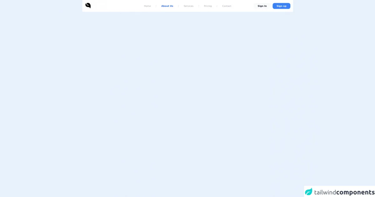
The preview of Navbar & Hamburger Menu ui component.
To create a navbar and hamburger menu with Tailwind CSS, we will use a combination of HTML and CSS. Here is a preview of what the final product will look like:
Free download of the Navbar & Hamburger Menu's source code
The source code of Navbar & Hamburger Menu ui component.
Here is the source code for creating a navbar and hamburger menu with Tailwind CSS:
<body class="bg-blue-500">
	<nav class="relative px-4 py-4 flex justify-between items-center bg-white">
		<a class="text-3xl font-bold leading-none" href="#">
			<svg class="h-10" alt="logo" viewBox="0 0 10240 10240">
				<path xmlns="http://www.w3.org/2000/svg" d="M8284 9162 c-2 -207 -55 -427 -161 -667 -147 -333 -404 -644 -733 -886 -81 -59 -247 -169 -256 -169 -3 0 -18 -9 -34 -20 -26 -19 -344 -180 -354 -180 -3 0 -29 -11 -58 -24 -227 -101 -642 -225 -973 -290 -125 -25 -397 -70 -480 -80 -22 -3 -76 -9 -120 -15 -100 -13 -142 -17 -357 -36 -29 -2 -98 -7 -153 -10 -267 -15 -436 -28 -525 -40 -14 -2 -45 -7 -70 -10 -59 -8 -99 -14 -130 -20 -14 -3 -41 -7 -60 -11 -19 -3 -39 -7 -45 -8 -5 -2 -28 -6 -50 -10 -234 -45 -617 -165 -822 -257 -23 -10 -45 -19 -48 -19 -7 0 -284 -138 -340 -170 -631 -355 -1107 -842 -1402 -1432 -159 -320 -251 -633 -308 -1056 -26 -190 -27 -635 -1 -832 3 -19 7 -59 10 -89 4 -30 11 -84 17 -120 6 -36 12 -77 14 -91 7 -43 33 -174 39 -190 3 -8 7 -28 9 -45 6 -35 52 -221 72 -285 7 -25 23 -79 35 -120 29 -99 118 -283 189 -389 67 -103 203 -244 286 -298 75 -49 178 -103 196 -103 16 0 27 16 77 110 124 231 304 529 485 800 82 124 153 227 157 230 3 3 28 36 54 74 116 167 384 497 546 671 148 160 448 450 560 542 14 12 54 45 90 75 88 73 219 172 313 238 42 29 77 57 77 62 0 5 -13 34 -29 66 -69 137 -149 405 -181 602 -7 41 -14 82 -15 90 -1 8 -6 46 -10 83 -3 37 -8 77 -10 88 -2 11 -7 65 -11 122 -3 56 -8 104 -9 107 -2 3 0 12 5 19 6 10 10 8 15 -10 10 -34 167 -346 228 -454 118 -210 319 -515 340 -515 4 0 40 18 80 40 230 128 521 255 787 343 118 40 336 102 395 113 28 5 53 11 105 23 25 5 59 12 75 15 17 3 41 8 55 11 34 7 274 43 335 50 152 18 372 29 565 29 194 0 481 -11 489 -19 2 -3 -3 -6 -12 -6 -9 -1 -20 -2 -24 -3 -33 -8 -73 -16 -98 -21 -61 -10 -264 -56 -390 -90 -649 -170 -1243 -437 -1770 -794 -60 -41 -121 -82 -134 -93 l-24 -18 124 -59 c109 -52 282 -116 404 -149 92 -26 192 -51 220 -55 17 -3 64 -12 105 -21 71 -14 151 -28 230 -41 19 -3 46 -7 60 -10 14 -2 45 -7 70 -10 25 -4 56 -8 70 -10 14 -2 53 -7 88 -10 35 -4 71 -8 81 -10 10 -2 51 -6 92 -9 101 -9 141 -14 147 -21 3 -3 -15 -5 -39 -6 -24 0 -52 -2 -62 -4 -21 -4 -139 -12 -307 -22 -242 -14 -700 -7 -880 13 -41 4 -187 27 -250 39 -125 23 -274 68 -373 111 -43 19 -81 34 -86 34 -4 0 -16 -8 -27 -17 -10 -10 -37 -33 -59 -52 -166 -141 -422 -395 -592 -586 -228 -257 -536 -672 -688 -925 -21 -36 -43 -66 -47 -68 -4 -2 -8 -7 -8 -11 0 -5 -24 -48 -54 -97 -156 -261 -493 -915 -480 -935 2 -3 47 -21 101 -38 54 -18 107 -36 118 -41 58 -25 458 -138 640 -181 118 -27 126 -29 155 -35 14 -2 45 -9 70 -14 66 -15 137 -28 300 -55 37 -7 248 -33 305 -39 28 -3 84 -9 125 -13 163 -16 792 -8 913 12 12 2 58 9 102 15 248 35 423 76 665 157 58 19 134 46 170 60 86 33 344 156 348 166 2 4 8 7 13 7 14 0 205 116 303 184 180 126 287 216 466 396 282 281 511 593 775 1055 43 75 178 347 225 455 100 227 236 602 286 790 59 220 95 364 120 485 6 28 45 245 50 275 2 14 7 41 10 60 3 19 8 49 10 65 2 17 6 46 9 65 15 100 35 262 40 335 3 39 8 89 10 112 22 225 33 803 21 1043 -3 41 -7 129 -11 195 -3 66 -8 136 -10 155 -2 19 -6 76 -10 125 -3 50 -8 101 -10 115 -2 14 -6 57 -10 95 -7 72 -12 113 -20 175 -2 19 -7 55 -10 80 -6 46 -43 295 -51 340 -2 14 -9 54 -15 90 -5 36 -16 97 -24 135 -8 39 -17 84 -20 100 -12 68 -18 97 -50 248 -19 87 -47 204 -61 260 -14 56 -27 109 -29 117 -30 147 -232 810 -253 832 -4 4 -7 -23 -8 -60z"></path>
			</svg>
		</a>
		<div class="lg:hidden">
			<button class="navbar-burger flex items-center text-blue-600 p-3">
				<svg class="block h-4 w-4 fill-current" viewBox="0 0 20 20" xmlns="http://www.w3.org/2000/svg">
					<title>Mobile menu</title>
					<path d="M0 3h20v2H0V3zm0 6h20v2H0V9zm0 6h20v2H0v-2z"></path>
				</svg>
			</button>
		</div>
		<ul class="hidden absolute top-1/2 left-1/2 transform -translate-y-1/2 -translate-x-1/2 lg:flex lg:mx-auto lg:flex lg:items-center lg:w-auto lg:space-x-6">
			<li><a class="text-sm text-gray-400 hover:text-gray-500" href="#">Home</a></li>
			<li class="text-gray-300">
				<svg xmlns="http://www.w3.org/2000/svg" fill="none" stroke="currentColor" class="w-4 h-4 current-fill" viewBox="0 0 24 24">
					<path stroke-linecap="round" stroke-linejoin="round" stroke-width="2" d="M12 5v0m0 7v0m0 7v0m0-13a1 1 0 110-2 1 1 0 010 2zm0 7a1 1 0 110-2 1 1 0 010 2zm0 7a1 1 0 110-2 1 1 0 010 2z" />
				</svg>
			</li>
			<li><a class="text-sm text-blue-600 font-bold" href="#">About Us</a></li>
			<li class="text-gray-300">
				<svg xmlns="http://www.w3.org/2000/svg" fill="none" stroke="currentColor" class="w-4 h-4 current-fill" viewBox="0 0 24 24">
					<path stroke-linecap="round" stroke-linejoin="round" stroke-width="2" d="M12 5v0m0 7v0m0 7v0m0-13a1 1 0 110-2 1 1 0 010 2zm0 7a1 1 0 110-2 1 1 0 010 2zm0 7a1 1 0 110-2 1 1 0 010 2z" />
				</svg>
			</li>
			<li><a class="text-sm text-gray-400 hover:text-gray-500" href="#">Services</a></li>
			<li class="text-gray-300">
				<svg xmlns="http://www.w3.org/2000/svg" fill="none" stroke="currentColor" class="w-4 h-4 current-fill" viewBox="0 0 24 24">
					<path stroke-linecap="round" stroke-linejoin="round" stroke-width="2" d="M12 5v0m0 7v0m0 7v0m0-13a1 1 0 110-2 1 1 0 010 2zm0 7a1 1 0 110-2 1 1 0 010 2zm0 7a1 1 0 110-2 1 1 0 010 2z" />
				</svg>
			</li>
			<li><a class="text-sm text-gray-400 hover:text-gray-500" href="#">Pricing</a></li>
			<li class="text-gray-300">
				<svg xmlns="http://www.w3.org/2000/svg" fill="none" stroke="currentColor" class="w-4 h-4 current-fill" viewBox="0 0 24 24">
					<path stroke-linecap="round" stroke-linejoin="round" stroke-width="2" d="M12 5v0m0 7v0m0 7v0m0-13a1 1 0 110-2 1 1 0 010 2zm0 7a1 1 0 110-2 1 1 0 010 2zm0 7a1 1 0 110-2 1 1 0 010 2z" />
				</svg>
			</li>
			<li><a class="text-sm text-gray-400 hover:text-gray-500" href="#">Contact</a></li>
		</ul>
		<a class="hidden lg:inline-block lg:ml-auto lg:mr-3 py-2 px-6 bg-gray-50 hover:bg-gray-100 text-sm text-gray-900 font-bold  rounded-xl transition duration-200" href="#">Sign In</a>
		<a class="hidden lg:inline-block py-2 px-6 bg-blue-500 hover:bg-blue-600 text-sm text-white font-bold rounded-xl transition duration-200" href="#">Sign up</a>
	</nav>
	<div class="navbar-menu relative z-50 hidden">
		<div class="navbar-backdrop fixed inset-0 bg-gray-800 opacity-25"></div>
		<nav class="fixed top-0 left-0 bottom-0 flex flex-col w-5/6 max-w-sm py-6 px-6 bg-white border-r overflow-y-auto">
			<div class="flex items-center mb-8">
				<a class="mr-auto text-3xl font-bold leading-none" href="#">
					<svg class="h-12" alt="logo" viewBox="0 0 10240 10240">
				        <path xmlns="http://www.w3.org/2000/svg" d="M8284 9162 c-2 -207 -55 -427 -161 -667 -147 -333 -404 -644 -733 -886 -81 -59 -247 -169 -256 -169 -3 0 -18 -9 -34 -20 -26 -19 -344 -180 -354 -180 -3 0 -29 -11 -58 -24 -227 -101 -642 -225 -973 -290 -125 -25 -397 -70 -480 -80 -22 -3 -76 -9 -120 -15 -100 -13 -142 -17 -357 -36 -29 -2 -98 -7 -153 -10 -267 -15 -436 -28 -525 -40 -14 -2 -45 -7 -70 -10 -59 -8 -99 -14 -130 -20 -14 -3 -41 -7 -60 -11 -19 -3 -39 -7 -45 -8 -5 -2 -28 -6 -50 -10 -234 -45 -617 -165 -822 -257 -23 -10 -45 -19 -48 -19 -7 0 -284 -138 -340 -170 -631 -355 -1107 -842 -1402 -1432 -159 -320 -251 -633 -308 -1056 -26 -190 -27 -635 -1 -832 3 -19 7 -59 10 -89 4 -30 11 -84 17 -120 6 -36 12 -77 14 -91 7 -43 33 -174 39 -190 3 -8 7 -28 9 -45 6 -35 52 -221 72 -285 7 -25 23 -79 35 -120 29 -99 118 -283 189 -389 67 -103 203 -244 286 -298 75 -49 178 -103 196 -103 16 0 27 16 77 110 124 231 304 529 485 800 82 124 153 227 157 230 3 3 28 36 54 74 116 167 384 497 546 671 148 160 448 450 560 542 14 12 54 45 90 75 88 73 219 172 313 238 42 29 77 57 77 62 0 5 -13 34 -29 66 -69 137 -149 405 -181 602 -7 41 -14 82 -15 90 -1 8 -6 46 -10 83 -3 37 -8 77 -10 88 -2 11 -7 65 -11 122 -3 56 -8 104 -9 107 -2 3 0 12 5 19 6 10 10 8 15 -10 10 -34 167 -346 228 -454 118 -210 319 -515 340 -515 4 0 40 18 80 40 230 128 521 255 787 343 118 40 336 102 395 113 28 5 53 11 105 23 25 5 59 12 75 15 17 3 41 8 55 11 34 7 274 43 335 50 152 18 372 29 565 29 194 0 481 -11 489 -19 2 -3 -3 -6 -12 -6 -9 -1 -20 -2 -24 -3 -33 -8 -73 -16 -98 -21 -61 -10 -264 -56 -390 -90 -649 -170 -1243 -437 -1770 -794 -60 -41 -121 -82 -134 -93 l-24 -18 124 -59 c109 -52 282 -116 404 -149 92 -26 192 -51 220 -55 17 -3 64 -12 105 -21 71 -14 151 -28 230 -41 19 -3 46 -7 60 -10 14 -2 45 -7 70 -10 25 -4 56 -8 70 -10 14 -2 53 -7 88 -10 35 -4 71 -8 81 -10 10 -2 51 -6 92 -9 101 -9 141 -14 147 -21 3 -3 -15 -5 -39 -6 -24 0 -52 -2 -62 -4 -21 -4 -139 -12 -307 -22 -242 -14 -700 -7 -880 13 -41 4 -187 27 -250 39 -125 23 -274 68 -373 111 -43 19 -81 34 -86 34 -4 0 -16 -8 -27 -17 -10 -10 -37 -33 -59 -52 -166 -141 -422 -395 -592 -586 -228 -257 -536 -672 -688 -925 -21 -36 -43 -66 -47 -68 -4 -2 -8 -7 -8 -11 0 -5 -24 -48 -54 -97 -156 -261 -493 -915 -480 -935 2 -3 47 -21 101 -38 54 -18 107 -36 118 -41 58 -25 458 -138 640 -181 118 -27 126 -29 155 -35 14 -2 45 -9 70 -14 66 -15 137 -28 300 -55 37 -7 248 -33 305 -39 28 -3 84 -9 125 -13 163 -16 792 -8 913 12 12 2 58 9 102 15 248 35 423 76 665 157 58 19 134 46 170 60 86 33 344 156 348 166 2 4 8 7 13 7 14 0 205 116 303 184 180 126 287 216 466 396 282 281 511 593 775 1055 43 75 178 347 225 455 100 227 236 602 286 790 59 220 95 364 120 485 6 28 45 245 50 275 2 14 7 41 10 60 3 19 8 49 10 65 2 17 6 46 9 65 15 100 35 262 40 335 3 39 8 89 10 112 22 225 33 803 21 1043 -3 41 -7 129 -11 195 -3 66 -8 136 -10 155 -2 19 -6 76 -10 125 -3 50 -8 101 -10 115 -2 14 -6 57 -10 95 -7 72 -12 113 -20 175 -2 19 -7 55 -10 80 -6 46 -43 295 -51 340 -2 14 -9 54 -15 90 -5 36 -16 97 -24 135 -8 39 -17 84 -20 100 -12 68 -18 97 -50 248 -19 87 -47 204 -61 260 -14 56 -27 109 -29 117 -30 147 -232 810 -253 832 -4 4 -7 -23 -8 -60z"></path>
			        </svg>
				</a>
				<button class="navbar-close">
					<svg class="h-6 w-6 text-gray-400 cursor-pointer hover:text-gray-500" xmlns="http://www.w3.org/2000/svg" fill="none" viewBox="0 0 24 24" stroke="currentColor">
						<path stroke-linecap="round" stroke-linejoin="round" stroke-width="2" d="M6 18L18 6M6 6l12 12"></path>
					</svg>
				</button>
			</div>
			<div>
				<ul>
					<li class="mb-1">
						<a class="block p-4 text-sm font-semibold text-gray-400 hover:bg-blue-50 hover:text-blue-600 rounded" href="#">Home</a>
					</li>
					<li class="mb-1">
						<a class="block p-4 text-sm font-semibold text-gray-400 hover:bg-blue-50 hover:text-blue-600 rounded" href="#">About Us</a>
					</li>
					<li class="mb-1">
						<a class="block p-4 text-sm font-semibold text-gray-400 hover:bg-blue-50 hover:text-blue-600 rounded" href="#">Services</a>
					</li>
					<li class="mb-1">
						<a class="block p-4 text-sm font-semibold text-gray-400 hover:bg-blue-50 hover:text-blue-600 rounded" href="#">Pricing</a>
					</li>
					<li class="mb-1">
						<a class="block p-4 text-sm font-semibold text-gray-400 hover:bg-blue-50 hover:text-blue-600 rounded" href="#">Contact</a>
					</li>
				</ul>
			</div>
			<div class="mt-auto">
				<div class="pt-6">
					<a class="block px-4 py-3 mb-3 leading-loose text-xs text-center font-semibold leading-none bg-gray-50 hover:bg-gray-100 rounded-xl" href="#">Sign in</a>
					<a class="block px-4 py-3 mb-2 leading-loose text-xs text-center text-white font-semibold bg-blue-600 hover:bg-blue-700  rounded-xl" href="#">Sign Up</a>
				</div>
				<p class="my-4 text-xs text-center text-gray-400">
					<span>Copyright © 2021</span>
				</p>
			</div>
		</nav>
	</div>
</body>

<script>
// Burger menus
document.addEventListener('DOMContentLoaded', function() {
    // open
    const burger = document.querySelectorAll('.navbar-burger');
    const menu = document.querySelectorAll('.navbar-menu');

    if (burger.length && menu.length) {
        for (var i = 0; i < burger.length; i++) {
            burger[i].addEventListener('click', function() {
                for (var j = 0; j < menu.length; j++) {
                    menu[j].classList.toggle('hidden');
                }
            });
        }
    }

    // close
    const close = document.querySelectorAll('.navbar-close');
    const backdrop = document.querySelectorAll('.navbar-backdrop');

    if (close.length) {
        for (var i = 0; i < close.length; i++) {
            close[i].addEventListener('click', function() {
                for (var j = 0; j < menu.length; j++) {
                    menu[j].classList.toggle('hidden');
                }
            });
        }
    }

    if (backdrop.length) {
        for (var i = 0; i < backdrop.length; i++) {
            backdrop[i].addEventListener('click', function() {
                for (var j = 0; j < menu.length; j++) {
                    menu[j].classList.toggle('hidden');
                }
            });
        }
    }
});
</script>
How to create a Navbar & Hamburger Menu with Tailwind CSS?
Now that we have an understanding of what Tailwind CSS is and why it's a good choice for creating a navbar and hamburger menu, let's dive into the steps for creating one.
Step 1: Set up your HTML
The first step is to set up the HTML for your navbar. Here is an example of what the HTML might look like:
<nav class="bg-gray-800">
  <div class="max-w-7xl mx-auto px-2 sm:px-6 lg:px-8">
    <div class="relative flex items-center justify-between h-16">
      <div class="absolute inset-y-0 left-0 flex items-center sm:hidden">
        <!-- Hamburger menu button -->
        <button type="button" class="inline-flex items-center justify-center p-2 rounded-md text-gray-400 hover:text-white hover:bg-gray-700 focus:outline-none focus:ring-2 focus:ring-inset focus:ring-white" aria-controls="mobile-menu" aria-expanded="false">
          <span class="sr-only">Open main menu</span>
          <!-- Icon when menu is closed. -->
          <!--
            Heroicon name: outline/menu

            Menu open: "hidden", Menu closed: "block"
          -->
          <svg class="block h-6 w-6" xmlns="http://www.w3.org/2000/svg" fill="none" viewBox="0 0 24 24" stroke="currentColor" aria-hidden="true">
            <path stroke-linecap="round" stroke-linejoin="round" stroke-width="2" d="M4 6h16M4 12h16M4 18h16" />
          </svg>
          <!-- Icon when menu is open. -->
          <!--
            Heroicon name: outline/x

            Menu open: "block", Menu closed: "hidden"
          -->
          <svg class="hidden h-6 w-6" xmlns="http://www.w3.org/2000/svg" fill="none" viewBox="0 0 24 24" stroke="currentColor" aria-hidden="true">
            <path stroke-linecap="round" stroke-linejoin="round" stroke-width="2" d="M6 18L18 6M6 6l12 12" />
          </svg>
        </button>
      </div>
      <div class="flex-1 flex items-center justify-center sm:items-stretch sm:justify-start">
        <div class="flex-shrink-0">
          <!-- Your logo goes here -->
          <a href="/">
            <img class="block lg:hidden h-8 w-auto" src="https://tailwindui.com/img/logos/workflow-mark-indigo-500.svg" alt="Workflow">
            <img class="hidden lg:block h-8 w-auto" src="https://tailwindui.com/img/logos/workflow-logo-indigo-500-mark-white-text.svg" alt="Workflow">
          </a>
        </div>
        <div class="hidden sm:block sm:ml-6">
          <div class="flex space-x-4">
            <!-- Navigation links go here -->
            <a href="#" class="bg-gray-900 text-white px-3 py-2 rounded-md text-sm font-medium">Dashboard</a>
            <a href="#" class="text-gray-300 hover:bg-gray-700 hover:text-white px-3 py-2 rounded-md text-sm font-medium">Team</a>
            <a href="#" class="text-gray-300 hover:bg-gray-700 hover:text-white px-3 py-2 rounded-md text-sm font-medium">Projects</a>
            <a href="#" class="text-gray-300 hover:bg-gray-700 hover:text-white px-3 py-2 rounded-md text-sm font-medium">Calendar</a>
          </div>
        </div>
      </div>
      <div class="hidden sm:block sm:ml-6">
        <div class="flex space-x-4">
          <!-- Social media icons go here -->
          <a href="#" class="text-gray-400 hover:text-gray-500">
            <span class="sr-only">Facebook</span>
            <svg class="h-6 w-6" fill="currentColor" viewBox="0 0 24 24" aria-hidden="true">
              <path d="M22 12c0-5.523-4.477-10-10-10S2 6.477 2 12c0 5.168 3.8 9.43 8.75 10.243v-7.243h-2.5v-3h2.5V9.305c0-2.47 1.494-3.805 3.683-3.805 1.063 0 1.974.079 2.243.114v2.555l-1.532.001c-1.209 0-1.444.573-1.444 1.411V9.5h2.888l-.377 3h-2.511v7.243C18.2 21.43 22 17.168 22 12z" />
            </svg>
          </a>
          <a href="#" class="text-gray-400 hover:text-gray-500">
            <span class="sr-only">Twitter</span>
            <svg class="h-6 w-6" fill="currentColor" viewBox="0 0 24 24" aria-hidden="true">
              <path d="M23 4.998v.568c0 6.253-4.75 13.462-13.462 13.462-2.668 0-5.15-.78-7.227-2.116.37.042.75.066 1.14.066 2.23 0 4.278-.758 5.92-2.03-2.086-.038-3.84-1.414-4.44-3.292.29.054.587.083.89.083.433 0 .85-.058 1.247-.166-2.17-.44-3.803-2.36-3.803-4.67v-.06c.633.352 1.35.563 2.117.587-.77-.52-1.28-1.39-1.28-2.38 0-.526.14-1.02.38-1.44 1.39 1.7 3.47 2.81 5.8 2.93-.04-.17-.06-.35-.06-.53 0-1.28.98-2.33 2.17-2.33.63 0 1.2.26 1.61.68.5-.1.97-.28 1.4-.53-.16.52-.52.96-.98 1.24.45-.06.88-.17 1.28-.33-.3.45-.68.84-1.12 1.16z" />
            </svg>
          </a>
          <a href="#" class="text-gray-400 hover:text-gray-500">
            <span class="sr-only">GitHub</span>
            <svg class="h-6 w-6" fill="currentColor" viewBox="0 0 24 24" aria-hidden="true">
              <path fill-rule="evenodd" clip-rule="evenodd" d="M12 2C6.48 2 2 6.477 2 12c0 4.42 2.865 8.167 6.839 9.49.5.092.682-.216.682-.48 0-.236-.01-.865-.015-1.7-2.782.604-3.369-1.34-3.369-1.34-.455-1.156-1.111-1.466-1.111-1.466-.908-.62.07-.608.07-.608 1.003.074 1.532 1.03 1.532 1.03.89 1.524 2.34 1.084 2.91.828.092-.645.35-1.084.635-1.334-2.22-.25-4.555-1.11-4.555-4.94 0-1.09.39-1.986 1.03-2.684-.104-.25-.448-1.266.098-2.636 0 0 .84-.268 2.75 1.02A9.58 9.58 0 0112 5.73c.84.004 1.68.113 2.48.336 1.91-1.288 2.75-1.02 2.75-1.02.546 1.37.202 2.386.1 2.636.64.698 1.03 1.594 1.03 2.684 0 3.838-2.337 4.688-4.565 4.935.36.308.68.918.68 1.85 0 1.338-.01 2.416-.01 2.746 0 .266.18.574.69.47C19.138 20.165 22 16.418 22 12c0-5.523-4.477-10-10-10z" />
            </svg>
          </a>
        </div>
      </div>
    </div>
  </div>

  <!-- Mobile menu, show/hide based on menu state. -->
  <div class="sm:hidden" id="mobile-menu">
    <div class="px-2 pt-2 pb-3 space-y-1">
      <!-- Navigation links go here -->
      <a href="#" class="bg-gray-900 text-white block px-3 py-2 rounded-md text-base font-medium">Dashboard</a>
      <a href="#" class="text-gray-300 hover:bg-gray-700 hover:text-white block px-3 py-2 rounded-md text-base font-medium">Team</a>
      <a href="#" class="text-gray-300 hover:bg-gray-700 hover:text-white block px-3 py-2 rounded-md text-base font-medium">Projects</a>
      <a href="#" class="text-gray-300 hover:bg-gray-700 hover:text-white block px-3 py-2 rounded-md text-base font-medium">Calendar</a>
    </div>
  </div>
</nav>
Step 2: Add Tailwind CSS to your project
The next step is to add Tailwind CSS to your project. You can do this by either downloading the CSS file from the Tailwind CSS website or by using a package manager like npm or yarn.
Once you have the CSS file, you can include it in your HTML file like this:
<link href="https://cdn.jsdelivr.net/npm/tailwindcss@latest/dist/tailwind.min.css" rel="stylesheet">
Step 3: Customize your navbar
Now that you have your HTML and CSS set up, you can start customizing your navbar. You can do this by modifying the CSS classes in your HTML file.
For example, if you want to change the background color of your navbar, you can modify the bg-gray-800 class to a different color:
<nav class="bg-blue-500">
Step 4: Add functionality to your hamburger menu
If you want to add functionality to your hamburger menu, such as opening and closing the menu when the button is clicked, you can use JavaScript or a JavaScript framework like React.
Here is an example of how you might use JavaScript to toggle the visibility of the mobile menu:
const button = document.querySelector('button');
const menu = document.querySelector('#mobile-menu');

button.addEventListener('click', () => {
  menu.classList.toggle('hidden');
});
Step 5: Test and deploy your navbar
The final step is to test your navbar and make any necessary adjustments. Once you are happy with the result, you can deploy your website to a production environment.
Conclusion
Creating a navbar and hamburger menu with Tailwind CSS is a quick and easy process that can save you time and effort compared to writing custom CSS from scratch. By following the steps outlined in this article, you can create a custom navbar and hamburger menu that matches the design of your website.