- Published on
6 Easy Ways To Create A Navbar Famms With Tailwind CSS Without Even Thinking About It
- What is Tailwind CSS?
- The description of Navbar Famms UI component
- Why use Tailwind CSS to create a Navbar Famms UI component?
- The preview of Navbar Famms UI component
- The source code of Navbar Famms UI component
- How to create a Navbar Famms with Tailwind CSS?
- 1. Setup the HTML structure
- 2. Style the background color
- 3. Center the content
- 4. Add the logo
- 5. Add the navigation links
- 6. Make the Navbar Famms responsive
- Conclusion
As a FrontEnd technology blogger, it is important to stay up to date with the latest tools and technologies. One such tool that has gained popularity in recent times is Tailwind CSS. Tailwind CSS is a utility-first CSS framework that allows you to create beautiful and responsive UI components with ease. In this article, we will explore how to create a Navbar Famms UI component with Tailwind CSS.
What is Tailwind CSS?
Tailwind CSS is a utility-first CSS framework that provides a set of pre-defined utility classes for styling HTML elements. These classes can be used to create custom designs without writing any CSS code. Tailwind CSS is highly customizable and can be configured to fit any design style.
The description of Navbar Famms UI component
Navbar Famms is a UI component that is commonly used in web applications. It is a navigation bar that allows users to navigate through different sections of the application. Navbar Famms typically contains links to different pages, dropdown menus, and search bars.
Why use Tailwind CSS to create a Navbar Famms UI component?
Tailwind CSS provides a set of pre-defined utility classes that can be used to create a Navbar Famms UI component with ease. These utility classes provide a consistent design style and make it easy to customize the component to fit any design style. Additionally, Tailwind CSS is highly responsive and can be used to create a mobile-first design.
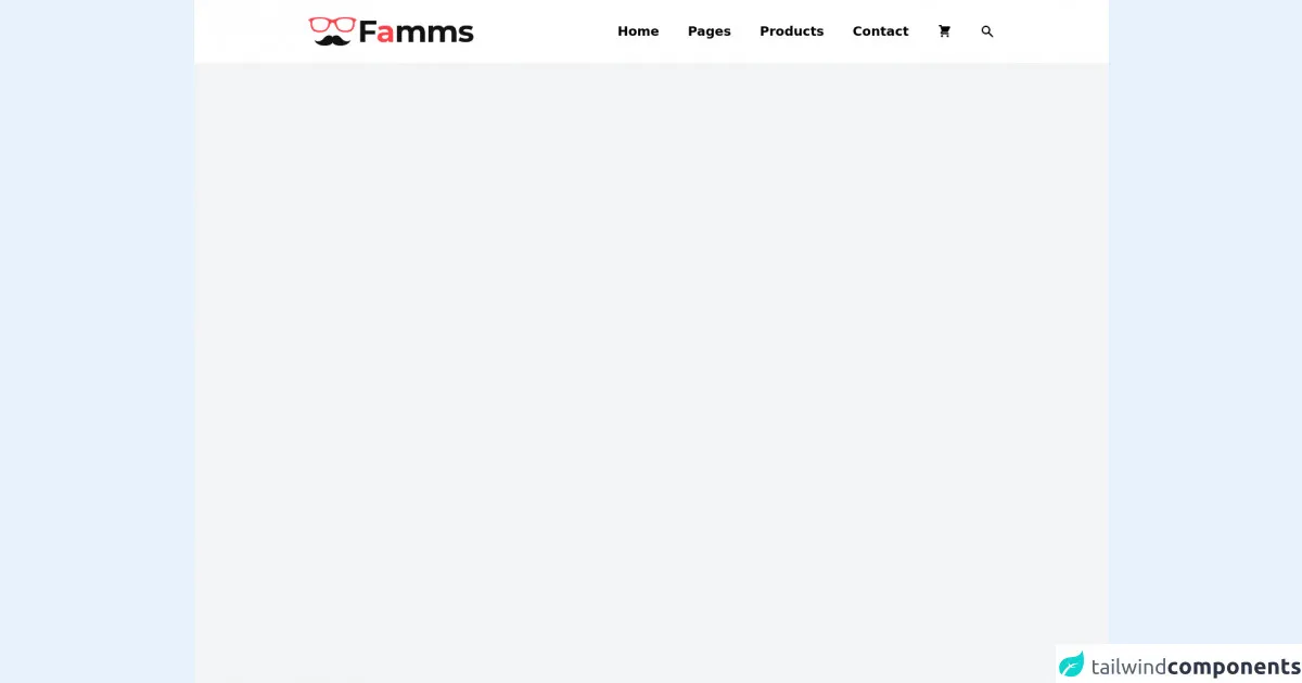
The preview of Navbar Famms UI component
To create a Navbar Famms UI component with Tailwind CSS, we will be using a set of pre-defined utility classes. These classes can be used to style the different elements of the Navbar Famms component.
Free download of the Navbar Famms's source code
The source code of Navbar Famms UI component
To create a Navbar Famms UI component with Tailwind CSS, we will be using a set of pre-defined utility classes. These classes can be used to style the different elements of the Navbar Famms component.
<nav class="h-screen bg-gray-100">
  <div class="flex justify-between items-center bg-white py-6 lg:px-40 md:px-20 px-10">
    <div class="">
      <a href="#"><img class="h-10 cursor-pointer" src="https://i.imgur.com/TMfJoK7.png" alt="" /></a>
    </div>
    <ul class="lg:flex hidden items-center space-x-10">
      <li class="text-lg font-semibold hover:text-red-500 transition duration-200 cursor-pointer">Home</li>
      <li class="text-lg font-semibold hover:text-red-500 transition duration-200 cursor-pointer">Pages</li>
      <li class="text-lg font-semibold hover:text-red-500 transition duration-200 cursor-pointer">Products</li>
      <li class="text-lg font-semibold hover:text-red-500 transition duration-200 cursor-pointer">Contact</li>
      <li class="hover:text-red-500 transition duration-200 cursor-pointer">
        <svg xmlns="http://www.w3.org/2000/svg" class="h-5 w-5" viewBox="0 0 20 20" fill="currentColor">
          <path d="M3 1a1 1 0 000 2h1.22l.305 1.222a.997.997 0 00.01.042l1.358 5.43-.893.892C3.74 11.846 4.632 14 6.414 14H15a1 1 0 000-2H6.414l1-1H14a1 1 0 00.894-.553l3-6A1 1 0 0017 3H6.28l-.31-1.243A1 1 0 005 1H3zM16 16.5a1.5 1.5 0 11-3 0 1.5 1.5 0 013 0zM6.5 18a1.5 1.5 0 100-3 1.5 1.5 0 000 3z" />
        </svg>
      </li>
      <li class="hover:text-red-500 transition duration-200 cursor-pointer">
        <svg xmlns="http://www.w3.org/2000/svg" class="h-5 w-5" viewBox="0 0 20 20" fill="currentColor">
          <path fill-rule="evenodd" d="M8 4a4 4 0 100 8 4 4 0 000-8zM2 8a6 6 0 1110.89 3.476l4.817 4.817a1 1 0 01-1.414 1.414l-4.816-4.816A6 6 0 012 8z" clip-rule="evenodd" />
        </svg>
      </li>
    </ul>
    <div class="lg:hidden">
      <svg xmlns="http://www.w3.org/2000/svg" class="h-10 w-10 cursor-pointer" fill="none" viewBox="0 0 24 24" stroke="currentColor">
        <path stroke-linecap="round" stroke-linejoin="round" stroke-width="2" d="M4 6h16M4 12h16M4 18h16" />
      </svg>
    </div>
  </div>
</nav>
How to create a Navbar Famms with Tailwind CSS?
Creating a Navbar Famms with Tailwind CSS is easy and can be done in 6 simple steps. Let's get started!
1. Setup the HTML structure
The first step is to setup the HTML structure for the Navbar Famms component. We will be using a nav element to wrap the component. Inside the nav element, we will have a div element that will contain the logo and a ul element that will contain the navigation links.
<nav class="bg-gray-800">
  <div class="max-w-7xl mx-auto px-2 sm:px-6 lg:px-8">
    <div class="flex items-center justify-between h-16">
      <!-- Logo -->
      <div class="flex-shrink-0">
        <img class="h-8 w-8" src="/img/logo.svg" alt="Workflow">
      </div>
      <!-- Navigation Links -->
      <div class="hidden md:block">
        <ul class="ml-10 flex items-baseline space-x-4">
          <li class="text-gray-300 hover:bg-gray-700 hover:text-white px-3 py-2 rounded-md text-sm font-medium">Home</li>
          <li class="text-gray-300 hover:bg-gray-700 hover:text-white px-3 py-2 rounded-md text-sm font-medium">About</li>
          <li class="text-gray-300 hover:bg-gray-700 hover:text-white px-3 py-2 rounded-md text-sm font-medium">Contact</li>
        </ul>
      </div>
    </div>
  </div>
</nav>
2. Style the background color
The next step is to style the background color of the Navbar Famms component. We will be using the bg-gray-800 utility class to set the background color to gray.
<nav class="bg-gray-800">
3. Center the content
The next step is to center the content of the Navbar Famms component. We will be using the max-w-7xl and mx-auto utility classes to center the content on the page.
<div class="max-w-7xl mx-auto px-2 sm:px-6 lg:px-8">
4. Add the logo
The next step is to add the logo to the Navbar Famms component. We will be using an img element to display the logo. We will also be using the h-8 and w-8 utility classes to set the height and width of the logo.
<div class="flex-shrink-0">
  <img class="h-8 w-8" src="/img/logo.svg" alt="Workflow">
</div>
5. Add the navigation links
The next step is to add the navigation links to the Navbar Famms component. We will be using a ul element to contain the links and a li element for each link. We will also be using the text-gray-300, hover:bg-gray-700, hover:text-white, px-3, py-2, rounded-md, text-sm, and font-medium utility classes to style the links.
<div class="hidden md:block">
  <ul class="ml-10 flex items-baseline space-x-4">
    <li class="text-gray-300 hover:bg-gray-700 hover:text-white px-3 py-2 rounded-md text-sm font-medium">Home</li>
    <li class="text-gray-300 hover:bg-gray-700 hover:text-white px-3 py-2 rounded-md text-sm font-medium">About</li>
    <li class="text-gray-300 hover:bg-gray-700 hover:text-white px-3 py-2 rounded-md text-sm font-medium">Contact</li>
  </ul>
</div>
6. Make the Navbar Famms responsive
The final step is to make the Navbar Famms component responsive. We will be using the hidden and block utility classes to hide and show the navigation links on smaller screens. We will also be using the sm:px-6 and lg:px-8 utility classes to adjust the padding on smaller and larger screens.
<nav class="bg-gray-800">
  <div class="max-w-7xl mx-auto px-2 sm:px-6 lg:px-8">
    <div class="flex items-center justify-between h-16">
      <!-- Logo -->
      <div class="flex-shrink-0">
        <img class="h-8 w-8" src="/img/logo.svg" alt="Workflow">
      </div>
      <!-- Navigation Links -->
      <div class="hidden md:block">
        <ul class="ml-10 flex items-baseline space-x-4">
          <li class="text-gray-300 hover:bg-gray-700 hover:text-white px-3 py-2 rounded-md text-sm font-medium">Home</li>
          <li class="text-gray-300 hover:bg-gray-700 hover:text-white px-3 py-2 rounded-md text-sm font-medium">About</li>
          <li class="text-gray-300 hover:bg-gray-700 hover:text-white px-3 py-2 rounded-md text-sm font-medium">Contact</li>
        </ul>
      </div>
    </div>
  </div>
</nav>
Conclusion
In this article, we explored how to create a Navbar Famms UI component with Tailwind CSS. We learned that Tailwind CSS provides a set of pre-defined utility classes that can be used to create beautiful and responsive UI components with ease. We also learned that creating a Navbar Famms with Tailwind CSS is easy and can be done in 6 simple steps. With Tailwind CSS, creating UI components has never been easier!