- Published on
Ways To Build A Navbar With Tailwind CSS In 60 Minutes
- What is Tailwind CSS?
- The description of Navbar ui component
- Why use Tailwind CSS to create a Navbar ui component?
- The preview of Navbar ui component
- The source code of Navbar ui component
- How to create a Navbar with Tailwind CSS?
- Step 1: Set up a new project
- Step 2: Configure Tailwind CSS
- Step 3: Create a HTML file
- Step 4: Create a CSS file
- Step 5: Add Tailwind CSS to the CSS file
- Step 6: Customize the navbar
- Step 7: Build the project
- Step 8: Add the CSS file to the HTML file
- Conclusion
What is Tailwind CSS?
Tailwind CSS is a utility-first CSS framework that provides a set of pre-designed CSS classes that can be used to create custom user interfaces quickly. It allows developers to build responsive and modern web applications without writing any CSS code from scratch.
The description of Navbar ui component
A navbar is a user interface component that is used to provide navigation links to different pages of a website. It is typically located at the top of a web page and contains links to the most important sections of the website.
Why use Tailwind CSS to create a Navbar ui component?
Tailwind CSS provides a set of pre-designed CSS classes that can be used to create a navbar easily and quickly. It also provides a responsive design system that allows the navbar to adapt to different screen sizes and devices.
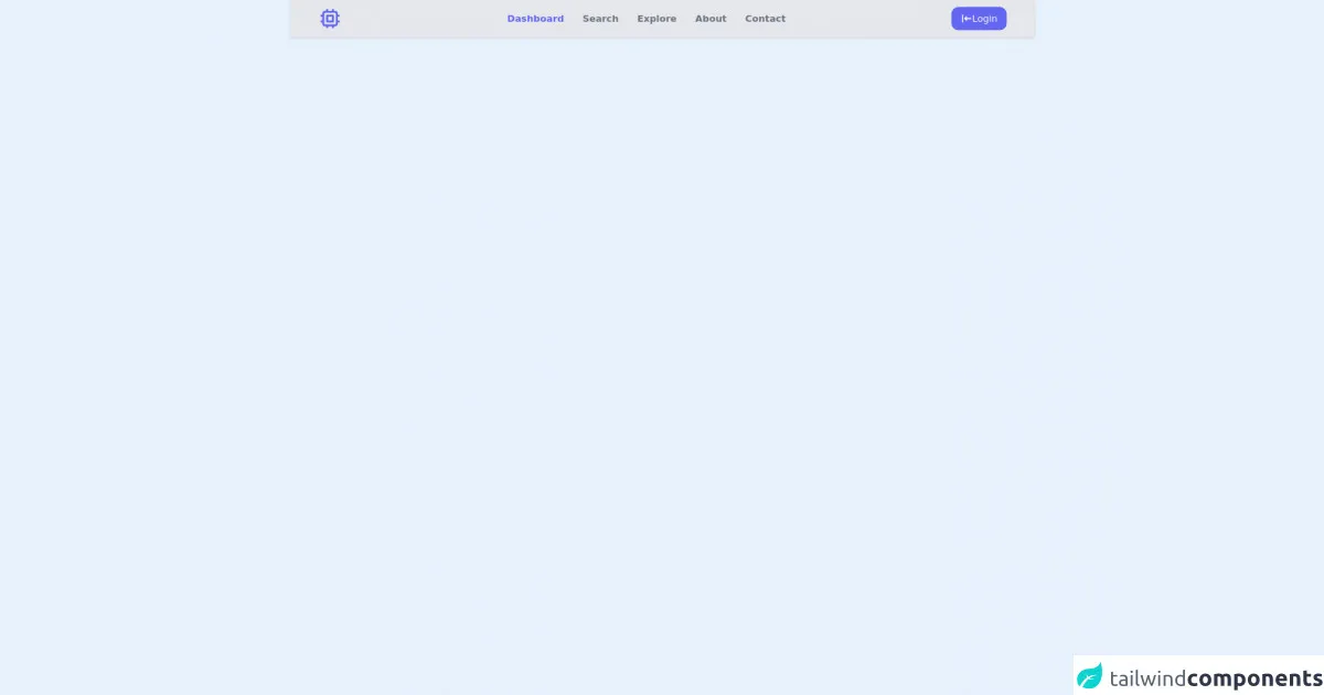
The preview of Navbar ui component
To create a navbar with Tailwind CSS, we can use the navbar component. The navbar component provides a basic navbar layout with a logo and navigation links.
Free download of the Navbar's source code
The source code of Navbar ui component
To create a navbar with Tailwind CSS, we can use the following HTML and CSS code.
<nav class="bg-gray-200 shadow shadow-gray-300 w-100 px-8 md:px-auto">
	<div class="md:h-16 h-28 mx-auto md:px-4 container flex items-center justify-between flex-wrap md:flex-nowrap">
		<!-- Logo -->
		<div class="text-indigo-500 md:order-1">
			<!-- Heroicon - Chip Outline -->
			<svg xmlns="http://www.w3.org/2000/svg" class="h-10 w-10" fill="none" viewBox="0 0 24 24"
				stroke="currentColor">
				<path stroke-linecap="round" stroke-linejoin="round" stroke-width="2"
					d="M9 3v2m6-2v2M9 19v2m6-2v2M5 9H3m2 6H3m18-6h-2m2 6h-2M7 19h10a2 2 0 002-2V7a2 2 0 00-2-2H7a2 2 0 00-2 2v10a2 2 0 002 2zM9 9h6v6H9V9z" />
			</svg>
		</div>
		<div class="text-gray-500 order-3 w-full md:w-auto md:order-2">
			<ul class="flex font-semibold justify-between">
                <!-- Active Link = text-indigo-500
                Inactive Link = hover:text-indigo-500 -->
				<li class="md:px-4 md:py-2 text-indigo-500"><a href="#">Dashboard</a></li>
				<li class="md:px-4 md:py-2 hover:text-indigo-400"><a href="#">Search</a></li>
				<li class="md:px-4 md:py-2 hover:text-indigo-400"><a href="#">Explore</a></li>
				<li class="md:px-4 md:py-2 hover:text-indigo-400"><a href="#">About</a></li>
				<li class="md:px-4 md:py-2 hover:text-indigo-400"><a href="#">Contact</a></li>
			</ul>
		</div>
		<div class="order-2 md:order-3">
			<button class="px-4 py-2 bg-indigo-500 hover:bg-indigo-600 text-gray-50 rounded-xl flex items-center gap-2">
                <!-- Heroicons - Login Solid -->
                <svg xmlns="http://www.w3.org/2000/svg" class="h-5 w-5" viewBox="0 0 20 20" fill="currentColor">
                <path fill-rule="evenodd" d="M3 3a1 1 0 011 1v12a1 1 0 11-2 0V4a1 1 0 011-1zm7.707 3.293a1 1 0 010 1.414L9.414 9H17a1 1 0 110 2H9.414l1.293 1.293a1 1 0 01-1.414 1.414l-3-3a1 1 0 010-1.414l3-3a1 1 0 011.414 0z" clip-rule="evenodd" />
                </svg>
                <span>Login</span>
            </button>
		</div>
	</div>
</nav>
How to create a Navbar with Tailwind CSS?
To create a navbar with Tailwind CSS, we can follow the steps below:
Step 1: Set up a new project
To get started, we need to set up a new project and install Tailwind CSS. We can use the following command to create a new project:
mkdir my-project
cd my-project
npm init -y
Next, we can install Tailwind CSS and its dependencies using the following command:
npm install tailwindcss postcss autoprefixer
Step 2: Configure Tailwind CSS
After installing Tailwind CSS, we need to configure it by creating a tailwind.config.js file in the root directory of our project. We can use the following command to create a default configuration file:
npx tailwindcss init
This will create a tailwind.config.js file with the default configuration. We can customize the configuration file to suit our needs.
Step 3: Create a HTML file
Next, we need to create a HTML file that will contain our navbar. We can use the following HTML code as a starting point:
<!DOCTYPE html>
<html lang="en">
<head>
  <meta charset="UTF-8">
  <meta name="viewport" content="width=device-width, initial-scale=1.0">
  <title>My Website</title>
  <link rel="stylesheet" href="css/style.css">
</head>
<body>
  <nav class="bg-gray-800">
    <div class="max-w-7xl mx-auto px-2 sm:px-6 lg:px-8">
      <div class="relative flex items-center justify-between h-16">
        <div class="absolute inset-y-0 left-0 flex items-center sm:hidden">
          <!-- Mobile menu button -->
          <button type="button" class="inline-flex items-center justify-center p-2 rounded-md text-gray-400 hover:text-white hover:bg-gray-700 focus:outline-none focus:ring-2 focus:ring-inset focus:ring-white" aria-controls="mobile-menu" aria-expanded="false">
            <span class="sr-only">Open main menu</span>
            <!--
              Icon when menu is closed.

              Heroicon name: menu

              Menu open: "hidden", Menu closed: "block"
            -->
            <svg class="block h-6 w-6" xmlns="http://www.w3.org/2000/svg" fill="none" viewBox="0 0 24 24" stroke="currentColor" aria-hidden="true">
              <path stroke-linecap="round" stroke-linejoin="round" stroke-width="2" d="M4 6h16M4 12h16M4 18h16" />
            </svg>
            <!--
              Icon when menu is open.

              Heroicon name: x

              Menu open: "block", Menu closed: "hidden"
            -->
            <svg class="hidden h-6 w-6" xmlns="http://www.w3.org/2000/svg" fill="none" viewBox="0 0 24 24" stroke="currentColor" aria-hidden="true">
              <path stroke-linecap="round" stroke-linejoin="round" stroke-width="2" d="M6 18L18 6M6 6l12 12" />
            </svg>
          </button>
        </div>
        <div class="flex-1 flex items-center justify-center sm:items-stretch sm:justify-start">
          <div class="flex-shrink-0">
            <img class="block lg:hidden h-8 w-auto" src="https://tailwindui.com/img/logos/workflow-mark-indigo-500.svg" alt="Workflow">
            <img class="hidden lg:block h-8 w-auto" src="https://tailwindui.com/img/logos/workflow-logo-indigo-500-mark-white-text.svg" alt="Workflow">
          </div>
          <div class="hidden sm:block sm:ml-6">
            <div class="flex space-x-4">
              <a href="#" class="px-3 py-2 rounded-md text-sm font-medium text-white bg-gray-900">Dashboard</a>
              <a href="#" class="px-3 py-2 rounded-md text-sm font-medium text-gray-300 hover:text-white hover:bg-gray-700">Team</a>
              <a href="#" class="px-3 py-2 rounded-md text-sm font-medium text-gray-300 hover:text-white hover:bg-gray-700">Projects</a>
              <a href="#" class="px-3 py-2 rounded-md text-sm font-medium text-gray-300 hover:text-white hover:bg-gray-700">Calendar</a>
            </div>
          </div>
        </div>
        <div class="absolute inset-y-0 right-0 flex items-center pr-2 sm:static sm:inset-auto sm:ml-6 sm:pr-0">
          <button class="bg-gray-800 p-1 rounded-full text-gray-400 hover:text-white focus:outline-none focus:ring-2 focus:ring-offset-2 focus:ring-offset-gray-800 focus:ring-white">
            <span class="sr-only">View notifications</span>
            <!-- Heroicon name: bell -->
            <svg class="h-6 w-6" xmlns="http://www.w3.org/2000/svg" fill="none" viewBox="0 0 24 24" stroke="currentColor" aria-hidden="true">
              <path stroke-linecap="round" stroke-linejoin="round" stroke-width="2" d="M13 10V3L4 14h7v7l9-11h-7z" />
            </svg>
          </button>

          <!-- Profile dropdown -->
          <div class="ml-3 relative">
            <div>
              <button type="button" class="bg-gray-800 flex text-sm rounded-full focus:outline-none focus:ring-2 focus:ring-offset-2 focus:ring-offset-gray-800 focus:ring-white" id="user-menu" aria-expanded="false" aria-haspopup="true">
                <span class="sr-only">Open user menu</span>
                <img class="h-8 w-8 rounded-full" src="https://avatars.githubusercontent.com/u/45729378?v=4" alt="">
              </button>
            </div>
            <!--
              Profile dropdown panel, show/hide based on dropdown state.

              For animated transitions, import { Transition } from '@headlessui/react' and wrap the next tag in this component:

              <Transition
                show={isOpen}
                enter="transition ease-out duration-100"
                enterFrom="transform opacity-0 scale-95"
                enterTo="transform opacity-100 scale-100"
                leave="transition ease-in duration-75"
                leaveFrom="transform opacity-100 scale-100"
                leaveTo="transform opacity-0 scale-95"
              >
              </Transition>
            -->
            <div class="hidden origin-top-right absolute right-0 mt-2 w-48 rounded-md shadow-lg py-1 bg-white ring-1 ring-black ring-opacity-5" role="menu" aria-orientation="vertical" aria-labelledby="user-menu">
              <a href="#" class="block px-4 py-2 text-sm text-gray-700 hover:bg-gray-100" role="menuitem">Your Profile</a>
              <a href="#" class="block px-4 py-2 text-sm text-gray-700 hover:bg-gray-100" role="menuitem">Settings</a>
              <a href="#" class="block px-4 py-2 text-sm text-gray-700 hover:bg-gray-100" role="menuitem">Sign out</a>
            </div>
          </div>
        </div>
      </div>
    </div>

    <!-- Mobile menu, show/hide based on menu state. -->
    <div class="sm:hidden" id="mobile-menu">
      <div class="px-2 pt-2 pb-3 space-y-1">
        <a href="#" class="block px-3 py-2 rounded-md text-base font-medium text-white bg-gray-900">Dashboard</a>
        <a href="#" class="block px-3 py-2 rounded-md text-base font-medium text-gray-300 hover:text-white hover:bg-gray-700">Team</a>
        <a href="#" class="block px-3 py-2 rounded-md text-base font-medium text-gray-300 hover:text-white hover:bg-gray-700">Projects</a>
        <a href="#" class="block px-3 py-2 rounded-md text-base font-medium text-gray-300 hover:text-white hover:bg-gray-700">Calendar</a>
      </div>
    </div>
  </nav>

  <script src="js/main.js"></script>
</body>
</html>
Step 4: Create a CSS file
Next, we need to create a CSS file that will contain the styles for our navbar. We can use the following CSS code as a starting point:
@tailwind base;
@tailwind components;
@tailwind utilities;

/* Custom styles for the navbar */
Step 5: Add Tailwind CSS to the CSS file
After creating the CSS file, we need to add Tailwind CSS to it using the @import directive. We can add the following code to the CSS file:
@tailwind base;
@tailwind components;
@tailwind utilities;

/* Custom styles for the navbar */
Step 6: Customize the navbar
Finally, we can customize the navbar by adding our own styles to the CSS file. We can use the pre-designed Tailwind CSS classes to style the navbar elements.
For example, we can change the background color of the navbar by adding the bg-gray-800 class to the nav element:
<nav class="bg-gray-800">
We can also add a logo to the navbar by adding an img element with the appropriate classes:
<div class="flex-shrink-0">
  <img class="block lg:hidden h-8 w-auto" src="https://tailwindui.com/img/logos/workflow-mark-indigo-500.svg" alt="Workflow">
  <img class="hidden lg:block h-8 w-auto" src="https://tailwindui.com/img/logos/workflow-logo-indigo-500-mark-white-text.svg" alt="Workflow">
</div>
We can add navigation links to the navbar by adding a elements with the appropriate classes:
<div class="hidden sm:block sm:ml-6">
  <div class="flex space-x-4">
    <a href="#" class="px-3 py-2 rounded-md text-sm font-medium text-white bg-gray-900">Dashboard</a>
    <a href="#" class="px-3 py-2 rounded-md text-sm font-medium text-gray-300 hover:text-white hover:bg-gray-700">Team</a>
    <a href="#" class="px-3 py-2 rounded-md text-sm font-medium text-gray-300 hover:text-white hover:bg-gray-700">Projects</a>
    <a href="#" class="px-3 py-2 rounded-md text-sm font-medium text-gray-300 hover:text-white hover:bg-gray-700">Calendar</a>
  </div>
</div>
Step 7: Build the project
After customizing the navbar, we can build the project by running the following command:
npx tailwindcss build css/style.css -o css/output.css
This will generate a CSS file called output.css in the css directory.
Step 8: Add the CSS file to the HTML file
Finally, we need to add the CSS file to the HTML file using the link element. We can add the following code to the head section of the HTML file:
<link rel="stylesheet" href="css/output.css">
Conclusion
In this article, we have learned how to create a navbar with Tailwind CSS. We have seen how to set up a new project, configure Tailwind CSS, create a HTML file, create a CSS file, add Tailwind CSS to the CSS file, customize the navbar, build the project, and add the CSS file to the HTML file. With these steps, we can create a responsive and modern navbar in just 60 minutes.