- Published on
How to Make A Navbar With Tailwind CSS?
- What is Tailwind CSS?
- The description of navbar UI component
- Why use Tailwind CSS to create a navbar UI component?
- The preview of navbar UI component
- The source code of navbar UI component
- How to create a navbar with Tailwind CSS?
- Conclusion
What is Tailwind CSS?
Tailwind CSS is a utility-first CSS framework that provides a set of pre-defined classes to style your web pages. With Tailwind CSS, you can create complex UI components quickly and easily without writing any custom CSS code.
The description of navbar UI component
A navbar is a common UI component that is used to provide navigation links to different parts of a website. It typically includes a logo, a set of links, and sometimes a search bar or other input fields.
Why use Tailwind CSS to create a navbar UI component?
Tailwind CSS provides a set of pre-defined classes for creating a navbar UI component. This makes it much easier to create a navbar quickly and without having to write any custom CSS code. Additionally, Tailwind CSS is highly customizable, so you can easily modify the look and feel of your navbar to match your website's branding.
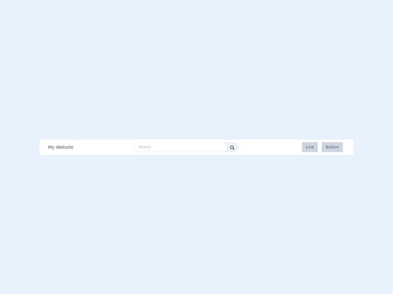
The preview of navbar UI component
To create a navbar with Tailwind CSS, we will use the following classes:
bg-gray-800: sets the background color of the navbar to gray-800.text-white: sets the color of the text in the navbar to white.flex: sets the display property of the navbar to flex.justify-between: aligns the navbar items to the left and right of the navbar.items-center: centers the navbar items vertically.py-4: adds padding to the top and bottom of the navbar.px-6: adds padding to the left and right of the navbar.
Free download of the navbar's source code
The source code of navbar UI component
To create a navbar with Tailwind CSS, you can use the following HTML code:
<!-- This is an example component -->
  <link href="https://cdnjs.cloudflare.com/ajax/libs/font-awesome/5.11.2/css/all.min.css" rel="stylesheet">
  <div class="w-screen flex flex-row items-center p-1 justify-between bg-white shadow-xs">
    <div class="ml-8 text-lg text-gray-700 hidden md:flex">My Website</div>
    <span class="w-screen md:w-1/3 h-10 bg-gray-200 cursor-pointer border border-gray-300 text-sm rounded-full flex">
      <input type="search" name="serch" placeholder="Search"
        class="flex-grow px-4 rounded-l-full rounded-r-full text-sm focus:outline-none">
      <i class="fas fa-search m-3 mr-5 text-lg text-gray-700 w-4 h-4">
      </i>
    </span>
    <div class="flex flex-row-reverse mr-4 ml-4 md:hidden">
      <i class="fas fa-bars"></i>
    </div >
      <div class="flex flex-row-reverse mr-8 hidden md:flex">
        <div class="text-gray-700 text-center bg-gray-400 px-4 py-2 m-2">Button</div>
        <div class="text-gray-700 text-center bg-gray-400 px-4 py-2 m-2">Link</div>
      </div>
  </div>
How to create a navbar with Tailwind CSS?
To create a navbar with Tailwind CSS, follow these steps:
- Create a new HTML file and add the following code:
<nav class="bg-gray-800">
  <div class="max-w-7xl mx-auto px-2 sm:px-6 lg:px-8">
    <div class="relative flex items-center justify-between h-16">
      <div class="flex-1 flex items-center justify-center sm:items-stretch sm:justify-start">
        <div class="flex-shrink-0">
          <img class="h-8 w-8" src="https://tailwindui.com/img/logos/workflow-mark-indigo-500.svg" alt="Workflow">
        </div>
        <div class="hidden sm:block sm:ml-6">
          <div class="flex space-x-4">
            <a href="#" class="text-white px-3 py-2 rounded-md text-sm font-medium">Dashboard</a>
            <a href="#" class="text-gray-300 hover:bg-gray-700 hover:text-white px-3 py-2 rounded-md text-sm font-medium">Team</a>
            <a href="#" class="text-gray-300 hover:bg-gray-700 hover:text-white px-3 py-2 rounded-md text-sm font-medium">Projects</a>
            <a href="#" class="text-gray-300 hover:bg-gray-700 hover:text-white px-3 py-2 rounded-md text-sm font-medium">Calendar</a>
          </div>
        </div>
      </div>
      <div class="hidden sm:block sm:ml-6">
        <div class="flex space-x-4">
          <a href="#" class="text-gray-300 hover:bg-gray-700 hover:text-white px-3 py-2 rounded-md text-sm font-medium">Settings</a>
          <a href="#" class="text-gray-300 hover:bg-gray-700 hover:text-white px-3 py-2 rounded-md text-sm font-medium">Profile</a>
          <a href="#" class="text-gray-300 hover:bg-gray-700 hover:text-white px-3 py-2 rounded-md text-sm font-medium">Sign out</a>
        </div>
      </div>
    </div>
  </div>
</nav>
Save the file and open it in your web browser. You should see a navbar with a logo and a set of links.
Customize the navbar by modifying the Tailwind CSS classes. For example, you can change the background color of the navbar by changing the
bg-gray-800class to a different color.
Conclusion
In this article, we learned how to create a navbar with Tailwind CSS. Tailwind CSS provides a set of pre-defined classes that make it easy to create complex UI components quickly and easily. By following the steps outlined in this article, you can create a customized navbar for your website in no time.