- Published on
How To Create A Navabr With Socail Links With Tailwind CSS In 6 Easy Steps?
- What is Tailwind CSS?
- The description of Navbar with social links UI component
- Why use Tailwind CSS to create a Navbar with social links UI component?
- The preview of Navbar with social links UI component
- The source code of Navbar with social links UI component
- How to create a Navbar with social links with Tailwind CSS?
- Step 1: Set up the HTML structure
- Step 2: Add the brand logo
- Step 3: Add the navigation links
- Step 4: Add the social links
- Step 5: Add responsive design utilities
- Step 6: Add custom styles
- Conclusion
What is Tailwind CSS?
Tailwind CSS is a utility-first CSS framework that allows you to quickly build custom user interfaces. It provides a set of pre-defined CSS classes that you can use to style your HTML elements. With Tailwind CSS, you can create complex layouts and designs without writing custom CSS.
The description of Navbar with social links UI component
A navbar is an essential UI component that helps users navigate a website. It usually contains links to different sections of the website, such as the home page, about page, contact page, etc. A navbar with social links is a variation of the traditional navbar that includes links to social media profiles.
Why use Tailwind CSS to create a Navbar with social links UI component?
Tailwind CSS provides a set of pre-defined CSS classes that you can use to style your HTML elements. This makes it easy to create complex UI components like a navbar with social links without writing custom CSS. Tailwind CSS also provides responsive design utilities that allow you to create a responsive navbar that looks great on all screen sizes.
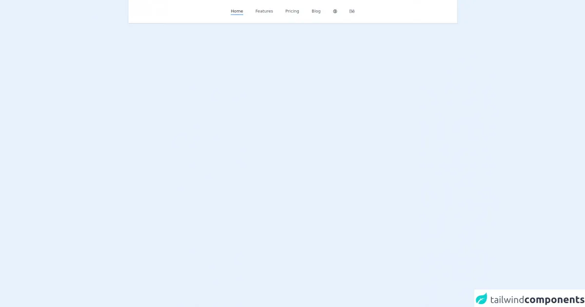
The preview of Navbar with social links UI component
To create a navbar with social links UI component, we will use Tailwind CSS. The navbar will have a brand logo on the left, navigation links in the middle, and social links on the right. Here's a preview of what the final UI component will look like:
Free download of the Navabr with socail links's source code
The source code of Navbar with social links UI component
Here's the HTML and Tailwind CSS code to create a navbar with social links UI component:
<nav class="bg-white shadow">
    <div class="container flex items-center justify-center px-6 py-8 mx-auto text-gray-600 capitalize">
        <a href="#" class="text-gray-800 border-b-2 border-blue-500 mx-1.5 sm:mx-6">home</a>

        <a href="#" class="border-b-2 border-transparent hover:text-gray-800 hover:border-blue-500 mx-1.5 sm:mx-6">features</a>

        <a href="#" class="border-b-2 border-transparent hover:text-gray-800 hover:border-blue-500 mx-1.5 sm:mx-6">pricing</a>

        <a href="#" class="border-b-2 border-transparent hover:text-gray-800 hover:border-blue-500 mx-1.5 sm:mx-6">blog</a>

        <a href="#" class="border-b-2 border-transparent hover:text-gray-800 hover:border-blue-500 mx-1.5 sm:mx-6">
            <svg class="w-4 h-4 fill-current" viewBox="0 0 24 24" fill="none" xmlns="http://www.w3.org/2000/svg"><path fill-rule="evenodd" clip-rule="evenodd" d="M1 11.9554V12.0446C1.01066 14.7301 1.98363 17.1885 3.59196 19.0931C4.05715 19.6439 4.57549 20.1485 5.13908 20.5987C5.70631 21.0519 6.31937 21.4501 6.97019 21.7853C7.90271 22.2656 8.91275 22.6165 9.97659 22.8143C10.5914 22.9286 11.2243 22.9918 11.8705 22.9993C11.9136 22.9998 11.9567 23 11.9999 23C15.6894 23 18.9547 21.1836 20.9502 18.3962C21.3681 17.8125 21.7303 17.1861 22.0291 16.525C22.6528 15.1448 22.9999 13.613 22.9999 12C22.9999 8.73978 21.5816 5.81084 19.3283 3.79653C18.8064 3.32998 18.2397 2.91249 17.6355 2.55132C15.9873 1.56615 14.0597 1 11.9999 1C11.888 1 11.7764 1.00167 11.6653 1.00499C9.99846 1.05479 8.42477 1.47541 7.0239 2.18719C6.07085 2.67144 5.19779 3.29045 4.42982 4.01914C3.7166 4.69587 3.09401 5.4672 2.58216 6.31302C2.22108 6.90969 1.91511 7.54343 1.6713 8.20718C1.24184 9.37631 1.00523 10.6386 1 11.9554ZM20.4812 15.0186C20.8171 14.075 20.9999 13.0588 20.9999 12C20.9999 9.54265 20.0151 7.31533 18.4186 5.6912C17.5975 7.05399 16.5148 8.18424 15.2668 9.0469C15.7351 10.2626 15.9886 11.5603 16.0045 12.8778C16.7692 13.0484 17.5274 13.304 18.2669 13.6488C19.0741 14.0252 19.8141 14.487 20.4812 15.0186ZM15.8413 14.8954C16.3752 15.0321 16.904 15.22 17.4217 15.4614C18.222 15.8346 18.9417 16.3105 19.5723 16.8661C18.0688 19.2008 15.5151 20.7953 12.5788 20.9817C13.5517 20.0585 14.3709 18.9405 14.972 17.6514C15.3909 16.7531 15.678 15.8272 15.8413 14.8954ZM13.9964 12.6219C13.9583 11.7382 13.7898 10.8684 13.5013 10.0408C10.6887 11.2998 7.36584 11.3765 4.35382 9.97197C4.01251 9.81281 3.68319 9.63837 3.36632 9.44983C3.12787 10.2584 2.99991 11.1142 2.99991 12C2.99991 13.9462 3.61763 15.748 4.6677 17.2203C6.83038 14.1875 10.3685 12.4987 13.9964 12.6219ZM6.047 18.7502C7.77258 16.059 10.7714 14.5382 13.8585 14.6191C13.723 15.3586 13.4919 16.093 13.1594 16.8062C12.3777 18.4825 11.1453 19.805 9.67385 20.6965C8.31043 20.3328 7.07441 19.6569 6.047 18.7502ZM11.9999 3C13.7846 3 15.4479 3.51946 16.847 4.41543C16.2113 5.54838 15.3593 6.4961 14.368 7.23057C13.3472 5.57072 11.8752 4.16433 10.027 3.21692C10.6619 3.07492 11.3222 3 11.9999 3ZM8.80619 4.84582C10.4462 5.61056 11.7474 6.80659 12.6379 8.23588C10.3464 9.24654 7.64722 9.30095 5.19906 8.15936C4.83384 7.98905 4.48541 7.79735 4.15458 7.58645C4.91365 6.24006 6.00929 5.10867 7.32734 4.30645C7.82672 4.44058 8.32138 4.61975 8.80619 4.84582Z" fill="currentColor" /></svg>
        </a>

        <a href="#" class="border-b-2 border-transparent hover:text-gray-800 hover:border-blue-500 mx-1.5 sm:mx-6">
            <svg class="w-5 h-5 fill-current" viewBox="0 0 24 24" xmlns="http://www.w3.org/2000/svg"><path d="m.75 19h7.092c4.552 0 6.131-6.037 2.107-8.203 2.701-2.354 1.029-6.797-2.595-6.797h-6.604c-.414 0-.75.336-.75.75v13.5c0 .414.336.75.75.75zm.75-13.5h5.854c3.211 0 3.215 4.768 0 4.768h-5.854zm0 6.268h6.342c3.861 0 3.861 5.732 0 5.732h-6.342z"/><path d="m18.374 7.857c-3.259 0-5.755 2.888-5.635 5.159-.247 3.28 2.397 5.984 5.635 5.984 2.012 0 3.888-1.065 4.895-2.781.503-.857-.791-1.613-1.293-.76-.739 1.259-2.12 2.041-3.602 2.041-2.187 0-3.965-1.668-4.125-3.771 1.443.017 4.136-.188 8.987-.033.016 0 .027-.008.042-.008 2-.09-.189-5.831-4.904-5.831zm-3.928 4.298c1.286-3.789 6.718-3.676 7.89.064-4.064.097-6.496-.066-7.89-.064z"/><path d="m21.308 6.464c.993 0 .992-1.5 0-1.5h-5.87c-.993 0-.992 1.5 0 1.5z"/></svg>
        </a>
    </div>
</nav>
How to create a Navbar with social links with Tailwind CSS?
Follow these six easy steps to create a navbar with social links UI component with Tailwind CSS:
Step 1: Set up the HTML structure
The first step is to set up the HTML structure for the navbar. Here's the basic structure:
<nav class="bg-gray-800">
  <div class="max-w-7xl mx-auto px-2 sm:px-6 lg:px-8">
    <div class="relative flex items-center justify-between h-16">
      <!-- Brand logo -->
      <div class="flex-shrink-0 flex items-center">
        <a href="#">
          <img class="h-8 w-auto" src="logo.svg" alt="Logo">
        </a>
      </div>

      <!-- Navigation links -->
      <div class="flex-1 flex items-center justify-center sm:items-stretch sm:justify-start">
        <div class="hidden sm:block sm:ml-6">
          <div class="flex space-x-4">
            <a href="#" class="text-gray-300 hover:bg-gray-700 hover:text-white px-3 py-2 rounded-md text-sm font-medium">Home</a>
            <a href="#" class="text-gray-300 hover:bg-gray-700 hover:text-white px-3 py-2 rounded-md text-sm font-medium">About</a>
            <a href="#" class="text-gray-300 hover:bg-gray-700 hover:text-white px-3 py-2 rounded-md text-sm font-medium">Contact</a>
          </div>
        </div>
      </div>

      <!-- Social links -->
      <div class="hidden sm:block">
        <div class="flex items-center">
          <a href="#" class="text-gray-300 hover:bg-gray-700 hover:text-white px-3 py-2 rounded-md text-sm font-medium">Facebook</a>
          <a href="#" class="text-gray-300 hover:bg-gray-700 hover:text-white px-3 py-2 rounded-md text-sm font-medium">Twitter</a>
          <a href="#" class="text-gray-300 hover:bg-gray-700 hover:text-white px-3 py-2 rounded-md text-sm font-medium">Instagram</a>
        </div>
      </div>
    </div>
  </div>
</nav>
In this code, we have a nav element with a class of bg-gray-800 to set the background color of the navbar. Inside the nav element, we have a div element with classes to set the maximum width and padding of the navbar.
Inside the div element, we have a div element with classes to set the height and alignment of the navbar. Inside this div element, we have three div elements:
- The first
divelement contains the brand logo. - The second
divelement contains the navigation links. - The third
divelement contains the social links.
Step 2: Add the brand logo
To add the brand logo, we need to add an img element inside the first div element. We also need to add some classes to style the logo:
<div class="flex-shrink-0 flex items-center">
  <a href="#">
    <img class="h-8 w-auto" src="logo.svg" alt="Logo">
  </a>
</div>
In this code, we have an a element with a href attribute to link to the homepage. Inside the a element, we have an img element with classes to set the height and width of the logo.
Step 3: Add the navigation links
To add the navigation links, we need to add an a element for each link inside the second div element. We also need to add some classes to style the links:
<div class="flex-1 flex items-center justify-center sm:items-stretch sm:justify-start">
  <div class="hidden sm:block sm:ml-6">
    <div class="flex space-x-4">
      <a href="#" class="text-gray-300 hover:bg-gray-700 hover:text-white px-3 py-2 rounded-md text-sm font-medium">Home</a>
      <a href="#" class="text-gray-300 hover:bg-gray-700 hover:text-white px-3 py-2 rounded-md text-sm font-medium">About</a>
      <a href="#" class="text-gray-300 hover:bg-gray-700 hover:text-white px-3 py-2 rounded-md text-sm font-medium">Contact</a>
    </div>
  </div>
</div>
In this code, we have a div element with classes to set the alignment of the navigation links. Inside this div element, we have another div element with classes to hide the navigation links on small screens and add some margin on larger screens. Inside this div element, we have an a element for each navigation link with classes to style the links.
Step 4: Add the social links
To add the social links, we need to add an a element for each link inside the third div element. We also need to add some classes to style the links:
<div class="hidden sm:block">
  <div class="flex items-center">
    <a href="#" class="text-gray-300 hover:bg-gray-700 hover:text-white px-3 py-2 rounded-md text-sm font-medium">Facebook</a>
    <a href="#" class="text-gray-300 hover:bg-gray-700 hover:text-white px-3 py-2 rounded-md text-sm font-medium">Twitter</a>
    <a href="#" class="text-gray-300 hover:bg-gray-700 hover:text-white px-3 py-2 rounded-md text-sm font-medium">Instagram</a>
  </div>
</div>
In this code, we have a div element with a class to hide the social links on small screens. Inside this div element, we have another div element with classes to align the social links to the right of the navbar. Inside this div element, we have an a element for each social link with classes to style the links.
Step 5: Add responsive design utilities
To make the navbar responsive, we need to add some responsive design utilities provided by Tailwind CSS. We need to add the sm prefix to some classes to apply the styles only on small screens:
<div class="max-w-7xl mx-auto px-2 sm:px-6 lg:px-8">
  <div class="relative flex items-center justify-between h-16">
    <!-- Brand logo -->
    <div class="flex-shrink-0 flex items-center">
      <a href="#">
        <img class="h-8 w-auto" src="logo.svg" alt="Logo">
      </a>
    </div>

    <!-- Navigation links -->
    <div class="flex-1 flex items-center justify-center sm:items-stretch sm:justify-start">
      <div class="hidden sm:block sm:ml-6">
        <div class="flex space-x-4">
          <a href="#" class="text-gray-300 hover:bg-gray-700 hover:text-white px-3 py-2 rounded-md text-sm font-medium">Home</a>
          <a href="#" class="text-gray-300 hover:bg-gray-700 hover:text-white px-3 py-2 rounded-md text-sm font-medium">About</a>
          <a href="#" class="text-gray-300 hover:bg-gray-700 hover:text-white px-3 py-2 rounded-md text-sm font-medium">Contact</a>
        </div>
      </div>
    </div>

    <!-- Social links -->
    <div class="hidden sm:block">
      <div class="flex items-center">
        <a href="#" class="text-gray-300 hover:bg-gray-700 hover:text-white px-3 py-2 rounded-md text-sm font-medium">Facebook</a>
        <a href="#" class="text-gray-300 hover:bg-gray-700 hover:text-white px-3 py-2 rounded-md text-sm font-medium">Twitter</a>
        <a href="#" class="text-gray-300 hover:bg-gray-700 hover:text-white px-3 py-2 rounded-md text-sm font-medium">Instagram</a>
      </div>
    </div>
  </div>
</div>
In this code, we have added the sm prefix to some classes to apply the styles only on small screens.
Step 6: Add custom styles
Finally, we can add some custom styles to the navbar to make it look more appealing. Here's the complete HTML and Tailwind CSS code with custom styles:
<nav class="bg-gray-800">
  <div class="max-w-7xl mx-auto px-2 sm:px-6 lg:px-8">
    <div class="relative flex items-center justify-between h-16">
      <!-- Brand logo -->
      <div class="flex-shrink-0 flex items-center">
        <a href="#">
          <img class="h-8 w-auto" src="logo.svg" alt="Logo">
        </a>
      </div>

      <!-- Navigation links -->
      <div class="flex-1 flex items-center justify-center sm:items-stretch sm:justify-start">
        <div class="hidden sm:block sm:ml-6">
          <div class="flex space-x-4">
            <a href="#" class="text-gray-300 hover:bg-gray-700 hover:text-white px-3 py-2 rounded-md text-sm font-medium">Home</a>
            <a href="#" class="text-gray-300 hover:bg-gray-700 hover:text-white px-3 py-2 rounded-md text-sm font-medium">About</a>
            <a href="#" class="text-gray-300 hover:bg-gray-700 hover:text-white px-3 py-2 rounded-md text-sm font-medium">Contact</a>
          </div>
        </div>
      </div>

      <!-- Social links -->
      <div class="hidden sm:block">
        <div class="flex items-center">
          <a href="#" class="text-gray-300 hover:bg-gray-700 hover:text-white px-3 py-2 rounded-md text-sm font-medium">Facebook</a>
          <a href="#" class="text-gray-300 hover:bg-gray-700 hover:text-white px-3 py-2 rounded-md text-sm font-medium">Twitter</a>
          <a href="#" class="text-gray-300 hover:bg-gray-700 hover:text-white px-3 py-2 rounded-md text-sm font-medium">Instagram</a>
        </div>
      </div>
    </div>
  </div>
</nav>
/* Custom styles */
nav a {
  transition: background-color 0.3s ease;
}

nav a:hover {
  background-color: #4a5568;
}

nav img {
  margin-left: 20px;
}
In this code, we have added custom styles to the navbar. We have added a transition effect to the links on hover and added some margin to the logo.
Conclusion
In this article, we have learned how to create a navbar with social links UI component with Tailwind CSS in six easy steps. Tailwind CSS provides a set of pre-defined CSS classes that make it easy to create complex UI components like a navbar with social links without writing custom CSS. With Tailwind CSS, you can create responsive and appealing UI components in no time.