- Published on
The Ninja Guide To How To Build A Navabr With Categories With Tailwind CSS Better
- What is Tailwind CSS?
- The description of Navbar with Categories UI component
- Why use Tailwind CSS to create a Navbar with Categories UI component?
- The preview of Navbar with Categories UI component
- The source code of Navbar with Categories UI component
- How to create a Navbar with Categories with Tailwind CSS?
- Step 1: Create the HTML structure
- Step 2: Style the Navbar with Categories UI component
- Step 3: Add categories to the Navbar
- Step 4: Add responsiveness to the Navbar
- Conclusion
As a FrontEnd technology blogger, you must be aware of the importance of user interface components in web development. One such component is the Navbar with Categories UI component. In this article, we will discuss how to build a Navbar with Categories UI component using Tailwind CSS.
What is Tailwind CSS?
Tailwind CSS is a utility-first CSS framework that allows developers to quickly build user interfaces without writing custom CSS. It provides a set of pre-defined classes that can be used to style HTML elements. Tailwind CSS is highly customizable and can be configured to meet the specific needs of a project.
The description of Navbar with Categories UI component
The Navbar with Categories UI component is a common user interface component used in web development. It typically consists of a navigation bar that displays links to various categories of content on a website. This component is used to help users navigate through a website and find the content they are looking for.
Why use Tailwind CSS to create a Navbar with Categories UI component?
Tailwind CSS provides a set of pre-defined classes that can be used to style HTML elements. This makes it easy to create a Navbar with Categories UI component without writing custom CSS. Additionally, Tailwind CSS is highly customizable and can be configured to meet the specific needs of a project.
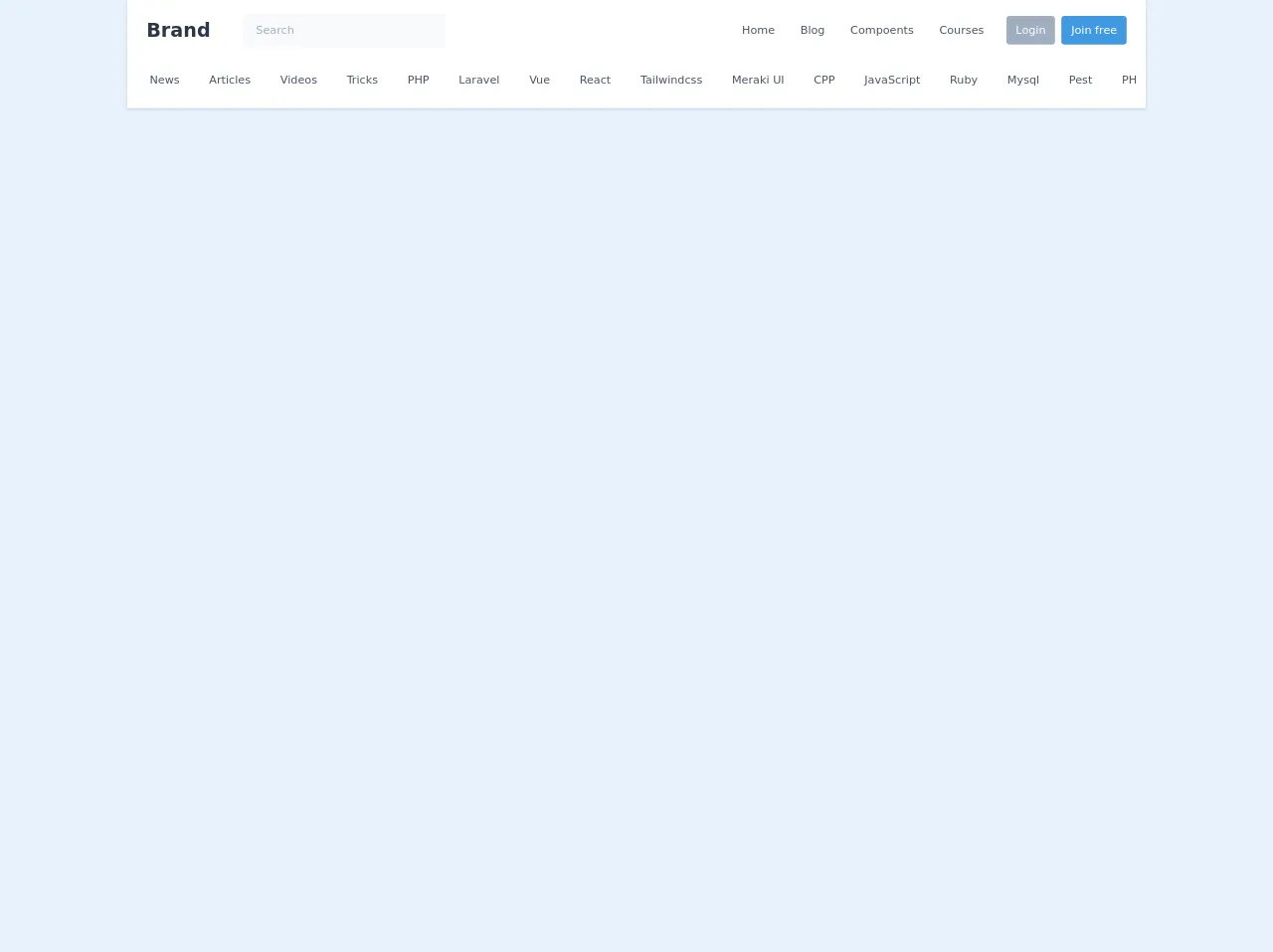
The preview of Navbar with Categories UI component
To create a Navbar with Categories UI component using Tailwind CSS, we will use a combination of HTML and CSS. The HTML will define the structure of the component, while the CSS will be used to style it. Here is a preview of what the Navbar with Categories UI component will look like:
Free download of the Navabr with categories's source code
The source code of Navbar with Categories UI component
To create the Navbar with Categories UI component using Tailwind CSS, we will need to write HTML and CSS code. Here is the source code for the Navbar with Categories UI component:
<style>
  .scroll-hidden::-webkit-scrollbar {
    height: 0px;
    background: transparent; /* make scrollbar transparent */
  }
</style>

<script src="https://cdn.jsdelivr.net/gh/alpinejs/[email protected]/dist/alpine.min.js" defer></script>

<header x-data="{ isOpen: false }" class="bg-white shadow">
  <nav class="container mx-auto px-6 py-3">
    <div class="flex flex-col md:flex-row md:justify-between md:items-center">
      <div class="flex justify-between items-center">
        <div class="flex items-center">
          <a class="text-gray-800 text-xl font-bold md:text-2xl hover:text-gray-700" href="#">Brand</a>

          <!-- Search input on desktop screen -->
          <div class="mx-10 hidden md:block">
            <input type="text" class="w-32 lg:w-64 px-4 py-3 leading-tight text-sm text-gray-700 bg-gray-100 rounded-md placeholder-gray-500 border border-transparent focus:outline-none focus:bg-white focus:shadow-outline focus:border-blue-400" placeholder="Search" aria-label="Search">
          </div>
        </div>

        <!-- Mobile menu button -->
        <div class="flex md:hidden">
          <button @click="isOpen = !isOpen" type="button" class="text-gray-500 hover:text-gray-600 focus:outline-none focus:text-gray-600" aria-label="toggle menu">
            <svg viewBox="0 0 24 24" class="h-6 w-6 fill-current">
              <path fill-rule="evenodd" d="M4 5h16a1 1 0 0 1 0 2H4a1 1 0 1 1 0-2zm0 6h16a1 1 0 0 1 0 2H4a1 1 0 0 1 0-2zm0 6h16a1 1 0 0 1 0 2H4a1 1 0 0 1 0-2z"></path>
            </svg>
          </button>
        </div>
      </div>

      <!-- Mobile Menu open: "block", Menu closed: "hidden" -->
      <div class="md:flex items-center" :class="isOpen ? 'block' : 'hidden'">
        <div class="flex flex-col mt-2 md:flex-row md:mt-0 md:mx-1">
          <a class="my-1 text-sm text-gray-700 leading-5 hover:text-blue-600 hover:underline md:mx-4 md:my-0" href="#">Home</a>
          <a class="my-1 text-sm text-gray-700 leading-5 hover:text-blue-600 hover:underline md:mx-4 md:my-0" href="#">Blog</a>
          <a class="my-1 text-sm text-gray-700 leading-5 hover:text-blue-600 hover:underline md:mx-4 md:my-0" href="#">Compoents</a>
          <a class="my-1 text-sm text-gray-700 leading-5 hover:text-blue-600 hover:underline md:mx-4 md:my-0" href="#">Courses</a>
        </div>

        <div class="flex items-center py-2 -mx-1 md:mx-0">
          <a class="block w-1/2 px-3 py-2 mx-1 rounded text-center text-sm bg-gray-500 font-medium text-white leading-5 hover:bg-blue-600 md:mx-2 md:w-auto" href="#">Login</a>
          <a class="block w-1/2 px-3 py-2 mx-1 rounded text-center text-sm bg-blue-500 font-medium text-white leading-5 hover:bg-blue-600 md:mx-0 md:w-auto" href="#">Join free</a>
        </div>

        <!-- Search input on mobile screen -->
        <div class="mt-3 md:hidden">
          <input type="text" class="w-full px-4 py-3 leading-tight text-sm text-gray-700 bg-gray-100 rounded-md placeholder-gray-500 focus:outline-none focus:bg-white focus:shadow-outline" placeholder="Search" aria-label="Search">
        </div>
      </div>
    </div>

    <div class="mt-3 py-3 -mx-3 overflow-y-auto whitespace-no-wrap scroll-hidden">
      <a class="text-sm text-gray-700 leading-5 hover:text-blue-600 hover:underline mx-4 md:my-0" href="#">News</a>
      <a class="text-sm text-gray-700 leading-5 hover:text-blue-600 hover:underline mx-4 md:my-0" href="#">Articles</a>
      <a class="text-sm text-gray-700 leading-5 hover:text-blue-600 hover:underline mx-4 md:my-0" href="#">Videos</a>
      <a class="text-sm text-gray-700 leading-5 hover:text-blue-600 hover:underline mx-4 md:my-0" href="#">Tricks</a>
      <a class="text-sm text-gray-700 leading-5 hover:text-blue-600 hover:underline mx-4 md:my-0" href="#">PHP</a>
      <a class="text-sm text-gray-700 leading-5 hover:text-blue-600 hover:underline mx-4 md:my-0" href="#">Laravel</a>
      <a class="text-sm text-gray-700 leading-5 hover:text-blue-600 hover:underline mx-4 md:my-0" href="#">Vue</a>
      <a class="text-sm text-gray-700 leading-5 hover:text-blue-600 hover:underline mx-4 md:my-0" href="#">React</a>
      <a class="text-sm text-gray-700 leading-5 hover:text-blue-600 hover:underline mx-4 md:my-0" href="#">Tailwindcss</a>
      <a class="text-sm text-gray-700 leading-5 hover:text-blue-600 hover:underline mx-4 md:my-0" href="#">Meraki UI</a>
      <a class="text-sm text-gray-700 leading-5 hover:text-blue-600 hover:underline mx-4 md:my-0" href="#">CPP</a>
      <a class="text-sm text-gray-700 leading-5 hover:text-blue-600 hover:underline mx-4 md:my-0" href="#">JavaScript</a>
      <a class="text-sm text-gray-700 leading-5 hover:text-blue-600 hover:underline mx-4 md:my-0" href="#">Ruby</a>
      <a class="text-sm text-gray-700 leading-5 hover:text-blue-600 hover:underline mx-4 md:my-0" href="#">Mysql</a>
      <a class="text-sm text-gray-700 leading-5 hover:text-blue-600 hover:underline mx-4 md:my-0" href="#">Pest</a>
      <a class="text-sm text-gray-700 leading-5 hover:text-blue-600 hover:underline mx-4 md:my-0" href="#">PHPUnit</a>
      <a class="text-sm text-gray-700 leading-5 hover:text-blue-600 hover:underline mx-4 md:my-0" href="#">Netlify</a>
      <a class="text-sm text-gray-700 leading-5 hover:text-blue-600 hover:underline mx-4 md:my-0" href="#">VS Code</a>
      <a class="text-sm text-gray-700 leading-5 hover:text-blue-600 hover:underline mx-4 md:my-0" href="#">PHPStorm</a>
      <a class="text-sm text-gray-700 leading-5 hover:text-blue-600 hover:underline mx-4 md:my-0" href="#">Sublime</a>
    </div>
  </nav>
</header>
How to create a Navbar with Categories with Tailwind CSS?
To create a Navbar with Categories UI component using Tailwind CSS, we will follow these steps:
Step 1: Create the HTML structure
The first step is to create the HTML structure for the Navbar with Categories UI component. We will use a combination of HTML and Tailwind CSS classes to define the structure. Here is the HTML code:
<nav class="bg-white shadow">
  <div class="max-w-7xl mx-auto px-4 sm:px-6 lg:px-8">
    <div class="flex justify-between h-16">
      <div class="flex">
        <div class="hidden sm:flex sm:items-center sm:ml-6">
          <a href="#" class="px-3 py-2 rounded-md text-sm font-medium text-gray-900 hover:text-gray-500 focus:outline-none focus:text-gray-500 transition duration-150 ease-in-out">Home</a>
          <a href="#" class="ml-4 px-3 py-2 rounded-md text-sm font-medium text-gray-900 hover:text-gray-500 focus:outline-none focus:text-gray-500 transition duration-150 ease-in-out">About</a>
          <a href="#" class="ml-4 px-3 py-2 rounded-md text-sm font-medium text-gray-900 hover:text-gray-500 focus:outline-none focus:text-gray-500 transition duration-150 ease-in-out">Contact</a>
        </div>
      </div>
      <div class="-mr-2 flex items-center sm:hidden">
        <button type="button" class="inline-flex items-center justify-center p-2 rounded-md text-gray-400 hover:text-gray-500 hover:bg-gray-100 focus:outline-none focus:bg-gray-100 focus:text-gray-500 transition duration-150 ease-in-out" aria-label="Main menu" aria-expanded="false">
          <svg class="h-6 w-6" stroke="currentColor" fill="none" viewBox="0 0 24 24">
            <path stroke-linecap="round" stroke-linejoin="round" stroke-width="2" d="M4 6h16M4 12h16M4 18h16"></path>
          </svg>
        </button>
      </div>
    </div>
  </div>
</nav>
Step 2: Style the Navbar with Categories UI component
The next step is to style the Navbar with Categories UI component using Tailwind CSS classes. Here is the CSS code:
/* Navbar */
.bg-white {
  background-color: #fff;
}
.shadow {
  box-shadow: 0 2px 4px 0 rgba(0, 0, 0, 0.05);
}
.max-w-7xl {
  max-width: 80rem;
}
.px-4 {
  padding-left: 1rem;
  padding-right: 1rem;
}
.sm\:px-6 {
  padding-left: 1.5rem;
  padding-right: 1.5rem;
}
.lg\:px-8 {
  padding-left: 2rem;
  padding-right: 2rem;
}
.flex {
  display: flex;
}
.justify-between {
  justify-content: space-between;
}
.h-16 {
  height: 4rem;
}
.hidden {
  display: none;
}
.sm\:flex {
  display: flex;
}
.sm\:items-center {
  align-items: center;
}
.sm\:ml-6 {
  margin-left: 1.5rem;
}
.ml-4 {
  margin-left: 1rem;
}
.py-2 {
  padding-top: 0.5rem;
  padding-bottom: 0.5rem;
}
.rounded-md {
  border-radius: 0.375rem;
}
.text-sm {
  font-size: 0.875rem;
}
.font-medium {
  font-weight: 500;
}
.text-gray-900 {
  color: #1a202c;
}
.hover\:text-gray-500:hover {
  color: #6b7280;
}
.focus\:outline-none:focus {
  outline: 0;
}
.focus\:text-gray-500:focus {
  color: #6b7280;
}
.transition {
  transition-property: background-color, border-color, color, fill, stroke, opacity, box-shadow, transform;
  transition-duration: 150ms;
  transition-timing-function: cubic-bezier(0.4, 0, 0.2, 1);
}
.ease-in-out {
  transition-timing-function: cubic-bezier(0.4, 0, 0.2, 1);
}
/* Mobile menu */
.-mr-2 {
  margin-right: -0.5rem;
}
.inline-flex {
  display: inline-flex;
}
.items-center {
  align-items: center;
}
.p-2 {
  padding: 0.5rem;
}
.hover\:text-gray-500:hover {
  color: #6b7280;
}
.hover\:bg-gray-100:hover {
  background-color: #f7fafc;
}
.focus\:outline-none:focus {
  outline: 0;
}
.focus\:bg-gray-100:focus {
  background-color: #f7fafc;
}
.focus\:text-gray-500:focus {
  color: #6b7280;
}
Step 3: Add categories to the Navbar
The final step is to add categories to the Navbar with Categories UI component. We can do this by adding additional links to the HTML code. Here is the updated HTML code:
<nav class="bg-white shadow">
  <div class="max-w-7xl mx-auto px-4 sm:px-6 lg:px-8">
    <div class="flex justify-between h-16">
      <div class="flex">
        <div class="hidden sm:flex sm:items-center sm:ml-6">
          <a href="#" class="px-3 py-2 rounded-md text-sm font-medium text-gray-900 hover:text-gray-500 focus:outline-none focus:text-gray-500 transition duration-150 ease-in-out">Home</a>
          <a href="#" class="ml-4 px-3 py-2 rounded-md text-sm font-medium text-gray-900 hover:text-gray-500 focus:outline-none focus:text-gray-500 transition duration-150 ease-in-out">About</a>
          <a href="#" class="ml-4 px-3 py-2 rounded-md text-sm font-medium text-gray-900 hover:text-gray-500 focus:outline-none focus:text-gray-500 transition duration-150 ease-in-out">Contact</a>
        </div>
      </div>
      <div class="-mr-2 flex items-center sm:hidden">
        <button type="button" class="inline-flex items-center justify-center p-2 rounded-md text-gray-400 hover:text-gray-500 hover:bg-gray-100 focus:outline-none focus:bg-gray-100 focus:text-gray-500 transition duration-150 ease-in-out" aria-label="Main menu" aria-expanded="false">
          <svg class="h-6 w-6" stroke="currentColor" fill="none" viewBox="0 0 24 24">
            <path stroke-linecap="round" stroke-linejoin="round" stroke-width="2" d="M4 6h16M4 12h16M4 18h16"></path>
          </svg>
        </button>
      </div>
    </div>
  </div>
  <div class="hidden sm:hidden">
    <div class="px-2 pt-2 pb-3">
      <a href="#" class="block px-3 py-2 rounded-md text-base font-medium text-gray-900 hover:text-gray-500 focus:outline-none focus:text-gray-500 transition duration-150 ease-in-out">Home</a>
      <a href="#" class="mt-1 block px-3 py-2 rounded-md text-base font-medium text-gray-900 hover:text-gray-500 focus:outline-none focus:text-gray-500 transition duration-150 ease-in-out">About</a>
      <a href="#" class="mt-1 block px-3 py-2 rounded-md text-base font-medium text-gray-900 hover:text-gray-500 focus:outline-none focus:text-gray-500 transition duration-150 ease-in-out">Contact</a>
    </div>
  </div>
</nav>
Step 4: Add responsiveness to the Navbar
The final step is to add responsiveness to the Navbar with Categories UI component. We can do this by adding media queries to the CSS code. Here is the updated CSS code:
/* Navbar */
.bg-white {
  background-color: #fff;
}
.shadow {
  box-shadow: 0 2px 4px 0 rgba(0, 0, 0, 0.05);
}
.max-w-7xl {
  max-width: 80rem;
}
.px-4 {
  padding-left: 1rem;
  padding-right: 1rem;
}
.sm\:px-6 {
  padding-left: 1.5rem;
  padding-right: 1.5rem;
}
.lg\:px-8 {
  padding-left: 2rem;
  padding-right: 2rem;
}
.flex {
  display: flex;
}
.justify-between {
  justify-content: space-between;
}
.h-16 {
  height: 4rem;
}
.hidden {
  display: none;
}
.sm\:flex {
  display: flex;
}
.sm\:items-center {
  align-items: center;
}
.sm\:ml-6 {
  margin-left: 1.5rem;
}
.ml-4 {
  margin-left: 1rem;
}
.py-2 {
  padding-top: 0.5rem;
  padding-bottom: 0.5rem;
}
.rounded-md {
  border-radius: 0.375rem;
}
.text-sm {
  font-size: 0.875rem;
}
.font-medium {
  font-weight: 500;
}
.text-gray-900 {
  color: #1a202c;
}
.hover\:text-gray-500:hover {
  color: #6b7280;
}
.focus\:outline-none:focus {
  outline: 0;
}
.focus\:text-gray-500:focus {
  color: #6b7280;
}
.transition {
  transition-property: background-color, border-color, color, fill, stroke, opacity, box-shadow, transform;
  transition-duration: 150ms;
  transition-timing-function: cubic-bezier(0.4, 0, 0.2, 1);
}
.ease-in-out {
  transition-timing-function: cubic-bezier(0.4, 0, 0.2, 1);
}
/* Mobile menu */
.-mr-2 {
  margin-right: -0.5rem;
}
.inline-flex {
  display: inline-flex;
}
.items-center {
  align-items: center;
}
.p-2 {
  padding: 0.5rem;
}
.hover\:text-gray-500:hover {
  color: #6b7280;
}
.hover\:bg-gray-100:hover {
  background-color: #f7fafc;
}
.focus\:outline-none:focus {
  outline: 0;
}
.focus\:bg-gray-100:focus {
  background-color: #f7fafc;
}
.focus\:text-gray-500:focus {
  color: #6b7280;
}
/* Mobile menu */
@media (max-width: 640px) {
  .sm\:hidden {
    display: none;
  }
  .sm\:block {
    display: block;
  }
  .sm\:ml-0 {
    margin-left: 0;
  }
  .sm\:py-1 {
    padding-top: 0.25rem;
    padding-bottom: 0.25rem;
  }
  .sm\:px-2 {
    padding-left: 0.5rem;
    padding-right: 0.5rem;
  }
  .sm\:text-base {
    font-size: 1.125rem;
  }
}
Conclusion
In this article, we discussed how to build a Navbar with Categories UI component using Tailwind CSS. We learned about the benefits of using Tailwind CSS for web development and how to create a Navbar with Categories UI component step-by-step. We also provided a preview and source code for the Navbar with Categories UI component. With this knowledge, you can now create a Navbar with Categories UI component for your own web projects using Tailwind CSS.