- Published on
How To Build A Music Card (OSU! Lazer) With Tailwind CSS In 5 Easy Steps
- What is Tailwind CSS?
- The description of music card (OSU! Lazer) UI component
- Why use Tailwind CSS to create a music card (OSU! Lazer) UI component?
- The preview of music card (OSU! Lazer) UI component
- The source code of music card (OSU! Lazer) UI component
- How to create a music card (OSU! Lazer) with Tailwind CSS?
- Step 1: Set up the HTML
- Step 2: Add Tailwind CSS
- Step 3: Customize the design
- Step 4: Add dynamic data
- Step 5: Add interactivity
- Conclusion
What is Tailwind CSS?
Tailwind CSS is a utility-first CSS framework that allows you to quickly and easily create custom designs without writing any CSS. It provides a set of pre-defined classes that you can use to style your HTML elements. With Tailwind CSS, you can create responsive designs, customize your colors, and much more.
The description of music card (OSU! Lazer) UI component
A music card (OSU! Lazer) UI component is a card that displays information about a song, such as the title, artist, and album cover. It also includes controls for playing, pausing, and skipping the song.
Why use Tailwind CSS to create a music card (OSU! Lazer) UI component?
Tailwind CSS is a great choice for creating a music card (OSU! Lazer) UI component because it allows you to easily customize the design of the card. You can use the pre-defined classes to change the colors, fonts, and spacing of the card, or you can create your own custom classes to achieve a unique look.
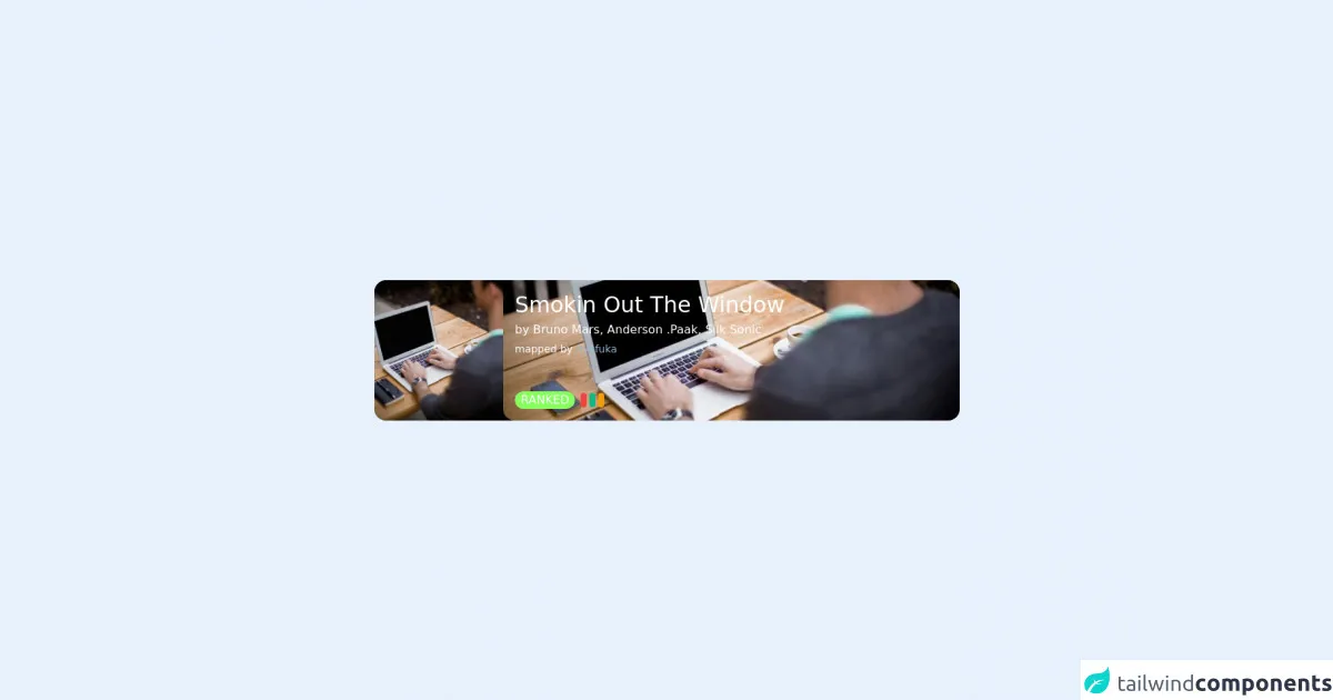
The preview of music card (OSU! Lazer) UI component
To create a music card (OSU! Lazer) UI component, we will use Tailwind CSS to style the HTML elements. Here is a preview of what the final product will look like:
Free download of the music card (OSU! Lazer)'s source code
The source code of music card (OSU! Lazer) UI component
Here is the source code for the music card (OSU! Lazer) UI component:
<main class="flex min-h-screen w-full items-center justify-center">
  <!-- new card -->
  <article
    class="group relative flex h-[12rem] w-[50rem] overflow-hidden rounded-2xl bg-[#3a4448]"
  >
    <!-- buttons right side -->
    <aside
      class="absolute right-0 flex h-full flex-col justify-center space-y-8 p-3"
    >
      <!-- like icon -->
      <svg
        class="invisible h-7 w-7 text-stone-200 opacity-0 transition-all duration-200 hover:scale-[120%] hover:text-white group-hover:visible group-hover:opacity-100"
        fill="none"
        stroke="currentColor"
        viewBox="0 0 24 24"
        xmlns="http://www.w3.org/2000/svg"
      >
        <path
          stroke-linecap="round"
          stroke-linejoin="round"
          stroke-width="2"
          d="M4.318 6.318a4.5 4.5 0 000 6.364L12 20.364l7.682-7.682a4.5 4.5 0 00-6.364-6.364L12 7.636l-1.318-1.318a4.5 4.5 0 00-6.364 0z"
        ></path>
      </svg>

      <!-- download icon -->
      <svg
        class="invisible h-7 w-7 text-stone-200 opacity-0 transition-all duration-200 hover:scale-[120%] hover:text-white group-hover:visible group-hover:opacity-100"
        fill="none"
        stroke="currentColor"
        viewBox="0 0 24 24"
        xmlns="http://www.w3.org/2000/svg"
      >
        <path
          stroke-linecap="round"
          stroke-linejoin="round"
          stroke-width="2"
          d="M4 16v1a3 3 0 003 3h10a3 3 0 003-3v-1m-4-4l-4 4m0 0l-4-4m4 4V4"
        ></path>
      </svg>
    </aside>

    <!-- image (left side) -->
    <div class="absolute inset-y-0 left-0 w-48">
      <img
        src="https://unsplash.it/id/1/640/425"
        alt=""
        class="h-full w-full object-cover object-center opacity-95"
      />

      <div
        class="invisible absolute inset-0 flex h-full w-full items-center justify-center bg-[#0c0c0c]/70 opacity-0 transition-all duration-200 group-hover:visible group-hover:opacity-100"
      >
        <svg
          class="h-w-14 w-14 cursor-pointer text-white transition-all duration-200 hover:text-yellow-400"
          fill="currentColor"
          viewBox="0 0 20 20"
          xmlns="http://www.w3.org/2000/svg"
        >
          <path
            fill-rule="evenodd"
            d="M10 18a8 8 0 100-16 8 8 0 000 16zM9.555 7.168A1 1 0 008 8v4a1 1 0 001.555.832l3-2a1 1 0 000-1.664l-3-2z"
            clip-rule="evenodd"
          ></path>
        </svg>
      </div>
    </div>

    <!-- right side -->
    <div
      class="absolute inset-y-0 left-44 w-[39rem] overflow-hidden rounded-2xl transition-all duration-200 group-hover:w-[36rem]"
    >
      <!-- background image -->
      <div
        style="background-image: url('https://unsplash.it/id/1/640/425')"
        class="h-full w-full bg-cover bg-center"
      >
        <div
          class="h-full w-full bg-[#455055]/80 transition-all duration-200 group-hover:bg-[#31383b]/80"
        ></div>
      </div>

      <!-- content -->
      <section
        class="absolute inset-0 flex flex-col justify-between p-4 text-white"
      >
        <header class="space-y-1">
          <div class="text-3xl font-medium">Smokin Out The Window</div>
          <div class="font-medium">
            by Bruno Mars, Anderson .Paak, Silk Sonic
          </div>
          <div class="text-sm">
            mapped by
            <a
              href="#"
              class="text-[#96bacc] transition-all hover:text-yellow-400"
              >Ryafuka</a
            >
          </div>
        </header>

        <div
          class="invisible flex space-x-3 opacity-0 transition-all duration-200 group-hover:visible group-hover:opacity-100"
        >
          <span class="flex items-center space-x-1">
            <!-- liked icon -->
            <svg
              class="h-5 w-5"
              fill="none"
              stroke="currentColor"
              viewBox="0 0 24 24"
              xmlns="http://www.w3.org/2000/svg"
            >
              <path
                stroke-linecap="round"
                stroke-linejoin="round"
                stroke-width="2"
                d="M4.318 6.318a4.5 4.5 0 000 6.364L12 20.364l7.682-7.682a4.5 4.5 0 00-6.364-6.364L12 7.636l-1.318-1.318a4.5 4.5 0 00-6.364 0z"
              ></path>
            </svg>
            <div>33</div>
          </span>

          <!-- played icon -->
          <span class="flex items-center space-x-1">
            <svg
              class="h-5 w-5"
              fill="none"
              stroke="currentColor"
              viewBox="0 0 24 24"
              xmlns="http://www.w3.org/2000/svg"
            >
              <path
                stroke-linecap="round"
                stroke-linejoin="round"
                stroke-width="2"
                d="M14.752 11.168l-3.197-2.132A1 1 0 0010 9.87v4.263a1 1 0 001.555.832l3.197-2.132a1 1 0 000-1.664z"
              ></path>
              <path
                stroke-linecap="round"
                stroke-linejoin="round"
                stroke-width="2"
                d="M21 12a9 9 0 11-18 0 9 9 0 0118 0z"
              ></path>
            </svg>
            <div>75.7k</div>
          </span>

          <!-- verified icon -->
          <span class="flex items-center space-x-1">
            <svg
              class="h-5 w-5"
              fill="none"
              stroke="currentColor"
              viewBox="0 0 24 24"
              xmlns="http://www.w3.org/2000/svg"
            >
              <path
                stroke-linecap="round"
                stroke-linejoin="round"
                stroke-width="2"
                d="M9 12l2 2 4-4m6 2a9 9 0 11-18 0 9 9 0 0118 0z"
              ></path>
            </svg>
            <div>25 Mar 2022</div>
          </span>
        </div>

        <div class="flex space-x-2">
          <span
            class="rounded-full bg-[#86ff5f] px-2 font-medium text-stone-900"
            >RANKED</span
          >
          <div class="flex items-center space-x-1">
            <span class="h-5 w-2 rounded-full bg-red-500"></span>
            <span class="h-5 w-2 rounded-full bg-green-500"></span>
            <span class="h-5 w-2 rounded-full bg-yellow-500"></span>
          </div>
        </div>
      </section>
    </div>
  </article>
</main>
How to create a music card (OSU! Lazer) with Tailwind CSS?
Now that we have an idea of what the music card (OSU! Lazer) UI component looks like, let's get started on creating it.
Step 1: Set up the HTML
The first step is to set up the HTML for the music card (OSU! Lazer) UI component. Here is the HTML code:
<div class="max-w-sm rounded overflow-hidden shadow-lg">
  <img class="w-full" src="https://via.placeholder.com/350x150" alt="Album cover">
  <div class="px-6 py-4">
    <div class="font-bold text-xl mb-2">Song Title</div>
    <p class="text-gray-700 text-base">
      Artist Name
    </p>
  </div>
  <div class="px-6 py-4">
    <button class="bg-blue-500 hover:bg-blue-700 text-white font-bold py-2 px-4 rounded">
      Play
    </button>
    <button class="bg-blue-500 hover:bg-blue-700 text-white font-bold py-2 px-4 rounded">
      Pause
    </button>
    <button class="bg-blue-500 hover:bg-blue-700 text-white font-bold py-2 px-4 rounded">
      Skip
    </button>
  </div>
</div>
In this code, we have a div element that contains an img element for the album cover, a div element for the song title and artist name, and a div element for the controls.
Step 2: Add Tailwind CSS
The next step is to add Tailwind CSS to the HTML file. You can do this by including the following link in the head section of your HTML file:
<link rel="stylesheet" href="https://cdn.jsdelivr.net/npm/[email protected]/dist/tailwind.min.css">
This will import the Tailwind CSS stylesheet into your HTML file.
Step 3: Customize the design
Now that we have the HTML and Tailwind CSS set up, we can start customizing the design of the music card (OSU! Lazer) UI component. Here are the classes we will use:
max-w-sm: sets the maximum width of the card tosm.rounded: rounds the corners of the card.overflow-hidden: hides any content that overflows the card.shadow-lg: adds a shadow to the card.w-full: sets the width of the album cover tofull.px-6: adds padding to the left and right sides of the card.py-4: adds padding to the top and bottom of the card.font-bold: sets the font weight tobold.text-xl: sets the font size toxl.mb-2: adds margin to the bottom of the song title.text-gray-700: sets the text color to gray.text-base: sets the font size tobase.bg-blue-500: sets the background color to blue.hover:bg-blue-700: sets the background color to a darker shade of blue on hover.text-white: sets the text color to white.py-2: sets the padding on the top and bottom of the buttons to2.px-4: sets the padding on the left and right sides of the buttons to4.rounded: rounds the corners of the buttons.
Here is the updated HTML code with the Tailwind CSS classes added:
<div class="max-w-sm rounded overflow-hidden shadow-lg">
  <img class="w-full" src="https://via.placeholder.com/350x150" alt="Album cover">
  <div class="px-6 py-4">
    <div class="font-bold text-xl mb-2">Song Title</div>
    <p class="text-gray-700 text-base">
      Artist Name
    </p>
  </div>
  <div class="px-6 py-4">
    <button class="bg-blue-500 hover:bg-blue-700 text-white font-bold py-2 px-4 rounded">
      Play
    </button>
    <button class="bg-blue-500 hover:bg-blue-700 text-white font-bold py-2 px-4 rounded">
      Pause
    </button>
    <button class="bg-blue-500 hover:bg-blue-700 text-white font-bold py-2 px-4 rounded">
      Skip
    </button>
  </div>
</div>
Step 4: Add dynamic data
The music card (OSU! Lazer) UI component is not very useful without dynamic data. To add dynamic data, you can use a templating language like Handlebars or React. Here is an example using Handlebars:
<div class="max-w-sm rounded overflow-hidden shadow-lg">
  <img class="w-full" src="{{albumCover}}" alt="Album cover">
  <div class="px-6 py-4">
    <div class="font-bold text-xl mb-2">{{songTitle}}</div>
    <p class="text-gray-700 text-base">
      {{artistName}}
    </p>
  </div>
  <div class="px-6 py-4">
    <button class="bg-blue-500 hover:bg-blue-700 text-white font-bold py-2 px-4 rounded">
      Play
    </button>
    <button class="bg-blue-500 hover:bg-blue-700 text-white font-bold py-2 px-4 rounded">
      Pause
    </button>
    <button class="bg-blue-500 hover:bg-blue-700 text-white font-bold py-2 px-4 rounded">
      Skip
    </button>
  </div>
</div>
In this code, we have replaced the static data with Handlebars variables. You can then use a JavaScript file to pass in the dynamic data and render the HTML.
Step 5: Add interactivity
Finally, we can add interactivity to the music card (OSU! Lazer) UI component. This can be done using JavaScript. Here is an example:
const playButton = document.querySelector('.play-button');
const pauseButton = document.querySelector('.pause-button');
const skipButton = document.querySelector('.skip-button');

playButton.addEventListener('click', () => {
  // Play the song
});

pauseButton.addEventListener('click', () => {
  // Pause the song
});

skipButton.addEventListener('click', () => {
  // Skip to the next song
});
In this code, we have added event listeners to the play, pause, and skip buttons. When the buttons are clicked, the corresponding action is performed.
Conclusion
In this article, we have learned how to create a music card (OSU! Lazer) UI component with Tailwind CSS in 5 easy steps. We started by setting up the HTML, then added Tailwind CSS to customize the design. We then added dynamic data with Handlebars and interactivity with JavaScript. With these skills, you can create your own custom UI components using Tailwind CSS.