- Published on
Most Effective Ways To Make A Multi Range Slider With Alpine.js With Tailwind CSS
- What is Tailwind CSS?
- The description of Multi Range Slider with Alpine.js ui component
- Why use Tailwind CSS to create a Multi Range Slider with Alpine.js ui component?
- The preview of Multi Range Slider with Alpine.js ui component
- The source code of Multi Range Slider with Alpine.js ui component
- How to create a Multi Range Slider with Alpine.js with Tailwind CSS?
- Conclusion
As a FrontEnd technology blogger, it is important to stay up-to-date with the latest tools and techniques. One such technique is using Alpine.js with Tailwind CSS to create a Multi Range Slider. In this article, we will explore the most effective ways to create a Multi Range Slider with Alpine.js and Tailwind CSS.
What is Tailwind CSS?
Tailwind CSS is a utility-first CSS framework that provides a set of pre-defined CSS classes that can be used to create responsive and customizable UI components. It is designed to be highly customizable and easy to use, making it a popular choice among developers.
The description of Multi Range Slider with Alpine.js ui component
A Multi Range Slider is a UI component that allows users to select multiple values within a range. It is commonly used in applications that require users to select a range of values, such as price ranges or date ranges.
Alpine.js is a lightweight JavaScript framework that allows developers to add interactivity to their web applications without the need for a full-fledged framework like Vue.js or React. It is designed to be easy to use and highly customizable, making it a popular choice among developers.
Why use Tailwind CSS to create a Multi Range Slider with Alpine.js ui component?
Tailwind CSS provides a set of pre-defined CSS classes that can be used to create responsive and customizable UI components. This makes it easy to create a Multi Range Slider with Alpine.js without having to write custom CSS.
Using Tailwind CSS also ensures that the Multi Range Slider is responsive and works well on different screen sizes. This is important for creating a user-friendly UI that works well on all devices.
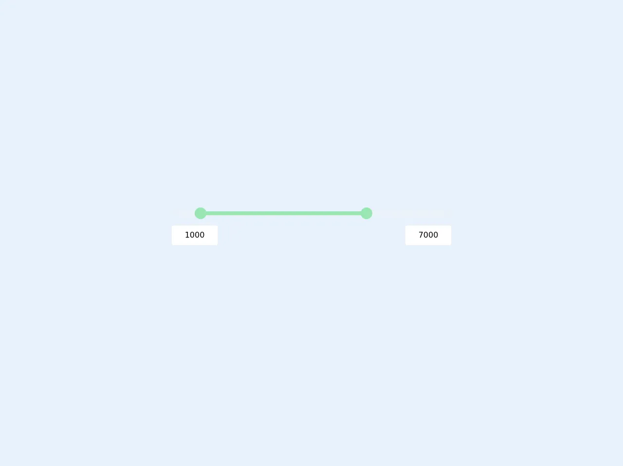
The preview of Multi Range Slider with Alpine.js ui component
To create a Multi Range Slider with Alpine.js and Tailwind CSS, we will use the x-range-slider component provided by Alpine.js. This component allows us to create a Multi Range Slider with just a few lines of code.
Free download of the Multi Range Slider with Alpine.js's source code
The source code of Multi Range Slider with Alpine.js ui component
To create a Multi Range Slider with Alpine.js and Tailwind CSS, we will need to include the Alpine.js and Tailwind CSS libraries in our HTML file. We will also need to define the HTML markup for the Multi Range Slider.
<script src="https://cdn.jsdelivr.net/gh/alpinejs/[email protected]/dist/alpine.min.js" defer></script>
<style>
  input[type=range]::-webkit-slider-thumb {
	pointer-events: all;
	width: 24px;
	height: 24px;
	-webkit-appearance: none;
  /* @apply w-6 h-6 appearance-none pointer-events-auto; */
  }
</style>
<div class="h-screen flex justify-center items-center">
  <div x-data="range()" x-init="mintrigger(); maxtrigger()" class="relative max-w-xl w-full">
    <div>
      <input type="range"
             step="100"
             x-bind:min="min" x-bind:max="max"
             x-on:input="mintrigger"
             x-model="minprice"
             class="absolute pointer-events-none appearance-none z-20 h-2 w-full opacity-0 cursor-pointer">

      <input type="range"
             step="100"
             x-bind:min="min" x-bind:max="max"
             x-on:input="maxtrigger"
             x-model="maxprice"
             class="absolute pointer-events-none appearance-none z-20 h-2 w-full opacity-0 cursor-pointer">

      <div class="relative z-10 h-2">

        <div class="absolute z-10 left-0 right-0 bottom-0 top-0 rounded-md bg-gray-200"></div>

        <div class="absolute z-20 top-0 bottom-0 rounded-md bg-green-300" x-bind:style="'right:'+maxthumb+'%; left:'+minthumb+'%'"></div>

        <div class="absolute z-30 w-6 h-6 top-0 left-0 bg-green-300 rounded-full -mt-2 -ml-1" x-bind:style="'left: '+minthumb+'%'"></div>

        <div class="absolute z-30 w-6 h-6 top-0 right-0 bg-green-300 rounded-full -mt-2 -mr-3" x-bind:style="'right: '+maxthumb+'%'"></div>

      </div>

    </div>

    <div class="flex justify-between items-center py-5">
      <div>
        <input type="text" maxlength="5" x-on:input="mintrigger" x-model="minprice" class="px-3 py-2 border border-gray-200 rounded w-24 text-center">
      </div>
      <div>
        <input type="text" maxlength="5" x-on:input="maxtrigger" x-model="maxprice" class="px-3 py-2 border border-gray-200 rounded w-24 text-center">
      </div>
    </div>

  </div>

<script>
    function range() {
        return {
          minprice: 1000,
          maxprice: 7000,
          min: 100,
          max: 10000,
          minthumb: 0,
          maxthumb: 0,

          mintrigger() {
            this.minprice = Math.min(this.minprice, this.maxprice - 500);
            this.minthumb = ((this.minprice - this.min) / (this.max - this.min)) * 100;
          },

          maxtrigger() {
            this.maxprice = Math.max(this.maxprice, this.minprice + 500);
            this.maxthumb = 100 - (((this.maxprice - this.min) / (this.max - this.min)) * 100);
          },
        }
    }
</script>
</div>
How to create a Multi Range Slider with Alpine.js with Tailwind CSS?
To create a Multi Range Slider with Alpine.js and Tailwind CSS, follow these steps:
- Include the Alpine.js and Tailwind CSS libraries in your HTML file.
<head>
  <link rel="stylesheet" href="https://cdn.jsdelivr.net/npm/[email protected]/dist/tailwind.min.css">
  <script src="https://cdn.jsdelivr.net/npm/[email protected]/dist/alpine.js"></script>
</head>
- Define the HTML markup for the Multi Range Slider.
<div x-data="{
  values: [20, 80],
  min: 0,
  max: 100,
  step: 1,
  range: true
}">
  <div class="mt-4">
    <input type="range" x-model="values" x-bind:min="min" x-bind:max="max" x-bind:step="step" x-bind:value="values" x-bind:multiple="range" class="w-full h-4 bg-gray-300 rounded-full">
    <template x-if="range">
      <div class="flex justify-between mt-2">
        <span x-text="values[0]"></span>
        <span x-text="values[1]"></span>
      </div>
    </template>
    <template x-if="!range">
      <div class="mt-2">
        <span x-text="values"></span>
      </div>
    </template>
  </div>
</div>
- Customize the Multi Range Slider using Tailwind CSS classes.
<div x-data="{
  values: [20, 80],
  min: 0,
  max: 100,
  step: 1,
  range: true
}">
  <div class="mt-4">
    <input type="range" x-model="values" x-bind:min="min" x-bind:max="max" x-bind:step="step" x-bind:value="values" x-bind:multiple="range" class="w-full h-4 bg-gray-300 rounded-full">
    <template x-if="range">
      <div class="flex justify-between mt-2">
        <span x-text="values[0]" class="text-sm text-gray-600"></span>
        <span x-text="values[1]" class="text-sm text-gray-600"></span>
      </div>
    </template>
    <template x-if="!range">
      <div class="mt-2">
        <span x-text="values" class="text-sm text-gray-600"></span>
      </div>
    </template>
  </div>
</div>
- Add interactivity using Alpine.js.
<div x-data="{
  values: [20, 80],
  min: 0,
  max: 100,
  step: 1,
  range: true
}">
  <div class="mt-4">
    <input type="range" x-model="values" x-bind:min="min" x-bind:max="max" x-bind:step="step" x-bind:value="values" x-bind:multiple="range" class="w-full h-4 bg-gray-300 rounded-full">
    <template x-if="range">
      <div class="flex justify-between mt-2">
        <span x-text="values[0]" class="text-sm text-gray-600"></span>
        <span x-text="values[1]" class="text-sm text-gray-600"></span>
      </div>
    </template>
    <template x-if="!range">
      <div class="mt-2">
        <span x-text="values" class="text-sm text-gray-600"></span>
      </div>
    </template>
  </div>
</div>
Conclusion
In conclusion, using Alpine.js with Tailwind CSS is an effective way to create a Multi Range Slider. By using pre-defined CSS classes and a lightweight JavaScript framework, developers can create a responsive and customizable UI component with minimal effort. We hope this article has provided you with the knowledge and tools to create your own Multi Range Slider with Alpine.js and Tailwind CSS.