- Published on
Advanced Guide: Make A Modern Login Template With Tailwind CSS
- What is Tailwind CSS?
- The description of Modern Login Template UI component
- Why use Tailwind CSS to create a Modern Login Template UI component?
- The preview of Modern Login Template UI component
- The source code of Modern Login Template UI component
- How to create a Modern Login Template with Tailwind CSS?
- Step 1: Set up your project
- Step 2: Create the login form
- Step 3: Style the login form
- Conclusion
In the world of web development, creating a login page is one of the most common tasks. A login page is a crucial part of any website or application, as it allows users to access their accounts and perform various actions. A well-designed login page can greatly enhance the user experience, and that's where Tailwind CSS comes in.
In this article, we will guide you through the process of creating a modern login template using Tailwind CSS. We'll cover the basics of Tailwind CSS, the description of the modern login template UI component, why Tailwind CSS is the best option for creating the template, the preview of the template, the source code, and the step-by-step process of creating the template.
What is Tailwind CSS?
Tailwind CSS is a utility-first CSS framework that allows you to quickly and easily create custom designs without writing any CSS code. It provides a set of pre-defined CSS classes that you can use to style your HTML elements. Tailwind CSS is highly customizable, and you can easily change the default styles to match your design requirements.
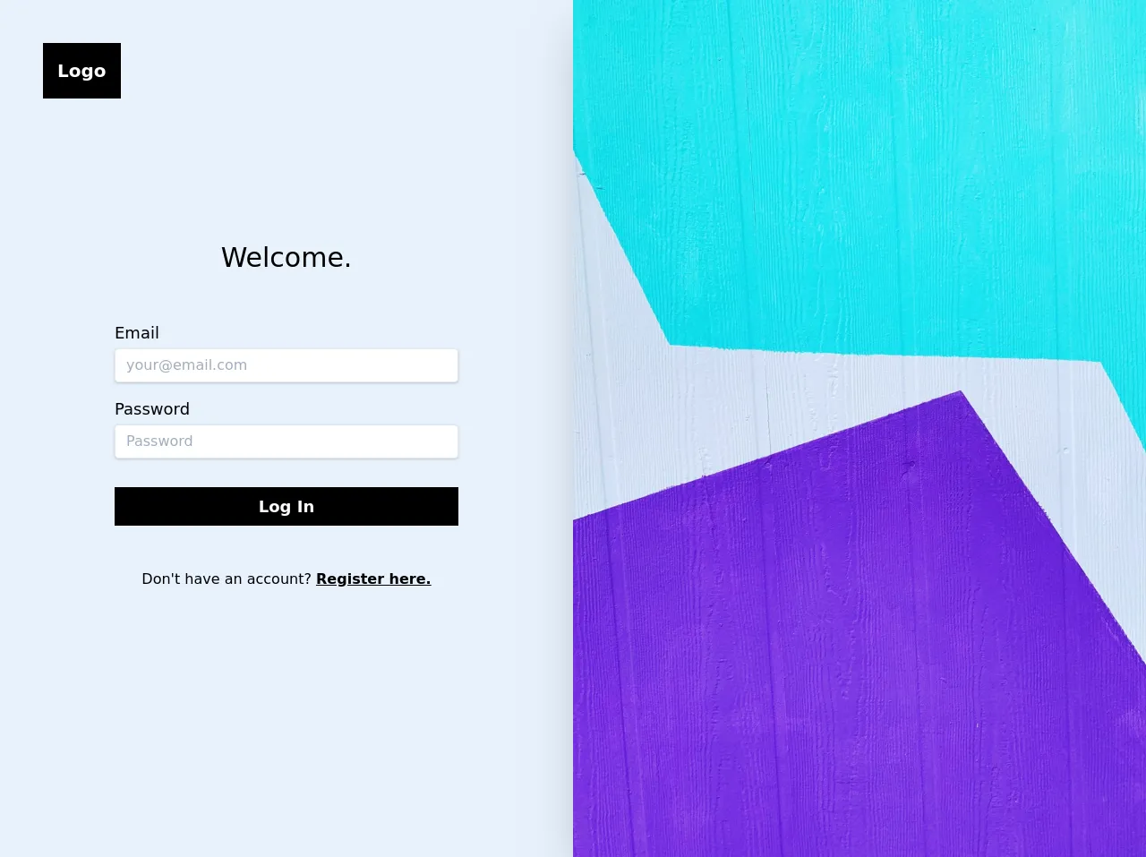
The description of Modern Login Template UI component
The modern login template UI component is a login page design that features a clean and modern look. It usually includes a login form with input fields for email and password, a forgot password link, and a sign-in button. The design is minimalistic and focuses on the essential elements, making it easy for users to access their accounts.
Why use Tailwind CSS to create a Modern Login Template UI component?
Tailwind CSS is an excellent choice for creating a modern login template UI component for several reasons:
Easy to use: Tailwind CSS provides a set of pre-defined classes that you can use to style your HTML elements. You don't need to write any CSS code, which makes it easy to use for developers of all skill levels.
Highly customizable: Tailwind CSS is highly customizable, and you can easily change the default styles to match your design requirements. You can also create your own custom classes and use them throughout your project.
Fast development: With Tailwind CSS, you can quickly create custom designs without spending hours writing CSS code. This makes it an excellent choice for projects with tight deadlines.
The preview of Modern Login Template UI component
Free download of the Modern Login Template's source code
The source code of Modern Login Template UI component
<!DOCTYPE html>
<html lang="en">
<head>
    <meta charset="UTF-8">
    <meta name="viewport" content="width=device-width, initial-scale=1.0">
    <title>Tailwind Login Template</title>
    <meta name="author" content="David Grzyb">
    <meta name="description" content="">

    <!-- Tailwind -->
    <link href="https://unpkg.com/tailwindcss/dist/tailwind.min.css" rel="stylesheet">
    <style>
        @import url('https://fonts.googleapis.com/css?family=Karla:400,700&display=swap');

        .font-family-karla {
            font-family: karla;
        }
    </style>
</head>
<body class="bg-white font-family-karla h-screen">

    <div class="w-full flex flex-wrap">

        <!-- Login Section -->
        <div class="w-full md:w-1/2 flex flex-col">

            <div class="flex justify-center md:justify-start pt-12 md:pl-12 md:-mb-24">
                <a href="#" class="bg-black text-white font-bold text-xl p-4">Logo</a>
            </div>

            <div class="flex flex-col justify-center md:justify-start my-auto pt-8 md:pt-0 px-8 md:px-24 lg:px-32">
                <p class="text-center text-3xl">Welcome.</p>
                <form class="flex flex-col pt-3 md:pt-8" onsubmit="event.preventDefault();">
                    <div class="flex flex-col pt-4">
                        <label for="email" class="text-lg">Email</label>
                        <input type="email" id="email" placeholder="[email protected]" class="shadow appearance-none border rounded w-full py-2 px-3 text-gray-700 mt-1 leading-tight focus:outline-none focus:shadow-outline">
                    </div>

                    <div class="flex flex-col pt-4">
                        <label for="password" class="text-lg">Password</label>
                        <input type="password" id="password" placeholder="Password" class="shadow appearance-none border rounded w-full py-2 px-3 text-gray-700 mt-1 leading-tight focus:outline-none focus:shadow-outline">
                    </div>

                    <input type="submit" value="Log In" class="bg-black text-white font-bold text-lg hover:bg-gray-700 p-2 mt-8">
                </form>
                <div class="text-center pt-12 pb-12">
                    <p>Don't have an account? <a href="register.html" class="underline font-semibold">Register here.</a></p>
                </div>
            </div>

        </div>

        <!-- Image Section -->
        <div class="w-1/2 shadow-2xl">
            <img class="object-cover w-full h-screen hidden md:block" src="https://source.unsplash.com/IXUM4cJynP0">
        </div>
    </div>

</body>
</html>
How to create a Modern Login Template with Tailwind CSS?
Now that we've covered the basics of Tailwind CSS and the modern login template UI component let's dive into the step-by-step process of creating the template.
Step 1: Set up your project
To get started, create a new HTML file and link the Tailwind CSS stylesheet to your project. You can either download the stylesheet from the official website or use a CDN link.
<!DOCTYPE html>
<html lang="en">
<head>
    <meta charset="UTF-8">
    <title>Modern Login Template</title>
    <link rel="stylesheet" href="https://cdn.tailwindcss.com/dist/tailwind.min.css">
</head>
<body>
</body>
</html>
Step 2: Create the login form
Next, create the login form using HTML and Tailwind CSS classes. The form should include input fields for email and password, a forgot password link, and a sign-in button.
<div class="flex flex-col items-center justify-center min-h-screen bg-gray-100">
  <div class="bg-white p-10 rounded-lg shadow-lg">
    <h2 class="text-2xl font-bold mb-5">Sign in to your account</h2>
    <form>
      <div class="mb-4">
        <label class="block text-gray-700 font-bold mb-2" for="email">
          Email
        </label>
        <input
          class="appearance-none border rounded w-full py-2 px-3 text-gray-700 leading-tight focus:outline-none focus:shadow-outline"
          id="email"
          type="email"
          placeholder="Email"
        />
      </div>
      <div class="mb-4">
        <label class="block text-gray-700 font-bold mb-2" for="password">
          Password
        </label>
        <input
          class="appearance-none border rounded w-full py-2 px-3 text-gray-700 leading-tight focus:outline-none focus:shadow-outline"
          id="password"
          type="password"
          placeholder="Password"
        />
      </div>
      <div class="flex items-center justify-between mb-4">
        <a class="inline-block align-baseline font-bold text-sm text-blue-500 hover:text-blue-800" href="#">
          Forgot Password?
        </a>
      </div>
      <div class="flex items-center justify-between">
        <button
          class="bg-blue-500 hover:bg-blue-700 text-white font-bold py-2 px-4 rounded focus:outline-none focus:shadow-outline"
          type="button"
        >
          Sign In
        </button>
      </div>
    </form>
  </div>
</div>
Step 3: Style the login form
Finally, add some custom styles to the login form to make it look more modern and appealing. You can use Tailwind CSS classes to style the form elements and add some custom CSS code to fine-tune the design.
<style>
  body {
    font-family: 'Open Sans', sans-serif;
  }

  .bg-blue {
    background-color: #3490dc;
  }

  .bg-blue:hover {
    background-color: #2779bd;
  }

  .text-blue {
    color: #3490dc;
  }

  .text-blue:hover {
    color: #2779bd;
  }

  .border-blue {
    border-color: #3490dc;
  }

  .border-blue:focus {
    box-shadow: 0 0 0 3px rgba(52, 144, 220, 0.5);
  }
</style>
Conclusion
Creating a modern login template with Tailwind CSS is a straightforward process that can greatly enhance the user experience of your website or application. By following the step-by-step guide outlined in this article, you can quickly create a custom login page that looks modern and appealing. Tailwind CSS is an excellent choice for developers of all skill levels, as it provides a set of pre-defined classes that you can use to style your HTML elements. We hope this article has been helpful in guiding you through the process of creating a modern login template with Tailwind CSS.