- Published on
Surprisingly Effective Ways To Create A Modal (Vuejs + Animate.css) With Tailwind CSS
- What is Tailwind CSS?
- The description of Modal (Vuejs + Animate.css) UI component
- Why use Tailwind CSS to create a Modal (Vuejs + Animate.css) UI component?
- The preview of Modal (Vuejs + Animate.css) UI component
- The source code of Modal (Vuejs + Animate.css) UI component
- How to create a Modal (Vuejs + Animate.css) with Tailwind CSS?
- Step 1: Create a new Vue component for the modal
- Step 2: Add a dark overlay to the component using Tailwind CSS classes
- Step 3: Add the modal content to the component
- Step 4: Use Animate.css classes to animate the modal when triggered
- Conclusion
As a FrontEnd technology blogger, it is important to keep up with the latest trends and tools in the industry. One such tool that has gained popularity in recent years is Tailwind CSS. It is a utility-first CSS framework that allows developers to create custom designs quickly and efficiently. In this article, we will explore how to use Tailwind CSS to create a Modal (Vuejs + Animate.css) UI component.
What is Tailwind CSS?
Tailwind CSS is a utility-first CSS framework that provides a set of pre-defined CSS classes. These classes can be used to create custom designs quickly and efficiently. It is different from other CSS frameworks like Bootstrap or Foundation, which provide pre-designed components. Tailwind CSS allows developers to create their own components from scratch and customize them according to their needs.
The description of Modal (Vuejs + Animate.css) UI component
A modal is a UI component that is used to display content on top of an existing page. It is commonly used to display additional information, confirmations, or alerts. In this article, we will create a modal using Vuejs and Animate.css. Vuejs is a popular JavaScript framework for building user interfaces, and Animate.css is a library of CSS animations.
Why use Tailwind CSS to create a Modal (Vuejs + Animate.css) UI component?
Tailwind CSS provides a set of pre-defined CSS classes that can be used to create custom designs quickly and efficiently. It also allows developers to create their own components from scratch and customize them according to their needs. This makes it an ideal choice for creating a modal UI component. Additionally, Vuejs and Animate.css provide a powerful combination for creating dynamic and animated UI components.
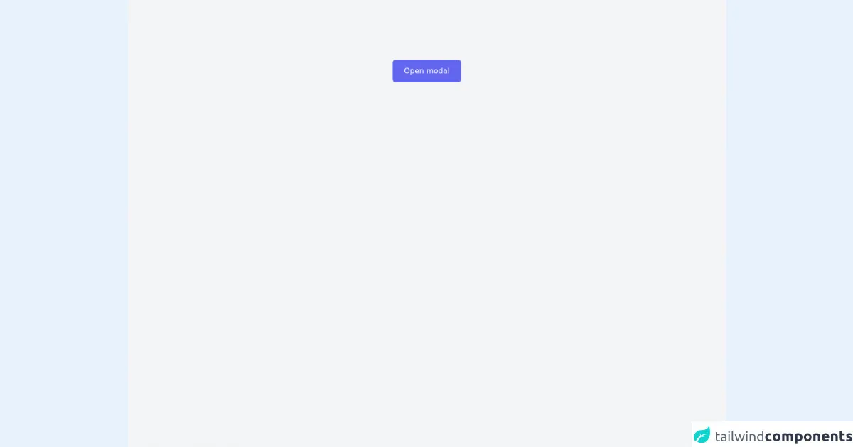
The preview of Modal (Vuejs + Animate.css) UI component
To create a modal UI component, we will use Vuejs and Animate.css along with Tailwind CSS. The modal will have a dark overlay and will slide up from the bottom of the screen when triggered.
Free download of the Modal (Vuejs + Animate.css)'s source code
The source code of Modal (Vuejs + Animate.css) UI component
To create the modal UI component, we will use Vuejs and Animate.css along with Tailwind CSS. The source code for the modal can be found below.
<link
    rel="stylesheet"
    href="https://cdnjs.cloudflare.com/ajax/libs/animate.css/4.1.1/animate.min.css"
  />

<div id="app" class="h-screen bg-gray-100 overflow-hidden">
  <!-- Modal trigger -->
  <button
        @click="showModal = !showModal"
        class="bg-indigo-500 hover:bg-indigo-600 focus:outline-none rounded-md px-6 py-3 mx-auto block text-white transition duration-500 ease-in-out mt-32">Open modal</button>
  <!-- ./Modal trigger -->
  <div class="flex items-center justify-center absolute h-screen top-0 left-0"></div>
  <transition name="custom" enter-active-class="animate__animated animate__bounceInDown" leave-active-class="animate__animated animate__bounceOutUp">
  <!-- Modal -->
  <div v-if="showModal" class="w-11/12 lg:w-full max-w-xl z-20 mx-auto bg-white flex flex-col relative self-center shadow-2xl rounded-md ">
    <!-- Modal header -->
    <div class="p-6 border-b-4 border-gray-200 text-lg font-bold text-indigo-400">Modal title</div>
    <!-- ./Modal header -->

    <!-- Modal body -->
    <div class="p-6">
      Lorem ipsum dolor sit amet consectetur adipisicing elit. Provident officiis ipsam cupiditate illum laborum atque voluptatibus ut doloremque excepturi quisquam repellendus dolor deserunt totam tempore, laboriosam earum sapiente esse praesentium.
    </div>
    <!-- ./Modal body -->

    <!-- Modal footer -->
    <div class="border-t-4 border-gray-200 p-6 flex justify-end">
      <button @click="showModal = false" class="bg-green-400 hover:bg-green-500 focus:outline-none transition px-4 py-2 rounded-md text-white transition duration-500 ease-in-out">Close Modal</button>
    </div>
    <!-- ./Modal footer -->
  </div>
  <!-- ./Modal -->
  </transition>

  <transition name="custom" enter-active-class="animate__animated animate__fadeIn" leave-active-class="animate__animated animate__fadeOut">
    <!-- Overlay -->
    <div v-if="showModal" class="bg-gray-700 bg-opacity-50 fixed bottom-0 left-0 w-full h-full transition duration-500 ease-in-out transfom z-10"></div>
    <!-- ./Overlay -->
  </transition>
</div>

<script src="https://cdn.jsdelivr.net/npm/vue@2/dist/vue.js"></script>
<script>
var app = new Vue({
  el: '#app',
  data() {
    return{
      showModal: false,
    }
  }
})
</script>
How to create a Modal (Vuejs + Animate.css) with Tailwind CSS?
To create a modal UI component with Tailwind CSS, follow the steps below:
- Create a new Vue component for the modal.
- Add a dark overlay to the component using Tailwind CSS classes.
- Add the modal content to the component.
- Use Animate.css classes to animate the modal when triggered.
Let's take a closer look at each step.
Step 1: Create a new Vue component for the modal
To create a new Vue component for the modal, create a new file called Modal.vue in your project's components directory. Add the following code to the file:
<template>
  <div class="fixed inset-0 z-50 overflow-auto bg-gray-900 bg-opacity-50 flex items-center justify-center">
    <div class="bg-white rounded-lg p-6">
      <!-- Modal content goes here -->
    </div>
  </div>
</template>

<script>
export default {
  name: 'Modal',
}
</script>
This code creates a new Vue component called Modal and adds a dark overlay to the component using Tailwind CSS classes.
Step 2: Add a dark overlay to the component using Tailwind CSS classes
To add a dark overlay to the component, we can use the bg-gray-900 and bg-opacity-50 classes. These classes will create a dark gray background with 50% opacity.
<div class="fixed inset-0 z-50 overflow-auto bg-gray-900 bg-opacity-50 flex items-center justify-center">
Step 3: Add the modal content to the component
To add the modal content to the component, we can add it inside a div element with the bg-white and rounded-lg classes. These classes will create a white background with rounded corners.
<div class="bg-white rounded-lg p-6">
  <!-- Modal content goes here -->
</div>
Step 4: Use Animate.css classes to animate the modal when triggered
To animate the modal when triggered, we can use Animate.css classes. We will use the animate__slideInUp class to slide the modal up from the bottom of the screen when triggered.
<div class="bg-white rounded-lg p-6 animate__animated animate__slideInUp">
  <!-- Modal content goes here -->
</div>
To trigger the modal, we can add a button to our main component and use Vuejs to toggle the visibility of the modal component.
<template>
  <div>
    <button @click="showModal = true">Show Modal</button>
    <Modal v-if="showModal" @close="showModal = false" />
  </div>
</template>

<script>
import Modal from '@/components/Modal.vue'

export default {
  name: 'App',
  components: {
    Modal,
  },
  data() {
    return {
      showModal: false,
    }
  },
}
</script>
This code creates a button that triggers the modal when clicked. It also passes a close event to the modal component to allow it to be closed when the user clicks outside the modal.
Conclusion
In this article, we explored how to use Tailwind CSS to create a Modal (Vuejs + Animate.css) UI component. We learned how Tailwind CSS provides a set of pre-defined CSS classes that can be used to create custom designs quickly and efficiently. We also learned how Vuejs and Animate.css provide a powerful combination for creating dynamic and animated UI components. By following the steps outlined in this article, you can create your own modal UI component using Tailwind CSS.