- Published on
The Ninja Guide To How To Build A Mobile Social Network Profile Page With Tailwind CSS Better
- What is Tailwind CSS?
- The description of Mobile Social Network Profile Page UI component
- Why use Tailwind CSS to create a Mobile Social Network Profile Page UI component?
- The preview of Mobile Social Network Profile Page UI component
- The source code of Mobile Social Network Profile Page UI component
- How to create a Mobile Social Network Profile Page with Tailwind CSS?
- Step 1: Set up your project
- Step 2: Create the HTML structure
- Step 3: Style the HTML elements with Tailwind CSS classes
- Step 4: Optimize for mobile devices
- Conclusion
As a FrontEnd technology blogger, you are always looking for ways to improve your skills and create better user interfaces. In this article, we will explore how to build a Mobile Social Network Profile Page with Tailwind CSS. We will cover what Tailwind CSS is, the description of the Mobile Social Network Profile Page UI component, why use Tailwind CSS to create a Mobile Social Network Profile Page UI component, the preview of the Mobile Social Network Profile Page UI component, the source code of the Mobile Social Network Profile Page UI component, and how to create a Mobile Social Network Profile Page with Tailwind CSS.
What is Tailwind CSS?
Tailwind CSS is a utility-first CSS framework that provides a set of pre-defined CSS classes that you can use to style your HTML elements. It allows you to create complex UI components quickly and efficiently. Tailwind CSS is easy to learn and use, and it is highly customizable. You can customize the framework to match your design needs, and you can also extend it with your own CSS classes.
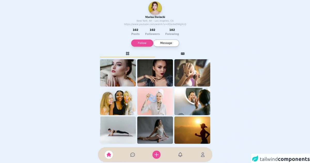
The description of Mobile Social Network Profile Page UI component
A Mobile Social Network Profile Page UI component is a user interface component that displays a user's profile information on a mobile device. It typically includes the user's profile picture, name, bio, and social media links. The component should be responsive and optimized for mobile devices.
Why use Tailwind CSS to create a Mobile Social Network Profile Page UI component?
Tailwind CSS provides a set of pre-defined CSS classes that you can use to style your HTML elements. This makes it easy to create complex UI components quickly and efficiently. Tailwind CSS is also highly customizable, which means you can customize the framework to match your design needs. Additionally, Tailwind CSS is optimized for mobile devices, which makes it perfect for creating a Mobile Social Network Profile Page UI component.
The preview of Mobile Social Network Profile Page UI component
Free download of the Mobile Social Network Profile Page's source code
The source code of Mobile Social Network Profile Page UI component
<div class="max-w-2xl mx-auto">

    <div class="px-3 py-2">

        <div class="flex flex-col gap-1 text-center">
            <a class="block mx-auto bg-center bg-no-repeat bg-cover w-20 h-20 rounded-full border border-gray-400 shadow-lg" href="" style="background-image: url('https://images.pexels.com/photos/415829/pexels-photo-415829.jpeg')"></a>
            <p class="font-serif font-semibold">Marina Davinchi</p>
            <span class="text-sm text-gray-400">New York, NY - Los Angeles, CA</span>
            <span class="text-sm text-gray-400">https://www.youtube.com/watch?v=dQw4w9WgXcQ</span>
        </div>


        <div class="flex justify-center items-center gap-2 my-3">
            <div class="font-semibold text-center mx-4">
                <p class="text-black">102</p>
                <span class="text-gray-400">Posts</span>
            </div>
            <div class="font-semibold text-center mx-4">
                <p class="text-black">102</p>
                <span class="text-gray-400">Followers</span>
            </div>
            <div class="font-semibold text-center mx-4">
                <p class="text-black">102</p>
                <span class="text-gray-400">Folowing</span>
            </div>
        </div>


        <div class="flex justify-center gap-2 my-5">
            <button class="bg-pink-500 px-10 py-2 rounded-full text-white shadow-lg">Follow</button>
            <button class="bg-white border border-gray-500 px-10 py-2 rounded-full shadow-lg">Message</button>
        </div>


        <div class="flex justify-between items-center">
            <button class="w-full py-2 border-b-2 border-yellow-400">
                <svg xmlns="http://www.w3.org/2000/svg" class="mx-auto h-6 w-6" fill="none" viewBox="0 0 24 24" stroke="currentColor">
                    <path stroke-linecap="round" stroke-linejoin="round" stroke-width="2" d="M4 6a2 2 0 012-2h2a2 2 0 012 2v2a2 2 0 01-2 2H6a2 2 0 01-2-2V6zM14 6a2 2 0 012-2h2a2 2 0 012 2v2a2 2 0 01-2 2h-2a2 2 0 01-2-2V6zM4 16a2 2 0 012-2h2a2 2 0 012 2v2a2 2 0 01-2 2H6a2 2 0 01-2-2v-2zM14 16a2 2 0 012-2h2a2 2 0 012 2v2a2 2 0 01-2 2h-2a2 2 0 01-2-2v-2z" />
                  </svg>
            </button>
            <button class="w-full py-2">
                <svg xmlns="http://www.w3.org/2000/svg" class="mx-auto h-6 w-6" fill="none" viewBox="0 0 24 24" stroke="currentColor">
                    <path stroke-linecap="round" stroke-linejoin="round" stroke-width="2" d="M3 10h18M3 14h18m-9-4v8m-7 0h14a2 2 0 002-2V8a2 2 0 00-2-2H5a2 2 0 00-2 2v8a2 2 0 002 2z" />
                  </svg>
            </button>
        </div>


           <div class="grid grid-cols-3 gap-2 my-3">
                <a class="block bg-center bg-no-repeat bg-cover h-40 w-full rounded-lg" href="" style="background-image: url('https://images.pexels.com/photos/458766/pexels-photo-458766.jpeg')"></a>
                <a class="block bg-center bg-no-repeat bg-cover h-40 w-full rounded-lg" href="" style="background-image: url('https://images.pexels.com/photos/247287/pexels-photo-247287.jpeg')"></a>
                <a class="block bg-center bg-no-repeat bg-cover h-40 w-full rounded-lg" href="" style="background-image: url('https://images.pexels.com/photos/6169/woman-hand-girl-professional.jpg')"></a>

                <a class="block bg-center bg-no-repeat bg-cover h-40 w-full rounded-lg" href="" style="background-image: url('https://images.pexels.com/photos/3851790/pexels-photo-3851790.jpeg')"></a>
                <a class="block bg-center bg-no-repeat bg-cover h-40 w-full rounded-lg" href="" style="background-image: url('https://images.pexels.com/photos/3852159/pexels-photo-3852159.jpeg')"></a>
                <a class="block bg-center bg-no-repeat bg-cover h-40 w-full rounded-lg" href="" style="background-image: url('https://images.pexels.com/photos/4491173/pexels-photo-4491173.jpeg')"></a>

                <a class="block bg-center bg-no-repeat bg-cover h-40 w-full rounded-lg" href="" style="background-image: url('https://images.pexels.com/photos/2294354/pexels-photo-2294354.jpeg')"></a>
                <a class="block bg-center bg-no-repeat bg-cover h-40 w-full rounded-lg" href="" style="background-image: url('https://images.pexels.com/photos/6019812/pexels-photo-6019812.jpeg')"></a>
                <a class="block bg-center bg-no-repeat bg-cover h-40 w-full rounded-lg" href="" style="background-image: url('https://images.pexels.com/photos/40751/running-runner-long-distance-fitness-40751.jpeg')"></a>
           </div>

    </div>


    <div class="flex justify-between items-center bg-yellow-600 bg-opacity-20 px-10 py-5 rounded-full text-gray-500">
        <button class="p-2 rounded-full bg-white">
            <svg xmlns="http://www.w3.org/2000/svg" class="h-8 w-8 text-pink-500" viewBox="0 0 20 20" fill="currentColor">
                <path d="M10.707 2.293a1 1 0 00-1.414 0l-7 7a1 1 0 001.414 1.414L4 10.414V17a1 1 0 001 1h2a1 1 0 001-1v-2a1 1 0 011-1h2a1 1 0 011 1v2a1 1 0 001 1h2a1 1 0 001-1v-6.586l.293.293a1 1 0 001.414-1.414l-7-7z" />
              </svg>
        </button>
        <button>
            <svg xmlns="http://www.w3.org/2000/svg" class="h-8 w-8" fill="none" viewBox="0 0 24 24" stroke="currentColor">
                <path stroke-linecap="round" stroke-linejoin="round" stroke-width="2" d="M8 12h.01M12 12h.01M16 12h.01M21 12c0 4.418-4.03 8-9 8a9.863 9.863 0 01-4.255-.949L3 20l1.395-3.72C3.512 15.042 3 13.574 3 12c0-4.418 4.03-8 9-8s9 3.582 9 8z" />
              </svg>
        </button>
        <button class="p-2 rounded-full bg-pink-500">
            <svg xmlns="http://www.w3.org/2000/svg" class="text-white h-8 w-8" fill="none" viewBox="0 0 24 24" stroke="currentColor">
                <path stroke-linecap="round" stroke-linejoin="round" stroke-width="2" d="M12 4v16m8-8H4" />
              </svg>
        </button>
        <button>
            <svg xmlns="http://www.w3.org/2000/svg" class="h-8 w-8" fill="none" viewBox="0 0 24 24" stroke="currentColor">
                <path stroke-linecap="round" stroke-linejoin="round" stroke-width="2" d="M15 17h5l-1.405-1.405A2.032 2.032 0 0118 14.158V11a6.002 6.002 0 00-4-5.659V5a2 2 0 10-4 0v.341C7.67 6.165 6 8.388 6 11v3.159c0 .538-.214 1.055-.595 1.436L4 17h5m6 0v1a3 3 0 11-6 0v-1m6 0H9" />
              </svg>
        </button>
        <button>
            <svg xmlns="http://www.w3.org/2000/svg" class="h-8 w-8" fill="none" viewBox="0 0 24 24" stroke="currentColor">
                <path stroke-linecap="round" stroke-linejoin="round" stroke-width="2" d="M16 7a4 4 0 11-8 0 4 4 0 018 0zM12 14a7 7 0 00-7 7h14a7 7 0 00-7-7z" />
              </svg>
        </button>
    </div>

</div>
How to create a Mobile Social Network Profile Page with Tailwind CSS?
To create a Mobile Social Network Profile Page with Tailwind CSS, follow these steps:
Step 1: Set up your project
To set up your project, you will need to create a new HTML file and link it to the Tailwind CSS stylesheet. You can download the stylesheet from the official Tailwind CSS website or use a CDN.
Step 2: Create the HTML structure
Create the HTML structure for the Mobile Social Network Profile Page UI component. The HTML structure should include the user's profile picture, name, bio, and social media links.
Step 3: Style the HTML elements with Tailwind CSS classes
Style the HTML elements with Tailwind CSS classes. You can use pre-defined classes like bg-gray-200 for background color or text-lg for font size. You can also customize the framework by adding your own CSS classes.
Step 4: Optimize for mobile devices
Optimize the Mobile Social Network Profile Page UI component for mobile devices. Use responsive design techniques like media queries to ensure that the component looks good on different screen sizes.
Conclusion
In this article, we explored how to build a Mobile Social Network Profile Page with Tailwind CSS. We covered what Tailwind CSS is, the description of the Mobile Social Network Profile Page UI component, why use Tailwind CSS to create a Mobile Social Network Profile Page UI component, the preview of the Mobile Social Network Profile Page UI component, the source code of the Mobile Social Network Profile Page UI component, and how to create a Mobile Social Network Profile Page with Tailwind CSS. By following these steps, you can create a beautiful and responsive Mobile Social Network Profile Page UI component that will impress your users.