- Published on
Most Effective Ways To Build A Mobile Login Page With Tailwind CSS
- What is Tailwind CSS?
- The description of Mobile Login Page ui component
- Why use Tailwind CSS to create a Mobile Login Page ui component?
- The preview of Mobile Login Page ui component.
- The source code of Mobile Login Page ui component.
- How to create a Mobile Login Page with Tailwind CSS?
- Conclusion
In today's world, mobile devices are becoming more and more popular. As a result, creating a mobile login page is becoming increasingly important for web developers. In this article, we will explore the most effective ways to build a mobile login page using Tailwind CSS.
What is Tailwind CSS?
Tailwind CSS is a utility-first CSS framework that helps developers create responsive and customizable user interfaces quickly. It provides a set of pre-defined CSS classes that can be used to style HTML elements. Tailwind CSS is designed to be highly customizable, so developers can easily create a unique look and feel for their web applications.
The description of Mobile Login Page ui component
A mobile login page is a user interface component that allows users to log in to a web application using their credentials. It typically consists of two input fields for the user's email address and password, along with a button to submit the login form.
Why use Tailwind CSS to create a Mobile Login Page ui component?
Tailwind CSS provides a set of pre-defined CSS classes that can be used to style HTML elements. This makes it easy for developers to create a mobile login page quickly and efficiently. Additionally, Tailwind CSS is highly customizable, so developers can easily create a unique look and feel for their web applications.
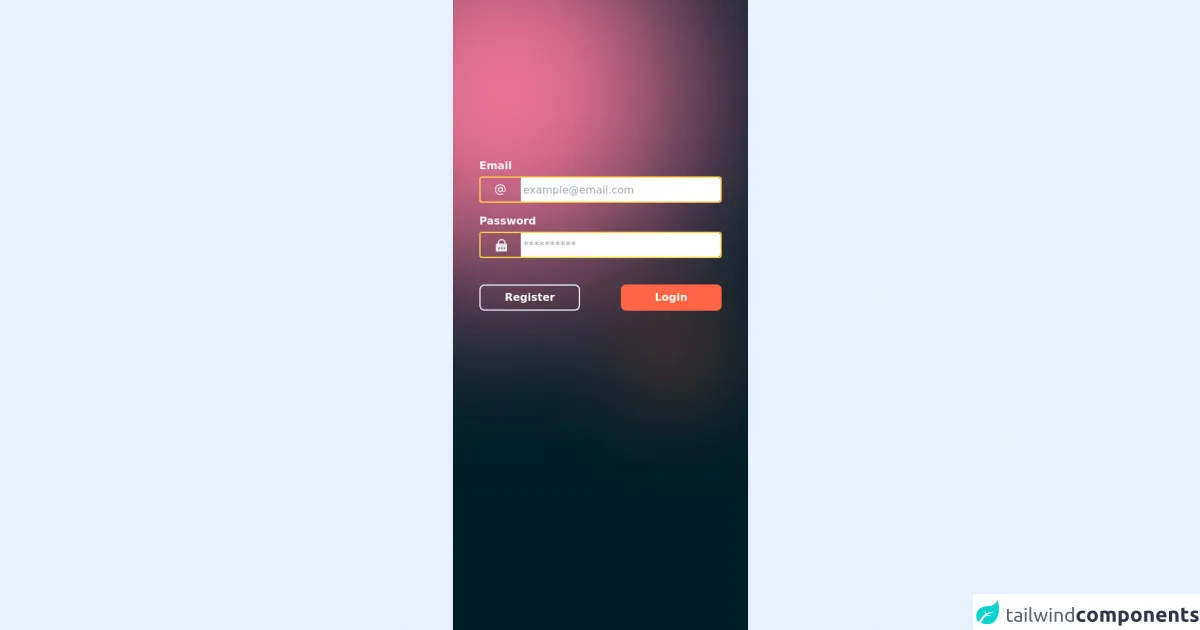
The preview of Mobile Login Page ui component.
To create a mobile login page using Tailwind CSS, we will use a combination of pre-defined CSS classes and custom CSS. Here is a preview of what the final product will look like:
Free download of the Mobile Login Page's source code
The source code of Mobile Login Page ui component.
To create the mobile login page, we will use HTML and CSS. Here is the source code for the mobile login page:
<div class="min-h-screen flex flex-col max-w-md mx-auto bg-gelap opacity-100 font-poppins px-4 bg-no-repeat bg-cover bg-center" style="background-image:  url(https://lnmlpexiwaspywjbwwvd.supabase.in/storage/v1/object/sign/assets/bgc.svg?token=eyJhbGciOiJIUzI1NiIsInR5cCI6IkpXVCJ9.eyJ1cmwiOiJhc3NldHMvYmdjLnN2ZyIsImlhdCI6MTYzMzQ0NTUwOCwiZXhwIjoxOTQ4ODA1NTA4fQ.1xBUJE_lX5NcfuSNcGz0s9x37TKzUVDPM0DF0WOgHtc)">
  <div class="px-6 pt-56">
  </div>
  <div class="px-6 pt-4 flex flex-col w-full space-y-4">
    <div class="flex flex-col w-full space-y-1">
      <label class="text-md font-semibold text-white">Email</label>
      <div class="w-full flex h-10 rounded border-2 border-yellow-300 bg-abu-5">
        <div class="w-2/12 h-full rounded-l-lg  flex items-center">
          <svg width="20" height="20" class="text-gray-200 mx-auto" viewBox="0 0 20 20" fill="currentColor" xmlns="http://www.w3.org/2000/svg">
            <path d="M9.99996 1.66666C5.41663 1.66666 1.66663 5.41666 1.66663 10C1.66663 14.5833 5.41663 18.3333 9.99996 18.3333C11.5 18.3333 12.9166 17.9167 14.1666 17.25C14.5833 17 14.6666 16.5 14.5 16.0833C14.25 15.6667 13.75 15.5833 13.3333 15.75C10.1666 17.5833 6.08329 16.5 4.24996 13.3333C2.41663 10.1667 3.49996 6.08333 6.66663 4.25C9.83329 2.41666 13.9166 3.5 15.75 6.66666C16.3333 7.66666 16.6666 8.83333 16.6666 10V10.6667C16.6666 11.5 16 12.1667 15.1666 12.1667C14.3333 12.1667 13.6666 11.5 13.6666 10.6667V7.08333C13.6666 6.58333 13.3333 6.25 12.8333 6.25C12.4166 6.25 12.0833 6.5 12 6.91666C10.3333 5.75 7.91663 6.16666 6.74996 7.83333C5.58329 9.5 5.99996 11.9167 7.66663 13.0833C9.24996 14.1667 11.3333 13.9167 12.5833 12.5C13.6666 13.8333 15.5833 14.0833 16.9166 13.0833C17.6666 12.5 18.1666 11.5833 18.1666 10.5833V10C18.3333 5.41666 14.5833 1.66666 9.99996 1.66666ZM9.99996 12.0833C8.83329 12.0833 7.91663 11.1667 7.91663 10C7.91663 8.83333 8.83329 7.91666 9.99996 7.91666C11.1666 7.91666 12.0833 8.83333 12.0833 10C12.0833 11.1667 11.1666 12.0833 9.99996 12.0833Z"/>
          </svg>
        </div>
        <div class="w-10/12 rounded-r-xl">
          <input type="text" class="w-full h-full rounded-r flex items-center px-1 focus:outline-none" placeholder="[email protected]">
        </div>
      </div>
    </div>
    <div class="flex flex-col w-full space-y-1">
      <label class="text-md font-semibold text-white">Password</label>
      <div class="w-full flex h-10 rounded border-2 border-yellow-300 bg-abu-5">
        <div class="w-2/12 h-full rounded-l-lg  flex items-center">
          <svg class="text-gray-200 mx-auto" viewBox="0 0 20 20" fill="currentColor" xmlns="http://www.w3.org/2000/svg" width="20" height="20">
            <path fill="none" d="M0 0h24v24H0z"/><path d="M18 8h2a1 1 0 0 1 1 1v12a1 1 0 0 1-1 1H4a1 1 0 0 1-1-1V9a1 1 0 0 1 1-1h2V7a6 6 0 1 1 12 0v1zm-2 0V7a4 4 0 1 0-8 0v1h8zm-5 6v2h2v-2h-2zm-4 0v2h2v-2H7zm8 0v2h2v-2h-2z"/>
          </svg>
        </div>
        <div class="w-10/12 rounded-r-xl">
          <input type="text" class="w-full h-full rounded-r flex items-center px-1 focus:outline-none" placeholder="**********">
        </div>
      </div>
    </div>
    <div class="pt-6 w-full flex space-x-2 justify-between">
      <button class="h-10 w-5/12 border-2 border-orange-700 rounded-lg text-white font-semibold">Register</button>
      <a href="https://soefyansyah.com" class="h-10 w-5/12 bg-btn rounded-lg text-white text-center items-center py-2 font-semibold">Login</a>
    </div>
  </div>
</div>
<style>
.bg-gelap{
  background-color: #001E26;
}
.bg-btn{
  background-color: #FF6446;
}
</style>
How to create a Mobile Login Page with Tailwind CSS?
To create a mobile login page with Tailwind CSS, follow these steps:
Create a new HTML file and add the necessary HTML elements for the login form. This should include two input fields for the user's email address and password, along with a button to submit the login form.
Add the necessary Tailwind CSS classes to style the HTML elements. This can be done by adding the classes directly to the HTML elements, or by creating a separate CSS file and linking it to the HTML file.
Customize the styles as needed using custom CSS. This can be done by adding additional CSS classes or by modifying the existing Tailwind CSS classes.
Test the mobile login page on different devices to ensure that it is responsive and looks good on all screen sizes.
Conclusion
Creating a mobile login page is an essential part of any web application. By using Tailwind CSS, developers can create a responsive and customizable mobile login page quickly and efficiently. With the steps outlined in this article, you can create a mobile login page that looks great and functions well on any device.