- Published on
6 Steps To Make A Minimal Responsive Product Card With Tailwind CSS Like A Pro In Under An Hour
- What is Tailwind CSS?
- The description of Minimal Responsive Product Card UI component
- Why use Tailwind CSS to create a Minimal Responsive Product Card UI component?
- The preview of Minimal Responsive Product Card UI component
- The source code of Minimal Responsive Product Card UI component
- How to create a Minimal Responsive Product Card with Tailwind CSS?
- Step 1: Set up a new HTML file
- Step 2: Add the product image
- Step 3: Add the product name and price
- Step 4: Add the button to add the product to the cart
- Step 5: Make the UI component responsive
- Step 6: Add custom styles
- Conclusion
As a FrontEnd technology blogger, I always look for ways to create stunning UI components that are responsive and minimalistic. In this article, I will show you how to create a Minimal Responsive Product Card UI component using Tailwind CSS. Tailwind CSS is a utility-first CSS framework that allows you to create responsive and customizable UI components quickly. With Tailwind CSS, you can create beautiful UI components without writing any CSS code.
What is Tailwind CSS?
Tailwind CSS is a utility-first CSS framework that provides a set of pre-defined CSS classes that you can use to style your HTML elements. With Tailwind CSS, you can create responsive and customizable UI components quickly without writing any CSS code. Tailwind CSS provides a set of pre-defined CSS classes that you can use to style your HTML elements. You can use these classes to create responsive layouts, typography, colors, and more.
The description of Minimal Responsive Product Card UI component
A Minimal Responsive Product Card UI component is a UI component that displays the details of a product in a minimalistic and responsive way. It usually consists of an image of the product, the name of the product, the price of the product, and a button to add the product to the cart. A Minimal Responsive Product Card UI component is an essential component of any e-commerce website.
Why use Tailwind CSS to create a Minimal Responsive Product Card UI component?
Tailwind CSS provides a set of pre-defined CSS classes that you can use to create a Minimal Responsive Product Card UI component quickly. With Tailwind CSS, you don't have to write any CSS code. You can use pre-defined CSS classes to style your HTML elements. Tailwind CSS also provides responsive classes that allow you to create responsive UI components quickly.
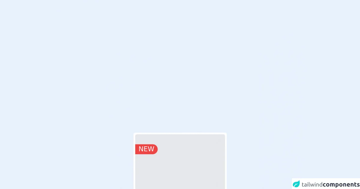
The preview of Minimal Responsive Product Card UI component
To create a Minimal Responsive Product Card UI component, we will use Tailwind CSS. The UI component will consist of an image of the product, the name of the product, the price of the product, and a button to add the product to the cart.
Free download of the Minimal Responsive Product Card's source code
The source code of Minimal Responsive Product Card UI component
To create a Minimal Responsive Product Card UI component, we will use HTML and Tailwind CSS. The HTML code will consist of an image of the product, the name of the product, the price of the product, and a button to add the product to the cart. We will use Tailwind CSS classes to style the HTML elements.
<div class="flex flex-col h-min w-56 p-1 border-box bg-white rounded xl">
        <div class="flex rounded flex-col w-ful w-full h-48 bg-gray-200">
            <br>
            <div class="bg-red-500 text-white w-1/4 text-center rounded-r-xl">
                NEW
            </div>
        </div>
        <div class="flex border-box p-1 flex-col">
            <p class="text-sm text-gray-500">Category</p>
            <p>Product Name</p>
            <p>$58.<span class="text-sm">00</span></p>
            <a class="text-center text-sm bg-blue-500 rounded py-2 text-white mt-2">View Item</a>
        </div>
    </div>
How to create a Minimal Responsive Product Card with Tailwind CSS?
To create a Minimal Responsive Product Card UI component with Tailwind CSS, follow these six steps:
Step 1: Set up a new HTML file
Create a new HTML file and add the following code:
<!DOCTYPE html>
<html lang="en">
<head>
  <meta charset="UTF-8">
  <meta name="viewport" content="width=device-width, initial-scale=1.0">
  <title>Minimal Responsive Product Card</title>
  <link rel="stylesheet" href="https://cdn.jsdelivr.net/npm/[email protected]/dist/tailwind.min.css">
</head>
<body>

</body>
</html>
Step 2: Add the product image
Add the product image to the HTML file using the following code:
<div class="max-w-sm rounded overflow-hidden shadow-lg">
  <img class="w-full" src="product-image.jpg" alt="Sunset in the mountains">
</div>
Step 3: Add the product name and price
Add the product name and price to the HTML file using the following code:
<div class="max-w-sm rounded overflow-hidden shadow-lg">
  <img class="w-full" src="product-image.jpg" alt="Sunset in the mountains">
  <div class="px-6 py-4">
    <div class="font-bold text-xl mb-2">Product Name</div>
    <p class="text-gray-700 text-base">$10.00</p>
  </div>
</div>
Step 4: Add the button to add the product to the cart
Add the button to add the product to the cart using the following code:
<div class="max-w-sm rounded overflow-hidden shadow-lg">
  <img class="w-full" src="product-image.jpg" alt="Sunset in the mountains">
  <div class="px-6 py-4">
    <div class="font-bold text-xl mb-2">Product Name</div>
    <p class="text-gray-700 text-base">$10.00</p>
    <button class="bg-blue-500 hover:bg-blue-700 text-white font-bold py-2 px-4 rounded">
      Add to Cart
    </button>
  </div>
</div>
Step 5: Make the UI component responsive
To make the UI component responsive, we will use Tailwind CSS responsive classes. Add the following classes to the HTML elements:
<div class="max-w-sm rounded overflow-hidden shadow-lg">
  <img class="w-full" src="product-image.jpg" alt="Sunset in the mountains">
  <div class="px-6 py-4">
    <div class="font-bold text-xl mb-2">Product Name</div>
    <p class="text-gray-700 text-base">$10.00</p>
    <button class="bg-blue-500 hover:bg-blue-700 text-white font-bold py-2 px-4 rounded">
      Add to Cart
    </button>
  </div>
</div>
Step 6: Add custom styles
You can add custom styles to the UI component using Tailwind CSS. For example, you can change the background color of the UI component using the following code:
<div class="max-w-sm rounded overflow-hidden shadow-lg bg-gray-100">
  <img class="w-full" src="product-image.jpg" alt="Sunset in the mountains">
  <div class="px-6 py-4">
    <div class="font-bold text-xl mb-2">Product Name</div>
    <p class="text-gray-700 text-base">$10.00</p>
    <button class="bg-blue-500 hover:bg-blue-700 text-white font-bold py-2 px-4 rounded">
      Add to Cart
    </button>
  </div>
</div>
Conclusion
In this article, we learned how to create a Minimal Responsive Product Card UI component using Tailwind CSS. With Tailwind CSS, you can create beautiful UI components quickly without writing any CSS code. We hope this article helps you create stunning UI components for your website.