- Published on
How To Create A Minimal Portfolio With Tailwind CSS In 6 Easy Steps?
- What is Tailwind CSS?
- The description of Minimal Portfolio ui component
- Why use Tailwind CSS to create a Minimal Portfolio ui component?
- The preview of Minimal Portfolio ui component
- The source code of Minimal Portfolio ui component
- How to create a Minimal Portfolio with Tailwind CSS?
- Step 1: Set up your project
- Step 2: Create the header
- Step 3: Create the projects section
- Step 4: Create the skills section
- Step 5: Create the contact section
- Step 6: Style your Minimal Portfolio
- Conclusion
What is Tailwind CSS?
Tailwind CSS is a utility-first CSS framework that provides a set of pre-defined CSS classes to help you quickly build custom user interfaces. It allows you to create complex layouts and designs without writing any custom CSS.
The description of Minimal Portfolio ui component
A Minimal Portfolio is a simple and elegant way to showcase your work and achievements. It typically includes a list of projects or case studies along with a brief description and some visuals.
Why use Tailwind CSS to create a Minimal Portfolio ui component?
Tailwind CSS is a great choice for creating a Minimal Portfolio because it provides a wide range of pre-defined CSS classes that can be used to style the various elements of the portfolio. This makes it easy to create a consistent and visually appealing design without having to write a lot of custom CSS.
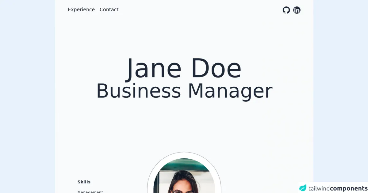
The preview of Minimal Portfolio ui component
To give you an idea of what a Minimal Portfolio might look like, here is a preview of a sample portfolio:
Free download of the Minimal Portfolio's source code
The source code of Minimal Portfolio ui component
Here is the source code for the Minimal Portfolio:
<div class="relative text-gray-800 bg-gray-50">
<!-- Navbar -->
    <header>
        <nav class="w-full">
            <div class="flex justify-between w-full px-16 py-8">
                <!-- Left Nav -->
                <div>
                    <ul
                        class="flex flex-col text-left md:flex-row space-y-5 md:space-y-0 md:space-x-6 text-xl md:text-2xl">
                        <li class="text-left">
                            <a href="#experience">
                                Experience
                            </a>

                        </li>
                        <li class="text-left">
                            <a href="#contact">
                                Contact
                            </a>

                        </li>
                    </ul>
                </div>
                <!-- Right Nav -->
                <div>
                    <!-- Socials -->
                    <ul class="flex flex-col md:flex-row items-end md:items-center md:space-x-4 space-y-4 md:space-y-0">
                        <li>
                            <a href="https://www.github.com" target="_blank" aria-label="Github"
                                class="hover:text-blue-600">
                                <svg xmlns="http://www.w3.org/2000/svg" class="w-9 h-9" fill="currentColor"
                                    class="bi bi-github" viewBox="0 0 16 16">
                                    <path
                                        d="M8 0C3.58 0 0 3.58 0 8c0 3.54 2.29 6.53 5.47 7.59.4.07.55-.17.55-.38 0-.19-.01-.82-.01-1.49-2.01.37-2.53-.49-2.69-.94-.09-.23-.48-.94-.82-1.13-.28-.15-.68-.52-.01-.53.63-.01 1.08.58 1.23.82.72 1.21 1.87.87 2.33.66.07-.52.28-.87.51-1.07-1.78-.2-3.64-.89-3.64-3.95 0-.87.31-1.59.82-2.15-.08-.2-.36-1.02.08-2.12 0 0 .67-.21 2.2.82.64-.18 1.32-.27 2-.27.68 0 1.36.09 2 .27 1.53-1.04 2.2-.82 2.2-.82.44 1.1.16 1.92.08 2.12.51.56.82 1.27.82 2.15 0 3.07-1.87 3.75-3.65 3.95.29.25.54.73.54 1.48 0 1.07-.01 1.93-.01 2.2 0 .21.15.46.55.38A8.012 8.012 0 0 0 16 8c0-4.42-3.58-8-8-8z" />
                                </svg>
                            </a>
                        </li>

                        <li>
                            <a href="https://www.linkedin.com" target="_blank" aria-label="linkedin"
                                class="hover:text-blue-600">
                                <svg xmlns="http://www.w3.org/2000/svg" class="w-9 h-9 rounded-full" fill="currentColor"
                                    class="bi bi-linkedin" viewBox="0 0 16 16">
                                    <path
                                        d="M0 1.146C0 .513.526 0 1.175 0h13.65C15.474 0 16 .513 16 1.146v13.708c0 .633-.526 1.146-1.175 1.146H1.175C.526 16 0 15.487 0 14.854V1.146zm4.943 12.248V6.169H2.542v7.225h2.401zm-1.2-8.212c.837 0 1.358-.554 1.358-1.248-.015-.709-.52-1.248-1.342-1.248-.822 0-1.359.54-1.359 1.248 0 .694.521 1.248 1.327 1.248h.016zm4.908 8.212V9.359c0-.216.016-.432.08-.586.173-.431.568-.878 1.232-.878.869 0 1.216.662 1.216 1.634v3.865h2.401V9.25c0-2.22-1.184-3.252-2.764-3.252-1.274 0-1.845.7-2.165 1.193v.025h-.016a5.54 5.54 0 0 1 .016-.025V6.169h-2.4c.03.678 0 7.225 0 7.225h2.4z" />
                                </svg>
                            </a>
                        </li>
                    </ul>
                </div>
            </div>
        </nav>
    </header>
    <!-- / Navbar -->
    <!-- Name section -->
    <section class="flex flex-col items-center justify-center h-screen  -my-20 md:-mt-48 px-8">
        <!-- style="height: 50vh" -->
        <div class="flex flex-col items-center justify-center text-center h-screen-half">
            <!-- image -->
            <img class="md:hidden object-cover w-15 h-40 rounded-full mb-5 ring-2 ring-gray-500/50 ring-offset-[10px]"
                src="https://i.ibb.co/Byd813Q/mateus-campos-felipe-Zxd-JFg-SGQBA-unsplash.jpg" alt="Your Name Here">
            <h1 class="text-5xl sm:text-6xl lg:text-9xl">Jane Doe</h1>
            <h2 class="font-light text-4xl sm:text-5xl lg:text-8xl">Business Manager</h2>
        </div>
    </section>
    <!-- /Name Section -->
    <!-- image section -->
    <section class="flex items-center justify-between px-8 mb-20 tracking-wider">
        <!-- Summary (left) -->
        <div class="flex flex-col w-full md:w-1/3 space-y-12 text-center md:text-left">
            <div class="flex flex-col px-10 md:px-20">
                <h3 class="text-xl font-bold">Skills</h3>
                <br>
                <span class="text-lg">Management</span>
                <span class="text-lg">Collaboration</span>
                <span class="text-lg">Communication</span>
                <span class="text-lg">Microsoft Office</span>
            </div>
            <div class="px-10 md:px-20">
                <h3 class="text-xl font-bold">Summary</h3>
                <br>
                <p class="w-full md:w-2/3">Lorem ipsum dolor sit amet consectetur adipisicing elit. Eius eaque delectus
                    consequuntur harum doloremque assumenda omnis quibusdam quia neque, adipisci iste laborum sed
                    nostrum.</p>
            </div>
            <div class="px-10 md:px-20">
                <br>
                <h3 class="text-xl font-bold">Contact</h3>
                <a class="text-xl hover:text-blue-600" href="mailto:[email protected]">[email protected]</a>
                <p>675 234 4323</p>
            </div>
        </div>
        <!-- image -->
        <img class="hidden md:block object-cover w-1/4 h-screen rounded-full ring-2 ring-gray-500/50 ring-offset-[30px]"
            src="https://i.ibb.co/Byd813Q/mateus-campos-felipe-Zxd-JFg-SGQBA-unsplash.jpg" alt="Your Name Here">
        <!-- statistics (right) -->
        <div class="hidden md:flex flex-col w-1/3 space-y-12 text-right">
            <div class="px-20">
                <h4 class="text-xl font-bold">Experience</h4>
                <br>
                <p class="text-6xl">+2</p>
            </div>
            <div class="px-20">
                <h4 class="text-xl font-bold">Projects</h4>
                <br>
                <p class="text-6xl">+25</p>
            </div>
            <div class="px-20">
                <h4 class="text-xl font-bold">Clients</h4>
                <br>
                <p class="text-6xl">+14</p>
            </div>
        </div>
    </section>
    <!-- /image section -->
    <hr class="border-gray-400 mx-44" />
    <!-- Resume -->
    <section class="px-20 mt-10">
        <h4 class="mb-8 text-3xl font-bold text-center md:text-left">Experience</h4>
        <div class="grid grid-cols-1 md:grid-cols-6 my-10">
            <div class="flex flex-col col-span-2 mb-4 md:mb-0">
                <h5 class="text-xl md:text-2xl font-bold">Full Stack Developer</h5>
                <h6 class="text-lg font-bold">Facebook</h6>
                <p>Jan 2015 - present</p>
            </div>
            <div class="flex flex-col col-span-4">
                <p>Lorem ipsum dolor sit amet consectetur adipisicing elit. Aliquid eveniet deleniti tempore veritatis
                    adipisci accusantium voluptatibus vel aperiam ex alias officiis deserunt, ad, iste id cum minus sit
                    laudantium ullam! Lorem ipsum dolor sit, amet consectetur adipisicing elit. Animi non incidunt
                    voluptates molestiae delectus nulla quisquam aperiam voluptas tempora distinctio! Ipsa cupiditate
                    harum voluptates praesentium. Suscipit itaque officiis odio ut!</p>
            </div>
        </div>
        <div class="grid grid-cols-1 md:grid-cols-6 my-10">
            <div class="flex flex-col col-span-2 mb-4 md:mb-0">
                <h5 class="text-xl md:text-2xl  font-bold">Software Developer</h5>
                <h6 class="text-lg font-bold">Google</h6>
                <p>Feb 2010 - Jan 2015</p>
            </div>
            <div class="flex flex-col col-span-4">
                <p>Lorem ipsum dolor sit amet consectetur adipisicing elit. Aliquid eveniet deleniti tempore veritatis
                    adipisci accusantium voluptatibus vel aperiam ex alias officiis deserunt, ad, iste id cum minus sit
                    laudantium ullam! Lorem ipsum dolor sit, amet consectetur adipisicing elit. Animi non incidunt
                    voluptates molestiae delectus nulla quisquam aperiam voluptas tempora distinctio! Ipsa cupiditate
                    harum voluptates praesentium. Suscipit itaque officiis odio ut!</p>
            </div>
        </div>
        <div class="grid grid-cols-1 md:grid-cols-6 my-10">
            <div class="flex flex-col col-span-2 mb-4 md:mb-0">
                <h5 class="text-xl md:text-2xl  font-bold">Web Developer</h5>
                <h6 class="text-lg font-bold">IBM</h6>
                <p>Apr 2008 - Feb 2010</p>
            </div>
            <div class="flex flex-col col-span-4">
                <p>Lorem ipsum dolor sit amet consectetur adipisicing elit. Aliquid eveniet deleniti tempore veritatis
                    adipisci accusantium voluptatibus vel aperiam ex alias officiis deserunt, ad, iste id cum minus sit
                    laudantium ullam! Lorem ipsum dolor sit, amet consectetur adipisicing elit. Animi non incidunt
                    voluptates molestiae delectus nulla quisquam aperiam voluptas tempora distinctio! Ipsa cupiditate
                    harum voluptates praesentium. Suscipit itaque officiis odio ut!</p>
            </div>
        </div>
    </section>
    <hr class="border-gray-400 mx-44" />
    <!-- Resume -->
    <section class="px-20 mt-10">
        <h4 class="mb-8 text-3xl font-bold text-center md:text-left">Education</h4>
        <div class="grid grid-cols-1 md:grid-cols-6 my-10">
            <div class="flex flex-col col-span-2 mb-4 md:mb-0">
                <h5 class="text-xl md:text-2xl  font-bold">B.S. Computer Science</h5>
                <h6 class="text-lg font-bold">Harward University</h6>
                <p>Jan 2015 - present</p>
            </div>
            <div class="flex flex-col col-span-4 ">
                <p>Lorem ipsum dolor sit amet consectetur adipisicing elit. Aliquid eveniet deleniti tempore veritatis
                    adipisci accusantium voluptatibus vel aperiam ex alias officiis deserunt, ad, iste id cum minus sit
                    laudantium ullam! Lorem ipsum dolor sit, amet consectetur adipisicing elit. Animi non incidunt
                    voluptates molestiae delectus nulla quisquam aperiam voluptas tempora distinctio! Ipsa cupiditate
                    harum voluptates praesentium. Suscipit itaque officiis odio ut!</p>
            </div>
        </div>
    </section>
    <footer class="absolute w-full h-36 bottom-0 p-8 px-16 bg-gray-800 text-gray-50">
        <p class="text-2xl">Thank you for checking out my portfolio</p>
        <a class="text-lg" href="mailto:[email protected]">[email protected]</a>
    </footer>
    <div class="h-80">
    </div>
    </div>
How to create a Minimal Portfolio with Tailwind CSS?
Now that you have an idea of what a Minimal Portfolio looks like and what the source code might look like, let's walk through the steps to create your own Minimal Portfolio using Tailwind CSS.
Step 1: Set up your project
To get started, you'll need to create a new HTML file and include the Tailwind CSS stylesheet. You can do this by adding the following code to the head of your HTML file:
<head>
  <link rel="stylesheet" href="https://cdn.jsdelivr.net/npm/[email protected]/dist/tailwind.min.css">
</head>
Step 2: Create the header
The header of your Minimal Portfolio should include your name, a short bio, and links to your social media profiles. You can create the header by adding the following code to your HTML file:
<header class="bg-gray-900 text-white py-10">
  <div class="container mx-auto px-4">
    <h1 class="text-4xl font-bold">Your Name</h1>
    <p class="text-lg">Short Bio</p>
    <div class="mt-4">
      <a href="#" class="text-gray-400 hover:text-white"><i class="fab fa-twitter"></i></a>
      <a href="#" class="text-gray-400 hover:text-white ml-4"><i class="fab fa-github"></i></a>
      <a href="#" class="text-gray-400 hover:text-white ml-4"><i class="fab fa-linkedin"></i></a>
    </div>
  </div>
</header>
Step 3: Create the projects section
The projects section of your Minimal Portfolio should include a list of your projects or case studies along with some visuals and a brief description. You can create the projects section by adding the following code to your HTML file:
<section class="bg-gray-100 py-20">
  <div class="container mx-auto px-4">
    <h2 class="text-3xl font-bold mb-10">Projects</h2>
    <div class="grid grid-cols-1 md:grid-cols-2 lg:grid-cols-3 gap-10">
      <div class="bg-white shadow-md rounded-lg overflow-hidden">
        <img src="https://via.placeholder.com/640x360.png?text=Project+1" alt="Project 1" class="w-full h-48 object-cover">
        <div class="p-4">
          <h3 class="text-xl font-bold mb-2">Project 1</h3>
          <p class="text-gray-700">Lorem ipsum dolor sit amet, consectetur adipiscing elit. Sed euismod, magna a eleifend tristique, elit mauris convallis nisi, vel mattis elit elit non nunc.</p>
          <a href="#" class="mt-4 inline-block bg-blue-500 text-white py-2 px-4 rounded hover:bg-blue-600">View Project</a>
        </div>
      </div>
      <div class="bg-white shadow-md rounded-lg overflow-hidden">
        <img src="https://via.placeholder.com/640x360.png?text=Project+2" alt="Project 2" class="w-full h-48 object-cover">
        <div class="p-4">
          <h3 class="text-xl font-bold mb-2">Project 2</h3>
          <p class="text-gray-700">Lorem ipsum dolor sit amet, consectetur adipiscing elit. Sed euismod, magna a eleifend tristique, elit mauris convallis nisi, vel mattis elit elit non nunc.</p>
          <a href="#" class="mt-4 inline-block bg-blue-500 text-white py-2 px-4 rounded hover:bg-blue-600">View Project</a>
        </div>
      </div>
      <div class="bg-white shadow-md rounded-lg overflow-hidden">
        <img src="https://via.placeholder.com/640x360.png?text=Project+3" alt="Project 3" class="w-full h-48 object-cover">
        <div class="p-4">
          <h3 class="text-xl font-bold mb-2">Project 3</h3>
          <p class="text-gray-700">Lorem ipsum dolor sit amet, consectetur adipiscing elit. Sed euismod, magna a eleifend tristique, elit mauris convallis nisi, vel mattis elit elit non nunc.</p>
          <a href="#" class="mt-4 inline-block bg-blue-500 text-white py-2 px-4 rounded hover:bg-blue-600">View Project</a>
        </div>
      </div>
    </div>
  </div>
</section>
Step 4: Create the skills section
The skills section of your Minimal Portfolio should include a list of your skills or areas of expertise. You can create the skills section by adding the following code to your HTML file:
<section class="bg-gray-200 py-20">
  <div class="container mx-auto px-4">
    <h2 class="text-3xl font-bold mb-10">Skills</h2>
    <div class="grid grid-cols-1 md:grid-cols-2 lg:grid-cols-3 gap-10">
      <div class="bg-white shadow-md rounded-lg overflow-hidden">
        <div class="p-4">
          <h3 class="text-xl font-bold mb-2">Skill 1</h3>
          <p class="text-gray-700">Lorem ipsum dolor sit amet, consectetur adipiscing elit. Sed euismod, magna a eleifend tristique, elit mauris convallis nisi, vel mattis elit elit non nunc.</p>
        </div>
      </div>
      <div class="bg-white shadow-md rounded-lg overflow-hidden">
        <div class="p-4">
          <h3 class="text-xl font-bold mb-2">Skill 2</h3>
          <p class="text-gray-700">Lorem ipsum dolor sit amet, consectetur adipiscing elit. Sed euismod, magna a eleifend tristique, elit mauris convallis nisi, vel mattis elit elit non nunc.</p>
        </div>
      </div>
      <div class="bg-white shadow-md rounded-lg overflow-hidden">
        <div class="p-4">
          <h3 class="text-xl font-bold mb-2">Skill 3</h3>
          <p class="text-gray-700">Lorem ipsum dolor sit amet, consectetur adipiscing elit. Sed euismod, magna a eleifend tristique, elit mauris convallis nisi, vel mattis elit elit non nunc.</p>
        </div>
      </div>
    </div>
  </div>
</section>
Step 5: Create the contact section
The contact section of your Minimal Portfolio should include a form or other means of getting in touch with you. You can create the contact section by adding the following code to your HTML file:
<section class="bg-gray-100 py-20">
  <div class="container mx-auto px-4">
    <h2 class="text-3xl font-bold mb-10">Contact</h2>
    <form class="max-w-lg mx-auto">
      <div class="mb-4">
        <label class="block text-gray-700 font-bold mb-2" for="name">
          Name
        </label>
        <input class="appearance-none border rounded w-full py-2 px-3 text-gray-700 leading-tight focus:outline-none focus:shadow-outline" id="name" type="text" placeholder="Name">
      </div>
      <div class="mb-4">
        <label class="block text-gray-700 font-bold mb-2" for="email">
          Email
        </label>
        <input class="appearance-none border rounded w-full py-2 px-3 text-gray-700 leading-tight focus:outline-none focus:shadow-outline" id="email" type="email" placeholder="Email">
      </div>
      <div class="mb-4">
        <label class="block text-gray-700 font-bold mb-2" for="message">
          Message
        </label>
        <textarea class="appearance-none border rounded w-full py-2 px-3 text-gray-700 leading-tight focus:outline-none focus:shadow-outline" id="message" placeholder="Message"></textarea>
      </div>
      <div class="flex justify-center">
        <button class="bg-blue-500 hover:bg-blue-700 text-white font-bold py-2 px-4 rounded focus:outline-none focus:shadow-outline" type="button">
          Send Message
        </button>
      </div>
    </form>
  </div>
</section>
Step 6: Style your Minimal Portfolio
Now that you have the basic structure of your Minimal Portfolio in place, you can start customizing the styles using Tailwind CSS classes. For example, you can change the background color of the header by changing the bg-gray-900 class to something else, or you can adjust the font size of the project titles by changing the text-xl class to a different size.
Conclusion
Creating a Minimal Portfolio with Tailwind CSS is a great way to showcase your work and skills in a simple and elegant way. By following these six easy steps, you can create your own Minimal Portfolio in no time. With Tailwind CSS, you can easily customize the styles to match your personal brand and make your portfolio stand out.