- Published on
The 5 Really Obvious Ways To Make A Minimal Full Screen Page Loading With Tailwind CSS Better That You Ever Did
- What is Tailwind CSS?
- The description of Minimal Full Screen Page Loading ui component
- Why use Tailwind CSS to create a Minimal Full Screen Page Loading ui component?
- The preview of Minimal Full Screen Page Loading ui component
- The source code of Minimal Full Screen Page Loading ui component
- How to create a Minimal Full Screen Page Loading with Tailwind CSS?
- Step 1: Install Tailwind CSS
- Step 2: Define the HTML structure
- Step 3: Style the component with Tailwind CSS
- Conclusion
As a FrontEnd technology blogger, I am always on the lookout for ways to improve the user experience of websites. One of the most important aspects of this is the loading time of a website. Users expect websites to load quickly, and if they don't, they will likely leave and never come back. That's why it's essential to have a minimal full-screen page loading component that not only looks good but also loads quickly. In this article, I will show you how to create a minimal full-screen page loading component using Tailwind CSS and how to make it better than ever before.
What is Tailwind CSS?
Tailwind CSS is a utility-first CSS framework that allows you to quickly design and build responsive, mobile-first websites. It provides a set of pre-defined classes that you can use to style your HTML elements. With Tailwind CSS, you can create complex designs without writing any custom CSS code.
The description of Minimal Full Screen Page Loading ui component
A minimal full-screen page loading component is a UI element that appears on the screen when a user clicks on a link or performs an action that requires the website to load new content. The component usually consists of a full-screen overlay with a loading animation and a message that informs the user that the website is loading.
Why use Tailwind CSS to create a Minimal Full Screen Page Loading ui component?
Tailwind CSS is an excellent choice for creating a minimal full-screen page loading component because it provides a set of pre-defined classes that you can use to style your HTML elements. This means that you don't have to write any custom CSS code, which saves you time and makes your code more maintainable.
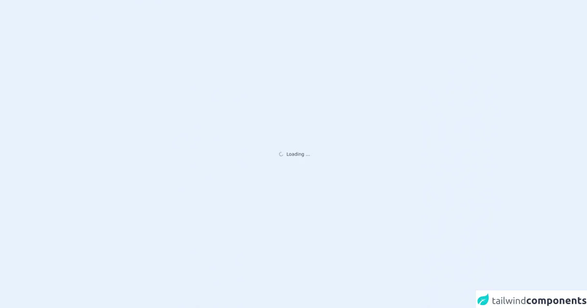
The preview of Minimal Full Screen Page Loading ui component
To create a minimal full-screen page loading component, you can use the following HTML and CSS code:
<div class="fixed top-0 left-0 w-full h-full flex items-center justify-center bg-white z-50">
  <div class="loader ease-linear rounded-full border-4 border-t-4 border-gray-200 h-12 w-12 mb-4"></div>
  <h2 class="text-center text-gray-800 text-xl font-semibold">{{__placeholder1__}}</h2>
</div>
Free download of the Minimal Full Screen Page Loading's source code
The source code of Minimal Full Screen Page Loading ui component
To create a minimal full-screen page loading component, you can use the following HTML and CSS code:
<div class="fixed top-0 left-0 w-full h-full flex items-center justify-center bg-white z-50">
  <div class="loader ease-linear rounded-full border-4 border-t-4 border-gray-200 h-12 w-12 mb-4"></div>
  <h2 class="text-center text-gray-800 text-xl font-semibold">{{__placeholder1__}}</h2>
</div>
<div class="flex items-center justify-center w-full h-full">
	<div class="flex justify-center items-center space-x-1 text-sm text-gray-700">

				<svg fill='none' class="w-6 h-6 animate-spin" viewBox="0 0 32 32" xmlns='http://www.w3.org/2000/svg'>
					<path clip-rule='evenodd'
						d='M15.165 8.53a.5.5 0 01-.404.58A7 7 0 1023 16a.5.5 0 011 0 8 8 0 11-9.416-7.874.5.5 0 01.58.404z'
						fill='currentColor' fill-rule='evenodd' />
				</svg>


		<div>Loading ...</div>
	</div>
</div>
How to create a Minimal Full Screen Page Loading with Tailwind CSS?
Now that you have seen the HTML and CSS code for a minimal full-screen page loading component, let's go through the steps to create it with Tailwind CSS.
Step 1: Install Tailwind CSS
The first step is to install Tailwind CSS. You can do this by adding the following code to your HTML file:
<link rel="stylesheet" href="https://cdn.jsdelivr.net/npm/tailwindcss@latest/dist/tailwind.min.css">
Alternatively, you can install Tailwind CSS using npm:
npm install tailwindcss
Step 2: Define the HTML structure
The next step is to define the HTML structure for the minimal full-screen page loading component. You can use the following code:
<div class="fixed top-0 left-0 w-full h-full flex items-center justify-center bg-white z-50">
  <div class="loader ease-linear rounded-full border-4 border-t-4 border-gray-200 h-12 w-12 mb-4"></div>
  <h2 class="text-center text-gray-800 text-xl font-semibold">Loading...</h2>
</div>
This code creates a full-screen overlay with a loading animation and a message that informs the user that the website is loading.
Step 3: Style the component with Tailwind CSS
The final step is to style the component with Tailwind CSS. You can use the following code:
<div class="fixed top-0 left-0 w-full h-full flex items-center justify-center bg-white z-50">
  <div class="loader ease-linear rounded-full border-4 border-t-4 border-gray-200 h-12 w-12 mb-4"></div>
  <h2 class="text-center text-gray-800 text-xl font-semibold">Loading...</h2>
</div>
This code uses Tailwind CSS classes to style the component. The fixed, top-0, left-0, w-full, and h-full classes position the component at the top left of the screen and make it full-screen. The flex, items-center, and justify-center classes center the content vertically and horizontally. The bg-white class sets the background color to white, and the z-50 class sets the z-index to 50, which ensures that the component appears on top of other elements.
The loader class creates a loading animation, and the ease-linear, rounded-full, border-4, border-t-4, and border-gray-200 classes define the animation's style. The h-12, w-12, and mb-4 classes define the size and margin of the animation.
The text-center, text-gray-800, text-xl, and font-semibold classes style the message that informs the user that the website is loading.
Conclusion
In conclusion, a minimal full-screen page loading component is an essential element of any website that loads new content. With Tailwind CSS, you can quickly create a minimal full-screen page loading component that not only looks good but also loads quickly. By following the steps outlined in this article, you can create a minimal full-screen page loading component that will improve the user experience of your website.