- Published on
Imagine You Build A Messenger Clone With Tailwind CSS Like An Expert. Follow These 6 Steps To Get There
- What is Tailwind CSS?
- The description of Messenger clone UI component
- Why use Tailwind CSS to create a Messenger clone UI component?
- The preview of Messenger clone UI component
- The source code of Messenger clone UI component
- How to create a Messenger clone with Tailwind CSS?
- Step 1: Set up your project
- Step 2: Add Tailwind CSS to your project
- Step 3: Create the chat bubble component
- Step 4: Create the message thread component
- Step 5: Create the user avatar component
- Step 6: Add interactivity with JavaScript
- Conclusion
Are you looking to create a Messenger clone UI component for your next project? If so, you're in luck! In this article, we'll show you how to build a Messenger clone with Tailwind CSS like an expert. By following these 6 steps, you'll be able to create a stunning Messenger clone that looks and feels just like the real thing.
What is Tailwind CSS?
Tailwind CSS is a utility-first CSS framework that makes it easy to design responsive and customizable user interfaces. With Tailwind CSS, you can create complex designs without writing a lot of custom CSS. Instead, you can use pre-defined classes that provide you with all the styles you need.
The description of Messenger clone UI component
A Messenger clone UI component is a user interface that looks and feels like Facebook Messenger. It includes all the features you'd expect from a messaging app, such as chat bubbles, message threads, and user avatars. By creating a Messenger clone UI component, you can add messaging functionality to your web application and provide your users with a seamless messaging experience.
Why use Tailwind CSS to create a Messenger clone UI component?
Tailwind CSS is the perfect choice for creating a Messenger clone UI component because it provides you with all the styles you need to create a responsive and customizable user interface. With Tailwind CSS, you can easily create chat bubbles, message threads, and user avatars without writing a lot of custom CSS.
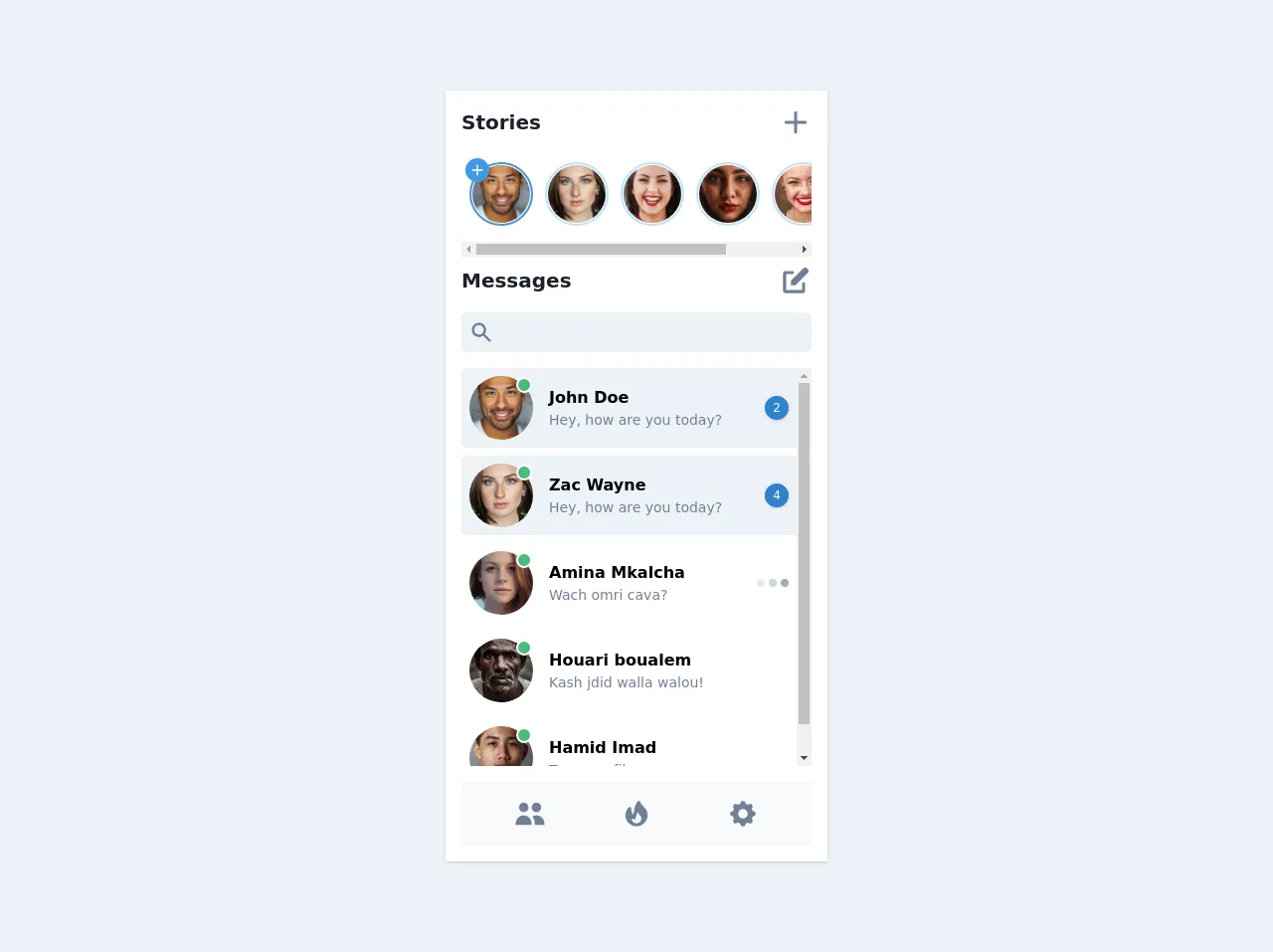
The preview of Messenger clone UI component
To give you an idea of what your Messenger clone UI component will look like, here's a preview of what we'll be creating:
Free download of the Messenger clone's source code
The source code of Messenger clone UI component
To create a Messenger clone UI component with Tailwind CSS, you'll need to write some HTML and CSS code. Here's the source code you'll need to get started:
<div class="flex items-center justify-center min-h-screen bg-gray-200 py-8">
        <div class="flex flex-col w-full max-w-sm shadow bg-white p-4">
            <h2 class="flex flex-row items-center justify-between">
                <span class="font-bold text-xl text-gray-900">Stories</span>
                <a href="#" class="text-gray-600 hover:text-gray-700">
                    <svg class="h-8 w-8" fill="currentColor" viewBox="0 0 20 20">
                        <path fill-rule="evenodd" d="M10 3a1 1 0 011 1v5h5a1 1 0 110 2h-5v5a1 1 0 11-2 0v-5H4a1 1 0 110-2h5V4a1 1 0 011-1z" clip-rule="evenodd" />
                    </svg>
                </a>
            </h2>
            <ul class="flex flex-row space-x-3 overflow-x-auto py-4 px-2 mt-2">
                <li>
                    <div class="relative">
                        <span class="absolute left-0 top-0 -mt-1 -ml-1 flex items-center justify-center h-6 w-6 rounded-full bg-blue-500 text-white">
                            <svg class="h-4 w-4" fill="currentColor" viewBox="0 0 20 20">
                                <path fill-rule="evenodd" d="M10 3a1 1 0 011 1v5h5a1 1 0 110 2h-5v5a1 1 0 11-2 0v-5H4a1 1 0 110-2h5V4a1 1 0 011-1z" clip-rule="evenodd" />
                            </svg>
                        </span>
                        <a href="#" class="flex rounded-full border-2 border-blue-500 p-px w-16 h-16">
                            <img src="https://images.unsplash.com/photo-1507003211169-0a1dd7228f2d?ixlib=rb-1.2.1&ixid=eyJhcHBfaWQiOjEyMDd9&auto=format&fit=facearea&w=128&h=128&q=60&facepad=1.5" alt class="w-full h-full rounded-full" />
                        </a>
                    </div>
                </li>
                <li>
                    <a href="#" class="flex rounded-full border-2 border-blue-200 p-px w-16 h-16">
                        <img src="https://images.unsplash.com/photo-1568967729548-e3dbad3d37e0?ixlib=rb-1.2.1&ixid=eyJhcHBfaWQiOjEyMDd9&auto=format&fit=facearea&w=128&h=128&q=60&facepad=1.5" alt class="w-full h-full rounded-full" />
                    </a>
                </li>
                <li>
                    <a href="#" class="flex rounded-full border-2 border-blue-200 p-px w-16 h-16">
                        <img src="https://images.unsplash.com/photo-1494790108377-be9c29b29330?ixlib=rb-1.2.1&ixid=eyJhcHBfaWQiOjEyMDd9&auto=format&fit=facearea&w=128&h=128&q=60&facepad=1.5" alt class="w-full h-full rounded-full" />
                    </a>
                </li>
                <li>
                    <a href="#" class="flex rounded-full border-2 border-blue-200 p-px w-16 h-16">
                        <img src="https://images.unsplash.com/photo-1557296387-5358ad7997bb?ixlib=rb-1.2.1&ixid=eyJhcHBfaWQiOjEyMDd9&auto=format&fit=facearea&w=128&h=128&q=60&facepad=1.5" alt class="w-full h-full rounded-full" />
                    </a>
                </li>
                <li>
                    <a href="#" class="flex rounded-full border-2 border-blue-200 p-px w-16 h-16">
                        <img src="https://images.unsplash.com/photo-1489424731084-a5d8b219a5bb?ixlib=rb-1.2.1&ixid=eyJhcHBfaWQiOjEyMDd9&auto=format&fit=facearea&w=128&h=128&q=60&facepad=1.5" alt class="w-full h-full rounded-full" />
                    </a>
                </li>
                <li>
                    <a href="#" class="flex rounded-full border-2 border-blue-200 p-px w-16 h-16">
                        <img src="https://images.unsplash.com/photo-1554151228-14d9def656e4?ixlib=rb-1.2.1&ixid=eyJhcHBfaWQiOjEyMDd9&auto=format&fit=facearea&w=128&h=128&q=60&facepad=1.5" alt class="w-full h-full rounded-full" />
                    </a>
                </li>
            </ul>
            <h2 class="flex flex-row items-center justify-between mt-2">
                <span class="font-bold text-xl text-gray-900">Messages</span>
                <a href="#" class="text-gray-600 hover:text-gray-700">
                    <svg class="h-8 w-8" fill="currentColor" viewBox="0 0 20 20">
                        <path d="M17.414 2.586a2 2 0 00-2.828 0L7 10.172V13h2.828l7.586-7.586a2 2 0 000-2.828z" />
                        <path fill-rule="evenodd" d="M2 6a2 2 0 012-2h4a1 1 0 010 2H4v10h10v-4a1 1 0 112 0v4a2 2 0 01-2 2H4a2 2 0 01-2-2V6z" clip-rule="evenodd" />
                    </svg>
                </a>
            </h2>
            <div class="flex flex-col relative mt-4">
                <div class="absolute flex items-center justify-center h-10 w-10 left-0 top-0">
                    <svg class="h-6 w-6 text-gray-600" fill="currentColor" viewBox="0 0 20 20">
                        <path fill-rule="evenodd" d="M8 4a4 4 0 100 8 4 4 0 000-8zM2 8a6 6 0 1110.89 3.476l4.817 4.817a1 1 0 01-1.414 1.414l-4.816-4.816A6 6 0 012 8z" clip-rule="evenodd" />
                    </svg>
                </div>
                <div>
                    <input class="pl-10 rounded h-10 w-full focus:outline-none bg-gray-200 focus:bg-gray-300" type="text" />
                </div>
            </div>
            <ul class="flex flex-col mt-4 space-y-2 overflow-y-auto" style="height:400px">
                <li class="flex flex-row items-center relative bg-gray-200 hover:bg-gray-100 p-2 rounded">
                    <div class="absolute flex items-center justify-center h-full right-0 top-0 mr-2">
                        <span class="flex items-center justify-center shadow bg-blue-600 h-6 w-6 text-xs rounded-full text-white">2</span>
                    </div>
                    <div class="relative flex-shrink-0">
                        <span class="absolute right-0 top-0 border-2 border-white mt-px mr-px flex items-center justify-center h-4 w-4 rounded-full bg-green-500"></span>
                        <a href="#" class="flex rounded-full w-16 h-16">
                            <img src="https://images.unsplash.com/photo-1507003211169-0a1dd7228f2d?ixlib=rb-1.2.1&ixid=eyJhcHBfaWQiOjEyMDd9&auto=format&fit=facearea&w=128&h=128&q=60&facepad=1.5" alt class="w-full h-full rounded-full" />
                        </a>
                    </div>
                    <div class="flex flex-col ml-4">
                        <h3 class="font-bold">John Doe</h3>
                        <p class="text-sm text-gray-600">Hey, how are you today?</p>
                    </div>
                </li>
                <li class="flex flex-row items-center relative bg-gray-200 hover:bg-gray-100 p-2 rounded">
                    <div class="absolute flex items-center justify-center h-full right-0 top-0 mr-2">
                        <span class="flex items-center justify-center shadow bg-blue-600 h-6 w-6 text-xs rounded-full text-white">4</span>
                    </div>
                    <div class="relative flex-shrink-0">
                        <span class="absolute right-0 top-0 border-2 border-white mt-px mr-px flex items-center justify-center h-4 w-4 rounded-full bg-green-500"></span>
                        <a href="#" class="flex rounded-full w-16 h-16">
                            <img src="https://images.unsplash.com/photo-1568967729548-e3dbad3d37e0?ixlib=rb-1.2.1&ixid=eyJhcHBfaWQiOjEyMDd9&auto=format&fit=facearea&w=128&h=128&q=60&facepad=1.5" alt class="w-full h-full rounded-full" />
                        </a>
                    </div>
                    <div class="flex flex-col ml-4">
                        <h3 class="font-bold">Zac Wayne</h3>
                        <p class="text-sm text-gray-600">Hey, how are you today?</p>
                    </div>
                </li>
                <li class="flex flex-row items-center relative hover:bg-gray-100 p-2 rounded">
                    <div class="absolute flex items-center flex-row space-x-1 right-0 top-0 mr-2 h-full">
                        <span class="block rounded-full h-2 w-2 bg-gray-300"></span>
                        <span class="block rounded-full h-2 w-2 bg-gray-400"></span>
                        <span class="block rounded-full h-2 w-2 bg-gray-500"></span>
                    </div>
                    <div class="relative flex-shrink-0">
                        <span class="absolute right-0 top-0 border-2 border-white mt-px mr-px flex items-center justify-center h-4 w-4 rounded-full bg-green-500"></span>
                        <a href="#" class="flex rounded-full w-16 h-16">
                            <img src="https://images.unsplash.com/photo-1438761681033-6461ffad8d80?ixlib=rb-1.2.1&ixid=eyJhcHBfaWQiOjEyMDd9&auto=format&fit=facearea&w=128&h=128&q=60&facepad=1.5" alt class="w-full h-full rounded-full" />
                        </a>
                    </div>
                    <div class="flex flex-col ml-4">
                        <h3 class="font-bold">Amina Mkalcha</h3>
                        <p class="text-sm text-gray-600">Wach omri cava?</p>
                    </div>
                </li>
                <li class="flex flex-row items-center relative hover:bg-gray-100 p-2 rounded">
                    <div class="relative flex-shrink-0">
                        <span class="absolute right-0 top-0 border-2 border-white mt-px mr-px flex items-center justify-center h-4 w-4 rounded-full bg-green-500"></span>
                        <a href="#" class="flex rounded-full w-16 h-16">
                            <img src="https://images.unsplash.com/photo-1493106819501-66d381c466f1?ixlib=rb-1.2.1&ixid=eyJhcHBfaWQiOjEyMDd9&auto=format&fit=facearea&w=128&h=128&q=60&facepad=1.5" alt class="w-full h-full rounded-full" />
                        </a>
                    </div>
                    <div class="flex flex-col ml-4">
                        <h3 class="font-bold">Houari boualem</h3>
                        <p class="text-sm text-gray-600">Kash jdid walla walou!</p>
                    </div>
                </li>
                <li class="flex flex-row items-center relative hover:bg-gray-100 p-2 rounded">
                    <div class="relative flex-shrink-0">
                        <span class="absolute right-0 top-0 border-2 border-white mt-px mr-px flex items-center justify-center h-4 w-4 rounded-full bg-green-500"></span>
                        <a href="#" class="flex rounded-full w-16 h-16">
                            <img src="https://images.unsplash.com/photo-1542909168-82c3e7fdca5c?ixlib=rb-1.2.1&ixid=eyJhcHBfaWQiOjEyMDd9&auto=format&fit=facearea&w=128&h=128&q=60&facepad=1.5" alt class="w-full h-full rounded-full" />
                        </a>
                    </div>
                    <div class="flex flex-col ml-4">
                        <h3 class="font-bold">Hamid Imad</h3>
                        <p class="text-sm text-gray-600">Tessema fiha</p>
                    </div>
                </li>
            </ul>
            <div class="flex flex-row items-center justify-around mt-4 bg-gray-100 p-4">
                <div class="flex text-gray-600">
                    <svg class="h-8 w-8" fill="currentColor" viewBox="0 0 20 20">
                        <path d="M9 6a3 3 0 11-6 0 3 3 0 016 0zM17 6a3 3 0 11-6 0 3 3 0 016 0zM12.93 17c.046-.327.07-.66.07-1a6.97 6.97 0 00-1.5-4.33A5 5 0 0119 16v1h-6.07zM6 11a5 5 0 015 5v1H1v-1a5 5 0 015-5z" />
                    </svg>
                </div>
                <div class="flex text-gray-600">
                    <svg class="h-8 w-8" fill="currentColor" viewBox="0 0 20 20">
                        <path
                            fill-rule="evenodd"
                            d="M11.757 2.034a1 1 0 01.638.519c.483.967.844 1.554 1.207 2.03.368.482.756.876 1.348 1.467A6.985 6.985 0 0117 11a7.002 7.002 0 01-14 0c0-1.79.684-3.583 2.05-4.95a1 1 0 011.707.707c0 1.12.07 1.973.398 2.654.18.374.461.74.945 1.067.116-1.061.328-2.354.614-3.58.225-.966.505-1.93.839-2.734.167-.403.356-.785.57-1.116.208-.322.476-.649.822-.88a1 1 0 01.812-.134zm.364 13.087A2.998 2.998 0 017 13s.879.5 2.5.5c0-1 .5-4 1.25-4.5.5 1 .786 1.293 1.371 1.879.586.585.879 1.353.879 2.121s-.293 1.536-.879 2.121z"
                            clip-rule="evenodd"
                        />
                    </svg>
                </div>
                <div class="flex text-gray-600">
                    <svg class="h-8 w-8" fill="currentColor" viewBox="0 0 20 20">
                        <path
                            fill-rule="evenodd"
                            d="M11.49 3.17c-.38-1.56-2.6-1.56-2.98 0a1.532 1.532 0 01-2.286.948c-1.372-.836-2.942.734-2.106 2.106.54.886.061 2.042-.947 2.287-1.561.379-1.561 2.6 0 2.978a1.532 1.532 0 01.947 2.287c-.836 1.372.734 2.942 2.106 2.106a1.532 1.532 0 012.287.947c.379 1.561 2.6 1.561 2.978 0a1.533 1.533 0 012.287-.947c1.372.836 2.942-.734 2.106-2.106a1.533 1.533 0 01.947-2.287c1.561-.379 1.561-2.6 0-2.978a1.532 1.532 0 01-.947-2.287c.836-1.372-.734-2.942-2.106-2.106a1.532 1.532 0 01-2.287-.947zM10 13a3 3 0 100-6 3 3 0 000 6z"
                            clip-rule="evenodd"
                        />
                    </svg>
                </div>
            </div>
        </div>
    </div>
How to create a Messenger clone with Tailwind CSS?
Now that you know why Tailwind CSS is the perfect choice for creating a Messenger clone UI component, let's get started with the tutorial. Here are the 6 steps you'll need to follow:
Step 1: Set up your project
The first step is to set up your project. You'll need to create a new HTML file and add the necessary CSS and JavaScript files. You can use a code editor like Visual Studio Code or Sublime Text to create your files.
Step 2: Add Tailwind CSS to your project
Next, you'll need to add Tailwind CSS to your project. You can do this by downloading the Tailwind CSS files from the official website or by using a package manager like npm or Yarn. Once you've added Tailwind CSS to your project, you can start using its pre-defined classes to style your UI components.
Step 3: Create the chat bubble component
The chat bubble component is the most important part of your Messenger clone UI component. To create the chat bubble component, you'll need to use the Tailwind CSS classes that provide you with the necessary styles. You can use the bg-blue-500 class to set the background color of the chat bubble and the text-white class to set the text color.
Step 4: Create the message thread component
The message thread component is the container that holds all the chat bubbles. To create the message thread component, you'll need to use the Tailwind CSS classes that provide you with the necessary styles. You can use the flex class to create a flex container and the flex-col class to create a vertical flex container.
Step 5: Create the user avatar component
The user avatar component is the image that represents the user in the chat. To create the user avatar component, you'll need to use the Tailwind CSS classes that provide you with the necessary styles. You can use the rounded-full class to create a circular image and the h-8 and w-8 classes to set the height and width of the image.
Step 6: Add interactivity with JavaScript
Finally, you'll need to add interactivity to your Messenger clone UI component with JavaScript. You can use JavaScript to handle user input, send messages, and update the UI in real-time. You can use a JavaScript framework like React or Vue.js to make your code more organized and maintainable.
Conclusion
By following these 6 steps, you can create a Messenger clone UI component with Tailwind CSS like an expert. With Tailwind CSS, you can easily create responsive and customizable user interfaces without writing a lot of custom CSS. So what are you waiting for? Start building your Messenger clone UI component today!