- Published on
Practical Guide: Create A Messages UI Layout With Tailwind CSS
- What is Tailwind CSS?
- The description of Messages UI Layout UI component
- Why use Tailwind CSS to create a Messages UI Layout UI component?
- The preview of Messages UI Layout UI component
- The source code of Messages UI Layout UI component
- How to create a Messages UI Layout with Tailwind CSS?
- Step 1: Set up the HTML structure
- Step 2: Style the HTML elements with Tailwind CSS classes
- Step 3: Add responsive styles with Tailwind CSS classes
- Conclusion
What is Tailwind CSS?
Tailwind CSS is a utility-first CSS framework that helps you quickly build custom designs without having to write any CSS code. It provides a set of pre-defined classes that you can use to style your HTML elements. With Tailwind CSS, you can create complex layouts and designs with ease.
The description of Messages UI Layout UI component
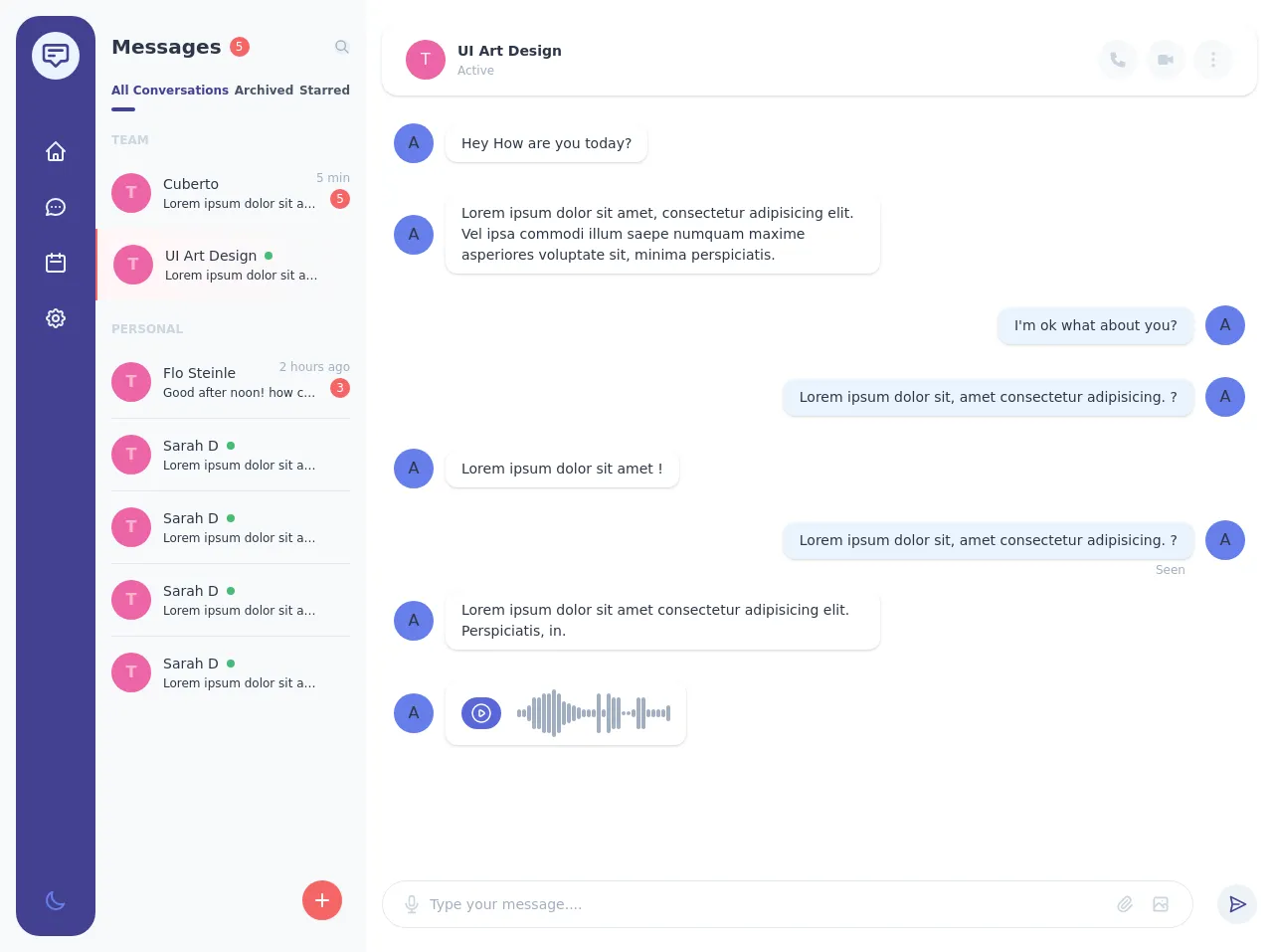
The Messages UI Layout is a common UI component that displays a list of messages in a conversation. It typically includes the sender's name, message content, and timestamp. This UI component is commonly used in chat applications, messaging platforms, and social media platforms.
Why use Tailwind CSS to create a Messages UI Layout UI component?
Tailwind CSS is a great choice for creating the Messages UI Layout UI component because it provides a set of pre-defined classes that you can use to style your HTML elements. This makes it easy to create a consistent and visually appealing design without having to write any CSS code. Additionally, Tailwind CSS is highly customizable, which means you can easily modify the default styles to match your specific design requirements.
The preview of Messages UI Layout UI component
To create the Messages UI Layout UI component with Tailwind CSS, we will use a combination of flexbox and grid layout. The result will be a responsive and visually appealing UI component that can be used in any chat application or messaging platform.
Free download of the Messages UI Layout's source code
The source code of Messages UI Layout UI component
To create the Messages UI Layout UI component, we will use HTML and Tailwind CSS classes. The HTML structure will include a container element, a list of messages, and individual message elements. The Tailwind CSS classes will be used to style the HTML elements and create the desired layout.
<div class="flex flex-row h-screen antialiased text-gray-800">
<div class="flex flex-row w-96 flex-shrink-0 bg-gray-100 p-4">
<div class="flex flex-col items-center py-4 flex-shrink-0 w-20 bg-indigo-800 rounded-3xl">
<a href="#"
class="flex items-center justify-center h-12 w-12 bg-indigo-100 text-indigo-800 rounded-full">
<svg class="w-8 h-8"
fill="none"
stroke="currentColor"
viewBox="0 0 24 24"
xmlns="http://www.w3.org/2000/svg">
<path stroke-linecap="round"
stroke-linejoin="round"
stroke-width="2"
d="M7 8h10M7 12h4m1 8l-4-4H5a2 2 0 01-2-2V6a2 2 0 012-2h14a2 2 0 012 2v8a2 2 0 01-2 2h-3l-4 4z"></path>
</svg>
</a>
<ul class="flex flex-col space-y-2 mt-12">
<li>
<a href="#"
class="flex items-center">
<span class="flex items-center justify-center text-indigo-100 hover:bg-indigo-700 h-12 w-12 rounded-2xl">
<svg class="w-6 h-6"
fill="none"
stroke="currentColor"
viewBox="0 0 24 24"
xmlns="http://www.w3.org/2000/svg">
<path stroke-linecap="round"
stroke-linejoin="round"
stroke-width="2"
d="M3 12l2-2m0 0l7-7 7 7M5 10v10a1 1 0 001 1h3m10-11l2 2m-2-2v10a1 1 0 01-1 1h-3m-6 0a1 1 0 001-1v-4a1 1 0 011-1h2a1 1 0 011 1v4a1 1 0 001 1m-6 0h6"></path>
</svg>
</span>
</a>
</li>
<li>
<a href="#"
class="flex items-center">
<span class="flex items-center justify-center text-indigo-100 hover:bg-indigo-700 h-12 w-12 rounded-2xl">
<svg class="w-6 h-6"
fill="none"
stroke="currentColor"
viewBox="0 0 24 24"
xmlns="http://www.w3.org/2000/svg">
<path stroke-linecap="round"
stroke-linejoin="round"
stroke-width="2"
d="M8 12h.01M12 12h.01M16 12h.01M21 12c0 4.418-4.03 8-9 8a9.863 9.863 0 01-4.255-.949L3 20l1.395-3.72C3.512 15.042 3 13.574 3 12c0-4.418 4.03-8 9-8s9 3.582 9 8z"></path>
</svg>
</span>
</a>
</li>
<li>
<a href="#"
class="flex items-center">
<span class="flex items-center justify-center text-indigo-100 hover:bg-indigo-700 h-12 w-12 rounded-2xl">
<svg class="w-6 h-6"
fill="none"
stroke="currentColor"
viewBox="0 0 24 24"
xmlns="http://www.w3.org/2000/svg">
<path stroke-linecap="round"
stroke-linejoin="round"
stroke-width="2"
d="M8 7V3m8 4V3m-9 8h10M5 21h14a2 2 0 002-2V7a2 2 0 00-2-2H5a2 2 0 00-2 2v12a2 2 0 002 2z"></path>
</svg>
</span>
</a>
</li>
<li>
<a href="#"
class="flex items-center">
<span class="flex items-center justify-center text-indigo-100 hover:bg-indigo-700 h-12 w-12 rounded-2xl">
<svg class="w-6 h-6"
fill="none"
stroke="currentColor"
viewBox="0 0 24 24"
xmlns="http://www.w3.org/2000/svg">
<path stroke-linecap="round"
stroke-linejoin="round"
stroke-width="2"
d="M10.325 4.317c.426-1.756 2.924-1.756 3.35 0a1.724 1.724 0 002.573 1.066c1.543-.94 3.31.826 2.37 2.37a1.724 1.724 0 001.065 2.572c1.756.426 1.756 2.924 0 3.35a1.724 1.724 0 00-1.066 2.573c.94 1.543-.826 3.31-2.37 2.37a1.724 1.724 0 00-2.572 1.065c-.426 1.756-2.924 1.756-3.35 0a1.724 1.724 0 00-2.573-1.066c-1.543.94-3.31-.826-2.37-2.37a1.724 1.724 0 00-1.065-2.572c-1.756-.426-1.756-2.924 0-3.35a1.724 1.724 0 001.066-2.573c-.94-1.543.826-3.31 2.37-2.37.996.608 2.296.07 2.572-1.065z"></path>
<path stroke-linecap="round"
stroke-linejoin="round"
stroke-width="2"
d="M15 12a3 3 0 11-6 0 3 3 0 016 0z"></path>
</svg>
</span>
</a>
</li>
</ul>
<button class="mt-auto flex items-center justify-center hover:text-indigo-100 text-indigo-500 h-10 w-10">
<svg class="w-6 h-6"
fill="none"
stroke="currentColor"
viewBox="0 0 24 24"
xmlns="http://www.w3.org/2000/svg">
<path stroke-linecap="round"
stroke-linejoin="round"
stroke-width="2"
d="M20.354 15.354A9 9 0 018.646 3.646 9.003 9.003 0 0012 21a9.003 9.003 0 008.354-5.646z"></path>
</svg>
</button>
</div>
<div class="flex flex-col w-full h-full pl-4 pr-4 py-4 -mr-4">
<div class="flex flex-row items-center">
<div class="flex flex-row items-center">
<div class="text-xl font-semibold">Messages</div>
<div class="flex items-center justify-center ml-2 text-xs h-5 w-5 text-white bg-red-500 rounded-full font-medium">5</div>
</div>
<div class="ml-auto">
<button class="flex items-center justify-center h-7 w-7 bg-gray-200 text-gray-500 rounded-full">
<svg class="w-4 h-4 stroke-current"
fill="none"
stroke="currentColor"
viewBox="0 0 24 24"
xmlns="http://www.w3.org/2000/svg">
<path stroke-linecap="round"
stroke-linejoin="round"
stroke-width="2"
d="M21 21l-6-6m2-5a7 7 0 11-14 0 7 7 0 0114 0z"></path>
</svg>
</button>
</div>
</div>
<div class="mt-5">
<ul class="flex flex-row items-center justify-between">
<li>
<a href="#"
class="flex items-center pb-3 text-xs font-semibold relative text-indigo-800">
<span>All Conversations</span>
<span class="absolute left-0 bottom-0 h-1 w-6 bg-indigo-800 rounded-full"></span>
</a>
</li>
<li>
<a href="#"
class="flex items-center pb-3 text-xs text-gray-700 font-semibold">
<span>Archived</span>
</a>
</li>
<li>
<a href="#"
class="flex items-center pb-3 text-xs text-gray-700 font-semibold">
<span>Starred</span>
</a>
</li>
</ul>
</div>
<div class="mt-5">
<div class="text-xs text-gray-400 font-semibold uppercase">Team</div>
</div>
<div class="mt-2">
<div class="flex flex-col -mx-4">
<div class="relative flex flex-row items-center p-4">
<div class="absolute text-xs text-gray-500 right-0 top-0 mr-4 mt-3">5 min</div>
<div class="flex items-center justify-center h-10 w-10 rounded-full bg-pink-500 text-pink-300 font-bold flex-shrink-0">
T
</div>
<div class="flex flex-col flex-grow ml-3">
<div class="text-sm font-medium">Cuberto</div>
<div class="text-xs truncate w-40">Lorem ipsum dolor sit amet, consectetur adipisicing elit. Debitis, doloribus?</div>
</div>
<div class="flex-shrink-0 ml-2 self-end mb-1">
<span class="flex items-center justify-center h-5 w-5 bg-red-500 text-white text-xs rounded-full">5</span>
</div>
</div>
<div class="flex flex-row items-center p-4 bg-gradient-to-r from-red-100 to-transparent border-l-2 border-red-500">
<div class="flex items-center justify-center h-10 w-10 rounded-full bg-pink-500 text-pink-300 font-bold flex-shrink-0">
T
</div>
<div class="flex flex-col flex-grow ml-3">
<div class="flex items-center">
<div class="text-sm font-medium">UI Art Design</div>
<div class="h-2 w-2 rounded-full bg-green-500 ml-2"></div>
</div>
<div class="text-xs truncate w-40">Lorem ipsum dolor sit amet, consectetur adipisicing elit. Debitis, doloribus?</div>
</div>
</div>
</div>
</div>
<div class="mt-5">
<div class="text-xs text-gray-400 font-semibold uppercase">Personal</div>
</div>
<div class="h-full overflow-hidden relative pt-2">
<div class="flex flex-col divide-y h-full overflow-y-auto -mx-4">
<div class="flex flex-row items-center p-4 relative">
<div class="absolute text-xs text-gray-500 right-0 top-0 mr-4 mt-3">2 hours ago</div>
<div class="flex items-center justify-center h-10 w-10 rounded-full bg-pink-500 text-pink-300 font-bold flex-shrink-0">
T
</div>
<div class="flex flex-col flex-grow ml-3">
<div class="text-sm font-medium">Flo Steinle</div>
<div class="text-xs truncate w-40">Good after noon! how can i help you?</div>
</div>
<div class="flex-shrink-0 ml-2 self-end mb-1">
<span class="flex items-center justify-center h-5 w-5 bg-red-500 text-white text-xs rounded-full">3</span>
</div>
</div>
<div class="flex flex-row items-center p-4">
<div class="flex items-center justify-center h-10 w-10 rounded-full bg-pink-500 text-pink-300 font-bold flex-shrink-0">
T
</div>
<div class="flex flex-col flex-grow ml-3">
<div class="flex items-center">
<div class="text-sm font-medium">Sarah D</div>
<div class="h-2 w-2 rounded-full bg-green-500 ml-2"></div>
</div>
<div class="text-xs truncate w-40">Lorem ipsum dolor sit amet, consectetur adipisicing elit. Debitis, doloribus?</div>
</div>
</div>
</div>
<div class="absolute bottom-0 right-0 mr-2">
<button class="flex items-center justify-center shadow-sm h-10 w-10 bg-red-500 text-white rounded-full">
<svg class="w-6 h-6"
fill="none"
stroke="currentColor"
viewBox="0 0 24 24"
xmlns="http://www.w3.org/2000/svg">
<path stroke-linecap="round"
stroke-linejoin="round"
stroke-width="2"
d="M12 6v6m0 0v6m0-6h6m-6 0H6"></path>
</svg>
</button>
</div>
</div>
</div>
</div>
<div class="flex flex-col h-full w-full bg-white px-4 py-6">
<div class="flex flex-row items-center py-4 px-6 rounded-2xl shadow">
<div class="flex items-center justify-center h-10 w-10 rounded-full bg-pink-500 text-pink-100">
T
</div>
<div class="flex flex-col ml-3">
<div class="font-semibold text-sm">UI Art Design</div>
<div class="text-xs text-gray-500">Active</div>
</div>
<div class="ml-auto">
<ul class="flex flex-row items-center space-x-2">
<li>
<a href="#"
class="flex items-center justify-center bg-gray-100 hover:bg-gray-200 text-gray-400 h-10 w-10 rounded-full">
<span>
<svg class="w-5 h-5"
fill="currentColor"
stroke="none"
viewBox="0 0 24 24"
xmlns="http://www.w3.org/2000/svg">
<path stroke-linecap="round"
stroke-linejoin="round"
stroke-width="2"
d="M3 5a2 2 0 012-2h3.28a1 1 0 01.948.684l1.498 4.493a1 1 0 01-.502 1.21l-2.257 1.13a11.042 11.042 0 005.516 5.516l1.13-2.257a1 1 0 011.21-.502l4.493 1.498a1 1 0 01.684.949V19a2 2 0 01-2 2h-1C9.716 21 3 14.284 3 6V5z"></path>
</svg>
</span>
</a>
</li>
<li>
<a href="#"
class="flex items-center justify-center bg-gray-100 hover:bg-gray-200 text-gray-400 h-10 w-10 rounded-full">
<span>
<svg class="w-5 h-5"
fill="currentColor"
stroke="none"
viewBox="0 0 24 24"
xmlns="http://www.w3.org/2000/svg">
<path stroke-linecap="round"
stroke-linejoin="round"
stroke-width="2"
d="M15 10l4.553-2.276A1 1 0 0121 8.618v6.764a1 1 0 01-1.447.894L15 14M5 18h8a2 2 0 002-2V8a2 2 0 00-2-2H5a2 2 0 00-2 2v8a2 2 0 002 2z"></path>
</svg>
</span>
</a>
</li>
<li>
<a href="#"
class="flex items-center justify-center bg-gray-100 hover:bg-gray-200 text-gray-400 h-10 w-10 rounded-full">
<span>
<svg class="w-5 h-5"
fill="none"
stroke="currentColor"
viewBox="0 0 24 24"
xmlns="http://www.w3.org/2000/svg">
<path stroke-linecap="round"
stroke-linejoin="round"
stroke-width="2"
d="M12 5v.01M12 12v.01M12 19v.01M12 6a1 1 0 110-2 1 1 0 010 2zm0 7a1 1 0 110-2 1 1 0 010 2zm0 7a1 1 0 110-2 1 1 0 010 2z"></path>
</svg>
</span>
</a>
</li>
</ul>
</div>
</div>
<div class="h-full overflow-hidden py-4">
<div class="h-full overflow-y-auto">
<div class="grid grid-cols-12 gap-y-2">
<div class="col-start-1 col-end-8 p-3 rounded-lg">
<div class="flex flex-row items-center">
<div
class="flex items-center justify-center h-10 w-10 rounded-full bg-indigo-500 flex-shrink-0"
>
A
</div>
<div
class="relative ml-3 text-sm bg-white py-2 px-4 shadow rounded-xl"
>
<div>Hey How are you today?</div>
</div>
</div>
</div>
<div class="col-start-1 col-end-8 p-3 rounded-lg">
<div class="flex flex-row items-center">
<div
class="flex items-center justify-center h-10 w-10 rounded-full bg-indigo-500 flex-shrink-0"
>
A
</div>
<div
class="relative ml-3 text-sm bg-white py-2 px-4 shadow rounded-xl"
>
<div>
Lorem ipsum dolor sit amet, consectetur adipisicing
elit. Vel ipsa commodi illum saepe numquam maxime
asperiores voluptate sit, minima perspiciatis.
</div>
</div>
</div>
</div>
<div class="col-start-6 col-end-13 p-3 rounded-lg">
<div class="flex items-center justify-start flex-row-reverse">
<div
class="flex items-center justify-center h-10 w-10 rounded-full bg-indigo-500 flex-shrink-0"
>
A
</div>
<div
class="relative mr-3 text-sm bg-indigo-100 py-2 px-4 shadow rounded-xl"
>
<div>I'm ok what about you?</div>
</div>
</div>
</div>
<div class="col-start-6 col-end-13 p-3 rounded-lg">
<div class="flex items-center justify-start flex-row-reverse">
<div
class="flex items-center justify-center h-10 w-10 rounded-full bg-indigo-500 flex-shrink-0"
>
A
</div>
<div
class="relative mr-3 text-sm bg-indigo-100 py-2 px-4 shadow rounded-xl"
>
<div>
Lorem ipsum dolor sit, amet consectetur adipisicing. ?
</div>
</div>
</div>
</div>
<div class="col-start-1 col-end-8 p-3 rounded-lg">
<div class="flex flex-row items-center">
<div
class="flex items-center justify-center h-10 w-10 rounded-full bg-indigo-500 flex-shrink-0"
>
A
</div>
<div
class="relative ml-3 text-sm bg-white py-2 px-4 shadow rounded-xl"
>
<div>Lorem ipsum dolor sit amet !</div>
</div>
</div>
</div>
<div class="col-start-6 col-end-13 p-3 rounded-lg">
<div class="flex items-center justify-start flex-row-reverse">
<div
class="flex items-center justify-center h-10 w-10 rounded-full bg-indigo-500 flex-shrink-0"
>
A
</div>
<div
class="relative mr-3 text-sm bg-indigo-100 py-2 px-4 shadow rounded-xl"
>
<div>
Lorem ipsum dolor sit, amet consectetur adipisicing. ?
</div>
<div
class="absolute text-xs bottom-0 right-0 -mb-5 mr-2 text-gray-500"
>
Seen
</div>
</div>
</div>
</div>
<div class="col-start-1 col-end-8 p-3 rounded-lg">
<div class="flex flex-row items-center">
<div
class="flex items-center justify-center h-10 w-10 rounded-full bg-indigo-500 flex-shrink-0"
>
A
</div>
<div
class="relative ml-3 text-sm bg-white py-2 px-4 shadow rounded-xl"
>
<div>
Lorem ipsum dolor sit amet consectetur adipisicing elit.
Perspiciatis, in.
</div>
</div>
</div>
</div>
<div class="col-start-1 col-end-8 p-3 rounded-lg">
<div class="flex flex-row items-center">
<div
class="flex items-center justify-center h-10 w-10 rounded-full bg-indigo-500 flex-shrink-0"
>
A
</div>
<div
class="relative ml-3 text-sm bg-white py-2 px-4 shadow rounded-xl"
>
<div class="flex flex-row items-center">
<button
class="flex items-center justify-center bg-indigo-600 hover:bg-indigo-800 rounded-full h-8 w-10"
>
<svg
class="w-6 h-6 text-white"
fill="none"
stroke="currentColor"
viewBox="0 0 24 24"
xmlns="http://www.w3.org/2000/svg"
>
<path
stroke-linecap="round"
stroke-linejoin="round"
stroke-width="1.5"
d="M14.752 11.168l-3.197-2.132A1 1 0 0010 9.87v4.263a1 1 0 001.555.832l3.197-2.132a1 1 0 000-1.664z"
></path>
<path
stroke-linecap="round"
stroke-linejoin="round"
stroke-width="1.5"
d="M21 12a9 9 0 11-18 0 9 9 0 0118 0z"
></path>
</svg>
</button>
<div class="flex flex-row items-center space-x-px ml-4">
<div class="h-2 w-1 bg-gray-500 rounded-lg"></div>
<div class="h-2 w-1 bg-gray-500 rounded-lg"></div>
<div class="h-4 w-1 bg-gray-500 rounded-lg"></div>
<div class="h-8 w-1 bg-gray-500 rounded-lg"></div>
<div class="h-8 w-1 bg-gray-500 rounded-lg"></div>
<div class="h-10 w-1 bg-gray-500 rounded-lg"></div>
<div class="h-10 w-1 bg-gray-500 rounded-lg"></div>
<div class="h-12 w-1 bg-gray-500 rounded-lg"></div>
<div class="h-10 w-1 bg-gray-500 rounded-lg"></div>
<div class="h-6 w-1 bg-gray-500 rounded-lg"></div>
<div class="h-5 w-1 bg-gray-500 rounded-lg"></div>
<div class="h-4 w-1 bg-gray-500 rounded-lg"></div>
<div class="h-3 w-1 bg-gray-500 rounded-lg"></div>
<div class="h-2 w-1 bg-gray-500 rounded-lg"></div>
<div class="h-2 w-1 bg-gray-500 rounded-lg"></div>
<div class="h-2 w-1 bg-gray-500 rounded-lg"></div>
<div class="h-10 w-1 bg-gray-500 rounded-lg"></div>
<div class="h-2 w-1 bg-gray-500 rounded-lg"></div>
<div class="h-10 w-1 bg-gray-500 rounded-lg"></div>
<div class="h-8 w-1 bg-gray-500 rounded-lg"></div>
<div class="h-8 w-1 bg-gray-500 rounded-lg"></div>
<div class="h-1 w-1 bg-gray-500 rounded-lg"></div>
<div class="h-1 w-1 bg-gray-500 rounded-lg"></div>
<div class="h-2 w-1 bg-gray-500 rounded-lg"></div>
<div class="h-8 w-1 bg-gray-500 rounded-lg"></div>
<div class="h-8 w-1 bg-gray-500 rounded-lg"></div>
<div class="h-2 w-1 bg-gray-500 rounded-lg"></div>
<div class="h-2 w-1 bg-gray-500 rounded-lg"></div>
<div class="h-2 w-1 bg-gray-500 rounded-lg"></div>
<div class="h-2 w-1 bg-gray-500 rounded-lg"></div>
<div class="h-4 w-1 bg-gray-500 rounded-lg"></div>
</div>
</div>
</div>
</div>
</div>
</div>
</div>
</div>
<div class="flex flex-row items-center">
<div class="flex flex-row items-center w-full border rounded-3xl h-12 px-2">
<button class="flex items-center justify-center h-10 w-10 text-gray-400 ml-1">
<svg class="w-5 h-5"
fill="none"
stroke="currentColor"
viewBox="0 0 24 24"
xmlns="http://www.w3.org/2000/svg">
<path stroke-linecap="round"
stroke-linejoin="round"
stroke-width="2"
d="M19 11a7 7 0 01-7 7m0 0a7 7 0 01-7-7m7 7v4m0 0H8m4 0h4m-4-8a3 3 0 01-3-3V5a3 3 0 116 0v6a3 3 0 01-3 3z"></path>
</svg>
</button>
<div class="w-full">
<input type="text"
class="border border-transparent w-full focus:outline-none text-sm h-10 flex items-center" placeholder="Type your message....">
</div>
<div class="flex flex-row">
<button class="flex items-center justify-center h-10 w-8 text-gray-400">
<svg class="w-5 h-5"
fill="none"
stroke="currentColor"
viewBox="0 0 24 24"
xmlns="http://www.w3.org/2000/svg">
<path stroke-linecap="round"
stroke-linejoin="round"
stroke-width="2"
d="M15.172 7l-6.586 6.586a2 2 0 102.828 2.828l6.414-6.586a4 4 0 00-5.656-5.656l-6.415 6.585a6 6 0 108.486 8.486L20.5 13"></path>
</svg>
</button>
<button class="flex items-center justify-center h-10 w-8 text-gray-400 ml-1 mr-2">
<svg class="w-5 h-5"
fill="none"
stroke="currentColor"
viewBox="0 0 24 24"
xmlns="http://www.w3.org/2000/svg">
<path stroke-linecap="round"
stroke-linejoin="round"
stroke-width="2"
d="M4 16l4.586-4.586a2 2 0 012.828 0L16 16m-2-2l1.586-1.586a2 2 0 012.828 0L20 14m-6-6h.01M6 20h12a2 2 0 002-2V6a2 2 0 00-2-2H6a2 2 0 00-2 2v12a2 2 0 002 2z"></path>
</svg>
</button>
</div>
</div>
<div class="ml-6">
<button class="flex items-center justify-center h-10 w-10 rounded-full bg-gray-200 hover:bg-gray-300 text-indigo-800 text-white">
<svg class="w-5 h-5 transform rotate-90 -mr-px"
fill="none"
stroke="currentColor"
viewBox="0 0 24 24"
xmlns="http://www.w3.org/2000/svg">
<path stroke-linecap="round"
stroke-linejoin="round"
stroke-width="2"
d="M12 19l9 2-9-18-9 18 9-2zm0 0v-8"></path>
</svg>
</button>
</div>
</div>
</div>
</div>
How to create a Messages UI Layout with Tailwind CSS?
To create the Messages UI Layout with Tailwind CSS, follow these steps:
Step 1: Set up the HTML structure
The first step is to set up the HTML structure for the Messages UI Layout. This will include a container element, a list of messages, and individual message elements. Here's an example:
<div class="container mx-auto px-4">
  <ul class="divide-y divide-gray-200">
    <li class="py-4 flex">
      <div class="ml-3">
        <p class="text-gray-900">John Doe</p>
        <p class="text-gray-600">Hello, how are you?</p>
        <p class="text-gray-500 text-xs">1:30 PM</p>
      </div>
    </li>
    <li class="py-4 flex">
      <div class="ml-3">
        <p class="text-gray-900">Jane Doe</p>
        <p class="text-gray-600">I'm good, thanks for asking. How about you?</p>
        <p class="text-gray-500 text-xs">1:35 PM</p>
      </div>
    </li>
  </ul>
</div>
In this example, we have a container element with a width of 100% and a max-width of 640px. Inside the container, we have a list of messages with a gray border between them. Each message element has a sender name, message content, and timestamp.
Step 2: Style the HTML elements with Tailwind CSS classes
The next step is to style the HTML elements with Tailwind CSS classes. Here's an example:
<div class="container mx-auto px-4">
  <ul class="divide-y divide-gray-200">
    <li class="py-4 flex">
      <div class="ml-3">
        <p class="text-gray-900 font-semibold">John Doe</p>
        <p class="text-gray-600">Hello, how are you?</p>
        <p class="text-gray-500 text-xs">1:30 PM</p>
      </div>
    </li>
    <li class="py-4 flex">
      <div class="ml-3">
        <p class="text-gray-900 font-semibold">Jane Doe</p>
        <p class="text-gray-600">I'm good, thanks for asking. How about you?</p>
        <p class="text-gray-500 text-xs">1:35 PM</p>
      </div>
    </li>
  </ul>
</div>
In this example, we have added the font-semibold class to the sender name to make it bold. We have also added the text-gray-600 class to the message content to make it less prominent. Finally, we have added the text-gray-500 and text-xs classes to the timestamp to make it smaller and less prominent.
Step 3: Add responsive styles with Tailwind CSS classes
The final step is to add responsive styles with Tailwind CSS classes. Here's an example:
<div class="container mx-auto px-4">
  <ul class="divide-y divide-gray-200">
    <li class="py-4 flex">
      <div class="ml-3">
        <p class="text-gray-900 font-semibold">John Doe</p>
        <p class="text-gray-600">Hello, how are you?</p>
        <p class="text-gray-500 text-xs">1:30 PM</p>
      </div>
    </li>
    <li class="py-4 flex">
      <div class="ml-3">
        <p class="text-gray-900 font-semibold">Jane Doe</p>
        <p class="text-gray-600">I'm good, thanks for asking. How about you?</p>
        <p class="text-gray-500 text-xs">1:35 PM</p>
      </div>
    </li>
  </ul>
</div>
In this example, we have added the mx-auto class to the container to center it on the page. We have also added the px-4 class to the container to add padding to the sides. Finally, we have added the divide-y and divide-gray-200 classes to the list to add a gray border between the messages.
Conclusion
In this article, we have learned how to create a Messages UI Layout with Tailwind CSS. We have seen how Tailwind CSS can help us quickly build custom designs without having to write any CSS code. We have also seen how to use flexbox and grid layout to create a responsive and visually appealing UI component. With these skills, you can create your own custom UI components with ease.