- Published on
Advanced Guide: Create A Menu Profile Sidebar With Tailwind CSS
- What is Tailwind CSS?
- The description of Menu profile sidebar UI component
- Why use Tailwind CSS to create a Menu profile sidebar UI component?
- The preview of Menu profile sidebar UI component
- The source code of Menu profile sidebar UI component
- How to create a Menu profile sidebar with Tailwind CSS?
- Step 1: Set up your HTML
- Step 2: Add Tailwind CSS
- Step 3: Customize your menu profile sidebar
- Conclusion
What is Tailwind CSS?
Tailwind CSS is a utility-first CSS framework that allows you to quickly build custom user interfaces. It provides a set of pre-defined classes that you can use to style your HTML elements without having to write any CSS code. With Tailwind CSS, you can create complex layouts and designs with ease.
The description of Menu profile sidebar UI component
A menu profile sidebar is a UI component that is commonly used in web applications. It typically includes a user's profile picture, name, and a list of menu items that allow the user to navigate through the application. The menu profile sidebar is usually located on the left or right side of the screen and can be collapsed or expanded depending on the user's preference.
Why use Tailwind CSS to create a Menu profile sidebar UI component?
Tailwind CSS is an excellent choice for creating a menu profile sidebar UI component because it provides a wide range of utility classes that make it easy to style and customize the component. With Tailwind CSS, you can quickly create a responsive and visually appealing menu profile sidebar without having to write any custom CSS code.
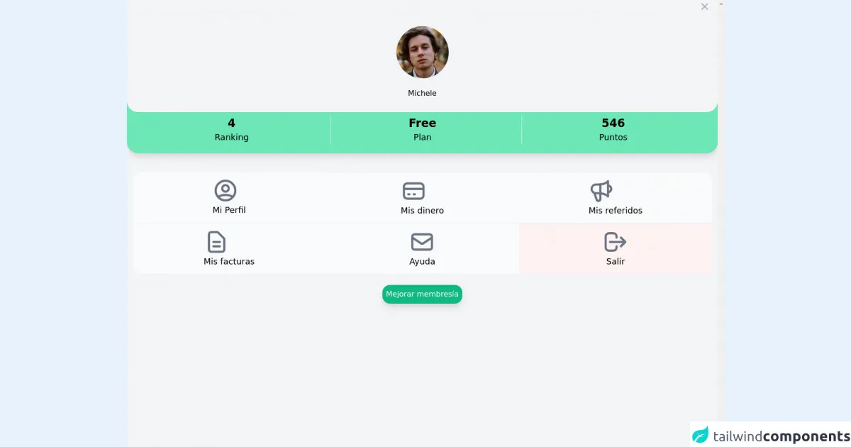
The preview of Menu profile sidebar UI component
To give you an idea of what a menu profile sidebar UI component looks like, here is a preview:
Free download of the Menu profile sidebar's source code
The source code of Menu profile sidebar UI component
Here is the source code for a basic menu profile sidebar UI component:
<div
class="h-full flex flex-col bg-gray-100 dark:bg-gray-700 shadow-xl overflow-y-scroll">
<div class="ml-3 h-7 flex justify-end items-center">
<button type="button"
class="bg-gray-100 dark:bg-gray-700 m-1 p-3 justify-end rounded-md text-gray-400 hover:text-gray-500 focus:ring-2 focus:ring-indigo-500">
<span class="sr-only">Close panel</span>
<!-- Heroicon name: outline/x -->
<svg class="h-6 w-6" xmlns="http://www.w3.org/2000/svg"
fill="none" viewBox="0 0 24 24" stroke="currentColor"
aria-hidden="true">
<path stroke-linecap="round" stroke-linejoin="round"
stroke-width="2" d="M6 18L18 6M6 6l12 12" />
</svg>
</button>
</div>
<div class="bg-green-300 shadow-lg pb-3 rounded-b-3xl">
<div
class="flex rounded-b-3xl bg-gray-100 dark:bg-gray-700 space-y-5 flex-col items-center py-7">
<img class="h-28 w-28 rounded-full"
src="https://api.lorem.space/image/face?w=120&h=120&hash=bart89fe"
alt="User">
<a href="#"> <span
class="text-h1">Michele</span></a>
</div>
<div
class="grid px-7 py-2 items-center justify-around grid-cols-3 gap-4 divide-x divide-solid ">
<div class="col-span-1 flex flex-col items-center ">
<span class="text-2xl font-bold dark:text-gray-500">4</span>
<span class="text-lg font-medium 0">Ranking</span>
</div>
<div class="col-span-1 px-3 flex flex-col items-center ">
<span class="text-2xl font-bold dark:text-gray-500">
Free</span>
<span class="text-lg font-medium">Plan</span>
</div>
<div class="col-span-1 px-3 flex flex-col items-center ">
<span class="text-2xl font-bold dark:text-gray-500">
546</span>
<span class="text-lg font-medium">Puntos</span>
</div>
</div>
</div>
<div
class="grid rounded-2xl divide-y divide-dashed hover:divide-solid justify-evenly bg-gray-50 dark:bg-gray-300 m-3 mt-10 grid-cols-3">
<div class="col-span-1 p-3">
<div class="flex flex-col items-center ">
<a href=""> <button
class="tr-300">
<svg xmlns="http://www.w3.org/2000/svg"
class="h-14 w-14 text-gray-500" fill="none"
viewBox="0 0 24 24" stroke="currentColor"
stroke-width="2">
<path stroke-linecap="round" stroke-linejoin="round"
d="M5.121 17.804A13.937 13.937 0 0112 16c2.5 0 4.847.655 6.879 1.804M15 10a3 3 0 11-6 0 3 3 0 016 0zm6 2a9 9 0 11-18 0 9 9 0 0118 0z" />
</svg>
<span class="text-lg font-medium">Mi Perfil</span>
</button></a>
</div>
</div>
<div class="col-span-1 p-3">
<div class="flex flex-col items-center ">
<a href=""> <button
class="tr-300">
<svg xmlns="http://www.w3.org/2000/svg"
class="h-14 w-14 text-gray-500" fill="none"
viewBox="0 0 24 24" stroke="currentColor"
stroke-width="2">
<path stroke-linecap="round" stroke-linejoin="round"
d="M3 10h18M7 15h1m4 0h1m-7 4h12a3 3 0 003-3V8a3 3 0 00-3-3H6a3 3 0 00-3 3v8a3 3 0 003 3z" />
</svg>
<span class="text-lg font-medium">Mis dinero</span>
</button></a>
</div>
</div>
<div class="col-span-1 p-3">
<div class="flex flex-col items-center ">
<a href=""> <button
class="tr-300">
<svg xmlns="http://www.w3.org/2000/svg"
class="h-14 w-14 text-gray-500" fill="none"
viewBox="0 0 24 24" stroke="currentColor"
stroke-width="2">
<path stroke-linecap="round" stroke-linejoin="round"
d="M11 5.882V19.24a1.76 1.76 0 01-3.417.592l-2.147-6.15M18 13a3 3 0 100-6M5.436 13.683A4.001 4.001 0 017 6h1.832c4.1 0 7.625-1.234 9.168-3v14c-1.543-1.766-5.067-3-9.168-3H7a3.988 3.988 0 01-1.564-.317z" />
</svg>
<span class="text-lg font-medium">Mis referidos</span>
</button></a>
</div>
</div>
<div class="col-span-1 p-3">
<div class="flex flex-col items-center ">
<a href="">
<button class="tr-300">
<svg xmlns="http://www.w3.org/2000/svg"
class="h-14 w-14 text-gray-500" fill="none"
viewBox="0 0 24 24" stroke="currentColor"
stroke-width="2">
<path stroke-linecap="round" stroke-linejoin="round"
d="M9 12h6m-6 4h6m2 5H7a2 2 0 01-2-2V5a2 2 0 012-2h5.586a1 1 0 01.707.293l5.414 5.414a1 1 0 01.293.707V19a2 2 0 01-2 2z" />
</svg>
<span class="text-lg font-medium">Mis facturas</span>
</button></a>
</div>
</div>
<div class="col-span-1 p-3">
<div class="flex flex-col items-center ">
<a href=""> <button class="tr-300">
<svg xmlns="http://www.w3.org/2000/svg"
class="h-14 w-14 text-gray-500" fill="none"
viewBox="0 0 24 24" stroke="currentColor"
stroke-width="2">
<path stroke-linecap="round" stroke-linejoin="round"
d="M3 8l7.89 5.26a2 2 0 002.22 0L21 8M5 19h14a2 2 0 002-2V7a2 2 0 00-2-2H5a2 2 0 00-2 2v10a2 2 0 002 2z" />
</svg>
<span class="text-lg font-medium">Ayuda</span>
</button></a>
</div>
</div>
<div class="col-span-1 bg-red-50 p-3">
<div class="flex flex-col items-center ">
<a href=""> <button class="tr-300">
<svg xmlns="http://www.w3.org/2000/svg"
class="h-14 w-14 text-gray-500" fill="none"
viewBox="0 0 24 24" stroke="currentColor"
stroke-width="2">
<path stroke-linecap="round" stroke-linejoin="round"
d="M17 16l4-4m0 0l-4-4m4 4H7m6 4v1a3 3 0 01-3 3H6a3 3 0 01-3-3V7a3 3 0 013-3h4a3 3 0 013 3v1" />
</svg>
<span class="text-lg font-medium">Salir</span>
</button></a>
</div>
</div>
</div>
<div class="flex mx-auto mt-3 w-100 ">
<a href=""> <button
class="p-2 shadow-lg rounded-2xl tr-300 w-100 font-medium bg-green-500 rounded-md hover:bg-green-600 text-gray-50">Mejorar
membresía</button></a>
</div>
</div>
How to create a Menu profile sidebar with Tailwind CSS?
To create a menu profile sidebar with Tailwind CSS, follow these steps:
Step 1: Set up your HTML
Start by creating the HTML structure for your menu profile sidebar. Here is an example:
<div class="flex flex-col h-screen w-64 bg-gray-100">
  <div class="flex items-center justify-center h-16 bg-white border-b border-gray-200">
    <img src="profile.jpg" alt="Profile picture" class="w-8 h-8 rounded-full mr-2">
    <span class="text-lg font-medium">John Doe</span>
  </div>
  <div class="flex-1 overflow-y-auto">
    <ul class="py-4">
      <li class="px-6 py-2 text-gray-700 hover:bg-gray-200">
        <a href="#">Dashboard</a>
      </li>
      <li class="px-6 py-2 text-gray-700 hover:bg-gray-200">
        <a href="#">Projects</a>
      </li>
      <li class="px-6 py-2 text-gray-700 hover:bg-gray-200">
        <a href="#">Tasks</a>
      </li>
      <li class="px-6 py-2 text-gray-700 hover:bg-gray-200">
        <a href="#">Calendar</a>
      </li>
    </ul>
  </div>
</div>
In this example, we have a container div with a width of 64 pixels and a gray background color. Inside the container, we have a header section with a white background color and a border at the bottom. The header section includes a profile picture and a name. Below the header section, we have a list of menu items with a gray background color that becomes lighter when hovered over.
Step 2: Add Tailwind CSS
Next, you need to add Tailwind CSS to your project. You can do this by including the Tailwind CSS stylesheet in your HTML file:
<link rel="stylesheet" href="https://unpkg.com/tailwindcss@latest/dist/tailwind.min.css">
Step 3: Customize your menu profile sidebar
Now that you have set up your HTML and added Tailwind CSS, you can customize your menu profile sidebar by adding Tailwind CSS classes to your HTML elements. Here are some examples:
- To set the width of the container to 300 pixels, use the
w-64class. - To set the background color of the container to gray, use the
bg-gray-100class. - To center the items in the header section, use the
items-centerandjustify-centerclasses. - To set the height of the header section to 16 pixels, use the
h-16class. - To set the background color of the header section to white, use the
bg-whiteclass. - To add a border at the bottom of the header section, use the
border-bandborder-gray-200classes. - To set the width and height of the profile picture to 8 pixels, use the
w-8andh-8classes. - To add a margin to the right of the profile picture, use the
mr-2class. - To set the font size of the name to large, use the
text-lgclass. - To set the font weight of the name to medium, use the
font-mediumclass. - To set the background color of the menu items to gray, use the
bg-gray-200class. - To change the background color of the menu items when hovered over, use the
hover:bg-gray-200class.
Conclusion
In this article, we have learned how to create a menu profile sidebar UI component with Tailwind CSS. We have seen how Tailwind CSS can make it easy to style and customize the component without having to write any custom CSS code. By following the steps outlined in this article, you can create a responsive and visually appealing menu profile sidebar for your web application.