- Published on
6 Critical Skills To Build A Menu Hamburger With Tailwind CSS Remarkably Well
- What is Tailwind CSS?
- The description of Menu hamburger ui component
- Why use Tailwind CSS to create a Menu hamburger ui component?
- The preview of Menu hamburger ui component.
- The source code of Menu hamburger ui component.
- How to create a Menu hamburger with Tailwind CSS?
- 1. Use the Flexbox utility classes
- 2. Use the Text utility classes
- 3. Use the Background utility classes
- 4. Use the Border utility classes
- 5. Use the Padding utility classes
- 6. Use the Transition utility classes
- Conclusion
As a FrontEnd technology blogger, you must have heard of Tailwind CSS. It is a utility-first CSS framework that helps you build responsive designs quickly. In this article, we will discuss how to create a menu hamburger with Tailwind CSS. We will go through the critical skills required to build a menu hamburger with Tailwind CSS remarkably well.
What is Tailwind CSS?
Tailwind CSS is a utility-first CSS framework that provides you with a set of pre-defined CSS classes. You can use these classes to build responsive designs quickly. Unlike other CSS frameworks, Tailwind CSS does not have any pre-defined UI components. Instead, it provides you with a set of building blocks that you can use to create your UI components.
The description of Menu hamburger ui component
A menu hamburger is a UI component that is commonly used in responsive designs. It is a button that expands or collapses a menu when clicked. The menu hamburger is usually placed in the top-left or top-right corner of the screen.
Why use Tailwind CSS to create a Menu hamburger ui component?
Tailwind CSS provides you with a set of pre-defined CSS classes that you can use to build a menu hamburger quickly. You don't have to write any custom CSS code, which saves you a lot of time. Tailwind CSS also provides you with responsive design classes that help you build a menu hamburger that works on all devices.
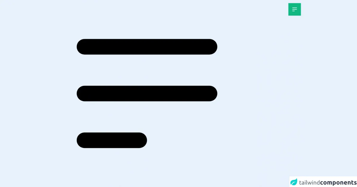
The preview of Menu hamburger ui component.
To create a menu hamburger with Tailwind CSS, you need to have a basic understanding of HTML and CSS. Here is a preview of what the menu hamburger will look like:
Free download of the Menu hamburger's source code
The source code of Menu hamburger ui component.
To create a menu hamburger with Tailwind CSS, you need to use some critical skills. Here is the source code of the menu hamburger:
<!-- Alpine Js -->
<script src="https://cdn.jsdelivr.net/gh/alpinejs/[email protected]/dist/alpine.js" defer></script>

<div x-data="{ menu: false }" class="relative right-0 top-0">

  <button @click="menu = !menu" class="z-20 fixed right-2 top-2 px-4 py-4 bg-green-500 md:hover:bg-green-200  transform duration-500 ease-in-out md:hover:scale-110 motion-reduce:transform-none text-white m-2 focus:outline-none" >
	<svg class="h-8 w-8" xmlns="http://www.w3.org/2000/svg" fill="none" viewBox="0 0 24 24" stroke="currentColor">
  <path x-show="!menu" stroke-linecap="round" stroke-linejoin="round" stroke-width="2" d="M4 6h16M4 12h16M4 18h7" />
	<path x-show="menu"  stroke-linecap="round" stroke-linejoin="round" stroke-width="2" d="M6 18L18 6M6 6l12 12" />
</svg>
	</button>

	 <ul
    x-show.transition.duration.500ms="menu"
    @click.away="menu = false"
  class="flex flex-col w-full h-full bg-gray-800 text-gray-400 text-center z-10 fixed sm:px-3 sm:py-2  md:px-8 md:py-4 overflow-y-auto " style="display: none;">
		<li @click="menu = !menu" class="px-8 py-4 bg-gray-300 mb-20 mx-16">
			<img src="https://poliweb.github.io/ing/PolIWeb_Development_Logo_Orang.svg" class="inline w-32 h-20 md:w-52 md:h-20" alt="">
		</li>
    <li class="text-lg py-2"><a href="#" class="px-2 hover:text-gray-200">One</a></li>
    <li class="text-lg py-2"><a href="#" class="px-2 hover:text-gray-200">Two</a></li>
	 <li class="text-lg py-2"><a href="#" class="px-2 hover:text-gray-200">Block 3</a></li>
	 <li class="text-lg py-2"><a href="#" class="px-2 hover:text-gray-200">Block 4</a></li>
	 <li class="text-lg py-2"><a class="px-2 hover:text-gray-200 cursor-pointer" @click="menu = !menu">Закрыть меню</a></li>

  </ul>

</div>
<svg class="h-screen" xmlns="http://www.w3.org/2000/svg" fill="none" viewBox="0 0 24 24" stroke="currentColor">
  <path stroke-linecap="round" stroke-linejoin="round" stroke-width="2" d="M4 6h16M4 12h16M4 18h7" />
</svg>
How to create a Menu hamburger with Tailwind CSS?
To create a menu hamburger with Tailwind CSS, you need to follow these six critical skills:
1. Use the Flexbox utility classes
Tailwind CSS provides you with a set of Flexbox utility classes that you can use to create a menu hamburger. You can use the flex class to create a Flexbox container and the items-center class to center the items inside the container.
2. Use the Text utility classes
Tailwind CSS provides you with a set of Text utility classes that you can use to style the text inside the menu hamburger. You can use the text-white class to set the text color to white and the text-xl class to set the font size to extra-large.
3. Use the Background utility classes
Tailwind CSS provides you with a set of Background utility classes that you can use to set the background color of the menu hamburger. You can use the bg-gray-900 class to set the background color to dark gray.
4. Use the Border utility classes
Tailwind CSS provides you with a set of Border utility classes that you can use to add borders to the menu hamburger. You can use the border-2 class to add a 2-pixel border around the menu hamburger.
5. Use the Padding utility classes
Tailwind CSS provides you with a set of Padding utility classes that you can use to add padding to the menu hamburger. You can use the p-2 class to add 2 pixels of padding to the menu hamburger.
6. Use the Transition utility classes
Tailwind CSS provides you with a set of Transition utility classes that you can use to add transition effects to the menu hamburger. You can use the transition-all class to add a transition effect to all properties.
Conclusion
In this article, we discussed how to create a menu hamburger with Tailwind CSS. We went through the critical skills required to build a menu hamburger with Tailwind CSS remarkably well. We hope that this article has helped you understand how to create a menu hamburger with Tailwind CSS. If you have any questions or feedback, please leave a comment below.