- Published on
6 Easy Ways To Create A Mentions & Hashtags With Tailwind CSS Without Even Thinking About It
- What is Tailwind CSS?
- The description of Mentions & Hashtags UI component
- Why use Tailwind CSS to create a Mentions & Hashtags UI component?
- The preview of Mentions & Hashtags UI component.
- The source code of Mentions & Hashtags UI component.
- How to create a Mentions & Hashtags with Tailwind CSS?
- 1. Create the input field
- 2. Add a label
- 3. Add a dropdown menu
- 4. Style the dropdown menu
- 5. Add a focus state
- 6. Add a hover state
- Conclusion
Are you looking for an easy way to create a Mentions & Hashtags UI component for your web application? Look no further than Tailwind CSS. In this article, we'll explore what Tailwind CSS is, why it's a great choice for creating UI components, and provide six easy ways to create a Mentions & Hashtags UI component without even thinking about it.
What is Tailwind CSS?
Tailwind CSS is a utility-first CSS framework that provides a set of pre-defined classes to help you quickly build custom user interfaces. It's designed to be highly customizable, allowing you to create unique designs without having to write custom CSS.
The description of Mentions & Hashtags UI component
A Mentions & Hashtags UI component is a common feature in social media applications that allows users to tag other users or topics in their posts. It typically consists of an input field where users can type in a username or hashtag, and a dropdown menu that displays a list of suggestions based on what the user has typed.
Why use Tailwind CSS to create a Mentions & Hashtags UI component?
Tailwind CSS is an excellent choice for creating a Mentions & Hashtags UI component for several reasons:
- It provides a set of pre-defined classes that make it easy to style your UI component without having to write custom CSS.
- It's highly customizable, allowing you to create unique designs that fit your brand.
- It's lightweight and fast, ensuring that your UI component loads quickly and doesn't slow down your website.
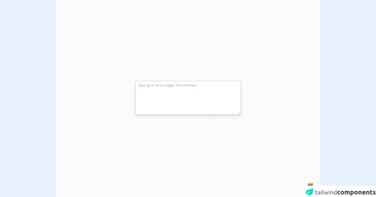
The preview of Mentions & Hashtags UI component.
Here's a preview of what our Mentions & Hashtags UI component will look like:
Free download of the Mentions & Hashtags's source code
The source code of Mentions & Hashtags UI component.
Here's the source code for our Mentions & Hashtags UI component:
<div class="min-w-screen min-h-screen bg-gray-50 flex items-center justify-center px-3 py-32" x-data="app()" x-init="setInput($refs.textarea)">
<div class="w-full max-w-lg relative" @click.outside="onBlur">
<textarea class="w-full bg-white border-2 border-gray-300 shadow-lg px-3 py-2 rounded-lg focus:outline-none focus:border-indigo-500" rows="6" placeholder="Type @ or # to trigger the mention" @input="onInput" @keydown="onKeyDown" @keyup="onKeyUp" @scroll="onScroll" x-ref="textarea"></textarea>
<div class="absolute z-30" style="display:none;" :style="`top: ${caretPosition.top-5}px; left: ${caretPosition.left-10}px`" x-show="showPopover" x-transition:enter="transition ease duration-100 transform" x-transition:enter-start="opacity-0 scale-90 translate-y-1" x-transition:enter-end="opacity-100 scale-100 translate-y-0" >
<span class="absolute top-0 left-0 w-2 h-2 bg-white transform rotate-45 -mt-1 ml-3 border-gray-300 border-r border-b z-20"></span>
<div class="bg-white overflow-auto rounded-lg shadow-md z-10 py-2 border border-gray-300 text-gray-800 text-xs absolute bottom-full">
<ul class="list-reset">
<template x-if="!displayedItems.length">
<li>
<span class="block px-4 py-1 text-gray-500 text-nowrap whitespace-nowrap">No results</span>
</li>
</template>
<template x-if="displayedItems.length">
<template x-for="(item,index) in displayedItems" :key="item.label+item.value+index">
<li @click.prevent="applyMention(index)" class="px-4 py-1 flex no-underline hover:no-underline transition-colors duration-100 text-nowrap whitespace-nowrap" :class="selectedIndex == index ? 'bg-indigo-500 text-white' : 'hover:bg-gray-100'">
<span x-text="item.label" class="font-bold"></span>
<span x-text="`[${key||''}${item.value}]`" class="ml-2"></span>
</li>
</template>
</template>
</ul>
</div>
</div>
</div>
</div>
<!-- BUY ME A BEER AND HELP SUPPORT OPEN-SOURCE RESOURCES -->
<div class="flex items-end justify-end fixed bottom-0 right-0 mb-4 mr-4 z-10">
<div>
<a title="Buy me a beer" href="https://www.buymeacoffee.com/scottwindon" target="_blank" class="block w-16 h-16 rounded-full transition-all shadow hover:shadow-lg transform hover:scale-110 hover:rotate-12">
<img class="object-cover object-center w-full h-full rounded-full" src="https://i.pinimg.com/originals/60/fd/e8/60fde811b6be57094e0abc69d9c2622a.jpg"/>
</a>
</div>
</div>
<script src="https://unpkg.com/alpinejs" defer></script>
<script>
function app() {
return {
keys: ['#', '@'],
users: [
{
label: "Rodolfo Kidd",
value: "rodolfo.kidd",
},
{
label: "Sheldon Lindsey",
value: "sheldonlindsey43",
},
{
label: "Adan Best",
value: "adan_best",
},
{
label: "Rosemary Hurley",
value: "rosemaryhurley22",
},
{
label: "Allyson Livingston",
value: "_allyson_livingston_",
},
{
label: "Carolina Gray",
value: "carolinagray",
},
{
label: "Howard Tran",
value: "howardtran923",
},
],
tags: [
{
label: "alpine",
value: "alpine",
},
{
label: "alpinestars",
value: "alpinestars",
},
{
label: "alpinebabes",
value: "alpinebabes",
},
{
label: "alpinestar",
value: "alpinestar",
},
{
label: "alpinelake",
value: "alpinelake",
},
{
label: "alpinewhite",
value: "alpinewhite",
},
{
label: "alpineclimbing",
value: "alpineclimbing",
},
{
label: "alpineloop",
value: "alpineloop",
},
{
label: "alpinebreak",
value: "alpinebreak",
},
{
label: "alpineskiing",
value: "alpineskiing",
},
{
label: "alpinea110",
value: "alpinea110",
},
{
label: "alpineski",
value: "alpineski",
},
{
label: "alpinelakeswilderness",
value: "alpinelakeswilderness",
},
{
label: "alpinevillage",
value: "alpinevillage",
},
{
label: "alpinevogue",
value: "alpinevogue",
},
],
items: [],
placement: 'top-start',
omitKey: false,
filteringDisabled: false,
insertSpace: false,
mapInsert: null,
limit: 4,
key: null,
oldKey: null,
searchText: null,
caretPosition: {
top: 0,
left: 0,
},
selectedIndex: 0,
input: null,
showPopover: false,
filteredItems: function() {
if (!this.searchText || this.filteringDisabled) {
return this.items
}
const searchText = this.searchText.toLowerCase()
return this.items.filter(item => {
/** @type {string} */
let text
if (item.searchText) {
text = item.searchText
} else if (item.label) {
text = item.label
} else {
text = ''
for (const key in item) {
text += item[key]
}
}
return text.toLowerCase().includes(searchText)
})
},
displayedItems: [],
updateDisplayedItems: function() {
selectedIndex = 0;
return this.displayedItems = this.filteredItems().slice(0, this.limit)
},
//
isIe: function() {
const userAgent = typeof window !== 'undefined' ? window.navigator.userAgent : '';
return userAgent.indexOf('MSIE ') !== -1 || userAgent.indexOf('Trident/') !== -1;
},
isFirefox: function() {
return !(window.mozInnerScreenX == null);
},
setInput: function(el) {
this.input = el;
},
getCaretPosition: function(element, position) {
var mirrorDiv, computed, style;
// The properties that we copy into a mirrored div.
// Note that some browsers, such as Firefox,
// do not concatenate properties, i.e. padding-top, bottom etc. -> padding,
// so we have to do every single property specifically.
var properties = [
'boxSizing',
'width', // on Chrome and IE, exclude the scrollbar, so the mirror div wraps exactly as the textarea does
'height',
'overflowX',
'overflowY', // copy the scrollbar for IE
'borderTopWidth',
'borderRightWidth',
'borderBottomWidth',
'borderLeftWidth',
'paddingTop',
'paddingRight',
'paddingBottom',
'paddingLeft',
// https://developer.mozilla.org/en-US/docs/Web/CSS/font
'fontStyle',
'fontVariant',
'fontWeight',
'fontStretch',
'fontSize',
'lineHeight',
'fontFamily',
'textAlign',
'textTransform',
'textIndent',
'textDecoration', // might not make a difference, but better be safe
'letterSpacing',
'wordSpacing'
];
// mirrored div
mirrorDiv = document.getElementById(element.nodeName + '--mirror-div');
if (!mirrorDiv) {
mirrorDiv = document.createElement('div');
mirrorDiv.id = element.nodeName + '--mirror-div';
document.body.appendChild(mirrorDiv);
}
style = mirrorDiv.style;
computed = getComputedStyle(element);
// default textarea styles
style.whiteSpace = 'pre-wrap';
if (element.nodeName !== 'INPUT')
style.wordWrap = 'break-word'; // only for textarea-s
// position off-screen
style.position = 'absolute'; // required to return coordinates properly
style.top = element.offsetTop + parseInt(computed.borderTopWidth) + 'px';
style.left = "400px";
style.visibility = 'hidden'; // not 'display: none' because we want rendering
// transfer the element's properties to the div
properties.forEach(function(prop) {
style[prop] = computed[prop];
});
if (this.isFirefox()) {
style.width = parseInt(computed.width) - 2 + 'px' // Firefox adds 2 pixels to the padding - https://bugzilla.mozilla.org/show_bug.cgi?id=753662
// Firefox lies about the overflow property for textareas: https://bugzilla.mozilla.org/show_bug.cgi?id=984275
if (element.scrollHeight > parseInt(computed.height))
style.overflowY = 'scroll';
} else {
style.overflow = 'hidden'; // for Chrome to not render a scrollbar; IE keeps overflowY = 'scroll'
}
mirrorDiv.textContent = element.value.substring(0, position);
// the second special handling for input type="text" vs textarea: spaces need to be replaced with non-breaking spaces - http://stackoverflow.com/a/13402035/1269037
if (element.nodeName === 'INPUT')
mirrorDiv.textContent = mirrorDiv.textContent.replace(/\s/g, "\u00a0");
var span = document.createElement('span');
// Wrapping must be replicated *exactly*, including when a long word gets
// onto the next line, with whitespace at the end of the line before (#7).
// The *only* reliable way to do that is to copy the *entire* rest of the
// textarea's content into the <span> created at the caret position.
// for inputs, just '.' would be enough, but why bother?
span.textContent = element.value.substring(position) || '.'; // || because a completely empty faux span doesn't render at all
mirrorDiv.appendChild(span);
var coordinates = {
top: span.offsetTop + parseInt(computed['borderTopWidth']) - element.scrollTop,
left: span.offsetLeft + parseInt(computed['borderLeftWidth']),
};
return coordinates;
},
onInput: function(e) {
this.checkKey()
},
onBlur: function() {
this.closeMenu()
},
onKeyDown: function(e) {
if (this.key) {
if( this.keys.includes(e.key) ) {
return this.cancelEvent(e);
}
this.updateDisplayedItems();
if (e.key === 'ArrowDown' || e.keyCode === 40) {
this.selectedIndex++
if (this.selectedIndex >= this.displayedItems.length) {
this.selectedIndex = 0
}
this.cancelEvent(e)
}
if (e.key === 'ArrowUp' || e.keyCode === 38) {
this.selectedIndex--
if (this.selectedIndex < 0) {
this.selectedIndex = this.displayedItems.length - 1
}
this.cancelEvent(e)
}
if ((e.key === 'Enter' || e.key === 'Tab' || e.keyCode === 13 || e.keyCode === 9) &&
this.displayedItems.length > 0) {
this.applyMention(this.selectedIndex)
this.cancelEvent(e)
}
if (e.key === 'Escape' || e.keyCode === 27) {
this.closeMenu()
this.cancelEvent(e)
}
}
},
onKeyUp: function(e) {
if (this.cancelKeyUp && (e.key === this.cancelKeyUp || e.keyCode === this.cancelKeyCode)) {
this.cancelEvent(e)
}
this.cancelKeyUp = null
// IE
this.cancelKeyCode = null
},
cancelEvent: function(e) {
e.preventDefault()
e.stopPropagation()
this.cancelKeyUp = e.key
// IE
this.cancelKeyCode = e.keyCode
},
onScroll: function() {
this.updateCaretPosition()
},
getSelectionStart: function() {
return this.input.selectionStart
},
setCaretPosition: function(index) {
this.$nextTick(() => {
this.input.selectionEnd = index
})
},
getValue: function() {
return this.input.value
},
setValue: function(value) {
this.input.value = value
},
checkKey: function() {
const index = this.getSelectionStart()
if (index >= 0) {
const { key, keyIndex } = this.getLastKeyBeforeCaret(index)
const searchText = this.lastSearchText = this.getLastSearchText(index, keyIndex)
if (!(keyIndex < 1 || /\s/.test(this.getValue()[keyIndex - 1]))) {
return false
}
if (searchText != null) {
this.openMenu(key, keyIndex)
this.searchText = searchText;
this.updateDisplayedItems();
return true
}
}
this.closeMenu()
return false
},
getLastKeyBeforeCaret: function(caretIndex) {
const [keyData] = this.keys.map(key => ({
key,
keyIndex: this.getValue().lastIndexOf(key, caretIndex - 1),
})).sort((a, b) => b.keyIndex - a.keyIndex)
return keyData
},
getLastSearchText: function(caretIndex, keyIndex) {
if (keyIndex !== -1) {
const searchText = this.getValue().substring(keyIndex + 1, caretIndex)
// If there is a space we close the menu
if (!/\s/.test(searchText)) {
return searchText
}
}
return null
},
openMenu: function(key, keyIndex) {
if (this.key !== key) {
this.key = key
this.keyIndex = keyIndex
this.updateCaretPosition()
this.selectedIndex = 0
this.showPopover = true;
this.items = this.key === '@' ? this.users : this.tags
}
},
closeMenu: function() {
if (this.key != null) {
this.oldKey = this.key
this.showPopover = false;
this.key = null
}
},
updateCaretPosition: function() {
if (this.key) {
this.caretPosition = this.getCaretPosition(this.input, this.keyIndex);
}
},
applyMention: function(itemIndex) {
const item = this.displayedItems[itemIndex]
const value = (this.omitKey ? '' : this.key || '') + String(this.mapInsert ? this.mapInsert(item, this.key) : item.value) + (this.insertSpace ? ' ' : '')
this.setValue(this.replaceText(this.getValue(), this.searchText, value, this.keyIndex))
this.setCaretPosition(this.keyIndex + value.length);
this.closeMenu()
},
replaceText: function(text, searchText, newText, index) {
return text.slice(0, index) + newText + text.slice(index + searchText.length + 1, text.length)
},
};
}
</script>
How to create a Mentions & Hashtags with Tailwind CSS?
Now that we've covered why Tailwind CSS is an excellent choice for creating a Mentions & Hashtags UI component, let's dive into six easy ways to create one.
1. Create the input field
The first step is to create the input field where users can type in a username or hashtag. To do this, we'll use the input element and the form-input class from Tailwind CSS:
<input type="text" class="form-input">
2. Add a label
Next, we'll add a label to the input field to provide context for the user. We'll use the label element and the label class from Tailwind CSS:
<label class="label">Mentions & Hashtags</label>
<input type="text" class="form-input">
3. Add a dropdown menu
Now we'll add a dropdown menu that displays a list of suggestions based on what the user has typed. We'll use the select element and the form-select class from Tailwind CSS:
<label class="label">Mentions & Hashtags</label>
<div class="relative">
  <input type="text" class="form-input">
  <select class="form-select absolute z-10 w-full">
    <option>Username 1</option>
    <option>Username 2</option>
    <option>Hashtag 1</option>
    <option>Hashtag 2</option>
  </select>
</div>
4. Style the dropdown menu
Next, we'll style the dropdown menu to make it look more like a traditional Mentions & Hashtags UI component. We'll use the bg-white, border, rounded-b, and shadow classes from Tailwind CSS:
<label class="label">Mentions & Hashtags</label>
<div class="relative">
  <input type="text" class="form-input">
  <select class="form-select absolute z-10 w-full bg-white border rounded-b shadow">
    <option>Username 1</option>
    <option>Username 2</option>
    <option>Hashtag 1</option>
    <option>Hashtag 2</option>
  </select>
</div>
5. Add a focus state
To make our UI component more user-friendly, we'll add a focus state to the input field. We'll use the focus:outline-none class from Tailwind CSS to remove the default outline when the input field is focused:
<label class="label">Mentions & Hashtags</label>
<div class="relative">
  <input type="text" class="form-input focus:outline-none">
  <select class="form-select absolute z-10 w-full bg-white border rounded-b shadow">
    <option>Username 1</option>
    <option>Username 2</option>
    <option>Hashtag 1</option>
    <option>Hashtag 2</option>
  </select>
</div>
6. Add a hover state
Finally, we'll add a hover state to the dropdown menu to make it more interactive. We'll use the hover:bg-gray-100 class from Tailwind CSS to change the background color of the dropdown menu when the user hovers over it:
<label class="label">Mentions & Hashtags</label>
<div class="relative">
  <input type="text" class="form-input focus:outline-none">
  <select class="form-select absolute z-10 w-full bg-white border rounded-b shadow hover:bg-gray-100">
    <option>Username 1</option>
    <option>Username 2</option>
    <option>Hashtag 1</option>
    <option>Hashtag 2</option>
  </select>
</div>
And there you have it! Six easy ways to create a Mentions & Hashtags UI component with Tailwind CSS.
Conclusion
In this article, we've explored what Tailwind CSS is, why it's a great choice for creating UI components, and provided six easy ways to create a Mentions & Hashtags UI component without even thinking about it. With Tailwind CSS, you can create beautiful and functional UI components quickly and easily, allowing you to focus on building great web applications.