- Published on
Ultimate Guide: Create A Meet The Team Section With Tailwind CSS
- What is Tailwind CSS?
- The description of Meet the Team Section UI component
- Why use Tailwind CSS to create a Meet the Team Section UI component?
- The preview of Meet the Team Section UI component
- The source code of Meet the Team Section UI component
- How to create a Meet the Team Section with Tailwind CSS?
- Step 1: Set up the HTML structure
- Step 2: Add Tailwind CSS classes
- Step 3: Customize the styles
- Conclusion
As a FrontEnd technology blogger, you are always looking for the best tools to create stunning UI components. One of the most popular CSS frameworks out there is Tailwind CSS. In this article, we will guide you through the process of creating a Meet the Team Section UI component using Tailwind CSS.
What is Tailwind CSS?
Tailwind CSS is a utility-first CSS framework that provides a set of pre-defined classes that you can use to style your HTML elements. It allows you to create custom designs quickly and easily by combining these classes. Tailwind CSS is highly customizable and can be used in any project, big or small.
The description of Meet the Team Section UI component
The Meet the Team Section is a common UI component that you can find on many websites. It is a section that showcases the team members of a company or organization. The Meet the Team Section usually includes a photo of each team member, their name, job title, and a short description of their role.
Why use Tailwind CSS to create a Meet the Team Section UI component?
Tailwind CSS is an excellent choice for creating a Meet the Team Section UI component because it provides a set of pre-defined classes that you can use to style your HTML elements. This means that you don't have to write custom CSS for each element, which saves you time and effort. Additionally, Tailwind CSS is highly customizable, so you can easily modify the styles to match your design requirements.
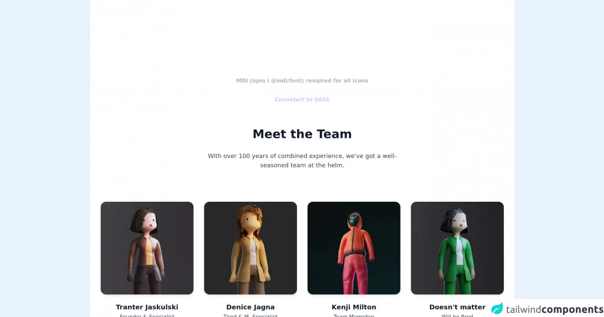
The preview of Meet the Team Section UI component
To create a Meet the Team Section UI component, we will use Tailwind CSS to style the HTML elements. The final result will be a section that showcases the team members of a company or organization. Here's a preview of what the Meet the Team Section UI component will look like:
Free download of the Meet the Team Section's source code
The source code of Meet the Team Section UI component
To create the Meet the Team Section UI component, we will use HTML and Tailwind CSS. Here's the source code for the Meet the Team Section UI component:
<!-- MDI Icons -->
<link rel="stylesheet" href="https://cdn.materialdesignicons.com/6.5.95/css/materialdesignicons.min.css">
<!-- Page Container -->
<div class="flex items-center justify-center min-h-screen bg-white py-48">
<div class="flex flex-col">
<!-- Notes -->
<span class="text-center font-bold my-10 opacity-30">
MDI (npm i @mdi/font) reuqired for all icons
<hr class="my-4">
<a href="https://egoistdeveloper.github.io/twcss-to-sass-playground/" target="_blank" class="text-blue-600">
Convetert to SASS
</a>
</span>
<div class="flex flex-col mt-8">
<!-- Meet the Team -->
<div class="container max-w-7xl px-4">
<!-- Section Header -->
<div class="flex flex-wrap justify-center text-center mb-24">
<div class="w-full lg:w-6/12 px-4">
<!-- Header -->
<h1 class="text-gray-900 text-4xl font-bold mb-8">
Meet the Team
</h1>
<!-- Description -->
<p class="text-gray-700 text-lg font-light">
With over 100 years of combined experience, we've got a well-seasoned team at the helm.
</p>
</div>
</div>
<!-- Team Members -->
<div class="flex flex-wrap">
<!-- Member #1 -->
<div class="w-full md:w-6/12 lg:w-3/12 mb-6 px-6 sm:px-6 lg:px-4">
<div class="flex flex-col">
<!-- Avatar -->
<a href="#" class="mx-auto">
<img class="rounded-2xl drop-shadow-md hover:drop-shadow-xl transition-all duration-200 delay-100"
src="https://images.unsplash.com/photo-1634926878768-2a5b3c42f139?fit=clamp&w=400&h=400&q=80">
</a>
<!-- Details -->
<div class="text-center mt-6">
<!-- Name -->
<h1 class="text-gray-900 text-xl font-bold mb-1">
Tranter Jaskulski
</h1>
<!-- Title -->
<div class="text-gray-700 font-light mb-2">
Founder & Specialist
</div>
<!-- Social Icons -->
<div class="flex items-center justify-center opacity-50 hover:opacity-100
transition-opacity duration-300">
<!-- Linkedin -->
<a href="#" class="flex rounded-full hover:bg-indigo-50 h-10 w-10">
<i class="mdi mdi-linkedin text-indigo-500 mx-auto mt-2"></i>
</a>
<!-- Twitter -->
<a href="#" class="flex rounded-full hover:bg-blue-50 h-10 w-10">
<i class="mdi mdi-twitter text-blue-300 mx-auto mt-2"></i>
</a>
<!-- Instagram -->
<a href="#" class="flex rounded-full hover:bg-orange-50 h-10 w-10">
<i class="mdi mdi-instagram text-orange-400 mx-auto mt-2"></i>
</a>
</div>
</div>
</div>
</div>
<!-- Member #2 -->
<div class="w-full md:w-6/12 lg:w-3/12 mb-6 px-6 sm:px-6 lg:px-4">
<div class="flex flex-col">
<!-- Avatar -->
<a href="#" class="mx-auto">
<img class="rounded-2xl drop-shadow-md hover:drop-shadow-xl transition-all duration-200 delay-100"
src="https://images.unsplash.com/photo-1634896941598-b6b500a502a7?fit=clamp&w=400&h=400&q=80">
</a>
<!-- Details -->
<div class="text-center mt-6">
<!-- Name -->
<h1 class="text-gray-900 text-xl font-bold mb-1">
Denice Jagna
</h1>
<!-- Title -->
<div class="text-gray-700 font-light mb-2">
Tired & M. Specialist
</div>
<!-- Social Icons -->
<div class="flex items-center justify-center opacity-50 hover:opacity-100
transition-opacity duration-300">
<!-- Linkedin -->
<a href="#" class="flex rounded-full hover:bg-indigo-50 h-10 w-10">
<i class="mdi mdi-linkedin text-indigo-700 mx-auto mt-2"></i>
</a>
<!-- Twitter -->
<a href="#" class="flex rounded-full hover:bg-blue-50 h-10 w-10">
<i class="mdi mdi-twitter text-blue-400 mx-auto mt-2"></i>
</a>
<!-- Instagram -->
<a href="#" class="flex rounded-full hover:bg-orange-50 h-10 w-10">
<i class="mdi mdi-instagram text-orange-400 mx-auto mt-2"></i>
</a>
</div>
</div>
</div>
</div>
<!-- Member #3 -->
<div class="w-full md:w-6/12 lg:w-3/12 mb-6 px-6 sm:px-6 lg:px-4">
<div class="flex flex-col">
<!-- Avatar -->
<a href="#" class="mx-auto">
<img class="rounded-2xl drop-shadow-md hover:drop-shadow-xl transition-all duration-200 delay-100"
src="https://images.unsplash.com/photo-1634193295627-1cdddf751ebf?fit=clamp&w=400&h=400&q=80">
</a>
<!-- Details -->
<div class="text-center mt-6">
<!-- Name -->
<h1 class="text-gray-900 text-xl font-bold mb-1">
Kenji Milton
</h1>
<!-- Title -->
<div class="text-gray-700 font-light mb-2">
Team Memeber
</div>
<!-- Social Icons -->
<div class="flex items-center justify-center opacity-50 hover:opacity-100
transition-opacity duration-300">
<!-- Linkedin -->
<a href="#" class="flex rounded-full hover:bg-indigo-50 h-10 w-10">
<i class="mdi mdi-linkedin text-indigo-700 mx-auto mt-2"></i>
</a>
<!-- Twitter -->
<a href="#" class="flex rounded-full hover:bg-blue-50 h-10 w-10">
<i class="mdi mdi-twitter text-blue-400 mx-auto mt-2"></i>
</a>
<!-- Instagram -->
<a href="#" class="flex rounded-full hover:bg-orange-50 h-10 w-10">
<i class="mdi mdi-instagram text-orange-400 mx-auto mt-2"></i>
</a>
</div>
</div>
</div>
</div>
<!-- Member #4 -->
<div class="w-full md:w-6/12 lg:w-3/12 mb-6 px-6 sm:px-6 lg:px-4">
<div class="flex flex-col">
<!-- Avatar -->
<a href="#" class="mx-auto">
<img class="rounded-2xl drop-shadow-md hover:drop-shadow-xl transition-all duration-200 delay-100"
src="https://images.unsplash.com/photo-1635003913011-95971abba560?fit=clamp&w=400&h=400&q=80">
</a>
<!-- Details -->
<div class="text-center mt-6">
<!-- Name -->
<h1 class="text-gray-900 text-xl font-bold mb-1">
Doesn't matter
</h1>
<!-- Title -->
<div class="text-gray-700 font-light mb-2">
Will be fired
</div>
<!-- Social Icons -->
<div class="flex items-center justify-center opacity-50 hover:opacity-100
transition-opacity duration-300">
<!-- Linkedin -->
<a href="#" class="flex rounded-full hover:bg-indigo-50 h-10 w-10">
<i class="mdi mdi-linkedin text-indigo-700 mx-auto mt-2"></i>
</a>
<!-- Twitter -->
<a href="#" class="flex rounded-full hover:bg-blue-50 h-10 w-10">
<i class="mdi mdi-twitter text-blue-400 mx-auto mt-2"></i>
</a>
<!-- Instagram -->
<a href="#" class="flex rounded-full hover:bg-orange-50 h-10 w-10">
<i class="mdi mdi-instagram text-orange-400 mx-auto mt-2"></i>
</a>
</div>
</div>
</div>
</div>
</div>
</div>
</div>
</div>
</div>
How to create a Meet the Team Section with Tailwind CSS?
Now that we have a better understanding of what Tailwind CSS is and why it's an excellent choice for creating a Meet the Team Section UI component let's dive into the step-by-step process of creating the component.
Step 1: Set up the HTML structure
The first step is to set up the HTML structure for the Meet the Team Section UI component. We will use a simple unordered list to display the team members. Each list item will contain a photo, name, job title, and a short description of the team member's role.
<section class="bg-gray-100 py-8">
  <div class="container mx-auto">
    <h2 class="text-2xl font-bold mb-8">Meet the Team</h2>
    <ul class="flex flex-wrap -mx-4">
      <li class="w-full md:w-1/2 lg:w-1/3 px-4 mb-8">
        <div class="bg-white rounded-lg shadow-lg overflow-hidden">
          <img class="w-full h-64 object-cover object-center" src="https://via.placeholder.com/640x360" alt="Team member">
          <div class="p-4">
            <h3 class="text-xl font-bold mb-2">John Doe</h3>
            <p class="text-gray-700 mb-2">Web Developer</p>
            <p class="text-gray-600">Lorem ipsum dolor sit amet, consectetur adipiscing elit. Duis euismod mauris vel elit ultrices, vitae suscipit velit bibendum. Sed euismod, lacus eget tempor lobortis, velit magna faucibus magna, eu ultricies turpis tellus a enim.</p>
          </div>
        </div>
      </li>
      <li class="w-full md:w-1/2 lg:w-1/3 px-4 mb-8">
        <div class="bg-white rounded-lg shadow-lg overflow-hidden">
          <img class="w-full h-64 object-cover object-center" src="https://via.placeholder.com/640x360" alt="Team member">
          <div class="p-4">
            <h3 class="text-xl font-bold mb-2">Jane Doe</h3>
            <p class="text-gray-700 mb-2">Graphic Designer</p>
            <p class="text-gray-600">Lorem ipsum dolor sit amet, consectetur adipiscing elit. Duis euismod mauris vel elit ultrices, vitae suscipit velit bibendum. Sed euismod, lacus eget tempor lobortis, velit magna faucibus magna, eu ultricies turpis tellus a enim.</p>
          </div>
        </div>
      </li>
      <li class="w-full md:w-1/2 lg:w-1/3 px-4 mb-8">
        <div class="bg-white rounded-lg shadow-lg overflow-hidden">
          <img class="w-full h-64 object-cover object-center" src="https://via.placeholder.com/640x360" alt="Team member">
          <div class="p-4">
            <h3 class="text-xl font-bold mb-2">Bob Smith</h3>
            <p class="text-gray-700 mb-2">Marketing Manager</p>
            <p class="text-gray-600">Lorem ipsum dolor sit amet, consectetur adipiscing elit. Duis euismod mauris vel elit ultrices, vitae suscipit velit bibendum. Sed euismod, lacus eget tempor lobortis, velit magna faucibus magna, eu ultricies turpis tellus a enim.</p>
          </div>
        </div>
      </li>
    </ul>
  </div>
</section>
Step 2: Add Tailwind CSS classes
Now that we have the HTML structure in place, we can start adding Tailwind CSS classes to style the elements. Here's a breakdown of the classes we will use:
bg-gray-100: sets the background color of the section to gray.py-8: adds padding to the top and bottom of the section.container: centers the content of the section.mx-auto: centers the unordered list.text-2xl: sets the font size of the section title to 2xl.font-bold: sets the font weight of the section title to bold.flex: sets the display property of the unordered list to flex.flex-wrap: allows the list items to wrap to the next line if there's not enough space.-mx-4: adds negative margin to the list items to remove the space between them.w-full: sets the width of the list item to full width on small screens.md:w-1/2: sets the width of the list item to half on medium screens.lg:w-1/3: sets the width of the list item to one-third on large screens.px-4: adds padding to the left and right of the list item.mb-8: adds margin to the bottom of the list item.bg-white: sets the background color of the list item to white.rounded-lg: adds rounded corners to the list item.shadow-lg: adds a shadow to the list item.overflow-hidden: hides any content that overflows the list item.w-full: sets the width of the image to full width.h-64: sets the height of the image to 64.object-cover: scales the image to cover the entire element.object-center: centers the image horizontally and vertically.p-4: adds padding to the content of the list item.text-xl: sets the font size of the team member name to xl.text-gray-700: sets the color of the job title to gray.text-gray-600: sets the color of the description to gray.
Step 3: Customize the styles
Once we have added the Tailwind CSS classes, we can customize the styles to match our design requirements. For example, we can change the background color of the section, the font size of the team member name, or the height of the image.
Conclusion
Creating a Meet the Team Section UI component with Tailwind CSS is a straightforward process that can save you time and effort. Tailwind CSS provides a set of pre-defined classes that you can use to style your HTML elements, which means you don't have to write custom CSS for each element. Additionally, Tailwind CSS is highly customizable, so you can easily modify the styles to match your design requirements. We hope this guide has been helpful in creating your Meet the Team Section UI component.